Thats true, which is why the problems with Source are not necessarily graphical. As its been said before, the minuscule maps and tedious compiling are both unrelated to graphics and major problems.
I can stand Portal 2’s graphics. But it’d be nice to see more. As always, art style will be more important than graphics, but who says we can’t have both?
Then why do you post in this thread ? Go to the general thought on portal 2 one …
Im starting to remember why i stopped visiting this forum, idiots will argue just for the sake of arguing O_o
Didn’t realize threads were supposed to be created for everyone to agree unconditionally with the OP. We can’t help it there are people in the world who disagree with you. Get over it you whiny bitch.
Jesus Christ, the amount of derp in this thread is overwhelming.
I personally did not notice graphical deficiencies when playing through Portal 2 (aside from the frequent load times) because I was too impressed by the art style and animation quality. That said, the game simply does not stand up to current-gen competitors in terms of raw graphical horsepower.
Now before you jump all over that, consider the fact that that statement makes no comment on the enjoyability of the game or the quality of the game’s design or aesthetic. All that the OP is saying is that Source is showing its age. He’s right. You really can’t argue with that as it’s a matter of fact. Compare the stats. Numbers don’t lie. Again, better tech does not a good game make. But this isn’t a conversation about game design; it’s about tech.
I would love a major upgrade for Episode 3. I think that Portal 2 is gorgeous, but with better technology it could look better. The only problem with the game (for me) was the frequent load times, which did grate after a while. That’s because I’m not hugely visual-centric. But who doesn’t like to look at pretty things?
I’ve heard valve is working on the Source Engine 2 for Episode 3, and that might be why it takes them so long to release it, They clearly don’t need all those years simply to add new fighting moves for Alyx or something like dat.
And actually, informations could be released on the E3, There WILL be something about Episode 3 in there anyway.
Your hope is adorable.
I thought the graphics in Portal 2 were great, especially considering that it ran with no lag on my computer on full, which is a problem with most games today. The only problem was that for some reason the shadows looked really block-y…
EDIT: Also, the fact that i had to load a new map every few minutes was quite annoying…
How come everyone assumes we’re talking about graphics exclusively when we say source is outdated?
Because for most people thats all they see of an engine. The rest is largely the realm of developers and those who work with the engine.
Evidence please?
And I really doubt they are working on a “source engine 2”. Unless they start suggesting otherwise, we’ll continue to see the modular updates.
That’s so cute.
IMO source engine is still quite OK.
Ofc it’s dated, it came out 7 years ago or something. But still I think it’s doing a heck of a job. Valve has some of the best game designers in the world, and that has a lot to say for how the games are. To me the graphics sort of fit the game in a weird way. Great atmosphere all the way.
I’m not going to complain if the next valve game comes out on the same engine.
I have absolutely no experience as a developer so I can’t say anything about how it is to develop for the Source engine, and I’m not gonna make a guess either.
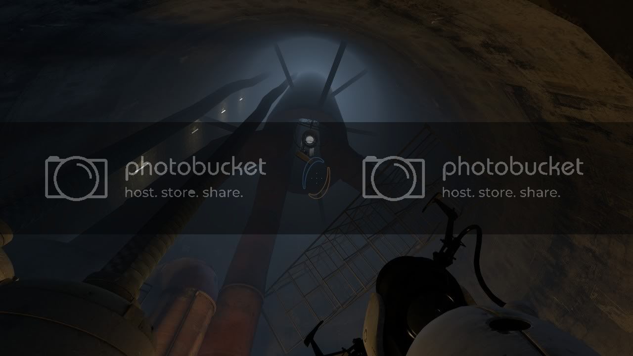
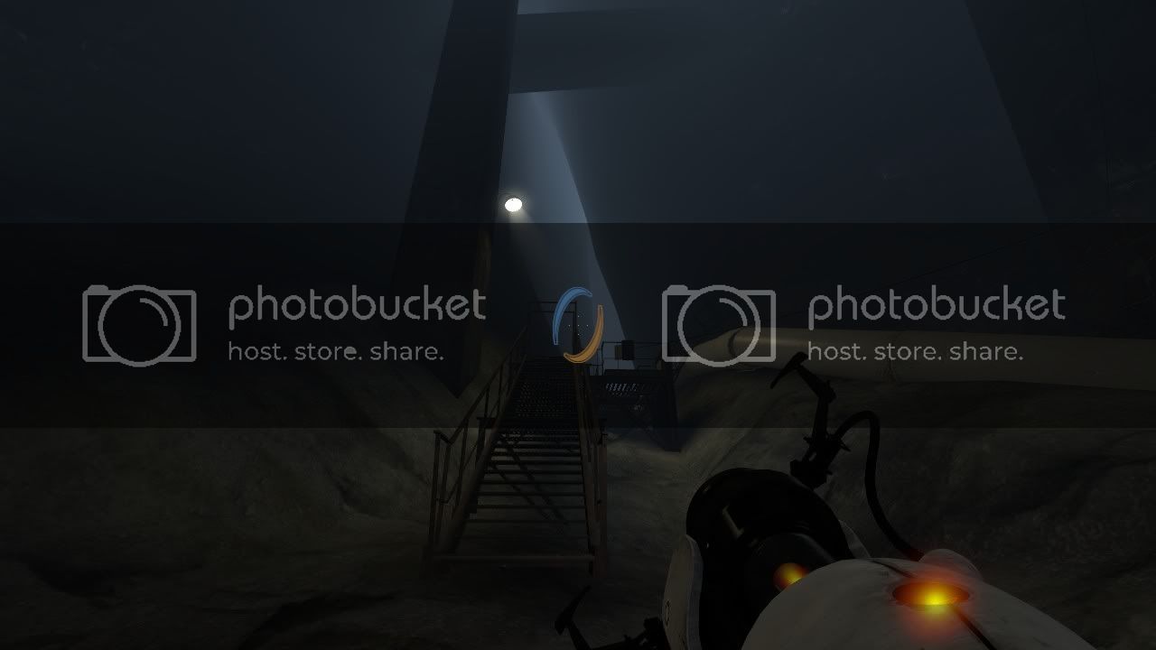
Because fog isn’t black
In real life, no. But this is a video game, and black fog can be effective.
I dont care if you agree with me, just dont go into a random thread starting by saying you dont care about it and the go on a random rant … oh wait
Yeah, but it isnt as bright as in portal 2. Fog is just light reflected from water droplets in the air, so unless there are some blue light sources underground in aparature, the farther you see the darker it gets. I know its valve way on giving better impression of distance between objects but I would rather have a dark fog than one that seems to be glowing.
Maybe there’s a lightsource way above that fog and that’s why it isn’t darker.
In that context the blue fog works okay. But black fog could work, at least in the first screen. You have to remember that fog in a video game can be used to simulate darkness in real life.
Aperture Science’s walls are light blue/white. So, it could be light filtering down from the upper levels…
The engine allows for the fog to be different colors, it’s more of a design thing that they made it blue. But yeah, that would probably make it look a lot nicer in so places


