@Maxwell, I’ll address your schematic a bit later, when I have a bit more spare time.
I decided to take a look to see what would be the best method of addressing the spatial issue, and if indeed it was possible/feasible. Long story short, I can address MOST of the spatial concerns between the maps with a little bit of magical jiggery-pokery, but addressing ALL of them is a little out of the question.
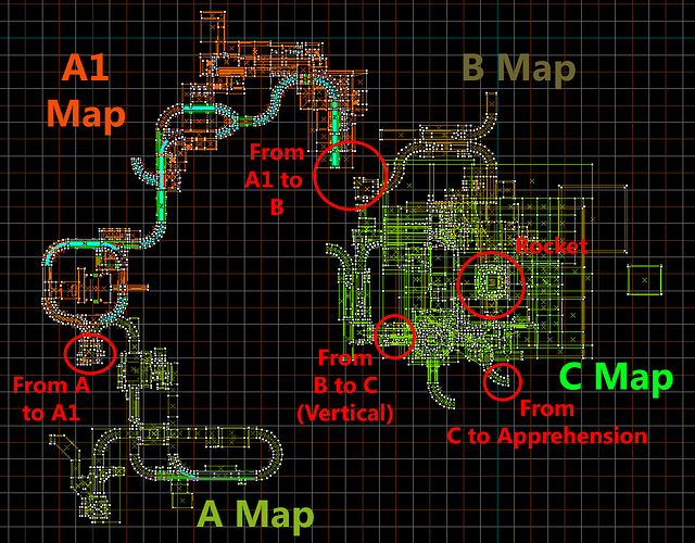
To help me visualize the problem, I actually constructed a map composite in Hammer using the basic map brushwork. While Wangman’s mockup was nice, because I’m a mapper it helps me to visualize things better through a medium I can easily relate to and understand.
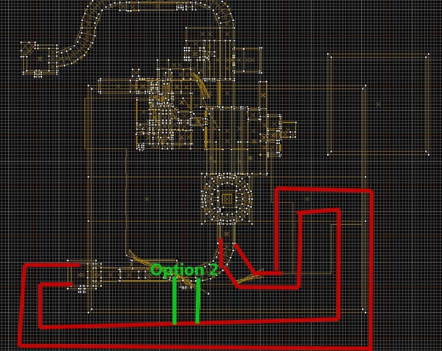
This schematic represents the current spatial layout of my maps, when I’ve made NO modifications to any of the Black Mesa maps:
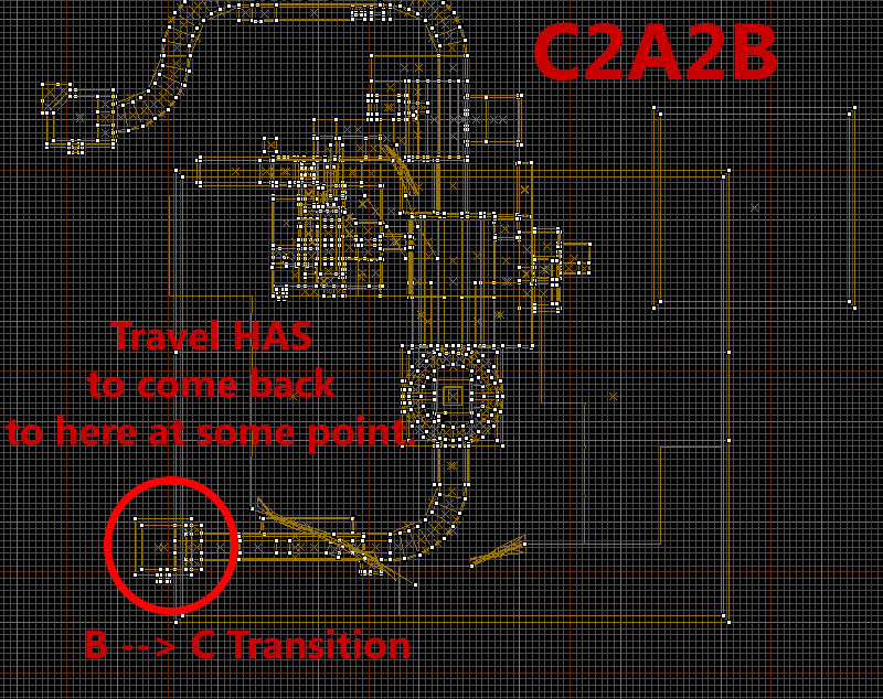
As you can see, there’s nowhere my maps can fit into this layout which doesn’t make the traveling feel pointless, an issue which has already been brought up. Mapping B1 into the empty space on the left seems like a neat idea but ultimately creates the problem of pointless travel, you’d be leaving B at one point and coming back to that same point, just a bit higher up, to transition to C a lot later, and that ain’t good.
The only simple way to resolve the spatial issue using this layout, would be to make my B1 map immediately come after A1, and have it predominantly travel to the right. This is a viable option as it resolves a few issues, but I ultimately don’t like it as it disrupts the chronology of Half-Life 1, and that’s not something I’m particularly considering doing. However it DOES resolve the the spatial issue and the separation of the launch/priming which would be present otherwise, so this IS a viable option, but not one I’m considering currently.
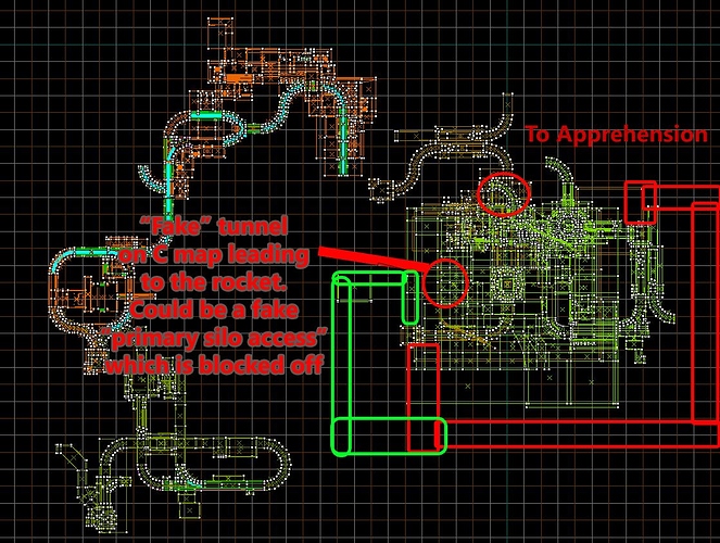
As predicted, Wangman’s solution of rotating the C map 180 degrees has proven to be the most viable option, at least in my mind. Having looked closely at the problem now, I’ve also found a pretty simple way to make it work well without much input from me - a pretty elegant solution if I do say so myself.
Rather than doing as Wangman suggested and rotating the rocket silo/entire C map, and the silo on the B map 180 degrees, which would be an editing nightmare (and DEFINITELY not something I’d be willing to do), there’s actually a much simpler way. The only part of the C map which the player ever observes from the B map is the skybox (representing C) above the silo. By rotating THIS 180 degrees on the B map I can make it appear as if the C map has been rotated 180 degrees. That is definitely not difficult to do. The player will be none the wiser. The only part of the B map which the player ever directly sees from the C map, is the innards of the silo itself. Rotating THESE innards 180 degrees is also not an issue, as, unlike on the B map, they aren’t actually connected to anything on the C map. By rotating these 2 opposing elements 180 degrees, it will appear that both maps have been rotated 180 degrees.
This solution is generally pretty brilliant. It avoids any HEFTY editing which is very time consuming, difficult, and could cause any number of problems. It creates a layout which does convey a sense of travel and progression, while also making spatial sense.
This layout does have one MAJOR issue though, one which Wangman didn’t consider. Though I forgot to circle it on the schematic, take a look at the transition to Apprehension, which on the rotated schematic is the very visible green curve sticking out the center of the C map at the top. It overlaps the B map by a fairly hefty margin, and, sadly, they’re on the same vertical level.
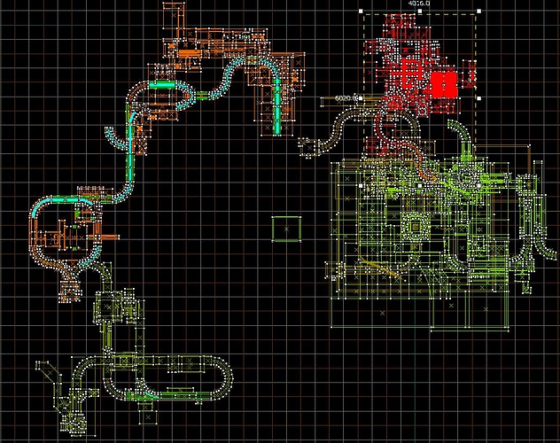
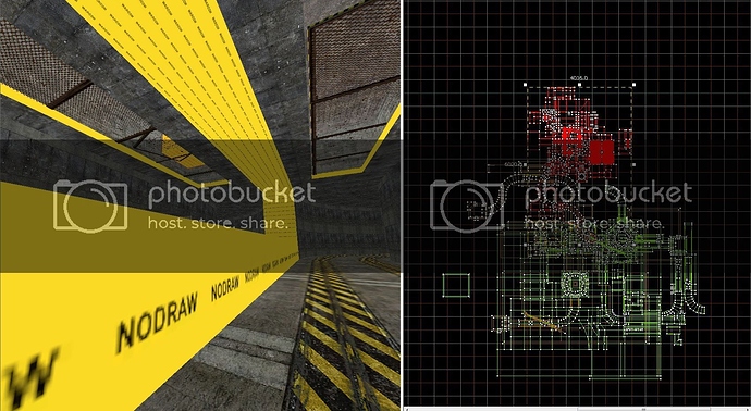
The overlap is visible here:
I added Apprehension’s first map joined together with the C map. I then selected it so it’ll be in red. The overlap is where the red meets the brown. As you can see this is a pretty damn serious issue too and I’m not too sure what can be done about it.
I’ll sit and think on it. I have to go and do some uni work right now, so I’ll get back to you later. Hope this clears things up a bit though.

