I’m going to wait until final release before I play this, as hard as that’s going to be.
Losing the tram is not an issue. If you lose the tram somehow, you’re just doing it wrong. My point is, why not put a gameover? Like when you lost the car in HL2?
Just a suggestion for the first major battle on A2 near the 50cal, that battle was always over by the time I made to the toll gate when riding the tram, leaving nothing but green lighting to contend with. What you could try is removing the vorts from the middle section and just leave the grunts that are there, because all the vorts do is melee the grunts and its over very quickly. Have the vorts only spawn on the far section opposite the 50cal, so that way it only becomes a 2 sided battle. Once you get to the 50 while ridding the tram you see the vort kill the 50 gunner allowing you to take it over and kill the survivors, at that point the grunts and vorts should still be preoccupied with each other. Currently the HECU and vorts spawn mixed together on each platform its kind of overwhelming trying to figure what was happening.
^ @ Mr.Someguy
Concerning this floating fountain/faucet/water spout, you depicted here https://puu.sh/22mra, I recently (12 days ago) reported this to the BM Devs “Bug Tracker” site and they’ve confirmed that it’s been “Resolved”, so it’ll be fixed/removed in their next patch/release.
Ah, okay, guess I’ll give it another shot. I approached the fight from the point closest to the tracks with the 50.cal vs vort fight (which finished before I even got there  )
)
One major compliment–> the soundtrack choice is brilliant, fits in perfectly with the fight scene and atmosphere.
Amazing job so far man 
I see the houndeyes in the storage room on the first floor tend to knock over stuff in the zombie filled office above with their blasts. Sometimes debris block the view of the corpse disappearing. It’s nothing major, just mentioning it. The elevator ideas sound brilliant, especially the one in the hallway at the security office where the marines that ambush you come from.
I just actually came by to wish you good luck on the B maps. SOOOO looking forward to it. After playing your A maps, I realized a change of color for the lights in the B tunnels will make the chapter so much more brilliant. I can’t wait to see your night time vista. If I understood what you were saying a part of your journey on the tram in the B maps will be set outside on the surface, not just an extension of the battle (on foot) near the rocket? I know your not changing anything in C just wondering if your idea is to have a part of your tram journey set outside?
You might have to wait a while! This is gonna be slower than ST Uncut. Work on the B maps is not progressing particularly fast. It’s much more painful than the A maps for a number of reasons I won’t go into.
Losing the tram IS an issue because it sometimes doesn’t emergency stop when you fall off it. I can quite easily see a normal (non-retarded) player losing the tram by accident. If it runs over the electrified water and the player doesn’t know the jumping trick - it then becomes impossible for them to win. I do have to take into account player mistakes. This one is plausible, unlike the player accidentally throwing all 10 TOW rockets outside the map on C2A5G.
Don’t thank me for the song, thank Dejan. Great piece. On a related note if someone knows how to contact Dejan please let me know - before the final release I wish to obtain his permission to use the piece.
Yeah, it’s a pain in the arse that Houndeye blasts aren’t blocked by solid walls.
I was a little reserved at first about the changes in lighting from the A maps to the B maps but as time has progressed and I’ve started mapping them out the idea has won me over a bit. Because the themes of the two sections are so distinct (Offices vs Mat Trans), the lighting will help distinguish them a bit better as well as helping to combat “chapter boredom,” by switching up the look and feel of the final half a bit. Plus I really like the way the Apprehension style of tunnel lighting looks, it’s got a real HL1 feel to it.
As for the outdoor section of the B maps, as time has progressed my mental picture of how it will look and play has worn down a little, I have to say. It’s probably not going to turn out how I’d originally envisaged it. Basically, the last half of HL’s F map, all the way to the end of B2 will be outdoors. I’ll explain this a bit more clearly when I get around to remaking F. I’m still only about 1/2 way through blocking out the very basic layout of E in B1.
About this whole issue around possibly losing the tram if you turn the fail safe off, the issue (aside from the back tracking) is that the tram doesn’t load with the next map currently if it passes through that point; leaving the player unable to get to it.
I’m pretty sure the same exact thing would happen with Goldsrc and Half-Life’s chapter if the level transitions were designed similarly to how they are in OaR uncut’s maps right now.
Valve must have used some sort of trick with the trams and the transitions in their levels to fix that and prevent it from happening.
You might want to try decompiling some of the Half-Life maps if you can and see if you can figure out what they did.
I realize that the trams in Half-Life are brush based, but i’m fairly certain the same technique they used could be pulled off here too.
Try looking at this https://developer.valvesoftware.com/wiki/Trigger_changelevel and read the bits under the ‘Notes’ section.
info_landmarks may be the key to finding a solution for this problem.
If you can make it work, we won’t ever have to worry about permanently losing the tram again (I think), and you can still keep the current layouts that prevent back tracking or running ahead because of the issues with how the trams are coded.
Bingo
Graphics card finally came. Played the maps for the first time and they are glorious. I am a little late to the party and I can’t be bothered to read every post on the last few pages to make sure I don’t repost things you’ve already said will be fixed so I won’t comment on too much for now, but here’s a few things.
-
Overall I think the lighting is just a tad too dark in some places even for on a rail.
-
The generators in A1 could due with some power on noise once you flip the switch in that room. I also thought this design was a little strange because you come across the switch before you even get to the crane switch to realize youd need to flip the switch. It’s just odd like a backwards puzzle.
-
I like the idea of the marines on the tram elevator rising up on the elevator at the start of A2. That would be really cool.
-
There’s a phone on the wall near the start of A2 that looks like it’s too far into the wall. It’s also a bit too high making Gordon seem like a midget.
-
The books on the bookshelf in the conference room look really bad like it’s obviously just a flat picture of books and they have no depth. This really just isn’t an acceptable look for a game of today or even a mod. It looks like a texture straight out of wolfenstein.
-
I got off the tram around the 50. cal vort vs marine fight and then found myself walking a huge distance with no real reason to hop back on the tram. Basically when it came time to advance I was very lost and had to backtrack a lot to find the tram again.
-
Overall I found some of the layout of A2 a bit too confusing even though I’ve seen the video twice I was still feeling a bit turned around at parts. When I eventually found some switch and flipped it I really don’t know what it did or what I was trying to do at that point but I eventually just backtracked all the way to my tram and then rode to the end of the level.
-
In the security office on the second floor if you hit the button that caused the marines to ambush you again it will play a marine audio clip each time you press it even after they are dead.
-
Are you still planning on adding a second tram that you could use at the end near the electricity instead of having to backtrack?
-
I really like the number of enemies encountered in these maps. There is a ton of action.
*What I don’t think would be a good idea would be to add in new enemies that spawn when backtracking. This would take away the sense that you cleared those areas when going through them originally.
It could also confuse the player because generally new enemies mean you’re going the right way and if they start backtracking before they need to it could be really disorienting. Also there’s A LOT of enemies in A2 already so it might make it a bit too much.
I’m sure there are things I’m forgetting, but I’ll do a few more runs later and do a more comprehensive feedback. Keep in mind that these are things I noticed as a first time player.
Mm, about the backtrack, there’s actually a stair case that leads back to where you first started, mind you it’s a bit tough to find if you don’t know what you’re looking for. I BELIEVE it’s on the third floor near the security office.
Snarks will attack everything, besides the garg (plausibly the the barnacle, haven’t tested that one) Alien Controller, AGrunt, and the Vorts.
Edit: @Text about the lighting, I noticed the lighting in the tunnel(s) for Power Up actually have something similar to Apprehension (at least in my opinion) take a look at the upper ones. This COULD be a good way to transition to the totally new lighting with the B tunnels.
Take a look at the attached snaps for a comparison. (first’s power up, seconds app)
Edit #2: Additionally who ever it was who said the lighting being slightly off, was actually right… partially anyway. Take a look at the comparative shots, I swear to god I didn’t change my brightness or anything of that sort:
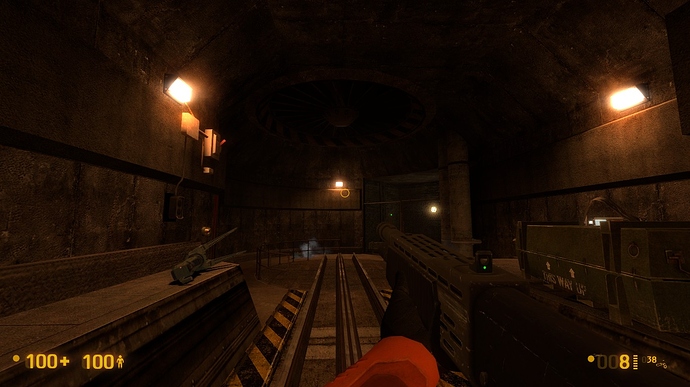
Your Map tram elevator at the beginning:
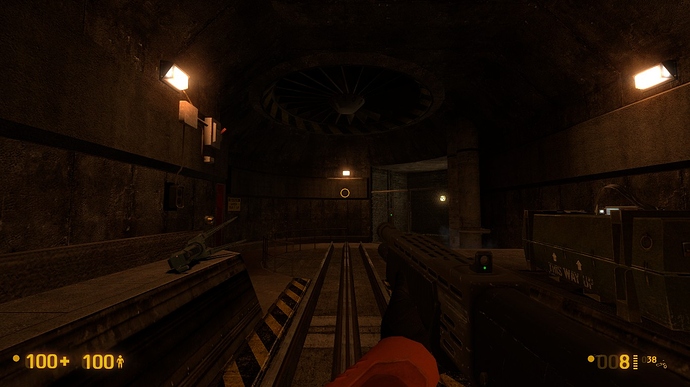
BM stock map, same area:
You notice it’s a little softer? Toning down the ambient light may do the trick, but I wouldn’t know.
Edit #3: … Never mind, the lighting on everything beyond your maps is the exact same with yours.
That’s fine, I can wait. In regards to contacting Dejan, this MIGHT be his twitter account, might be best to ask if he was on the BM forums in the past to make sure you’ve got the right guy. It also looks like it hasn’t been used recently.
Mm. About the vort battle at the end of A2, did another run through, I think the vorts are triggering earlier than they’re supposed to and killing off some of the marines, that MAY be why they’re ducking it up.
Continuation Of Feedback For OaR Uncut Alpha
- The handles on the three sets of double-doors that lead into the rocket engine room, clip into walls. Here’s one example https://i.imgur.com/OPbufXi.jpg
- In “Conference Room A”, can these signs not overlap, or is that the way they come? https://i.imgur.com/YiIxnj7.jpg
- In “Conference Room A”, consider swapping the positions of the two bulletin boards https://i.imgur.com/3flWoaw.jpg
- I suggest removing this shelf unit, as this security office is overly crowded https://i.imgur.com/1VBL1jF.jpg
- Consider inserting large bulletin boards, in the locker rooms, between their doors https://i.imgur.com/vsAUQwW.jpg
- One set of mini-lockers in the locker rooms cast a shadow https://i.imgur.com/1UYOw6i.jpg (shadow is actually reversed), but the ones at the other end don’t https://i.imgur.com/Xq9qdQX.jpg.
- What’s with the bathrooms having no mirrors? A ladies bathroom without a mirror? What… are you daft, man?!
- This soda dispenser clips through the counter https://i.imgur.com/SrbDPKD.jpg
- For the handrails next to the kitchen, shift these post footings to the left https://i.imgur.com/Eq3v9vr.jpg and the right ones, to the right https://i.imgur.com/8mmcgpG.jpg. Also, the two post footings at the wall, clip into it https://i.imgur.com/aNYeatk.jpg
- Functionally, would it make more sense to have these two rows of seats facing each other so that staff members would have been able to converse with each other more easily and in larger groups? https://i.imgur.com/AQiZbho.jpg
- I assume this is “Conference Room B” https://i.imgur.com/eSldigl.jpg. Post a sign indicating this, to match “Conference Room A”.
- There’s a weird player movement issue here https://i.imgur.com/vwv6Lrk.jpg, specifically here https://i.imgur.com/o3nu3Lu.jpg and occurs on the track floor between the two support pillars. When walking along the track floor (not on the rails but on the black-yellow markings) and reaching the problem spot, there’s a small invisible declination/step down. After passing this point the player slowly glides along the ground, without any footsteps sounds. The player stops gliding when he reaches here https://i.imgur.com/lR0RCC6.jpg which is several feet ahead. The player has to jump to escape. It’s like the player is in a very shallow invisible trough. The glide speed is constant and you can glide forward and backward. If you crouch while gliding, you become stuck in the crouch position. You can still glide back and forth while crouched but you can’t stand up or jump in order to free yourself. You have to use “noclip”. This happens on the opposite side as well. If the player walks on top of the rails, he can progress, without issue.
- Consider moving these wall signs and telephone to the left as they are too close to the security gate base https://i.imgur.com/VkVmzMn.jpg. I suggest having the “Security Sign” situated closest to the security gate. The setup at the other security gate is better https://i.imgur.com/1i0AzNr.jpg. Again, I suggest relocating the “Security Sign” to where the telephone is. In both instances, it will also result in moving the telephones closer to the adjacent lights. Also, consider lowering the height of the telephones, as they are too high.
- Consider relocating the light above the electronics console, to above the security panels, between the two monitors https://i.imgur.com/g7PRx1I.jpg. Although not perfect, it would still justify the electronics console’s shadow.
- Consider removing these two wooden tables as they look out of place here https://i.imgur.com/0y1lydI.jpg.
- Oddities with player footstep sounds (See #162 for additional incidents):
a) When walking along this platform edge, up to the steel support beam https://i.imgur.com/fxcVhcK.jpg, the footstep sounds change from “concrete-type” to “sand/gravel-type”. The area where this problem exists is here https://i.imgur.com/WBkn8ga.jpg.
b) Same occurs when walking along this sidewalk edge https://i.imgur.com/UwXOgKs.jpg. In this instance, the sound alternates between “concrete-type” and “sand/gravel-type”.
c) Across the tracks from instance 90(b), when walking along this sidewalk edge. https://i.imgur.com/1rX98qR.jpg
d) When walking over this fluorescent light, “vent-type” footsteps are heard. https://i.imgur.com/trx3l0V.jpg - In the rocket engine room, can this odd shadowing be fixed or removed? https://i.imgur.com/Eg9qSFI.jpg
- The metal frames/trusses on the underside of the security office for the crane-rail switches, are missing portions at several corners https://i.imgur.com/BQqCLja.jpg and https://i.imgur.com/rXhDnDb.jpg and https://i.imgur.com/JneDkzm.jpg and https://i.imgur.com/p8S5jxt.jpg. On two occasions, the trusses clip into the wall https://i.imgur.com/GPm8XXQ.jpg and https://i.imgur.com/wWTNpUT.jpg. Consider removing these trusses as they don’t look very good. It’s a model that doesn’t convey substance or rigidity. It’s more weak and flimsy rather than strong and solid.
- Reduce the height of this bulletin board https://i.imgur.com/pAchcHA.jpg. Here’s another one situated in “Conference Room A”. This one is a little lower, but is still too high https://i.imgur.com/BWlZic8.jpg. This is the third one I’ve seen that’s mounted too high. At some point, I’m sure you’ll be revisiting all of the bulletin boards and standardizing their height to a more realistic level.
- These two storage crates, situated in the “Rail Security Override” office, should be removed as they are too large to have been able to fit through the office’s doors https://i.imgur.com/8ldJw8j.jpg
- These handrail posts (two each on left and right sides) protrude through the bottom of the stair frame https://i.imgur.com/Jahai4s.jpg
- Almost all of this light fixture is clipping into the wall https://i.imgur.com/rrfStHd.jpg and https://i.imgur.com/1UYHxII.jpg
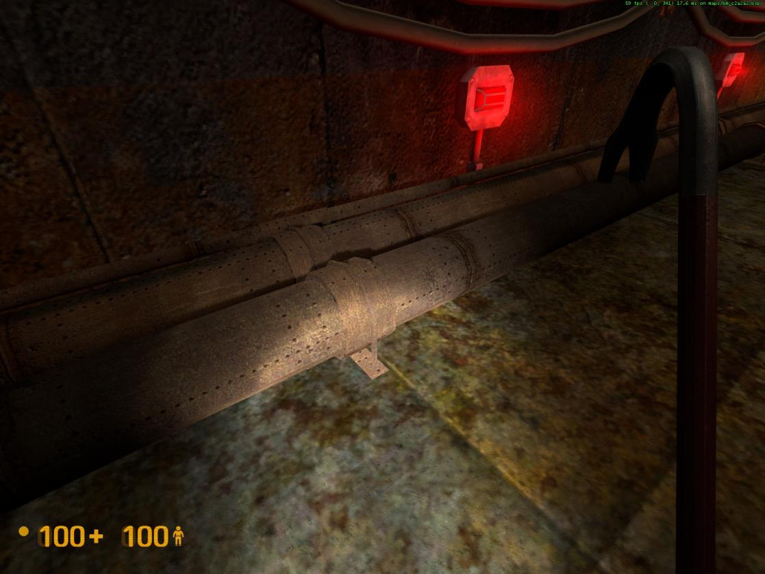
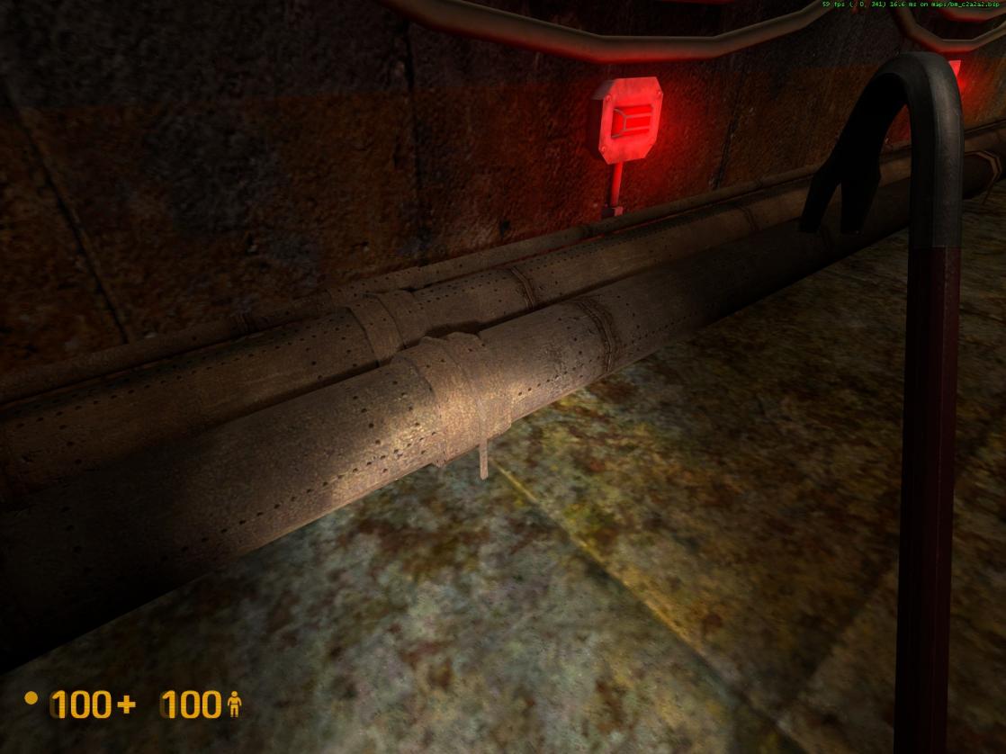
- In the access area below the grates, these pipe brackets have a texture z-fighting issue. See attached pictures 1 and 2 below.
- For consistency, raise the height of the left light so that it matches the one on the right https://i.imgur.com/7nXBqKg.jpg
- I noticed there are no fire extinguishers or alarms. Entity count issue? I assume they’ll be added in later.
[COLOR=‘Lime’]100. Concerning the four lights on the far wall (going from left to right): https://i.imgur.com/qzBbS0J.jpg
a) There’s a large gap between the first and second lights. Consider inserting one or two additional lights between them.
b) The height of these lights is inconsistent. The first and fourth lights are lower than the second and third ones. - Security gate arm clips into the ceiling https://i.imgur.com/r4AIbvc.jpg. Other security gates may also have this problem.
- Consider removing these two “girlie” ceiling lights located just past the two security gates https://i.imgur.com/mypas2n.jpg and https://i.imgur.com/QqU9pnO.jpg. They’re not really needed and are not tunnel worthy.
- Consider inserting a handrail on the left side of these stairs, up until the vertical wall lip. https://i.imgur.com/dDoUgos.jpg
- Consider centering this red light horizontally, unless doing so causes a collision with the perceived operation of the tram elevator https://i.imgur.com/HzHvBgf.jpg
- This handrail would look much better if it only covered the opening between the walls and it didn’t have the railing overrun at each end, beyond the opening. Curved rail end pieces, like the one on the left end, would look grand https://i.imgur.com/EZF8q8j.jpg
- Consider raising this air duct to the ceiling to provide more headroom https://i.imgur.com/UOc4Vbb.jpg or use a shallower type. If the player runs and jumps when approaching this air duct, he/she will hit their head on it and be stopped. If you stand under it and jump, your jump height is restricted. If you retain this model and raise it higher, remove the two air vents.
- I suggest installing a camera here to monitor the security gate https://i.imgur.com/Tnu9RL9.jpg, to match the existing camera that’s monitoring the other security gate https://i.imgur.com/yHUFjbV.jpg
- You’ve beautifully sculpted this horizontal concrete lip to fit into different environmental situations, as depicted here https://i.imgur.com/FQovyGB.jpg and here https://i.imgur.com/hRwoVCW.jpg. Can you work your magic to address the clipping issues occurring with these vertical steel beams (tops and bottoms)? https://i.imgur.com/muDOefA.jpg and https://i.imgur.com/Bf0aY8S.jpg
- Can this angled seam https://i.imgur.com/GfVXh4a.jpg be fixed to look like this? https://i.imgur.com/rY0KYQP.jpg.
- Had an issue where this blue crate forced me off of the tram. Initially, the tram pushed it along, but as soon as the crate hit an obstruction, it clipped through the tram and eventually pushed me off the back of it. The tram then auto-stopped with the crate clipping through it. The crate jerked about, making noises and emitting smoke, and eventually flung itself forward up ahead of the tram. I’ve seen objects behave like this before, but never where it impeded the player in this manner. Here’s a sequence of the events https://i.imgur.com/4VVN15H.jpg and https://i.imgur.com/DTQ0oBg.jpg and https://i.imgur.com/HNQyR8P.jpg and https://i.imgur.com/qDPE0pa.jpg and https://i.imgur.com/pNrWVm4.jpg and https://i.imgur.com/5eovvRk.jpg and finally https://i.imgur.com/VVxXxOD.jpg
- Consider attaching the menu sign onto the grate below it, to reduce its height https://i.imgur.com/MVlz89k.jpg. It’s a neck breaker where it is now. https://i.imgur.com/F0gh95K.jpg
- This cart and pallet obscured my view of the body being pulled into the office https://i.imgur.com/KABgRtk.jpg
- Probably nothing you can do about this, but it’s odd that there’s blood all over this bookcase but not a single drop appears on any of the books https://i.imgur.com/027EKaO.jpg
- Is anyone else getting this large black texture, or is it just me? https://i.imgur.com/WXpeOlT.jpg
- At the electrified water, this pipe is clipping through the tunnel support frame https://i.imgur.com/oMl9zLt.jpg
- Further to #116, functionally, this pipe would interfere with the blast door being able to lift/open because it passes through the wall immediately above it https://i.imgur.com/CiPR9IZ.jpg. The same applies to the blast door at the far side of the electrified water https://i.imgur.com/vISuBqN.jpg
- Similar to #117, this blast door has a pipe and an air duct passing through the wall, immediately above it. https://i.imgur.com/un9hKW0.jpg
- The electric arc originates too far away from these fluorescent lights, here https://i.imgur.com/b0NKdz1.jpg and in the zombie-headcrab ambush office https://i.imgur.com/9U1Gfhx.jpg.
- The signage next to these security office doors, should be the same https://i.imgur.com/ugJGrsO.jpg and https://i.imgur.com/9qYicCq.jpg
- For small dislodged/fallen light fixtures https://i.imgur.com/Ktk2txt.jpg, can a mounting plate (if a suitable asset exists, or one created using the Propper model utility) be affixed to the wall where the light was originally mounted? This would eliminate the confusion of whether or not the installation of a light was missed. In some cases, if possible, have a very short thin arcing wire protruding through it? It would look cool.
- To match other similar lights, this one https://i.imgur.com/SvqD66u.jpg should be positioned higher, at/around the horizontal seam, and slightly to the left. It’s just down from the cafeteria.
- If this grate can be placed, situate it closer to the floor, allowing for enough height to address the residue drips/runs https://i.imgur.com/6Yhwr3z.jpg
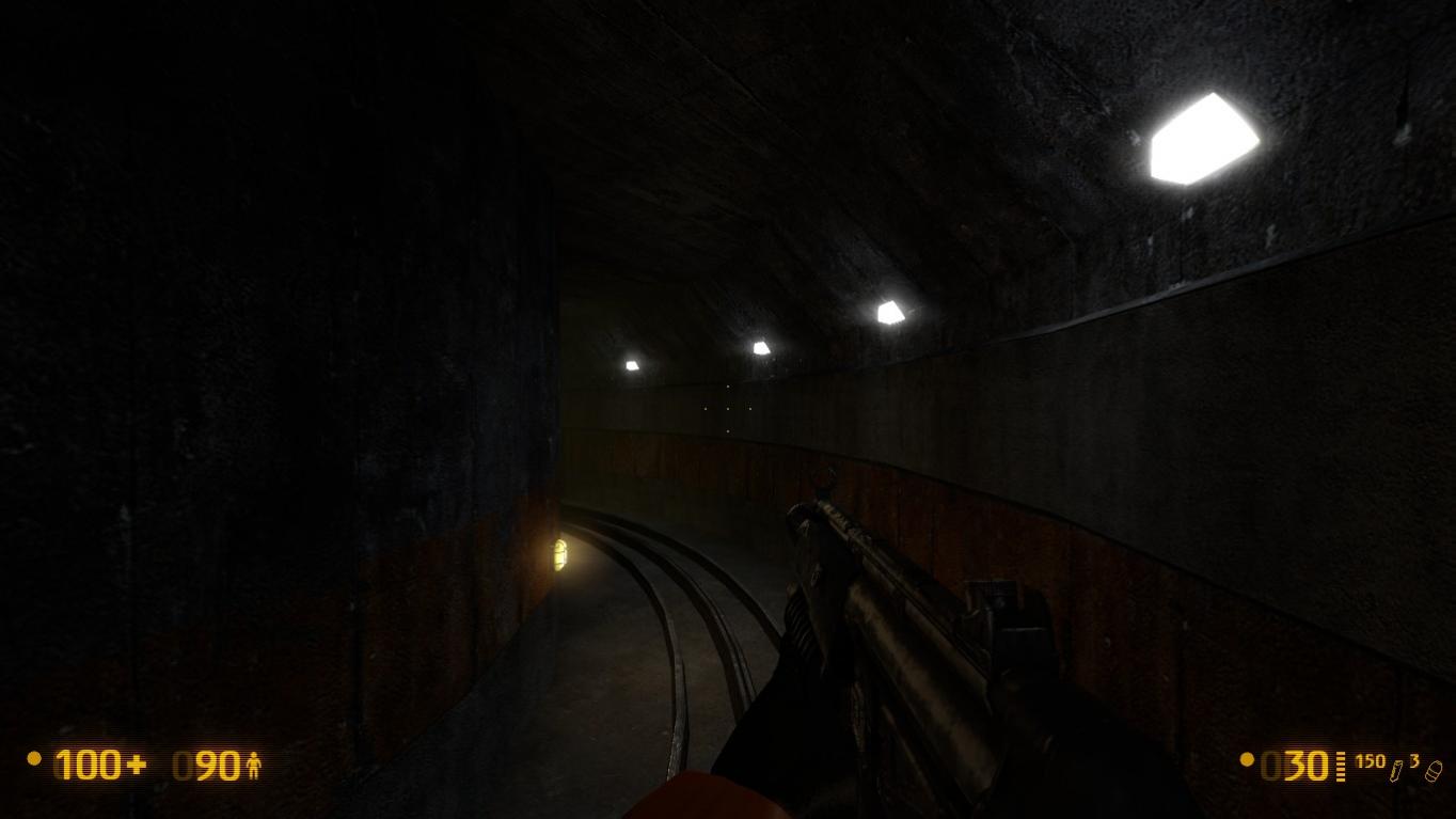
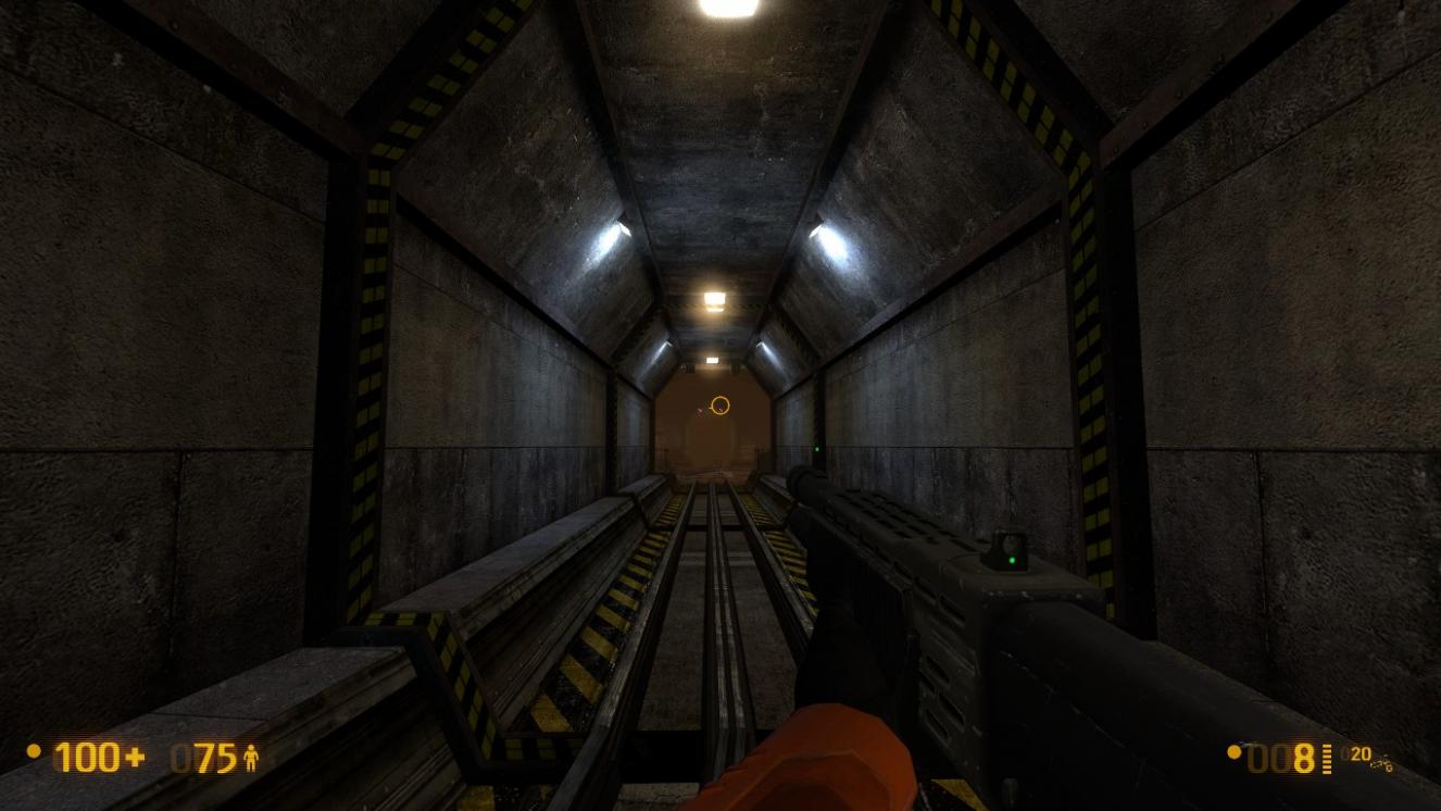
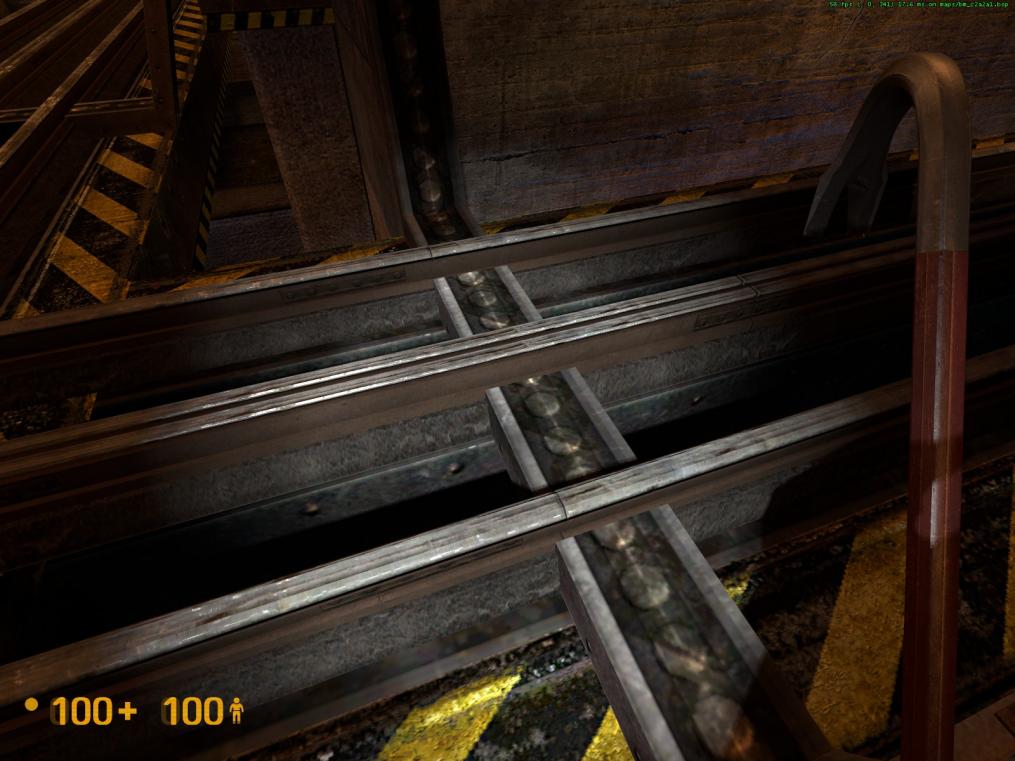
- These track rails have texture z-fighting issues. See attached pictures 3 and 4 below, for an example of the problem:
a) Leading into the rocket engine room, as depicted in pictures 3 and 4 below.
b) Further to 123(a), two more instances further along the tracks to the left and one to the right at the blast door.
c) Also here https://i.imgur.com/x8EveJS.jpg and further ahead at the blast door.
d) Here also https://i.imgur.com/S34ETFl.jpg
e) Here https://i.imgur.com/EVPG3d3.jpg
f) And here https://i.imgur.com/xDOClDY.jpg
g) At the electrified water blast door https://i.imgur.com/gCEo6nX.jpg and the blast door that follows https://i.imgur.com/s8yjdSS.jpg
There are NO issues here https://i.imgur.com/VjjuDGw.jpg here https://i.imgur.com/ImAYElb.jpg or here https://i.imgur.com/YYA2BZu.jpg. This problem may exist with all same-type rail designs. - This fluorescent light, above the blue pipe in the rocket engine room, clips into the wall https://i.imgur.com/l2TEUBN.jpg. The same level design is mirrored above the red pipe, without issue. Just need to center this light within the opening it occupies.
- Consider removing the air vent above this blast door, as it would interfere with it opening https://i.imgur.com/jpRdc9J.jpg
- Would the rails above this blast door interfere with it opening? https://i.imgur.com/WrSCyHM.jpg
- The base of this security gate clips into the I-beam https://i.imgur.com/91zmQxh.jpg close-up https://i.imgur.com/2LAimMQ.jpg
- Visual anomalies can be seen through the openings at the base of this blast door, situated down from the tram elevator HECU encampment https://i.imgur.com/UBFeeAv.jpg and https://i.imgur.com/nKWJVv1.jpg
- The vertical pipe on this electrical box looks odd, as it doesn’t terminate into the wall or ceiling https://i.imgur.com/MWpYVA2.jpg. The same with the four vertical wires from these electrical boxes https://i.imgur.com/y2rLkoP.jpg and https://i.imgur.com/3v2IBUS.jpg and https://i.imgur.com/ysouBYO.jpg and https://i.imgur.com/ysouBYO.jpg.
- Consider connecting this wire to the small electrical box and removing the larger one https://i.imgur.com/7GBz9b5.jpg
- These two sets of brown pipes take away from the beautiful long hallway view https://i.imgur.com/kcVL54l.jpg and https://i.imgur.com/zZPu98V.jpg. I suggest moving these ones https://i.imgur.com/ZLF2a9B.jpg to the right into the corner and moved back, up against the horizontal pipes and then raise them up to the ceiling. Consider removing this other set altogether https://i.imgur.com/HaajSNv.jpg or if you want to retain them, move them left into the corner and do the same as the other set.
Another idea is to rotate them 90 degrees on axis so that the horizontal section is over the grate instead of the hallway, and place the vertical section in their respective corner. - Can double doors be made to open in both directions? Right now, all of the double doors only open outwards, except for “Conference Room A” which only opens inwards.
- Concerning the crane guide rail supports:
a) As an example, this one is pristine https://i.imgur.com/I89cRpT.jpg.
b) This one to the left, has a missing top texture https://i.imgur.com/QJDLG6H.jpg.
c) The one further to the left is missing a top and partial side textures https://i.imgur.com/anJDDSE.jpg. As a result, the support rods don’t make contact with the bracket https://i.imgur.com/J3GGwcX.jpg. The ceiling anchor for this support, straddles both the flat and slanted ceilings. If possible, move this slightly to the right, so that it’s fully on the flat ceiling.
d) On another guide rail, the support struts on the right one clip into the slanted ceiling https://i.imgur.com/jpZR2Ap.jpg. - For symmetry and spacing of the existing lights, add a light to the right of this one https://i.imgur.com/J7SWPzn.jpg.
- I don’t know if you can fix this, but all four support rods/cables for the rocket engine transportation frame are not connected to the crane carriage https://i.imgur.com/dAbW1Zf.jpg and https://i.imgur.com/cJR613r.jpg
- Consider removing these square tile textures as they look weird and out of place here https://i.imgur.com/cpcCcww.jpg
- Similar to comments expressed in item #93, can these poor looking metal frames/trusses https://i.imgur.com/TnKEumw.jpg and https://i.imgur.com/Ov2wAqg.jpg be removed or a different model utilized (I suppose you already would have if one exists)? It appears their utilization here (above the HECU encampment on the tram elevator) is different than their use on the underside of the security office. Here, they appear to be load-bearing spacers for the elevated walkway they’re under. Still, if some alternate solution could be found, it would hopefully go a long way towards improving the overall look.
- Where the rail tracks cross each other here https://i.imgur.com/gIKSdd6.jpg and here https://i.imgur.com/UT2J1NY.jpg, there are a large number of texture z-fighting issues.
- Consider removing the three left air vents, as six of them here is too many https://i.imgur.com/LSyTmZx.jpg. Or remove one from each side.
- You’ll probably address this in your optimization passes, but I’ll mention it so that it’s on a list. The purposely darkened office https://i.imgur.com/3DZb6XY.jpg should still be outfitted with the usual compliment of light fixtures.
- Design wise, the number of light fixtures in the “Maintenance Storage” room https://i.imgur.com/uWjs0Gx.jpg is inadequate. It only has one wall light. Consider adding a defective fluorescent light to it.
- Consider having some of the ladies bathroom stalls https://i.imgur.com/En82gAa.jpg damaged, somewhat similar to the men’s bathroom https://i.imgur.com/HjeEcng.jpg.
- This light in the security office https://i.imgur.com/zhX9Gb8.jpg should be positioned lower, like so https://i.imgur.com/MiDKsJe.jpg.
- This stairwell light https://i.imgur.com/CKNtiSM.jpg should be positioned higher, like this one https://i.imgur.com/yjED1uE.jpg.
- For symmetry in “Storage Room B”, lights should be added here https://i.imgur.com/2JwPABF.jpg and here https://i.imgur.com/mTt3gFg.jpg.
- The lighting fixture allocation for the “Conference Room A” hallway https://i.imgur.com/El2Skf6.jpg seems insufficient for proper lighting levels. Fluorescent lights can’t be used because of the low ceiling, so please consider the following:
a) Just around the corner, place a fluorescent light here, as the ceiling is higher. https://i.imgur.com/5ZH5d6s.jpg
b) Place a light above this door https://i.imgur.com/0CGJYKs.jpg. All the other doors have one.
c) Place a light above these directories. https://i.imgur.com/VD47Sav.jpg
d) Place two lights on this wall. https://i.imgur.com/dB40Atx.jpg
These don’t need to be illuminated. It’s just to show that, normally, there would be sufficient lighting.
I realize the scarcity of lights may be due to their temporary removal to lessen the map entities for the alpha release. Hopefully some of these lights can be added in, during your optimization processes. - Center this light above the stairs https://i.imgur.com/Xj2wiwb.jpg
- Align the rails leading to the tram elevator HECU encampment https://i.imgur.com/PMMdXYd.jpg
- Consider removing this air vent https://i.imgur.com/E3410E0.jpg. Not needed, as there are three above the roll-up doors.
To be continued…
.
.
Wow Dadster, you have an amazing eye for stuff like this…
Just wanna say great work so far!
Not sure if it was entirely intentional, but I had one of the creepiest moments I’ve ever experienced in Black Mesa during this mod. When after hearing a huge battle I come round a corner and see six Vorts gathered over a pile of dead bodies gargling to eachother, then of course they all turned and zapped at me.
One strange thing I found was the corpse of a bullsquid and marine essentially fused together somewhere. Looked really weird and when I approached them they freaked out and started bouncing around everywhere. The amount of blood splats on the wall was insane when they were done…
https://steamcommunity.com/sharedfiles/filedetails/?id=127073899
https://steamcommunity.com/sharedfiles/filedetails/?id=127073886
There’s also a door to nowhere on one of the maps…
https://i.imgur.com/8GnwGc7.jpg
https://i.imgur.com/7bZVBNR.jpg
I love the hallway of hell you have, with every door leading to another horror.
My only thoughts on the fights is that it gets a bit crazy when you’re up against multiple enemy types at once. Vorts and marines together, fine. But Vorts, marines, houndeyes, headcrabs and bullsquids all within a short walk and potentially ALL after you? It got a little ridiculous here n there. Perhaps the enemies could come in waves? The sequence I’m thinking of right now, everything’s there from the start so that the houndeyes attack you whilst the vorts are still going crazy. Maybe if the houndeyes didn’t show up until you make the decision to enter the store room it would be better? I don’t know, everything just seems a bit close together.
I did get a little lost during the section where you had to power up the crane. A few more signs on the walls and equipment might give a better idea of what we’re supposed to be doing and where we’re meant to go. What about putting an area map on the walls in certain places with a “you are here” indicator?
If it’d be possible, have more lights knocked out to give a darker, scarier feel. There’s some places where you have an awesome flickering light fixture, but often right next to that is a soft warm orange light on the opposite wall that undercuts the horror vibe. Even having more side areas where you might need to use the flashlight would be cool.
But yeah, great job so far. Looking forward to future versions!
All of that is pretty much intentional. You aren’t really meant to take part in the fights (except clean up), you’re meant to watch them battle it out. It’s to give you the impression that the fight is bigger than you, that is isn’t just you vs everyone else–> instead it’s all these okes who have been thrown into the mess and are trying to survive/fight/take control/eat dinner.
The sequences appear to play out better when you approach from the 50.cal vs vort fight (go up the stairs) as you have to abandon your tram to open the gates.
Much to Text’s chagrin (I’m kidding, Text).
Maybe I should get into the gaming business.
Reflective surfaces aren’t allowed in Half-Life games.
Played through a second time.
https://i.imgur.com/Ia8KXDh.jpg
https://i.imgur.com/pA8dpNX.jpg
*Re-iterating that I think the design of this puzzle is bad in the way that you come across the power box before you even know you needed to find one and turn it on. I believe you should make it so you can’t access that room until you’ve first gone by the crane room. Once you continued on the tram around the loop you would then come to the back of this room and a door would be unlocked.
- Also note that some players might be confused to what they are supposed to do here because you first flip a switch with a large sign saying crane power overide and then in the next room there’s a console that says crane controls, but doesn’t actually control anything. Basically a new player might run between these two rooms trying to figure out what they are supposed to do for awhile instead of advancing on the tram.
https://i.imgur.com/qgPli97.jpg
Here is an example of the same type of power box in the first black mesa on a rail map. You might want to make the one in your map the same or more similar with wires coming out of the top.
https://i.imgur.com/wqg8icv.jpg
This little radio thing with the blue light looks too much like a suit battery.
- For the electric wire that’s hanging down over the track. I was messing around and threw a Houndeye into it and it started swinging back and forth a little. This is a cool effect if you could make it do this by default it would be nice and look a bit more natural for a cord that’s heavily sparking. Also on the very tip of the wire under it I think there’s no texture.
https://i.imgur.com/WssLlQ6.jpg
Before this door leading to A2 there’s track that wraps up around the wall and the ceiling. It’s the same type of track that the crane is hanging from and you can clearly see that because it’s in the same room. What is the point of it being on the wall here? Remove it.
https://i.imgur.com/VAJwe.png
https://youtu.be/XiM98LVcovQ?t=2m27s
I would like to see another environmental destruction factor in A1 by having some rubble fall from the ceiling while passing an area on the tram. Maybe you could use the same rubble that you used in STuncut in the end tunnel leading to forget about freeman. A good spot would be past the crane room when you’re completing the end of the loop.
https://i.imgur.com/ElJ2ow1.jpg
I realized that the reason I didn’t really know what I was doing the first time I played this map was that I stopped the tram before I got to this point and got off and also never saw that there was a boom gate here which blocks your advance by tram because it’s too dark.
https://i.imgur.com/v5Umobu.jpg
Just on the other side of this room is another boom gate that is properly lit. Simply make the lighting the same for the one that the tram actually stops at.
https://i.imgur.com/yyFCcG1.jpg
Not really sure what the point of the explosive barrel being here is. I think it would be much better across the room so you can use it to take out the vorts where four or five of them stand. That or use it somewhere else more useful in the maps.
I would also like to make a note here that it currently seems that the aliens are winning all of the fights in your maps. Is this intentional or is balancing simply still in progress?
https://i.imgur.com/u6ZGjIx.jpg
There are two of these phones in this area. They are both in the wall too far and also have the line cut. It doesn’t really seem that realistic for them both to be cut. Sure you could argue that the H.E.C.U. cut them or something, but it could be cool if one of them still had the phone and the line in and when you pulled it off the receiver you could hear something like this: (find a better emergency type message)
https://www.youtube.com/watch?v=nNvN1GKnsk4
There should be a model of an intact phone in either hl2, ep1 or ep2 if there aren’t any in BM.
https://i.imgur.com/HYDjHCB.jpg
The really bad looking bookcases found in the conference room and another office upstairs. Not much to say except hopefully this is placeholder. If it’s something that is used in black mesa already I would still say that just because something bad is used in black mesa doesn’t mean it should also be put in these maps.
https://i.imgur.com/ZA1T8JZ.jpg
Is there a reason that this pipe found next to the female scientist makes the sound of a shotgun when picked up or kicked around.
https://i.imgur.com/JZkiPl0.jpg
Something weird happened for me in the cafeteria at this part where I couldn’t walk past this blood spot as if there were a wall. When I crow-barred the spot suddenly a Bullsquid appeared there. The route I took was through the offices and into the caffeteria and then toward the soda and snack machines seen in the picture. At this point the Vortiguants had not spawn in yet or anything.
https://i.imgur.com/8e80kQI.jpg
This would be a perfect place to put images of the rest of the level on the monitors including one that is pretty in your face showing you that the boom gate is raised when you press that button.
https://i.imgur.com/gvp5ruF.jpg
When you walk on this piece of grate raised above the others on the floor it makes the proper metal clanking sound. The rest of the grate doesn’t.
Okay so I had a crazy thought about the backtracking situation. What if when you raised the boom gate you saw the tram advance on its own. It would then come to a stop closer to where you end up when going down the stairs near the cafeteria. Here there would be another boom gate that it stopped at with the switch inside the little control room in this area just before the electricity. Just a thought.
Edit: Another idea. Have the security door that leads out of the level to the electric water part initially closed. Put a switch that raises the door in the little security office in this area.
Edit2: I was also thinking that it would be cool to have the crane in A1 actually move into place while you approach that room. This would really reinforce what you’re supposed to be doing and make the place feel a bit more alive. The only problem is that I can’t really think of the logic that would be behind this. Maybe a marine in the control room that was also setting up the turret was blocking the path with the crane, but then there’s also the issue of the power. Perhaps you could have some kind of power cord in that room that looks destroyed as if he sabotaged it after putting the crane in your way.
Wow, alpha version of the second extended chapter already? Your dedication never ceases to amaze me.

