I might get around to it. Maybe find some more papers like this and have 'em tossed on a table or stapled to a wall somewhere.
Having some trouble getting these scripted sequences to work. On the bright side, these colors look really nice. I’ll figure it all out in a few hours when I get up.
Dem ghostpages.
Just don’t make it TOO colorful or it’ll look like a cartoon. 
Also, I like the room but it feels a bit cold. Maybe the overly dark color should be lightened a bit.
EDIT: Maybe you should also rename your decals to hc_[[decalname]].
Wanst it also the intention to make the room seem used?
THATS AWESOME!!! 
This too. Forgot about that for a moment.
Yeah, it should seem more used.
@Crypt could you maybe detail the hallway?Lars remade some brushes and aligned textures, so in his folder its called “hallway.vmf”.Its mainly because it needs to fit to the lobby its theme.
Do you have Gina model???
Since CatzEyes is not avaible at the moment, we must wait for the head.
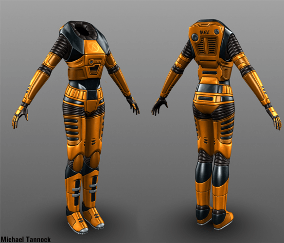
Heres full image though https://fc05.deviantart.net/fs71/f/2012/354/b/3/mark_iv_h_e_v__suit__female__by_michaeltannock-d5olxcj.jpg
Also I just noticed I didnt used a 32 grid for Dkys edit, and some brushes arent on the grid.
if you think that it new head will be extra quality then wait for it. here is pack with new gina for hls but if you wanna download the whole pack for one model.
https://hls.gamebanana.com/skins/115282
wellim prety sure thats the pack but i were got to many packs so i cant remember.
if you have high speed connection, try it.
We are not going to use any publicly-available models like that.
It’s a lazy way to go.
Its not necessary at the moment, since we are not fully finished yet.
Also we create our own models.
ok. 
what part are you up to?
As far as I know, we are currently detailing and fixing maps and improving a lot of things and adding new extras.
The only thing still in heavily W.I.P is the intro.
Uploaded latest version of both basic movement maps.
Also uploaded test map VMF of the camera. (It’s destructible!  )
)
Be careful copying+pasting it into other maps though… if you have more than one than you’ll have to rename the entities. I’ll convert it into a prefab at some point in the future, but until then, you’re on your own.
I’m too lazy to quote, so I’ll just respond to what I can remember.
@Too colorful: Mostly in that one corner is where the colors will be. Right now it’s Cyan, Blue (bit darker), Green, yellow and Red, all little splashes like in that screenshot. I was aiming for cold like in this shot of Anom. Mats. and dark, but I do think the fluorescent blue is a bit too blue. I’ll definitely brighten that shit up, though.
@Too unused-looking: I’ll chalk this up to me not having detailed yet.
@Detailing hallway: I presume you mean the one from the tram to the lobby, correct?
@Decal naming: I was going to match Black Mesa’s chapter-based naming for decals, but I can change it if you like.
Also, Box there’s plenty more that’s still heavy WIP. It’s probably in better shape than a few of the other areas, and then a few rooms aren’t even started yet.
Where is link!!!
I was thinking that nearly the whole sector was converted-industrial, but I guess some parts are more converted than others…?
The lighting could be similar to AM, but the textures could be more used-looking. Try that. If not, then I guess we could figure out some other options.
Like I said, I was thinking of having the elevator ride(s) be the transition from the newer looking lab areas to the converted industrial course. I’ll definitely try dirtying up the walls, though. Maybe abuse decals, but if not I could experiment with the textures and possibly make dirtier versions.
More images to double check that everyone thinks the lighting is acceptable:
Brightened it up a little, added some glass to add some detail and block some of the dark, colorful room away to keep the rooms from clashing too hard.
Minimal changes in here.
I’ll even admit that in the second one the dark blue light is kinda goofy looking, but otherwise I like the atmosphere of that small “room.”
To?
Off-note: I think the ModDB header should be changes to a picture that isn’t pre-redesign. I think Dky’s Jump rooms would be a good candidate as soon as they get textured. Easy to recognize.
link to download test map! you shoud finaly relase even test version!

