i mean… link … no matter. i think you shoud relase any kind of test map… ah…
hey how i can delete posted message? i want to delete previos message but dont know how.
A moderator has to delete you message. This is why you use the edit button!
There’s no public test maps, or any released content sans screenshots. We’ll let people know when we’re ready for external testing.
all right. sorry for double posting… never hapen again.
We could make the elevator worn, and make the shaft transition over time as the player rides down. I think having the player physically get out would be a bit cumbersome.
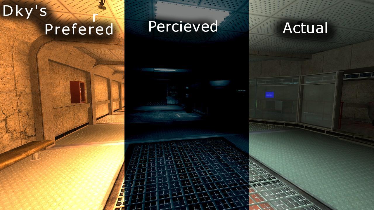
I like it. The lighting color, I mean. I think there could be maybe one more light fixture in the area where it starts to darken a little in the hallway. Don’t make it too crazy bright though! In general I think it should just be a tad darker than the AM labs.
I was thinking the same thing. I’ll get to texturing once I verify that everything is working the way I want them to.
I generally avoid texturing for as long as possible out of habit. I’m more of a geometry and entity guy anyway.
EDIT:
Could use some tweaking. But it’s a nice start, I think.
Oh yeah, definitely a nice start. I’m still not a fan of that orange glow the hologram emitter… emits. Kind distracts from the rest of the rooms lighting.
Should I leave the rails around the glass windows in the lobby? I like the look but they don’t serve much of a purpose.
Do you mean the glow that it casts onto the walls, or the glow from the point_spotlight sprite effects? Because the light glow that it casts is easy to fix, and I agree could use tweaking.
The spotlight sprite effects, on the other hand, are a bit more difficult to change without making them instantly look like crap.
In general though, I think it might make more sense when you see the hologram floating in the air. I just removed the placeholder Assassin model because it would ruin the picture.
As for your rails… my general rule is that if it looks nice or feels right to the point where removing it would feel wrong, just keep it.
The glow, definitely. The spotlight effects will probably look natural when we have Gina standing atop.
Rails are stayin’ then 
Edit:
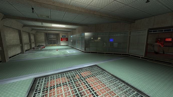
So, here as my final screenshot for a while I present, the lobby!
Ignore the retarded green light bending reflection, if you will. This window keeps having all sorts of problems. I modified the wall texture a bit so it’s a tad less clean, but I don’t think it’s noticeable enough. Any major changes I should make before continuing?
More springler systems at ceiling 
But looks good
Alright, I’m thinking the additional area to the flashlight training should work as a quick review of all the skills introduced by that point. So an obstacle course. With box stacking and ladders. In low-light levels.
Does that sound like a good idea to you guys, or would it just get tiresome?
It can’t go on for too long if you do that. I think box stacking might be a bit much.
Looks good guys! How about the scientists in the jump rooms are typing and will change animation after you successfully finished the challenges in the room. About the lobby add more scientists at this place. It may mean the top floor is the only one maintained while the actual course is the recycled area. Also the elevators at the lobby must be automatic and no switches for a while for the player. Put a security guard at the lobby and cameras that display parts of the course.
EDIT: Is the crouch jump room pipes are industrial pipes or HL1 like (with battery logo)? If the HL1 like is used, can you make the battery logo glow in the dark?
EDIT 2 :
No box stacking and ladders but maybe jumps and few boxes blocking near the end. The boxes can be used or crowbarred, up to the player.
Right now there’s three scis in the lobby and one in the hallway preceding it.
Okay… don’t kill me. But perhaps you could add a tiny splash of warm yellow light on the walls? The room looks dark and foreboding and not very friendly.
GAH! Vertical spaces, warm lights… Nah, I suppose I could warm it up a little.
This is exactly how one describes the Hazard Course!
Okay, so now that I’m done bein’ a dick (at least for now):
Finally better? Friendlier? I can make whatever changes are necessary, nothing better to do.
Except it’s not the Hazard Course… it’s the LOBBY to the Hazard Course. 
Anyway, your second picture is perfect. Don’t need to ask for anything more. 
Yay! I didn’t think Pale Yellow lights with blue light_spots would work.
Crypt, could you give the physics room a shot?
Not that I don’t want to do it anymore or something, but you seem to have a lot of freetime unlike me.
I suppose. Should I just go off of your design concept? Or maybe use that one map I had some pages back? Or completely new? I have no idea.
Try going for a maintenance hall look. Stay with the base geometry (it’s in my VMF folder), but try to tighten up the spaces and make them claustrophobic. I think I’d like to try something non-vertical for a change. 
I’ve never seen a maintenance hall before, or even know what the hell that is, but I’ll see what I come up with.


