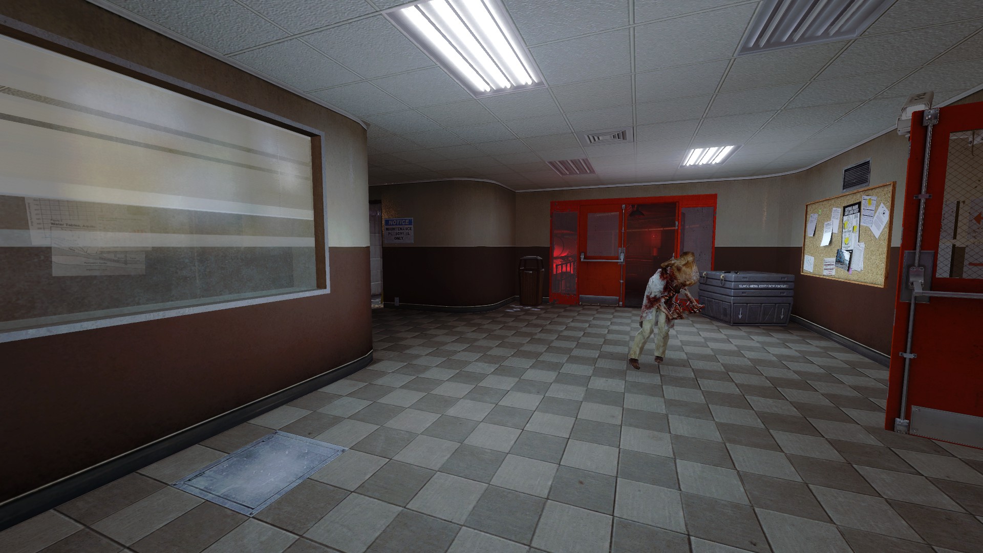
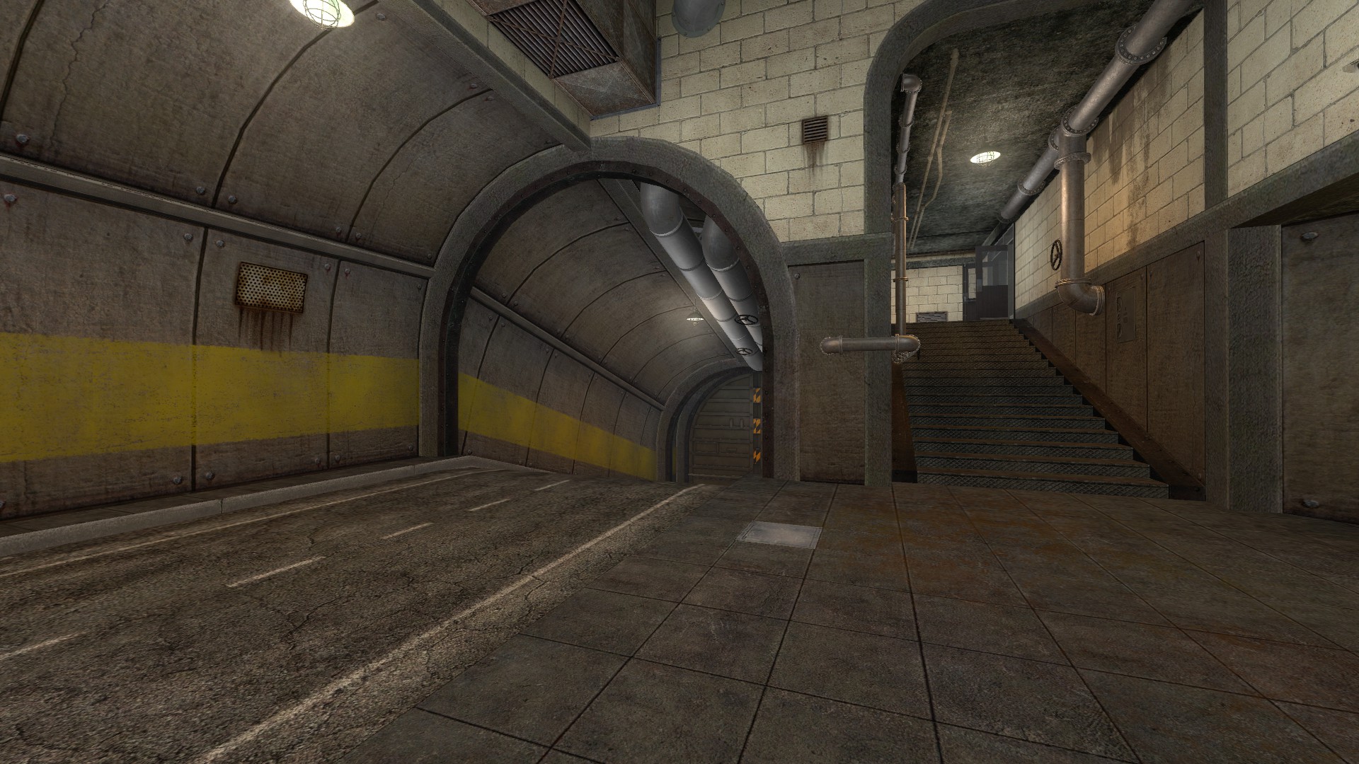
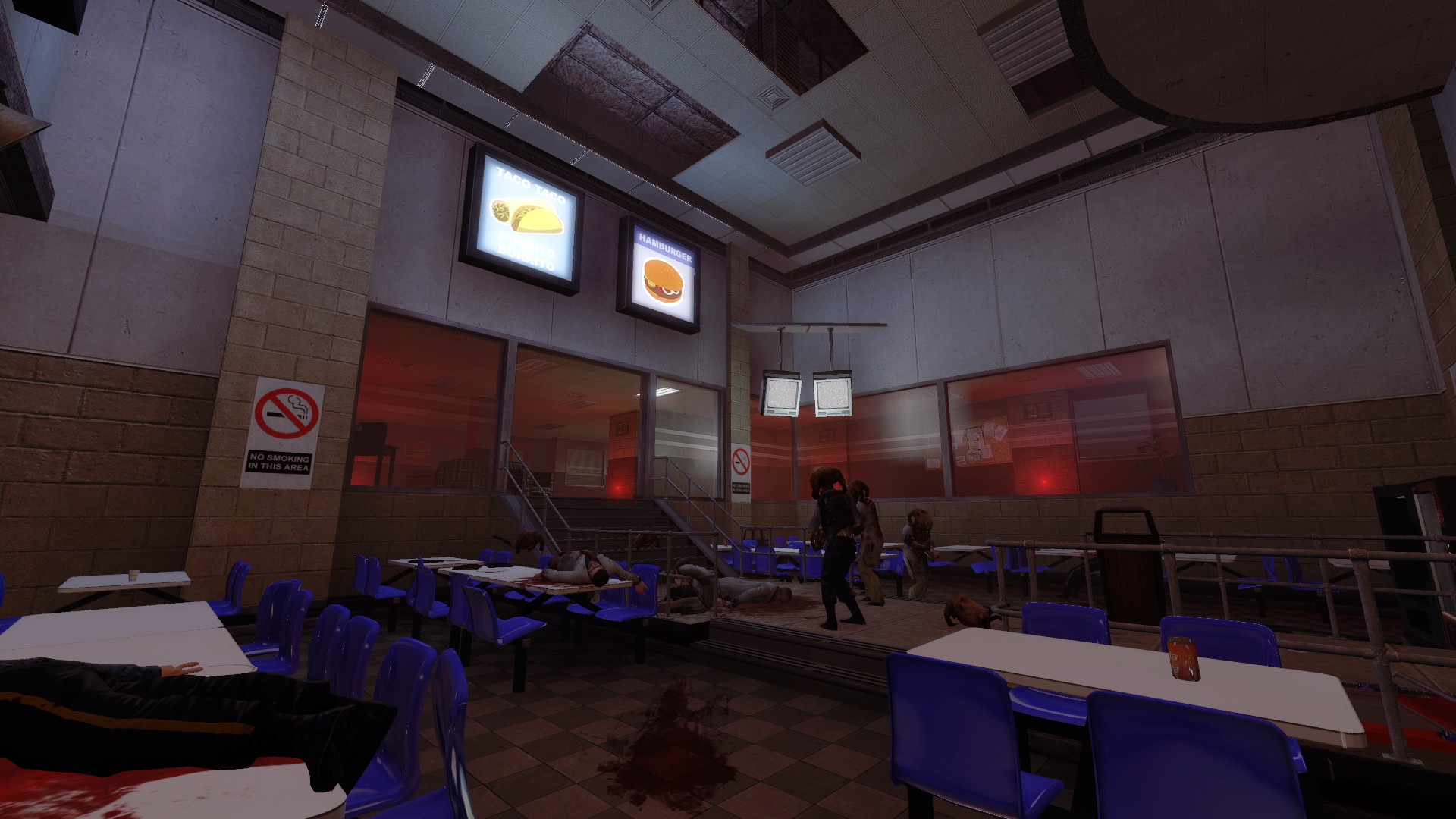
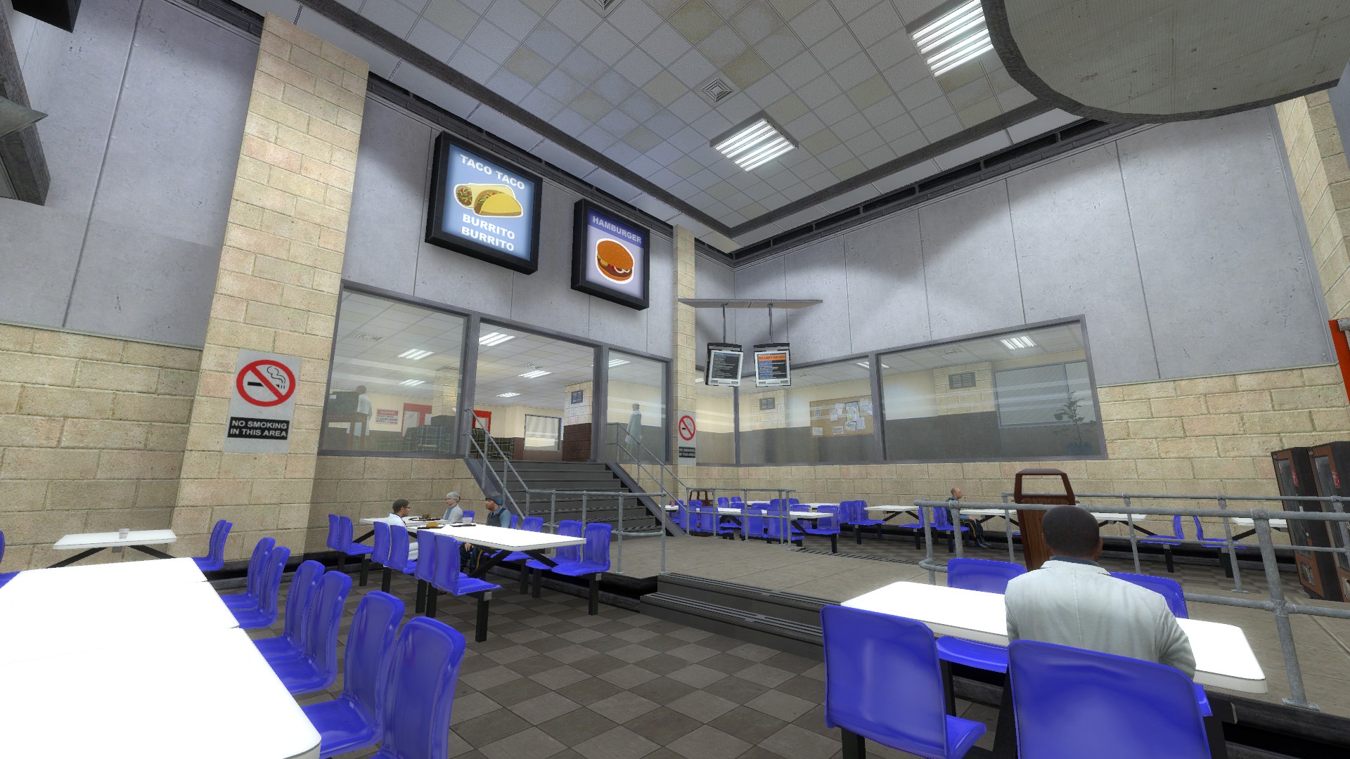
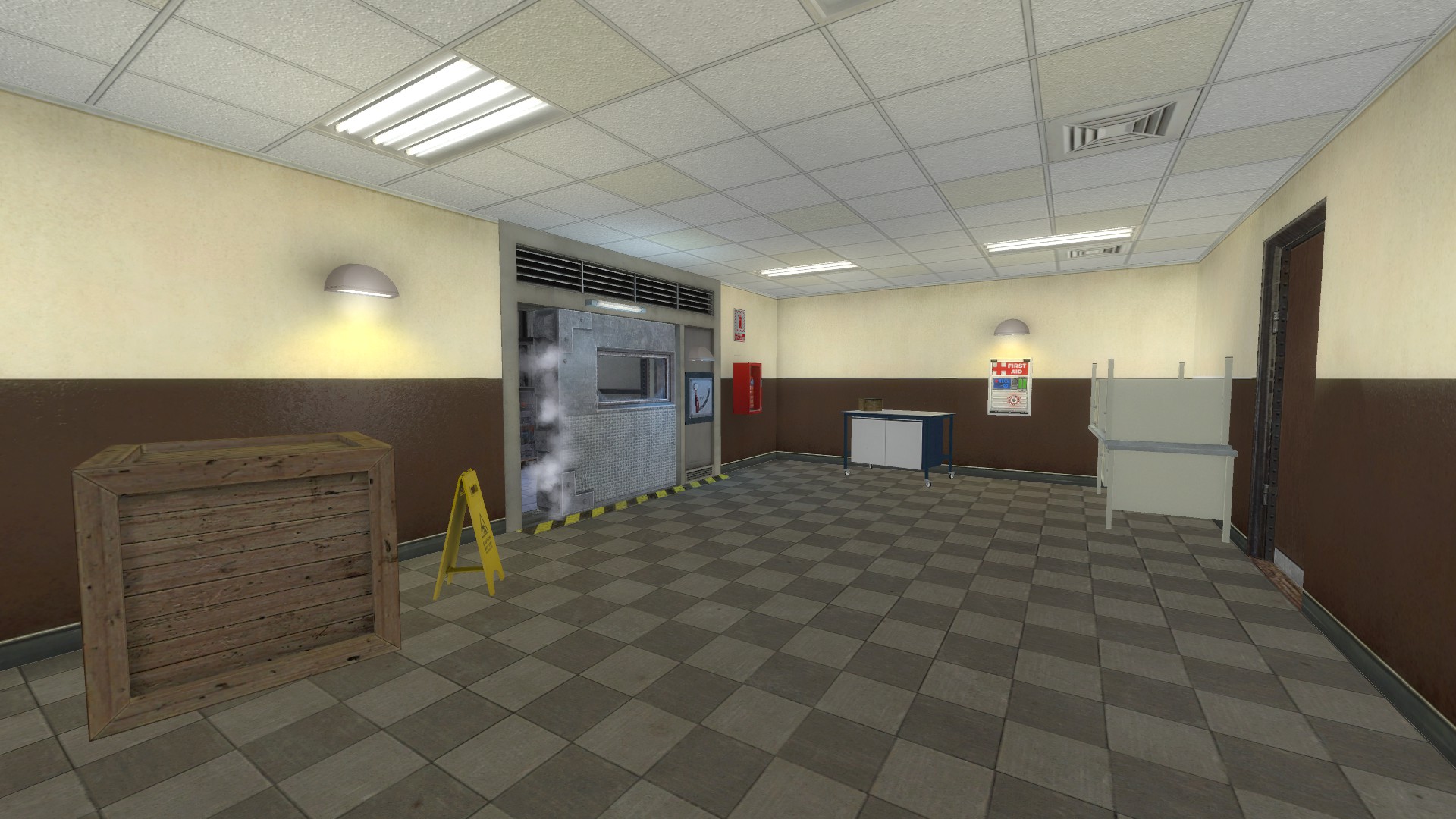
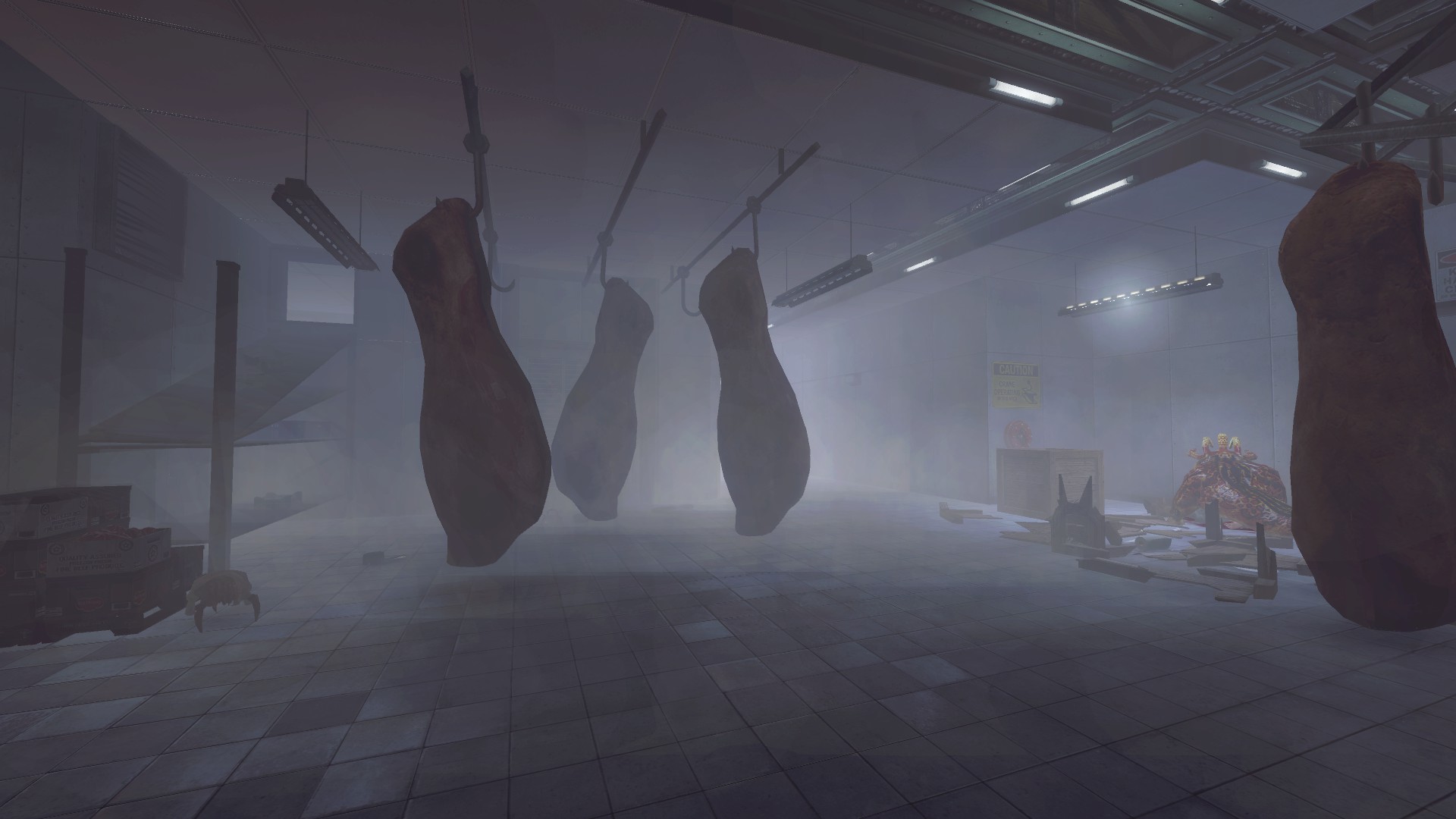
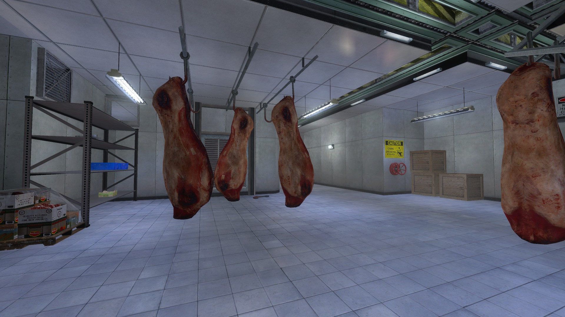
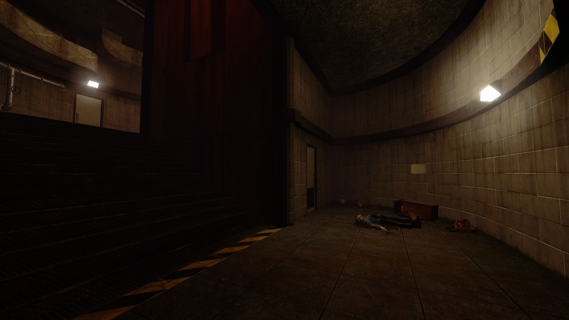
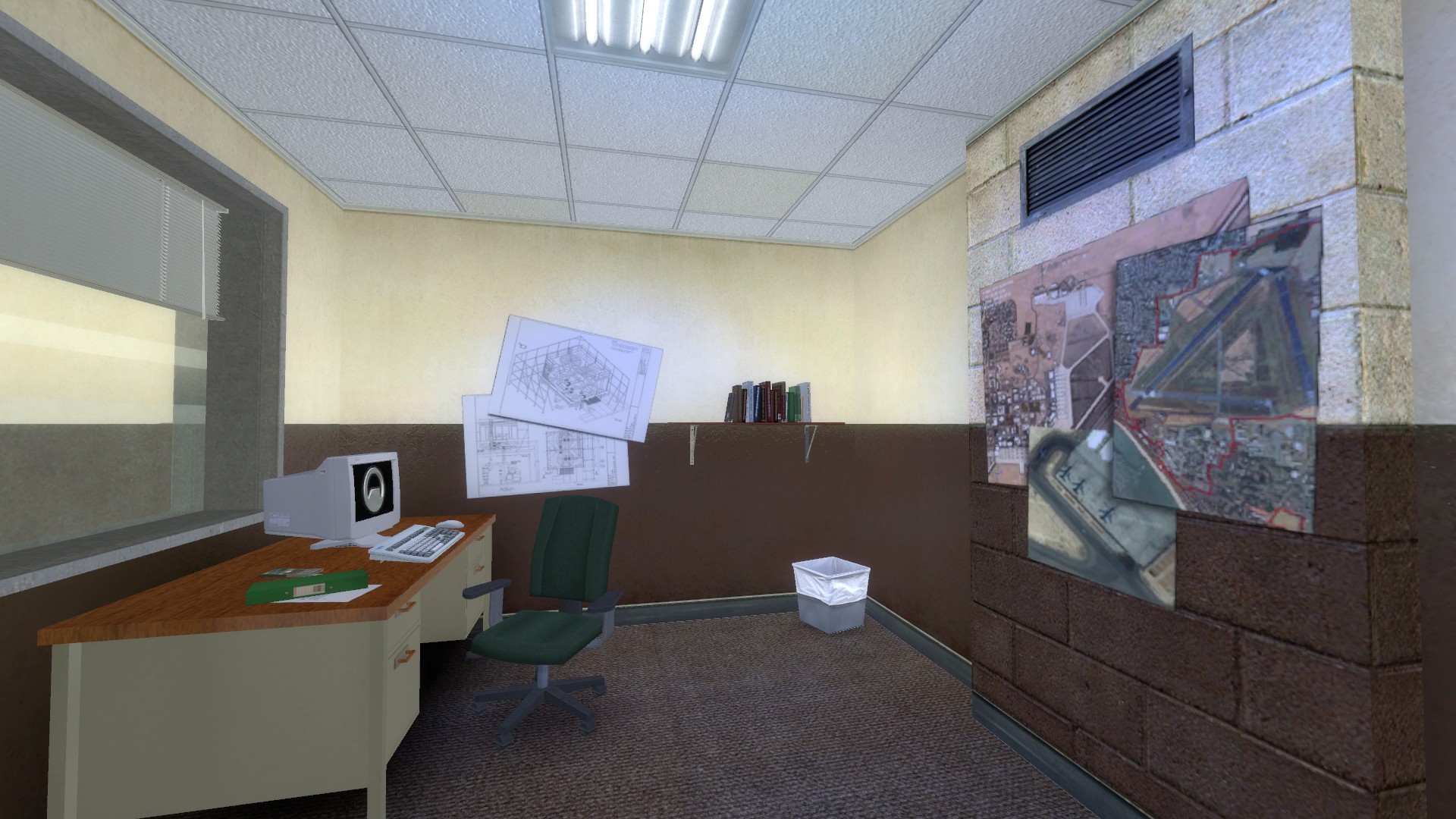
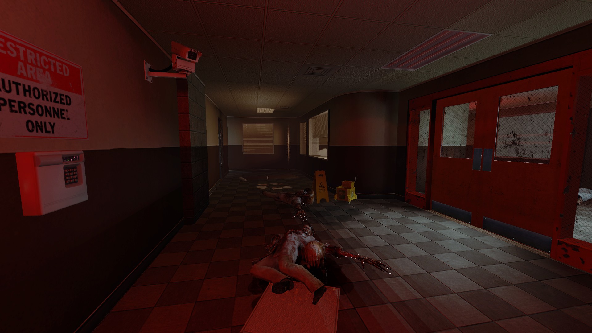
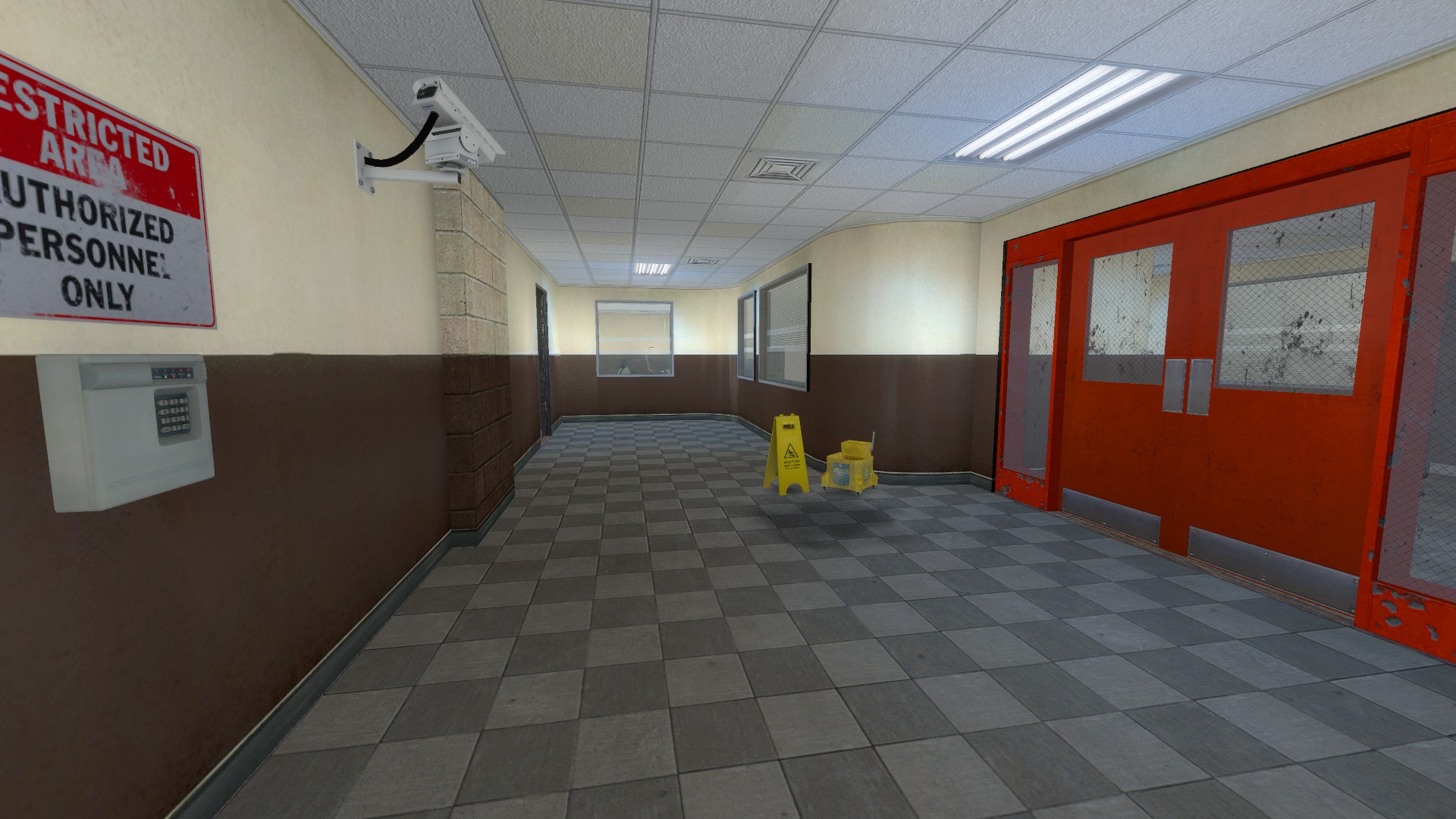
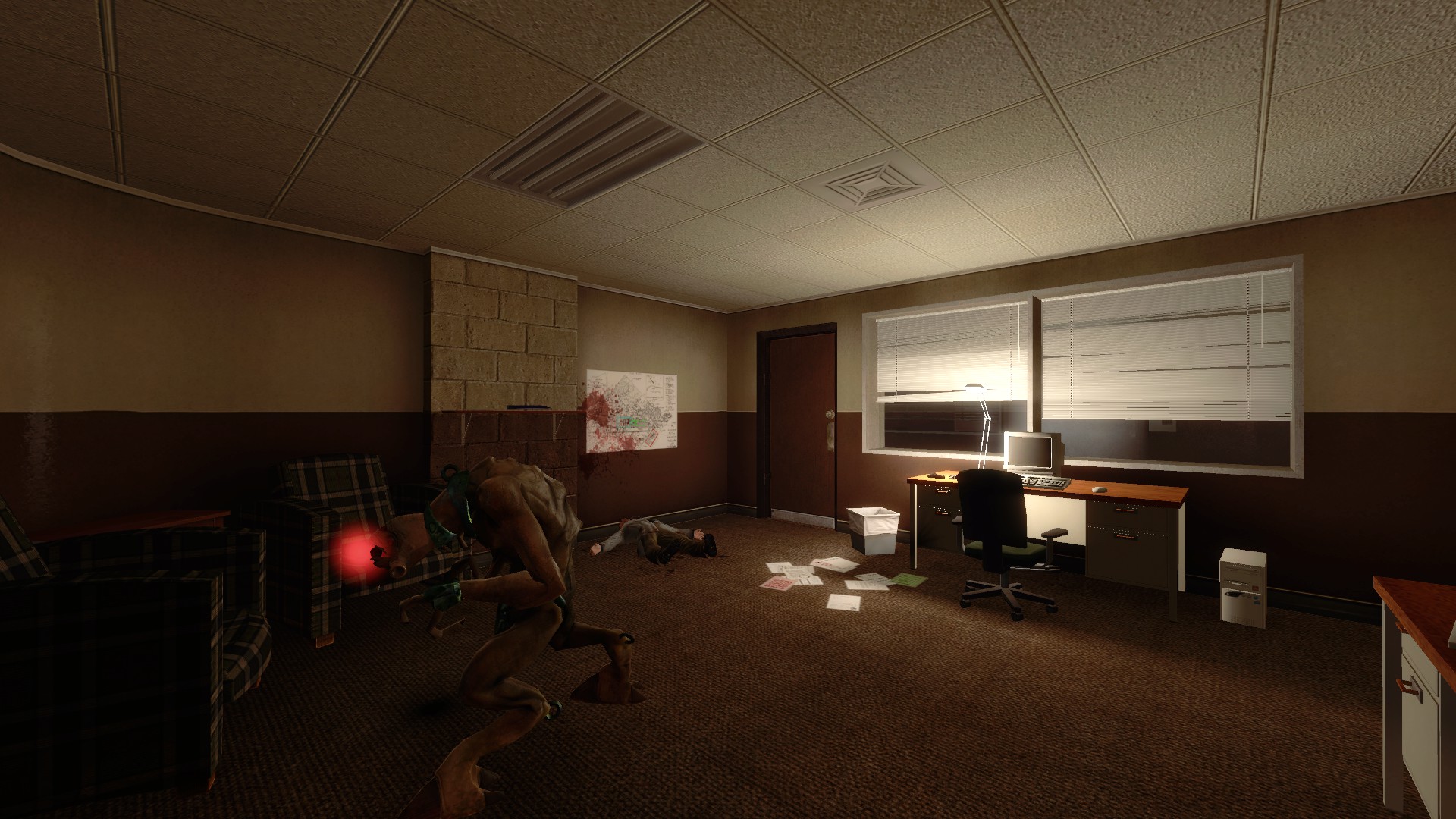
Freezer:
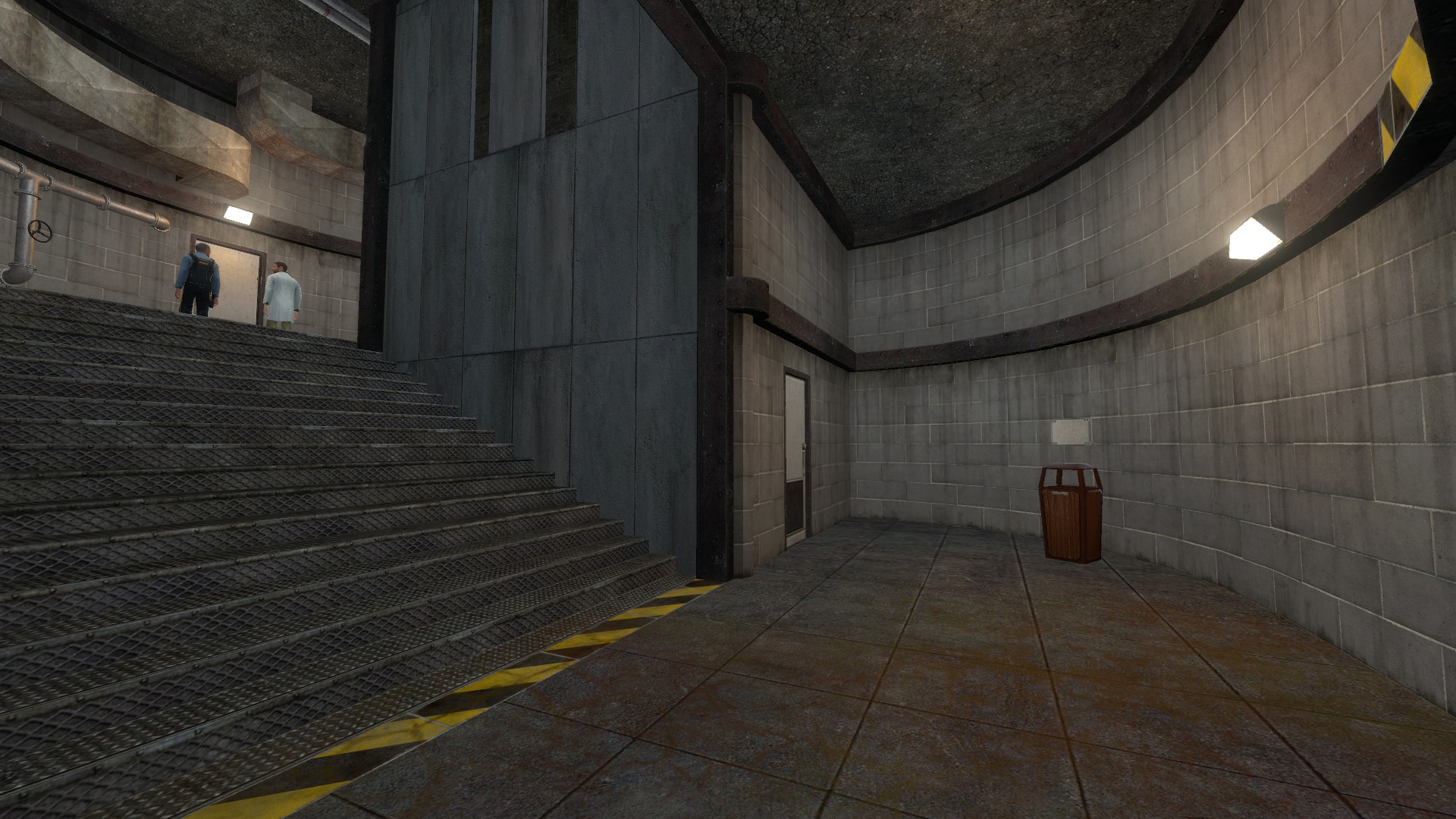
The guard is shivering. Give him a blanket.
Come to think of it, it’s weird to see guards and/or scientists in a lab coat in a canteen freezer.
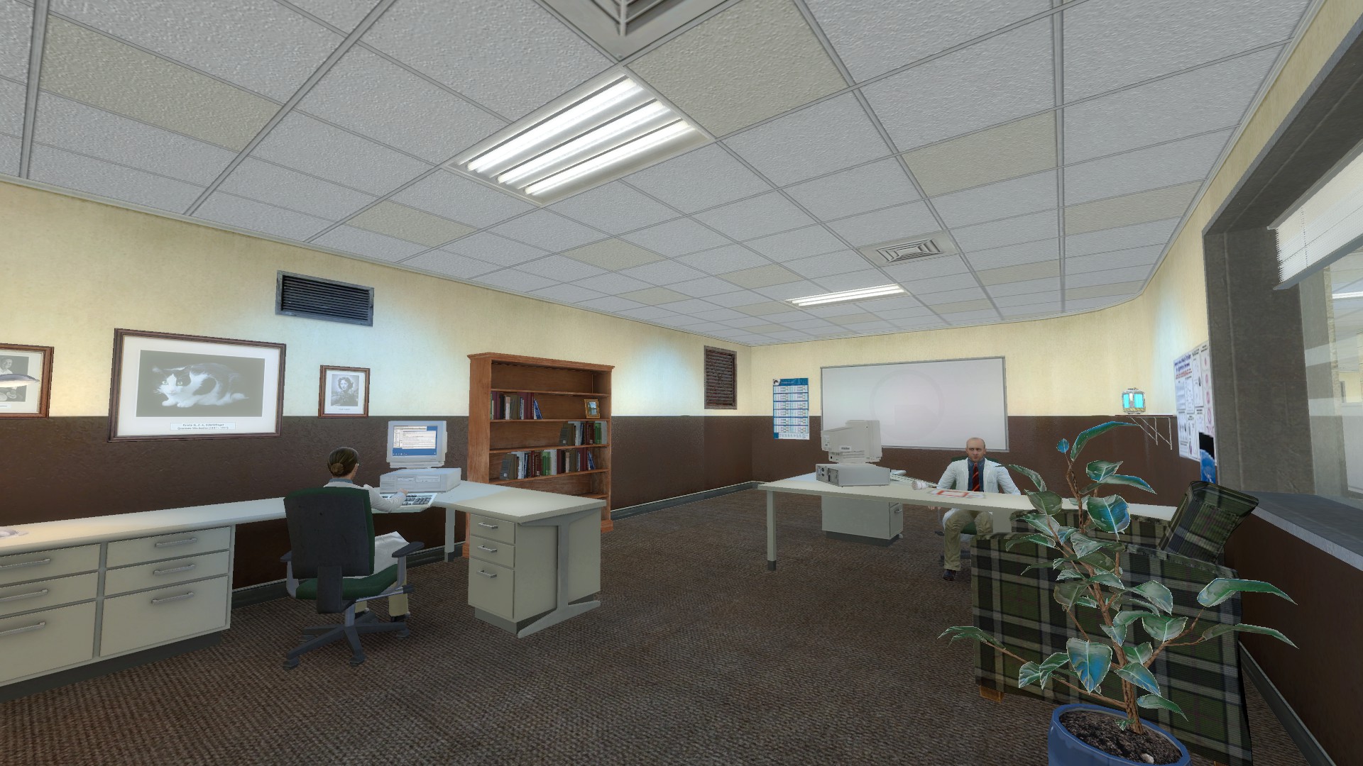
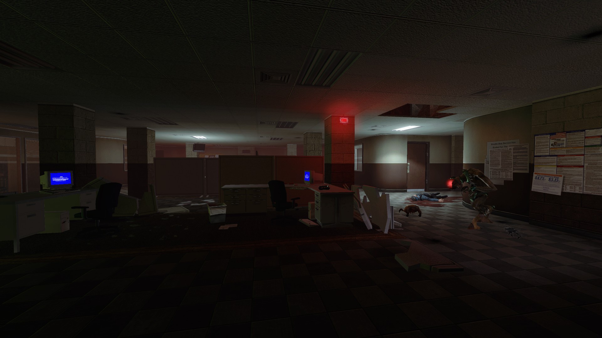
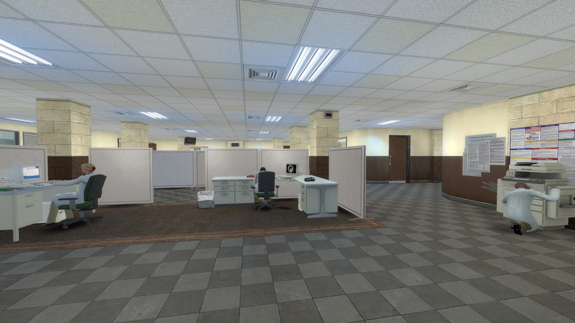
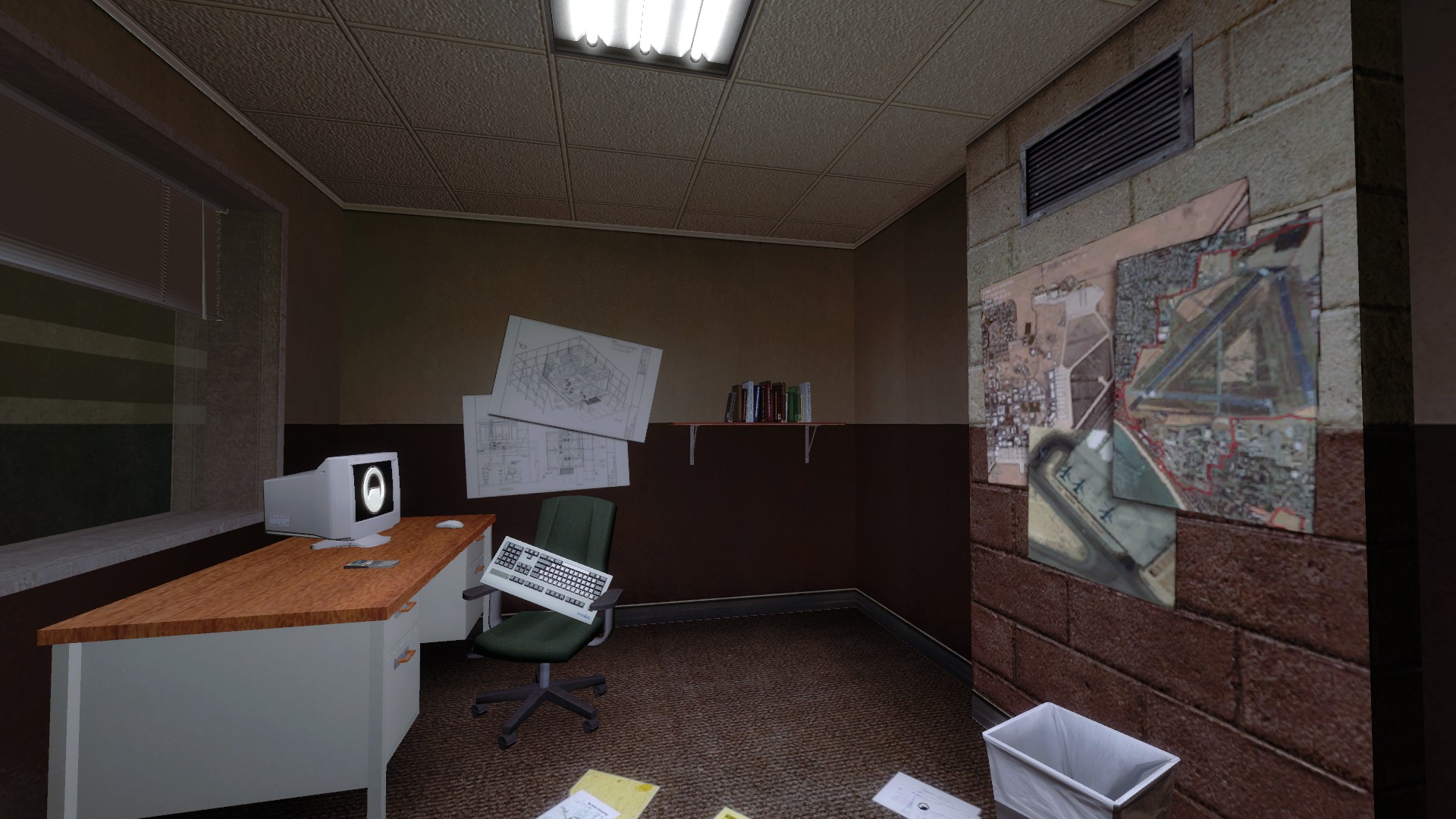
Dude, stop being, so amazing at what you do. I always look forward to your pre-disaster areas. You just do a great job, and I can’t wait till you are allowed to do some custom work to your areas.
These are amazing edits great job 
Nice work! I love it!
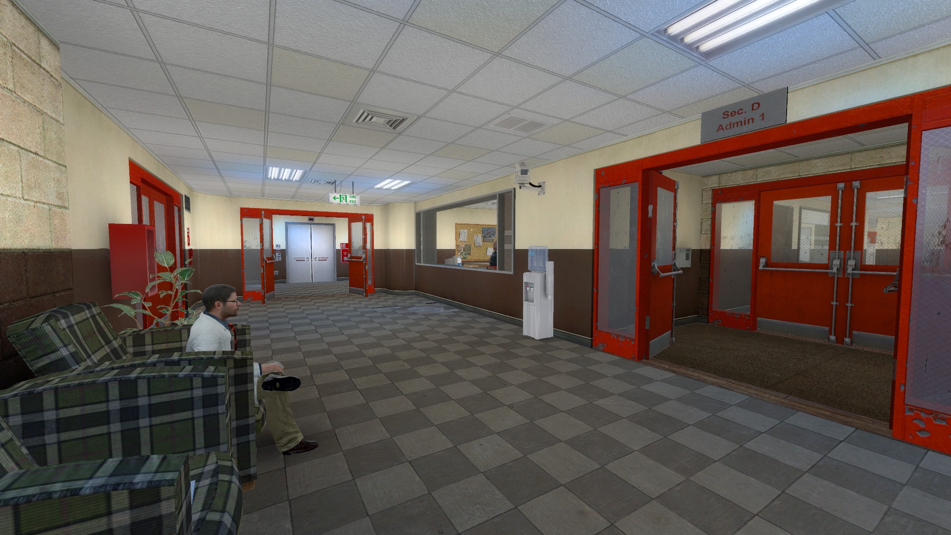
Minor thing I can see from the screenshots. In the hall next to the cafeteria, there are two vending machines. One of the vending machines is pulled away from the wall and partially turned. I suggest putting the vending machine back in line with the other one so they’re both against the wall. Before the disaster, there’s no reason for the vending machine to be out of place.
Beyond that, kudos! 
Let’s come back to expanding C Map.
I’d like to discuss the expansion with more of a formalistic approach this time, so let’s begin by defining our terms and locations:
Much of C map is Level 3 of the office complex- Admin 2 and some logistical areas. However, at the very end, we go up a staircase to the lobby of Level 4 / Admin 3:
That, in turn, leads up to an elevator shaft, which takes the player all the way up to WGH.
Now, the way that Office Complex is set up pretty closely mirrors the structure of, you know, an actual building made by sane architects, in that the different floors are relatively flat areas that don’t really interact with each other except at the elevators and stairwells. That means we can think about this little hallway, and Admin 3 beyond it, completely separately from the bulk of C Map.
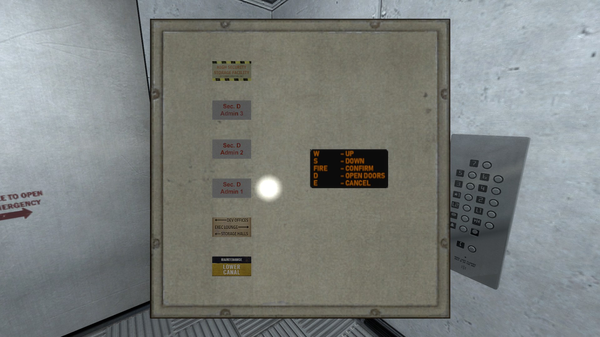
As a side note, counting the doors in the elevator shaft, it’s possible to get a sense of the vertical organization of the entire Sector D facility:
HSSF Level 2 (WGH map B )
HSSF Level 1 (WGH map A)
Unknown, possibly Admin 6 or an unseen lower level of the HSSF
Unknown, possibly Admin 5
Admin 4 (Not seen) Curiously, the skywalk is half a story below this
Admin 3 (Top of C map)
Admin 2 (C map)
Admin 1 (B map)
Development Offices (A map) There’s no door, but there’s a lip where one should be
Curiously, there’s no room for the basement storage area seen in Unforeseen Consequences’ E map. Perhaps only the big freight elevator actually goes down there?Its shaft (visible through “permeable infrastructure”) has like three more floors below the Development Offices.
Thus, with the top elements removed, C map looks something like this:
Now, before I put the project on hiatus, I had proposed putting a mid-sized office block in between the southeast lobby and the cafeteria, and I see really no reason not to still do that:
Considering that it’s where the elevator shaft passes next to the populated areas and this floor only has one “lobby” where all of the others have two (the one we see at the end is properly part of the next level up), I think it’s a good idea to put a lobby structure in or near the southwest corridor terminus. I know that it doesn’t look like there’s very much space there, but that’s mostly just a result of the somewhat distorted perspective of the birds’-eye view- that area is actually about 200 units wide, and with a little bit of fiddling with the elevator shaft itself (which won’t be visible from this map, although it eventually will be from We’ve Got Hostiles) I can make it 260, the same as the actual lobbies.
Beyond that… I’m not really sure. I’d definitely like to have a rail platform somewhere in this place, but no place really looks good for central access to the elevators and stairwells that a tram station would have. Then there’s that weird corridor up to the North, with hallways that seem to lead into maintenance areas… it’s a puzzle.
I think I’ve got the problem of the tram station figured out. I’ve been hung up for so long on the lack of a large, central area for it to open out into… so why not just make exactly that?
I’m now envisioning a much, much larger lobby for the southwest, basically a regular Office Complex lobby merged with the main entrance to the entire Office Complex, which then opens out into the main rail platform:
That doesn’t tell us exactly what to do about the northern corridor, but it gives me some ideas. We have this massive freezer complex right next to the tram platofrm, so I’m betting there are facilities to handle the loading and unloading of cargo to the southwest- and considering that those garage doors in the freezer itself continue all along that half, I’m betting there’s some kind of loading dock or freight area all along the western end of the map- this, in turn, connects to the NW end of the mystery corridor, possibly through some sort of processing or management area (this being Office Complex, after all). Still not certain about the NE wing, but maybe that’s more maintenancey stuff that serves Sector D?
Sounds good. Are you saying that there could be a freight line like materials transport that delivers stuff into a delivery area and then into the freezer room etc.? I would assume that a freight line would be beneficial to office complex, being filled with office equipment that they could fit into those smaller open-top trams (you see a freight tram in the Area 9 Hub in Inbound). This means that not all deliveries have to come via truck, and smaller crates etc. can be piled onto trams.
It’s just a thought - as I suddenly thought of Area 9’s Hub where you can see a freight tram parked. The Hub is near office complex anyway (as you can see hallways of Office Complex in that huge area too), so it could make sense having a cargo line as well as passenger lines in the tram platforms here.
I was actually thinking of a loading dock with a road, for trucks, since I want to keep the number of different rail systems to a minimum (we already have two or three, counting the ones in Blast Pit and Subtransit.
Fantastic work man!
i’ve wondered why none as made new texture for the offices so that some look different
someting like this or maybe a blueish colour
So, the reason why Office Complex is taking so long is because of grad school, but not because I’m overworked.
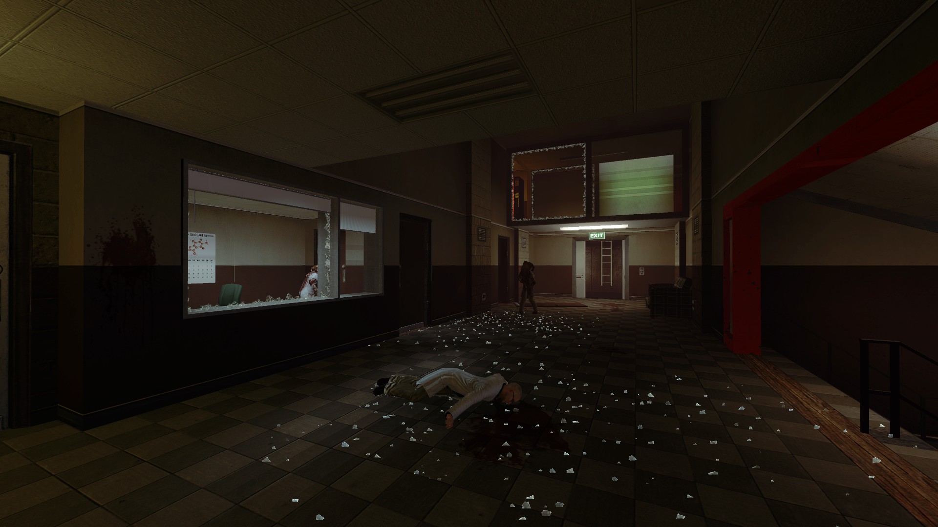
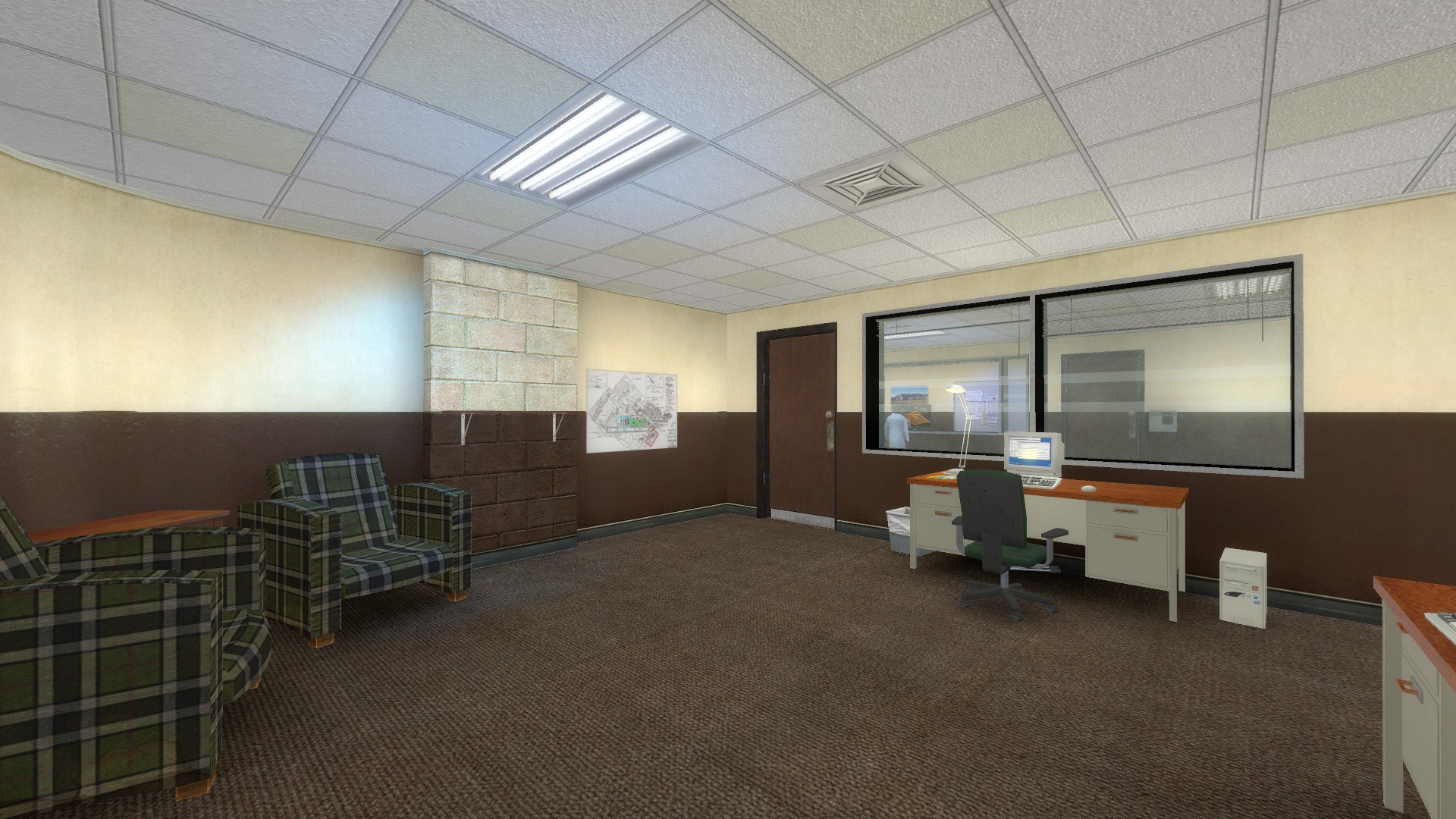
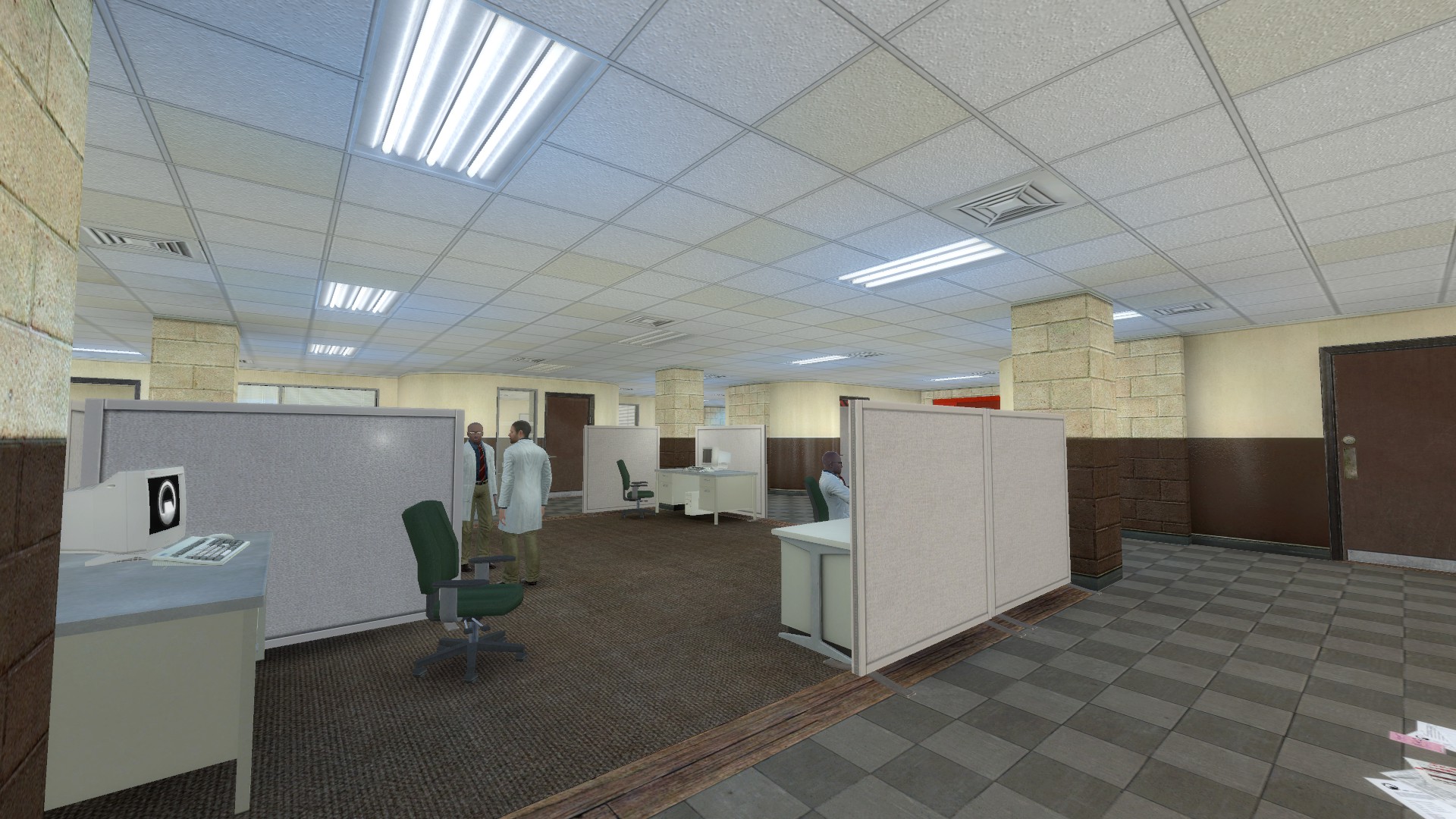
Rather, it’s because they have moved me to a part of campus I didn’t really frequent before, which is lit and organized pretty much identically to Office Complex- and now I realize that my last pass of lighting is in fact a pale imitation of the real thing. Here are some of the corridors near my lab:
The first thing worth pointing out here is that really, Black Mesa looks like a much better place to work than my actual job- it’s cleaner, the hallways are wider, the lighting is more even, and the ceiling tiles actually post-date World War 2. The second thing is that the lighting is extremely even and plenty bright enough to see by (except for a few darker areas where there are literally no lights nearby)… but each light also has a very well-defined triangular area of even greater brightness immediately surrounding it.
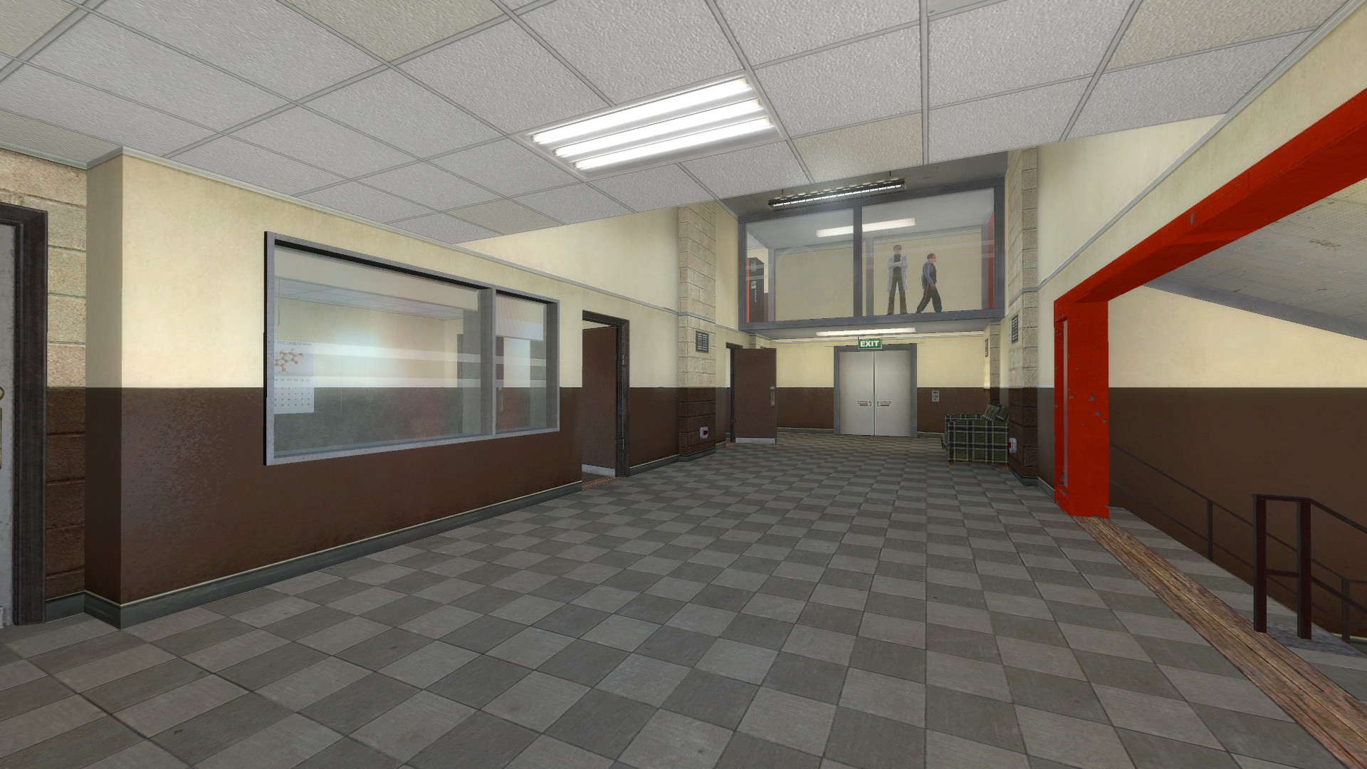
I’ve got the ‘even’ bit just about buttoned up- I used to have a lot of problems with using constant lights, but I’ve come up with an alternative that I think works reasonably well, and indeed I can make pretty much perfectly even lighting anywhere I want, and even remove the pseudoconstants in certain areas to make dim spots:
However, if I turn them down (either by dimming the lights themselves or setting the global bloom scale to a ridiculously low amount), they really don’t show up at all:
So I’m kind of presenting this to the community to ask whether everyone thinks this reality-inspired approach to Office Complex is a good direction to take, and also to ask whether anyone has any ideas on how to make it work.
Keep it up, friend! You’re work is awesome!
won’t the lighting on the models look better if you use an info_lighting entity placed further from the light source ?
It’s not just models but decals and things as well.
Hmm. You might try playing with the hard falloff if you haven’t already. Other than that, just making the inner(bright) angle much smaller or reducing the brightness of the point lights (that I assume you’re using alongside the light_spots) to very low values.
For that hallway in particular you could also maybe dim all the lights a bit and add a green one to the fire escape light for contrast. I find a constant colour often looks more flat than a constant brightness. Maybe turn off all the lights and have some shining in through the doors and windows? With some strategic lightmapping that could look quite slick, and sometimes hall lights get turned off for one reason or another and people forget to re-activate them if there’s enough light to navigate by.
Also, those reference images from your grad lab aren’t showing up anymore - I really wanted to take a look!


