
Better than what I expected
Need some criticism on this thing:
Making a large cave/fort thing for Skyrim, but its just not working somehow. Too grey, I guess. Any ideas?
You have some shades of green coming in from the water/ fog. I’d grab that and amplify it. Weave it into the whole aesthetic.
Maybe then you could contrast it with some vibrant oranges (aging gold plated architecture? Torches?)
I’ll try that out. Wanted to do it with the lights a bit, but they fade out at a ridiculously short distance for this kind of thing. I’ll try messing with the fog a bit.
So there isn’t a view distance slider for lights? The fog would definitely help. IDK about the ceiling of the cave but it should definitely have a lot of stalactites, and maybe throw in a large waterfall up high on the cave walls
Also is that how the lighting looks in game? If it is I’d suggest lowering the ambient light to make it darker if you can except for the light sources. That might make the fog stand out more and the entire thing a bit more interesting.
It might just be me, but at the top of the screenshot, the rocks look very duplicated, but you probably did that temporarily right?
Duplication isn’t temporary, but I’m going to decorate it with other stuff. Its the price of going way outside the premade kits, there are very few props to fill in the gaps with.
Yeah but it’s not too bad. Just rotate those top ones a bit and I’m sure it wouldn’t even be noticeable.
Hi guys,
I have recently finished off a project I have been working on for a while now.
Its a high detail model of the USS Enterprise (2009 movie). I then created a flyby animation to show off what she looks like 
I plan to tweak a few things as im not entirely happy with her yet :meh:
Anyway, take a look and please feedback any thoughts.
Youtube link below
wow looks nice
Satan is a Brony.
I got bored and made this in five minutes.
Also, I don’t know anything about the show, so if you have any idea how to increase the brony-ness, be my guest, and I’ll go work on it some more.
You should add a background of some sort. I’m thinking something along the lines of his bedroom with some mlp posters.
Sorry to spam the thread, but quick update:
Some messing with the ini produced the light LOD value, which I increased to about three times what the max should be. Also tossed a waterfall in for good measure. Still could use more blue/greens though.
Pretty sexy looking. For some reason the camera angle reminds me of when you enter one of those really large dungeons in daggerfall.
How do waterfalls work? Are there prefab entities with pre-determined sizes and you have to position it correctly over the water, or is it an entity where you place it and it determines the height it should collide with the water on its own?
Predetermined size but there’s a good variety of heights, and they are scalable like any prop so you can always fit your location, as long as its not from the Throat of the World to Blacksreach.
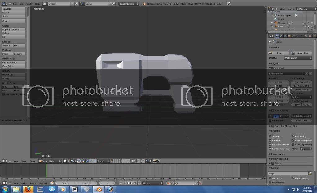
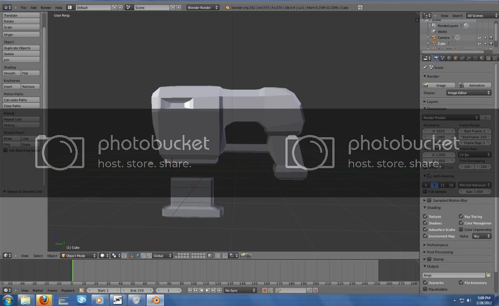
Ooh, is that UT’s enforcer? I always loved the recoil feel from that gun, especially when holding two.
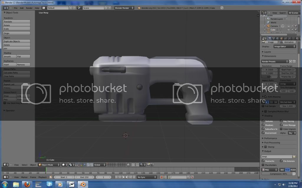
It’s a combination of the UT99 enforcer with the Unreal 1 AutoMag, with some of my own touches added in (because they are two of the coolest pistol designs I’ve seen IMO)
Finished the slide and worked on the magazine chamber:
Slide
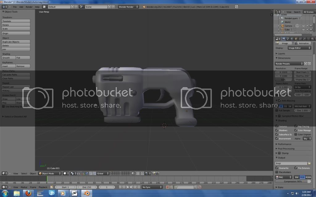
Player’s perspective
Ok guys which do you think looks better?
The rounded one here:
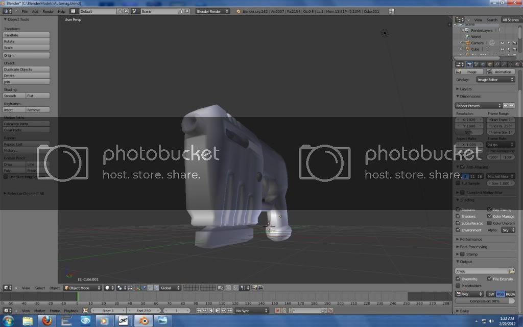
The “Box” like one, which is closer to the original design:
I get the feeling that for some reason a more curvy grip would look nicer on that.
Today I took a classic musical masterpiece and butchered it for a grade.
It would seem so, even with slight curves.
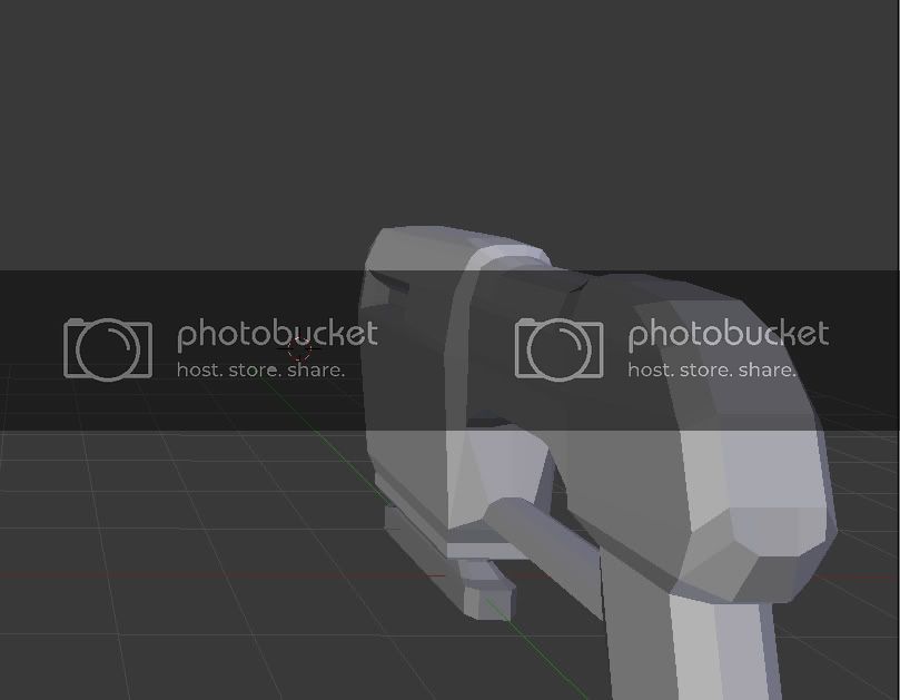
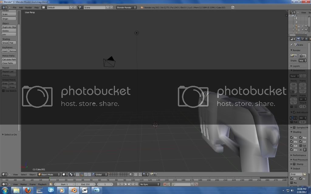
Also changed the bar below the trigger, and added the trigger.
Here’s a front isometric angle just to mix it up a bit:
coming along nice
i loved that theme music, tbh your was actually better, i enjoyed it so much more.