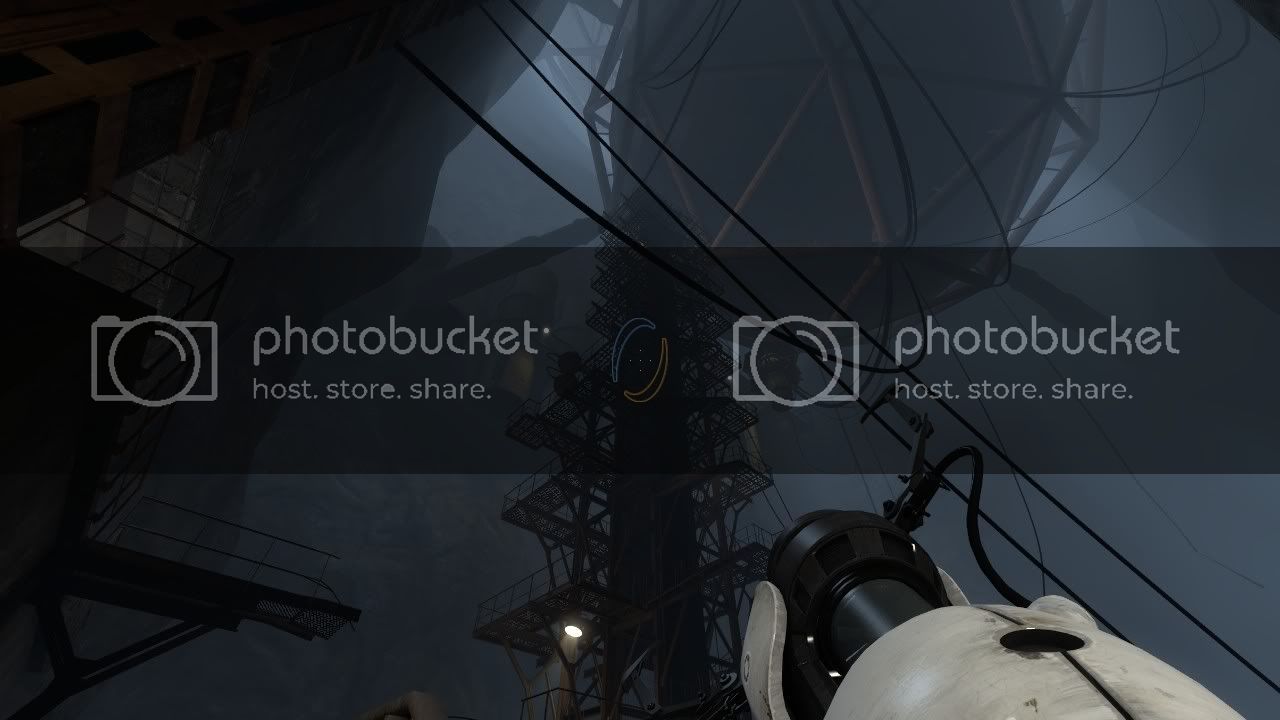
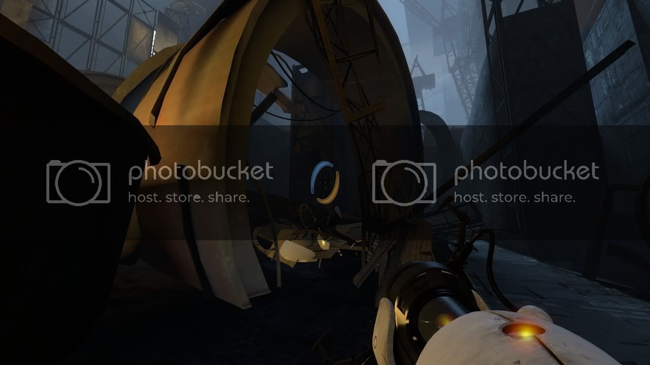
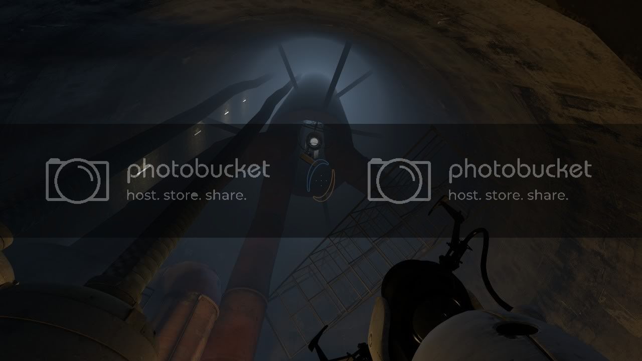
actualy the light is great, (spoiler) when the bluemotherfuker gets in control, the red light goes away and everithing goes bright, that gives u the sensation of wining, but then when he changes his mind , he not onli expreses himself with the pannels on the background but it start getting darker and that scary red light that comes from the ground start again . things get scaryer with lightning. the light help the characters to express himself, the character emotes through light. it was one of the best lighting settings i ever saw.
I like the graphics, they’re good enough for me!
To anyone complaining: Get a fucking life. Every time valve releases something you people start complaining like the fat bastards you are.
“Oh haha! Gabe newell is fat so i shall makes jokes about it and complain about release dates! Haha! I say valve games suck just to fit in on the forums but i actually think they’re good, even though sometimes i even believe my own lies! Haha!”
Honestly people stop lying to your self. Portal 2 was a fucking awesome game and you think so too. Stop thinking you’re Fitting in by saying it. Because you’re turning this forum into High School all over again… Pricks.
No Country for Old Men
This is a clear sign that you have no idea what the fuck you’re talking about.
I rest my case.
He doesn’t, but he has a point in that Source isn’t CryEngine.
First of all, the the version of Source that Portal 2 uses is not Source 2004.
Portal 2 introduces:
Improved shadow mapping
The entity env_projectedtexture is used intensively throughout the game. Compared to previous implementations, it’s utilizing a depthmap with a higher resolution and makes use of a smoother filtering kernel.
Blob particles
Used to render paint.
Video playback on materials
Added support to render Bink Video in-game on surfaces.
(Taken from Portal 2 article at Valve Dev. Community. Link here: https://developer.valvesoftware.com/wiki/Portal_2
Portal 2 also had higher minimum specs compared to Source 2007.
Minimum CPU clock rate for single core was raised from 1.7 GHz to 3.0 GHz.
Right, but it’s still the same engine from 2004. Just upgraded a little.
^quoted myself there…
I know it had updates… but still most if its based from 2004 engine. It has not been completely rebuilt. Therefore, making it amazing that they can make a game look that good with an engine that old.
his logic is sound.
And air isn’t dirt.
It hasn’t been changed “a little”. Source isn’t like other engines, where any updates they receive are minor and don’t affect looks too much. Source is a modular engine, which means that it was specifically designed so that Valve could rework large parts of it without too much hassle.
For all we know, Source 2011 bears as much resemblance code-wise to Source 2004 as CryEngine 3 resembles CryEngine 2. With that said, however, I wouldn’t mind Valve working on larger maps, fewer loading points and higher resolution textures. But by no means did Portal 2 look like an outdated game, even when taking into account the specific “clean” art style that makes use of Source’s simplicity.
Sorry to say this guys, but are we all friggin’ CoD fanboys now?!
Every TRUE gamer should keep himself to one rule:
Base over Graphics.
(With that i mean; overall game, story and such, above grahics)
If you can point out where anyone said Portal 2 is a bad game I’ll give you a virtual cookie.
Portal 2 looks just fine for me. Maybe Soruce could be a bit outdate, but they know how use it…
Portal 2 is the most awesome game I’ve ever played! Simple as that. Awesome story, super cool animations (with all the walls moving/crumbling) and interesting puzzles. It wasn’t too difficult, it wasn’t too easy either. Oh, and I adored the ending! After I finished it, I reloaded and watched the ending two more times. 
It’s really a great game. You can nitpick about graphics and loading points all you want, but at the end of the day it was still a great experience to play it!
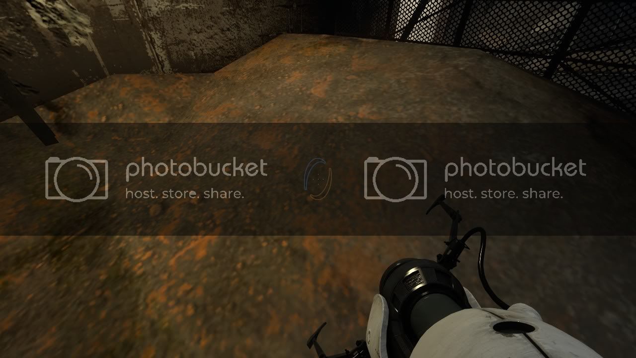
actually i just wanted to take few pics of this room as a good example where portal 2 looks good. But the problem is this is one of maybe 4 or 5 rooms that looked ok.
The only reason you can notice the normal maps is since the light is directly pointed at those surfaces, you cant see shit on the ones in the darker corners.
To anyone who says source engine still looks great, what a about the map size ? The level in this pic is like 1min long, and after this you will get another loading screen, i was getting 2-3 loading screens on the more simple levels, and thats just crazy. I dont know if it comes from the map format, or the lack of data streaming, but the levels are too fucking small !
Even the old apaarture levels may seem big at first, with all that stuff in distance, but the actual parts you can get too are very limited, and the geometry in thw distance looks extremely simple if you zoom in, i just replayed some of the levels and it took me only few mins too finish them.
And to all those idiots who go off topic with how the great game was, yeah it was one of the best games i played in last 2 years, dosnt make the engine less crappy ;f
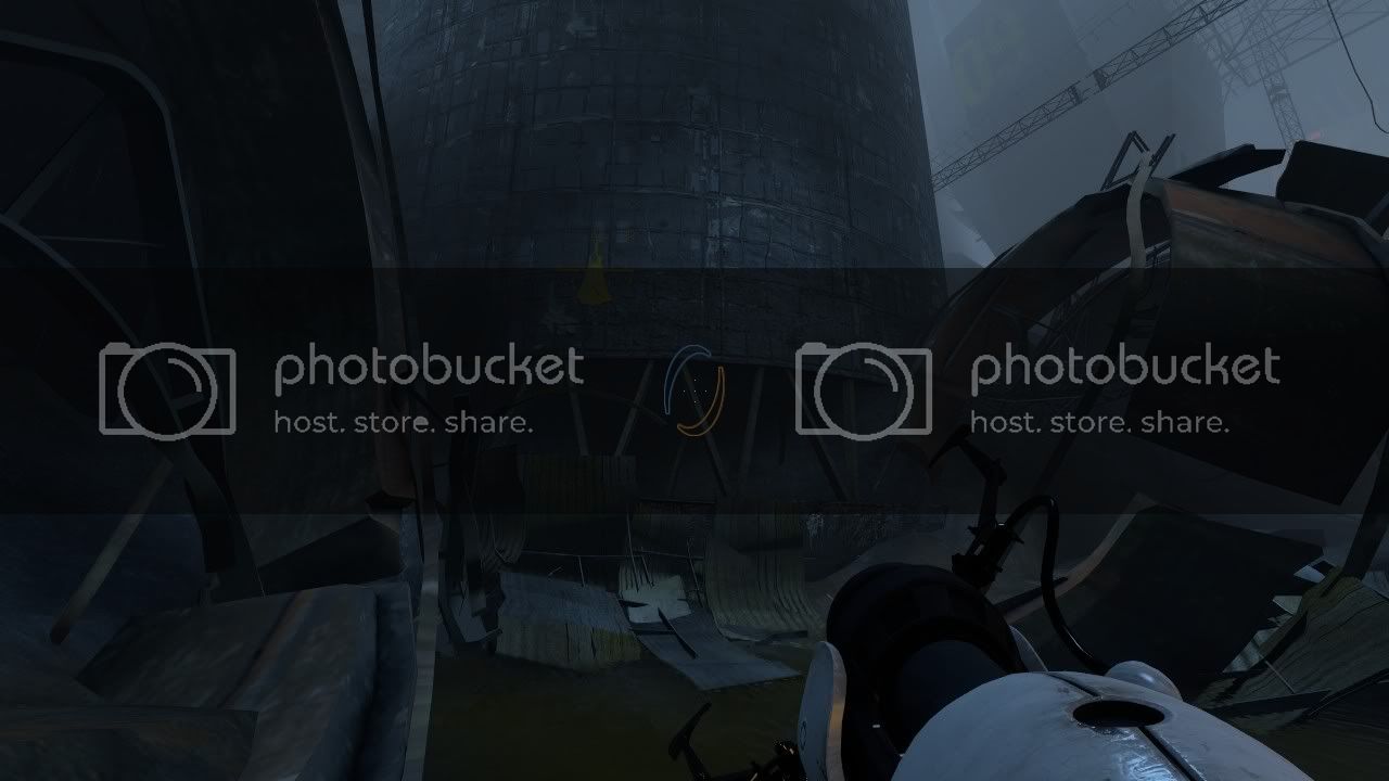
Also some pics showing the bigger levels ( everyting maxed out) A lot of bizzare blue fog and crappy textures is all i see ;(
I don’t really understand the bitching here. I thought Portal two looked pretty good, and had amazing gameplay. I absolutely loved the fact that during the worst economic environment of my lifetime I was able to play a brand new game that I have been looking forward to for years on my two and a half year old rig using maxed out settings (pretty good considering I can’t even run most new games). Many people cannot afford to go buy expensive new PC upgrades currently, especially people like me who have young families at home. I have supported Valve since 1998, and things like this make me feel like they respect their customers.
Good thing you call every discussion bitching, pls die troll …

