yes the Bullsquid is too big
what the fuck
also the demo is boring, 35% effort everyday shooter with cool weapons and nothing interesting at all
10/0
Wasad, make sure that Source SDK base 2007 installed on your steam.
As for the demo, I have a mixed thoughts about it. There are still a lot of work on it, though it’s just a demo.I like new NPSs.
Spooboy, if you are responsible for this mod, than I advise you guys to put more work on it, make it more improvement, IF this demo represent an actual gameplay. Work on bugs, and animations. Anyway I enjoyed it, even if it was so short.
Can’t wait for full mod.
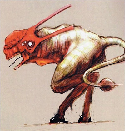
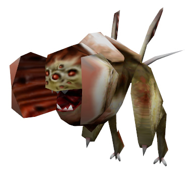
I just want to go ahead and say that I HATE the houndeye. The texture looks like some rough airbrushing with a noise filter on it. The model looks like a really under detailed HE model subdivided a few times. This even applies to the new one you posted on moddb. You can do way better, especially after seeing what you guys did with the charger (who also needs some love in the texture department).
The charger’s animations are pretty stiff too. The feet hit the ground too flat and the transition from leg to leg is very robotic.
There should be a few frames where both legs are airbourne. Check this out for reference. https://www.youtube.com/watch?v=1r-b8uY7C9E
Other then that, and the vortex gun that destroys the game if you get sucked into it, it’s pretty solid so far.
It’s a cut Half life enemy.
Houndeyes were placeholders. They’ve made a better one just after the demo release.
Too bad nearly all the new creatures animations don’t work out good.
And lol about the bullsquid :FFFUUU:
I know. I don’t like the new houndeye either.
I got it into steam/steamapps/sourcemods, but i can’t find a way to launch it… help?
EDIT: nvm, got it ^^
They were cut for a reason.
Yeesh.
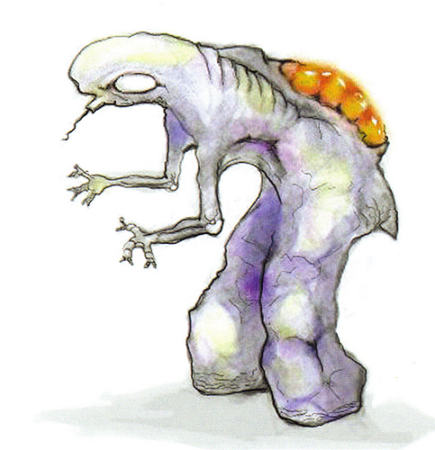
I dunno. The third one could be really creepy if it got psychic powers and a fondness for brain sauce.
If I ever have my own game company, I’m going to keep my cut and old content as fucking secret as I can, so the stupid fans won’t get any ideas or misconceptions of how “much better” and “atmospheric” or some other bullshit, that the game was supposed to be before the final version of the design got made.
It’s like they think the devs were retarded and kept changing the design and show it just to piss the fans off.
I gotta say I like the charger though. I mean it didn’t fit in HL, but I like it.
Also the HL2 beta had some awesome shit weapon wise that was cut.
I’m kinda surprised by all the hate. There’s a lot of good stuff in there.
reminds me of Ramierzoid for some reason
I thought it was okay… yeah, the texture on the Bullsquids is a tad palish, and they look terribly overweight, but i think they have a story element in store for that…
The custom NPC’s need a huge overhaul. Their textures are lacking (especially the Charger’s) and all the new AI’s completely ignored me most of the time, and I felt inadequate.
The level design was a little bland, hills with lots of ground to cover on foot can leave players bored… And there’s no way a reasonable person would solve that battery puzzle without looking at a walkthrough.
But the weapons are nice, and the viewmodels in the trailer look very cool. But if this is an example of final product, I would be disappointed.
I did, in under 5 minutes.
I’ve done it in 2min. Since there’s not much around the map, its easy as hell to find the second “lost” battery.
lol make a Beyond Black Mesa demo
No, that wouldn’t be a great game either.
this happened to me too. is there any known way to fix it? stadium works fine. y’know, i like the way the bullsquids looks.


