On A Rail Uncut - Re-Adding Cut Areas/Scenes (Expansion Project)

Meh, i’d prefer the lighting in the tunnels be the same just for consistency (though that’s just an opinion).
He wants it all to remain consistent for the most part.

And on the cafeteria issue, I don’t think you should go through removing it entirely just yet.
Just try to get it to blend in better with the surroundings first so it doesn’t stick out as much as it currently does.
Lower the brightness of the lights over the tables, reskin the seats if you can to be grey or black, get rid of the checkerboard tile floor underneat the tables, get rid of the plants in favor of some possibly more suitable props (How the hell would plants survive down there anyways unless they’re fake plastic ones O_o) etc…

And on the offices, seeing the post where you layed out your intentions and reasons for designing them the way they are did get rid of some of my concerns. In the end there’s still a lot of time to experiment.

Having a tram stop leading to that area would make little to no sense.
Stairs and elevators leading up to higher floors would probably be a better choice.

Maybe that office complex is just the basement level for a building on the surface or something; who knows.

I guess we need to walk in the maps ourselves and then talk about the ambient lighting and such :slight_smile:

Recording it is good to show us how it looks like and give us an idea what to expect later on, but recording also lowers the quality of everything…

I agree there should be an elevator or two that are malfunctioning. There’s one seen in half-life’s C2A2B2 map. Maybe this is something else you could put around the cafeteria area. Two elevators next to each other with broken buttons or one could be open and partially flooded inside. Elevators make a lot more sense than a few random double doors or stairs considering how far underground you are at this point.
https://i.imgur.com/3pcRY.png

Well, assuming they aren’t being added back in with this, sucks we won’t be able to wander around aimlessly and find hidden nooks and crannies like that with interesting shit in them.
Sure they were there just because, but it was neat finding stuff like that.

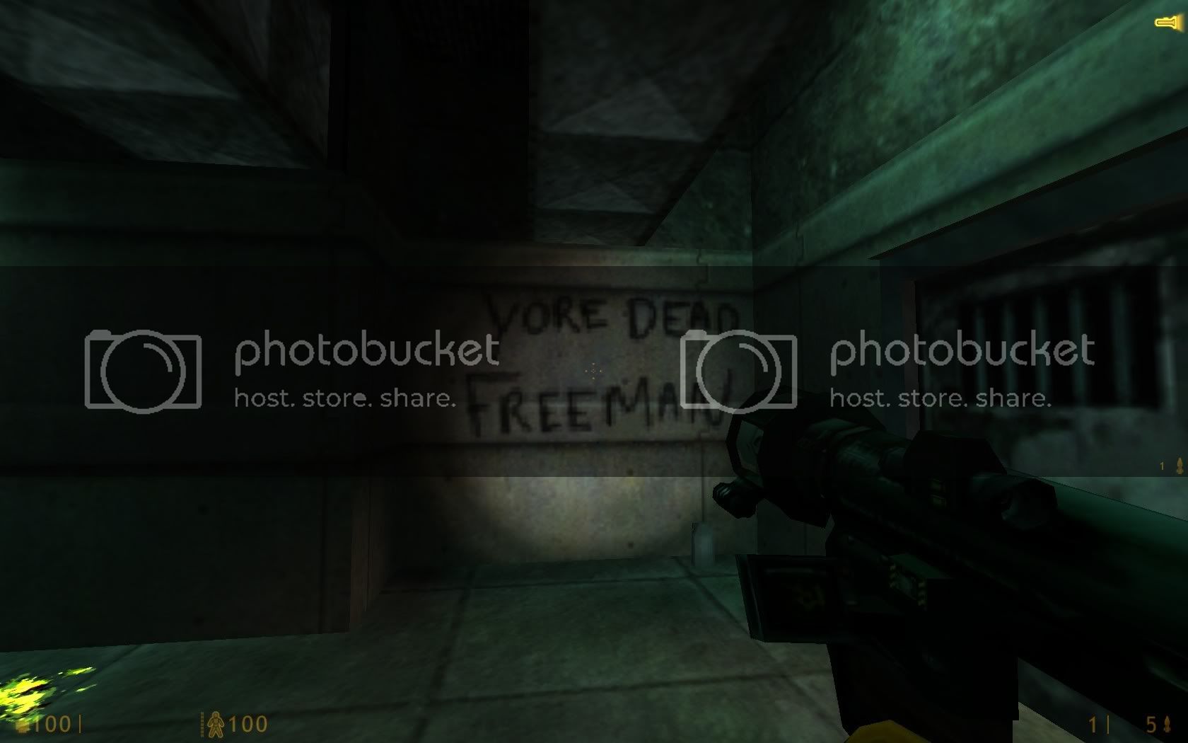
And who could forget:

This has to be somewhere in OaR uncut. :awesome:
Both the ‘Yore dead Freeman’ and ‘Surrender Freemen’ sprays.

(If you think back and can remember that very first video that was released of On a Rail when the grunts had the over the top voices, one of them on an adjacent train firing at the guy playing sounded like he shouted “Squad! Neutralize Freemen!” Almost like it was a reference to it. Of course in the end, those two grafitti sprays were never found in the chapter; only the ‘Die Freeman’ one.)

Okay, here’s my in-depth feedback on just about every aspect of what was seen in the video:

Perhaps one of the first things I’ve noticed was that the lighting in your map is slightly brighter at the beginning. Compare these two shots (the old map, and the start of your map), it’s subtle and I didn’t catch it at first, but I did notice something was off, and that’s what it is. I know you’ve already noted lighting concerns in the office, but I wanted to make sure you were aware of this one as well.

Next up you have the Marine on the boards. I think he should have a Rocket Launcher, but miss his shot, either to the side or to the top. He should also react more, give him a “Fire in the hole!” (HG_THROW00) when he shoots, and a “SHIT!” (HG_MEDIC00) when he misses / before he’s hit. If the tram is going too slow, he should try to run off the boards before it gets close, but if the tram is going full speed, or hits full speed, he won’t have time to. Perhaps there can be a distracting noise (headcrab teleporting in, electrical burst, explosion, etc) near him the instant before he fires, so it’s like he was startled.

Now we have the crane room. My biggest problem with that is the magnet. The magnet looks very out of place due to how friggin big it is, it’s larger than most of the boxes it moves, plus several of the boxes here aren’t even metal. This magnet was modeled to by the kind that picks up and moves shipping containers, it does not fit in such a small loading dock. You should forgo the magnet and replace it with a small hook attached to a very large crate, just like the ones suspended in Unforeseen Consequences. Second, if possible, make the crane an overhead crane (whether or not it’d be fully functional is up to you). Lastly, it’s unlikely that forklift would be able to climb that slope after the red door. There should be a small elevator like the one present under the turret in Office Complex.

The next room doesn’t feel entirely right to me, but I’m not 100% sure why, I think it might be clutter. Maybe extend the rail to the back of the room and remove the computers. Imbed the rail in the ground some as well, they seem to stick out a bit too much. The rail after this, the cross looks strange, maybe you could replace it with a non-interactable turntable? In the next level there’s another crossing, maybe another turnrable location? Just a suggestion. I’ve also noticed there’s a fairly large gap in the rails there too. I do have a suggestion on what to do with the soldiers to make them seem more busy, but I’ll save it for later.

As for the toll gates, I think you could replace them both with a security door to prevent people from going ahead on foot, requiring the player to open a security door at a security station also makes more sense than gates. And rather than allowing both sides of the tracks to be used, you could have a 4-5 car long tram train parked on the unused rail. As for the ‘year of death’ battle, it feels like the Aliens have too much of an upper-hand in the fight, seeing how you are swarmed with Houndeyes and Vortigaunts at the end of it. I agree with the man who said the BSOD computer should be the only light source in that room, it’d look nice that way. The bullsquid in the back should either be removed or eating something, it seems too inconvenient that he just sits there until you come by. The first bathroom strikes me as odd, why are the doors in the floor exactly?

The zombie room is nice, but as said before the corpse should be near the middle of the room, preferably in one piece yet, with zombies picking at it. I also mentioned before that it’d be really cool to have the soldiers fighting zombies as sort of a clean up operation, part of the office could be dedicated to this I think, and hopefully it’s not too late in development to suggest that*

At the Security Office, I noticed the second wave attacks you as soon as you hit the button. It’s a bit cliche I think, and shouldn’t happen. Instead they should spawn somewhat far away, move toward you, and get intercepted by Xenians and end up in another battle. I think that would help show off how screwed things are looking for them, and (most importantly) make it seem like they have more problems than just you.

The cafeteria is nice, keep it there. But dirty it up some, spread the tables out a bit, they seem a bit cramped and there’s quite a bit more than there needs to be. Remove some of the lights up there as well, it’s too bright.

The grates that run under ground are at a bad place, at least it seems that way from the video. They seem to be there for the sake of being there. I think they should be removed from this map, and added to another, as part of the path you need to take. I feel like their current placement doesn’t just do it justice. Lastly, as said before, remove the barnacles above the electricity.

*Perhaps the first wave of Soldiers could be fighting through the Zombies, and the second wave (arriving when you enter the security station) fights Vortigaunts that teleport in? It’s a huge change and I don’t expect you to do it especially considering how well things are working as-is, but I guess it’s still worth mentioning.[/SIZE]

Whew, that was more than I thought it would be, hopefully it wasn’t too much, and I hope it helps some.

just a note but there should be at least one alive scientist some where in the office area even if they are behind a door in a room that the player can’t get to but can see. I say this because the hecu have been shown to be violent but not efficient.

There is not much place for a scientist in OAR, where the area is full of xen aliens and marines. Anyway if there would’be a scientist there, he should also has a role, to either cry out his misfortune to us, or give us some intel, or just push a button.

About the toll gate for security doors suggestion, while the train is the whole gimmick of the chapter, I really don’t think freedom of movement should be sacrificed in this version from the original.

There are already obstacles in place at certain points that seperate the different maps/areas, which require you to be on the train. You should be allowed to move freely and unrestricted while in one particular area or even map. Why would you want to get rid of that or how would it benefit the player/chapter?

And about the grates thing, people keep complaining about certain things because they seem to be in the map just because, but so what?
It adds variety to the environments

  1. You make a good point

  2. My problem is that it doesn’t really go anywhere, or have a purpose, it’s just there.

What

I think it’s a spam bot that was summoned here by the constant discussion of the ‘office complex’.

See, even the spambots want to help liven up the OaR office complex.

I withdraw my objection: the bases look very good. But add destroyed/missing floor tiles please… it will look more interesting/desolated then… and maybe add some lighting in this area, so that the colums are slightly illuminated/cast shadows… will look better then i think. or maybe not… i m not sure…

and mr. someguy is right about the crane and such…

Even though I hated the original OaR I’m so stoked about this. Can’t wait to replay Black Mesa with your ST uncut and now this… Looks great!!

Same here, my only worry is that the soldiers obscene reaction times and accuracy will just numb the enjoyment for me. I find them easy to fight (died very few times on hard), but only in a specific cover-shoot way. I had a lot more fun vs the HL1 military on hard, you could screw around and not be bitten in the ass every single time :confused:

I was considering tweaking their stats in the config file, but I’m worried that it will ruin Uncut, since it’s been balanced with stock settings in mind :frowning:

The fanfic argument is irrelevant. BMS is a REMAKE of HL. ST and OaR Uncut are REMAKES of HL so your standards here need to be higher. It’s irrelevant what the BM Dev team thinks the relationships are between squid/vort and hound/vort. Only Valve can make this decision. Basically what I am trying to do is keep your maps from looking stupid in retrospect. For instance, Valve stated that vorts used antlions for farming and that houndeyes were repurposed to create hunters (not explicity but heavily implied). There’s no way in hell you could have known this w/o them explicitly saying so/creating the enemy type. What if in a later HL game they stated that squids were one of the natural predators of vorts and would ravage their homes and eat them. Then in your map, you see vorts sitting casually alongside squids. This would look really stupid.

What I’m NOT advocating is that you heavily decrease the diversity of what’s in the office complex…I’m just saying that you need be more mindful of how certain enemies should be placed. Case in point: there’s a squid by the cafeteria that’s really close to the vorts. He should not be there as he doesn’t add much to the location (another vort would have been fine) and just introduces a potential canon problem. Simply move him into a location where he’s by himself.

The one potential issue w/diversity is that you may be giving away too many of your cards in the office complex, though it’s hard to tell at this stage. Remember that you still need to make the other 50% of OaR uncut and this area needs to have new tricks and new things that enemies haven’t done before. This is yet another reason why I think OaR lite is stupid…from the start of the pitch bible, I’ve been trying to conceptualize the maps longitudinally so that every section is unique w/unique encounters. People assume it’s going to be the same old shit from HL but it won’t be and they will basically deprive themselves of the full experience w/just 1/2 of the maps.

There’s already plenty of content in the office complex (I’d say more needs to be added to A1) so I’m not necessarily in favor of a massive expansion of the vort side. I think it can be developed by simply porting over several rooms from the HECU side. This helps w/the architectural complexity by making connections between the upper floors of both sides and you can force exploration of both sides easily…I mentioned this in a previous post. Basically, floor 1 of vort side is inaccessable (must start on HECU side) but this side will need to be accessed because the security room needed to lift the boom gates (that’s what they’re actually called so make sure to change your sign) is on the 3rd floor. This adds some linearity to an otherwise non-linear section.

I like them too. The issue here is that it’s a little overdone and the office complex is a little too small to have them as it affects the functionality of the walkways. The number of gaps make the area a bit more complex than it needs to be…this kind of design is more appropriate for a multistory mall rather than an office complex. Should you keep most of them, the thing that I’d like to see is that the walkways are WIDENED. Currently, they only seem to accommodate 1-2 people walking side by side at most, which again is weird, especially in an office complex. The other thing you need to do is make sure the walkway widths in the areas w/gaps are essentially EQUAL throughout the complex. Any asymmetry negatively affects realism.

Re: Cafeteria
Don’t think you necessarily have to delete the cafeteria yet. For the alpha test, I’d recommend you keep it in the promenade but just tone down the scale by ~50% and see how it looks. Long-term wise, I’m thinking the cafeteria might benefit from being simplified into a dining commons (i.e. maybe just a couple of vending machines and a couple of tables w/6-8 chairs) and ported deeper into the office complex. The promenade itself may be deleted as it’s kind of an obsolete relic of HL or perhaps it could be repurposed to become the security office for the boom gates (the positioning kind of makes sense as it overlooks the rails).

Re: Full vs lite
If you’re really going to go through w/this, then 3 versions would be appropriate: Lite 1 (A maps), Lite 2 (B maps), Full. Practically speaking, this doesn’t really affect me but philosophically, the argument for doing this is utter bullshit as it caters to stupid thinking and prejudice toward the original HL map design. See targ’s 2nd post…it’s spot on.

[COLOR=‘Red’]Deleted a shit-ton of flameposts. NONE of you are TextFAMGUY1 and therefore can’t answer for him. If you don’t like the modification there’s no reason for you to play it.

too bad you also deleted some of targs earlier posts he made some important points both about the game and the posters.

This looks awesome. I loved OaR in Black mesa, hated it in half life, but I thought it was too short in BM. Mapping is excellent, but my only criticism is the cafeteria. It’s not it itself, but rather the lighting. It seems way too bright and clean, in the middle of an old rail system. My suggestion is to make the lighting fit with the rest of the office complex and maybe make it a bit less “clean”. Otherwise it’s all great looking, especially in a 3 week period. Keep the work up!

Unfortunately you not only deleted the posts wherein people were attempting to speak FOR Text, but also the one that inspired those responses in the first place, which was a legitimate post speaking TO Text.

Whatever. I suppose now that Text has achieved celebrity status we’ll have to be especially careful to avoid aggressive fans when trying to speak to him these days. B)

Founded in 2004, Leakfree.org became one of the first online communities dedicated to Valve’s Source engine development. It is more famously known for the formation of Black Mesa: Source under the 'Leakfree Modification Team' handle in September 2004.