On A Rail Uncut - Re-Adding Cut Areas/Scenes (Expansion Project)

As I said, it’s mostly me being a bit crazy about layouts and maps and such. But that’s just me. I believe everything will be just wonderful as long as there aren’t any obvious inconsistencies. They don’t have to be in the same place; as long as it feels that way. I’m guessing there are enough twists and turns to confuse even the most avid observer.

So, I meant it not as an accusation, but as a suggestion. I’d imagined that making it exact would probably be unreasonable, and you confirmed it. But I’d still plead you to think about it in some way; so, for example, I’d suggest not to make a lot of long straight tracks. You talked about loops, so that should be enough to make the cohesion plausible if not actually right, I imagine.

There are 4 inaccessible fire doors around the silo, and this is the only place that fire doors appear in the chapter. Maybe seeing the “other side” of these doors (near signs saying they lead to the silo or something) would help tie it together.

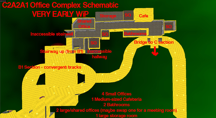
Just spent the past 4 hours designing and implementing the basic layout for the office complex section of A1. It’s far from finished but it’s come along nicely. Due to some of the limitations of Black Mesa’s track systems (uses smooth curves for 90 degree junctions rather than HL1’s use of simple diagonal junctions, which looks a tonne better but takes up a fair amount more space), I’ve had to expand it quite a bit, but this will probably turn out for the best in the end.

My biggest problem with this current layout is that the hallways are a bit too long, but it may be unavoidable. I’m going to obviously dot around interesting things in the hallways so they don’t seem too long and empty. The section of the hallway leading up to the cafeteria/canteen will be 2 stories high, borrowing HEAVILY from the vertical design of C2A2B’s office section (though I’m probably going to expand on that even FURTHER).

I’m not sure what I’ll do video/media wise. I’ve come so far along by this point it seems silly to do a media release for everyone without having it finished. So I might just wait until I’ve at the very least blocked out the basic layout and done some simple detailing. That’ll be another couple days minimum, but it’ll be a much more fleshed out media release than that which I’d intended, which is great.

I know Wangman was interested in the design for this section, so I figured I’ll post what I’ve done so far and see what everyone has to say on the design of the complex section.

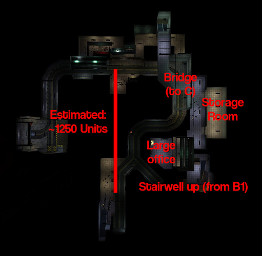
Office complex length: Approximately 2,900 Units (for reference: street on C2A5H was about 3,000 units long)

For reference here’s how it looked in HL1 (oriented differently, sorry about that. Labels should make it all fairly obvious though)

This sounds like an excellent idea.

@TEXT
Thanks for posting the schematics. Just finished relocating so here’s the additional feedback/input: based on what I’m seeing so far it looks like you’re staying VERY faithful to HL’s B1+C, which is good as this will make it easily recognizable for the HL vet. However, I’m going to make the case that you should make a 1:1.384 remake (roughly speaking) because I think based on your abilities, you can do BETTER than a 1:1 remake. I talked in the pitch bible/other posts about expanding VERTICALLY to increase the sense of scale and HORIZONTALLY to increase the sense of distance and it’s good that you’re taking that into consideration. I’ll touch more on this later but what I DIDN’T mention is that you should also expand the VORT side. If you look at HL’s B1+C (especially C), you’ll find that the vort side is heavily underdeveloped (read essentially unexplorable) and I see it in your work as well. It would greatly benefit you to expand this further as this area would be novel and would offer the most flexibility in design. You’re basically bound by otherwise rigid constraints for the rest of this map (since it was well designed in HL) which means that this could potentially end up being the most uninspired of your 3 maps. The vort side could serve as a nice but small showcase of your creativity. Below are some additional suggestions and random thoughts for the complex (in no particular order):

-The size of the café and bathrooms implies to me that there should probably be more shared offices than what’s there currently (i.e. more employees). The nametags in these offices could have the last names of the forum members who have helped you w/ST_uncut and/or OaR uncut as well as your last name to keep spirit w/the AM lockers and QE administrative sections in BMS.

-The storage room you made would be ideal for a houndeye vs HECU battle. If you pack the area w/a lot of small boxes, it could make for some cool physics scenes w/a minimal amount of scripting.

-If possible, consider scripting a sequence where the .50 cal is DESTROYED (e.g. a vort blast blows it up). I think this is essential for storytelling as the vorts need to win this battle (they lose in BMS’ B ) and obviously they would have little to no chance of success if a marine got a hold of the gun. Note that in this scene, the player views the .50 cal from the side rather than the front which looks really stupid because the HECU do not actually hold the weapon (they just hold up their fists in midair). Also, the gun is really in a useless position for the player as it’s wedged BETWEEN both the vorts and the HECU. It’s no big deal if it’s destroyed because there’s plenty of opportunities to use it later in the chapter.

-As was noted before, the major problem w/OaR is its content, which you could improve upon both in quality and quantity. Regarding the latter, you should follow the basic rule of “more room, more content” as you don’t want to jam all the features into a tight space. Based on your track layout, which is faithful to HL and as a result relatively short, I think your best bet now is to expand VERTICALLY. It should be possible to incorporate a third or perhaps even a fourth floor to the complex, as it is located very deep underground. How much you want to add simply depends on how much new content you can imagine but the extra floors will allow you to showcase your creativity moreso than the original 2.

-If there are multiple floors in the complex, any scientists/barney survivors should be in the TOP floor assuming the HECU are the only ones killing them and nothing is teleporting in. If the player makes it to the top, you could have new spawns appear in lower floors to force the player to actually do stuff while backtracking (he could have a barney buddy w/him).

-The key thing you should always consider w/spawn placement is if the spawns actually make sense. For instance, if the HECU are fighting vorts on floor 1, would the ones on floor 2 come down and reinforce? If not, why not (e.g. are they preoccupied, dead)?

-There’s 2 additional room types that you haven’t added which would make sense in the office complex: 1) a security office/help desk w/maps of OaR 2) a mini-armory containing a gunrack; the gunrack would be useful later on for ammo balancing; just don’t overload it as OaR is kind of an ammo-neutral chapter (e.g. no net gain or loss). Perhaps both of these features could be implemented on the VORT side or a THIRD floor.

-The color scheme in BMS OaR is really bland and consists primarily of grays, oranges and browns. You could spice it up a bit in the office complex by giving each floor a different color scheme. The ground floor wall would have the same flat yellow coloration as the BMS office complex in B. However, the other floors could have like a flat red or blue wall (i.e. primary colors theme, the blue pays homage to the color scheme in HL).

-A narrow stairwell would be a really great place for a barnacle eats marine script.

-As the office complex is fairly non-linear in HL (you can start exploring it from EITHER B1 or C or not at all), you should consider a variable scripts model for the scenes. For instance, if the player is in the underground hidden area of C, he could see a pair of bullsquids chasing a marine. However this scene does NOT trigger if he doesn’t access this area. Similarly, if the player first approaches floor 1 of the complex from B1, he could see a pair of marines being chased by 6 houndeyes. However, if he approaches from C, he instead sees a pair of marines gunning down a bullsquid. This design philosophy has the advantage of ensuring that the player doesn’t SEE the spawns appearing from thin air, which is especially important here because NONE of xenofauna in this chapter teleported in. It’s important to retain this feature as best you can…imagine a large pack of houndeyes teleported in front of a group of soldiers. From a story perspective, the player might get the impression that Nihilanth was using them as troops (in actually their presence is just a manifestation of random portal storms). This would be the equivalent of Earth invading Mars by first sending in waves of zebras, lions and giraffe before the actual army which is stupid.

-Once you release your A1 map for testing, make sure to use the same ammo/health placements (ESPECIALLY the positioning of the health/battery chargers) as in HL. Additional ammo/health that may be needed can be added in different places but it’s nice to keep fidelity w/the original placements first. It’s OK if health is sparse initially…we can godmode it if need be and things will balance out over several iterations.

-At the very end of your A1 map, you could have an elevator section where the marines follow you on a separate lift (essentially a faithful port of the cool sequence at the beginning of HL’s B1). This also has the advantage of forcing the player to keep the tram instead of ditching it for travel on foot. Note that since the player has NOT encountered the rocket yet, it’s irrelevant which way the tram moves (though up might be the most reasonable).

Finally, I want to reiterate this idea from the pitch bible as I’ve figured out a way to make it fix several of the problems associated w/the office complex:
-For combat music, I’d strongly recommend The Year of Death as it’s such a nasty track. Imagine it going off once the player gets to the second floor of C2A2B1. You could give the complex extremely poor lighting, w/only flickers showcasing the nasty handiwork of the HECU (e.g. scientist/security corpses). All of a sudden you see the eerie eyes of the nightvision marines approaching you or a pack of houndeyes lighting up the room w/their biouminescent attack, forcing a battle in otherwise near pitch blackness. This reinforces the ominous nature of HL OaR which is missing in BMS but keeps to the piano theme of BMS OaR, showcases the flashlight (would be even better if it had a battery life) and requires minimal redesign of C2A2B1 and C2A2C, which were nicely done. The complex could be illuminated after the battle by hitting a power switch.

So one of the issues w/the office complex is that it’s entirely optional in HL. You could just flip one of the toll gate switches in HL’s B1 and move all the way to C and D w/o ever exploring the upper floor. From a developer standpoint, this is kind of lame as it bypasses a lot of the hard work you will put into this map, making the office complex essentially an extraneous element. One way to integrate this idea w/some of my other suggestions is to make the toll gates NOT ACTIVATABLE w/the switches (i.e. delete the switches). BOTH gates will instead be lifted by hitting a switch in a control room on the THIRD floor vort side, which will be made obvious to the player once he gets to the office complex (similar to the claw control room and its spatial relationship w/the claw). This will allow you to develop the vort side further and create a sort of yin-yang w/my idea. My office complex side (the HECU side) will retain the same architecture as HL but differ in lighting whereas your side would have a completely new architecture but retain the original HL lighting. This should create an interesting stylistic contrast. Functionally, the complexes would be designed such that you would need to explore ALL sides in order to reach the control room (e.g. certain levels are blocked off in the vort side and HECU side). This would create a subtle linearity in an otherwise non-linear section, which quite frankly could benefit from a little more structure. You could even use a HL B2 element by connecting the two sides w/a deployable drawbridge that works after hitting the power switch.

Advantages:
-2 contrasting themes in lighting and architecture which create familiarity but novelty at the same time
-integration of a community project that got shafted by the devs; I think some of these guys deserve to have their day in the sun; as OaR uncut is a COMMUNITY project, it’s fitting that their work should appear here
-darkened section and the Year of Death track reinforce the ominous nature of HL OaR, which is missing in BMS OaR; the music is thematically consistent w/BMS
-forces the player to actually explore the office complex, no longer making it an extraneous element
-provides a showcase for your creativity in the vort section while giving the office complex a fresh new take

I don’t have time to write a reply right now as I’m actually pretty busy with real-life stuff (as I’m sure you are with your moving, thanks for taking the time to write all this btw!), but suffice to say I actually agreed with almost everything you put here, in fact 50% of what you wrote I was already planning to do (Year of Death in particular, that song is PERFECT for this section!).

I’ll edit this post later (read: in 3 - 4 hours) with a more detailed breakdown of what I’ll do.

I also really like the locker names idea. It’s a very nice way of having a nod to all my testers who’ve put so much hard work into this project, even if they haven’t been direct developers. I’ll fire out PMs later on today to those I think have made a big difference, to gather a couple surnames/permission. Should be pretty damn easy as I can skin/texture to a fairly competent degree.

Sounds good man…I’m gonna write up another post when I have time regarding targ, someguy and arctic’s feedback…I’ll post it here. Arctic said something that was actually really problematic regarding the layout…I think I have the solution but just need more time to mull over it.

Nice idea to add names to the lockers.

Wow… i have a feeling that it will be very very awesome… very nice and atmospheric ideas/concepts so far… ! make it a 3 or 4 story office complex… partially dark with night vision hecu or so… make it detailed and believable… and claustrophobic… deep in the belly of the black mesa research facility… i’m looking forward so much!

I agree with most what Wangman said (very nice post, I really don’t know where you find the time o.o), apart from one thing.
I am not sure, where you get the impression in Half-Life, that the HECU is loosing the battle during OAR. I replayed these areas in Half-Life 1 recently, and never felt like that.

Yes there are corpses here and there, and they take casualties during the fights, but it’s a war after all (It mostly looks one-sided, because Valve never bothered to put Xen corpses anywhere). The fights are usually slightly HECU favoured.

Especially, when you look at the areas, that follow OAR, the military is still perfectly in control of the situation (not saying they contained it, but they are staying very strong).

It would be very inconsistent to have them get slaughtered in the tunnels and then having them appear calm and in control during the following surface chapters.

I think that Text’s portrayal during his ST Uncut chapters (Great work, loved them) really nailed that critical moment of the military, so I don’t see any reason, why that should suddenly happen so much earlier in the game.

@Stefan
There’s several reasons why I think the HECU are losing:

  1. Next to EVERY bullsquid in HL OaR is always 2-3 marine corpses WITHOUT EXCEPTION. This implies that the HECU engaged w/them in the past and lost. If you do the math, the number of bodies probably adds up to ~30-40% of all of the marines in HL OaR (rough estimate, I didn’t calculate it out). That’s a lot, considering that they are dying to xenoFAUNA…hell it’s not even the alien military proper. The only thing that’s bizarre about HL is that the HECU never actively engage the squids, which this remake will correct and show WHY the body count is there.

  2. SOOO many defensive emplacements scattered throughout OaR. Why? Their mop up operation would have gone much faster had they just sent teams out to kill unarmed/barely armed scientists and security and the Xen aliens…but they’re not doing this which implies they are having trouble.

  3. Re: inconsistencies w/slaughtered marines in OaR vs other chapters: there is no inconsistency whatsoever. If you look at HL OaR, you’ll see that the aliens are in control for the 1st 1/3 of the chapter. The 2nd 1/3 is highly contested. The final 1/3 (near the SURFACE) is under HECU control which resolves your argument. Storywise, there’s also a bunch of ways to resolve the enemy distribution. For instance, there’s more defensive emplacements end chapter so the HECU fare better here vs xenians. However, once they established control and started sending expeditionary teams through the tunnels, many of the teams were killed off because they underestimated the number of xenofauna and had no defensive emplacements to retreat to.

  4. I am in favor of keeping this “rule of 1/3s” for enemy placement because it makes sense and adds diversity to gameplay which is EQUALLY important to my interpretation. I’m not arguing for the HECU to lose EVERY alien engagement. I’m arguing for them to be PREOCCUPIED w/aliens and to lose ~70% of their engagements. This is pretty consistent w/what happens in HL and makes the focus of the HECU greater than just Gordon. In addition, this is essential for maintaining gameplay diversity. You already fight HECU through ALL of WGH and ST and you have to deal w/them in almost every other chapter. Do you really want 70-80% of OaR to have just HECU engagements? Not very fun for a remake is it?

Devil’s advocate here, but it’d be more like sending rabid attack dogs in before ground forces. In fact, the Combine use this strategy to the tee, with their headcrab canister bombardments.

I somewhat agree that the HECU are suffering heavy casualties to the aliens in this chapter, but at the same time they have also completely shut down the rail system. For the most part they still have control over the entirety of the rail and are fighting an ongoing battle with the aliens at the time that Gordon comes through. Had Gordon not come and finished them off I believe they certainly couldn’t be considered to be losing as they have multiple gun emplacements that the aliens clearly weren’t able to handle. Personally I think neither side is ‘winning’ in On A Rail.

On another note, does anyone know why screenshots taken in BM come out so dark? It seems like when I use print screen they are much lighter than when using the in game screenshot key. What do you guys use to take quality screen shots that reflect how it looks in game? Using print screen and pasting them is time consuming. These will be useful to compare design elements found in the chapter compared to parts of these new additions when the time comes. It wasn’t as much of a problem in ST Uncut because there was a lot more light while OAR tends to be pretty dark.

I don’t really care if the HECU are winning or losing in OaR. Honestly I know it matters to the story I guess, but I don’t really mind if it doesn’t happen.
I just want to see more aliens in general. It felt like their absence was severely neglected. I think there is…1 proper alien vs grunts confrontation (Vorts vs HECU just before the shuttle priming if I remember), and then that’s it. Otherwise the few other aliens were just placed in places or teleported in, but there was no actual plot to it, if that makes sense.

I’m really interested to see how you make things and how it turns out. Can’t wait for some in-game shots.

So there’s been a fair amount of dissent regarding my suggested slotting of the HL section spanning the 2nd ½ of D to the 1st ½ of G (I suggested placing it AFTER BMS’ B map, similar to HL). I really feel this issue needs to be put to rest as TEXT is not too far from starting these sections, at least in the planning stages. This issue is worth discussing because it’s a fundamentally gamebreaking issue if done incorrectly. This isn’t a matter of opinion like what’s your favorite color…in this case, there really IS a correct (or at least best) interpretation and an incorrect one. I’ve basically distilled all of the complaints into 3 arguments and am going to try to drive home the idea that the current plan is the best plan:

1. After priming the rocket, the 2nd half of OaR_Uncut would feel redundant (i.e. put all of TEXT’s sections BEFORE BMS’ B ). From Someguy, Stefan.
Advantages w/my proposal:
-See TEXT’s argument regarding “meta perspective.” I really couldn’t phrase this better myself.
-Stays true to Valve’s philosophy of orienting you to your objective at different points. You see the rocket once mid-chapter during priming and once end-chapter during launch. W/o my proposal, the only mention of the rocket would be at the end of Power Up.
-Prevents the following theme reduplication: Office complex -> Materials transport -> Office complex -> Materials transport and therefore works w/in the constraints set by BMS better.
-No need to fundamentally overhaul the 1st ½ of HL’s G (and possibly earlier sections).
-Keeps the appearance of features chronological, which is important for the player’s recollection of OaR. EVERYTHING else in the rest of BMS adheres to this philosophy so there’s absolutely no reason to depart from it.
-Ask yourself if the second half of HL OaR felt redundant…boring maybe, but redundant no. This can easily be fixed.

2. If new maps were slotted between BMS’ B and C, why doesn’t the military disable the rocket after you prime it (i.e. too long of an interval between priming the rocket and launching it)? From everyone (including TEXT).
-Simply put, this is a non-issue because the problem exists BOTH in BMS OaR currently and w/my proposal so it’s an unfair argument. If you look at BMS now, why didn’t the two soldiers in the launch room just fire an MP5 grenade into the control panel or shoot it up after they noticed the priming?
-Everyone who has an issue w/this is assuming the HECU were ALREADY on the surface but this is pure SUPPOSTION and can easily be addressed. For instance, maybe the surface marines were reinforcements that were deployed IN REACTION to priming the rocket, in which case you could add a nice story element.
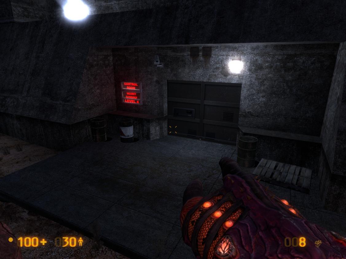
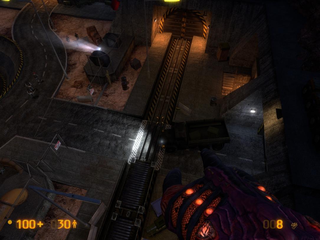
-I can think of 2 very nice solutions here 1) there’s a converging track element in the 2nd ½ of HL’s D by the bullsquid/sentry trap. You can make this a DIVERGING element that leads into the tunnel taking you directly to the rocket (this happens post-priming as it does in HL). As the player explores the tunnel, he sees a marine detonate a dynamite trap to seal the tunnel w/rubble. Storywise, this buys him enough time to reach the surface and call for reinforcements. Gordon is then forced to take the long route. 2) somewhere in the remake of HL’s mid E to mid F, you can have the player reach a security room where he sees (on a video monitor) marines deploying around the rocket in BMS’ C. This IS actually doable as there is a perfectly positioned camera right outside of the control room (image 1). You could even have 2 marines enter the room to represent the ones that killed the scientists inside. Also note that on the surface, there’s an M35 w/its headlights on (image 2)…this implies that the marines reached the primed rocket recently so their deployment makes perfect sense when seen through the camera. If you really want to get fancy, you could even have them drop down around the rocket by rappelling from an Osprey and capture this on camera.

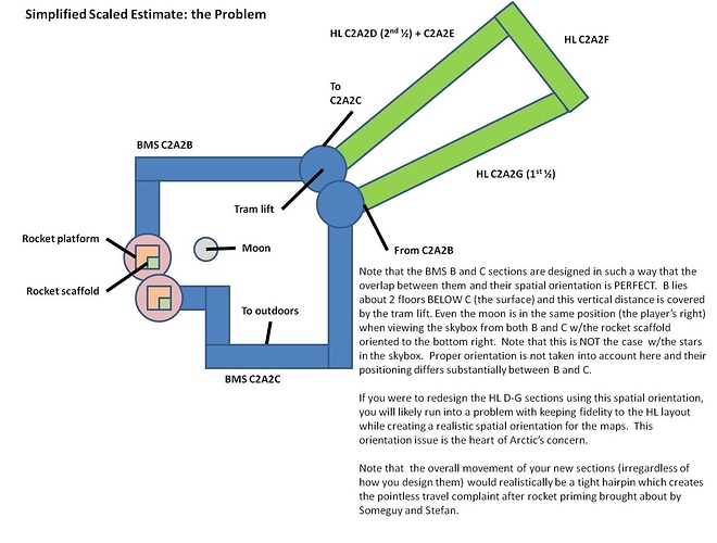
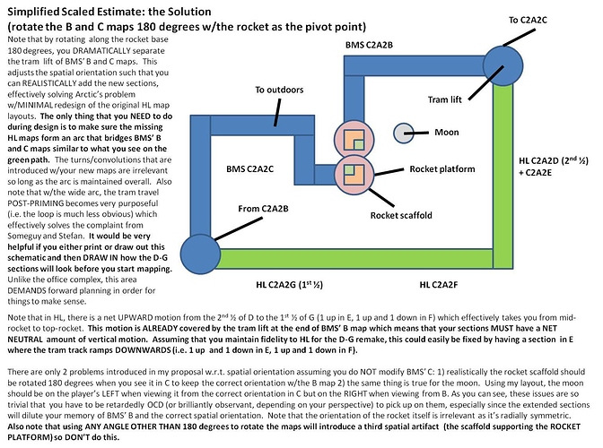
3. Slotting issue w.r.t. spatial orientation when introducing new maps between B, C. From Arctic.
-This to me is the only major problem to my recommended map slotting. If you look at BMS’ B and C and their relationship to one another, you’ll see that the two maps slot PERFECTLY into each other. W/my proposal, the map slotting will be slightly less perfect but the imperfections are essentially trivial. The images below offer a complete discussion (a critical read for TEXT):


Aliens don’t always win in Oar in Half-Life.
The first one, the HECU wins because they have the turret but in the second battle, more vortigaunts spawned so the HECU loses that round.

I think we should have the battles go either way. OAR doesn’t necessarily showcase their losing, but their struggling. Text’s Surface Tension showcase their losing excellently, and the air war in FaF solidifies that. I think OAR’s battles should be relatively equal. Personally I would like to see a part where some Vorts try to attack an HECU stronghold and get decimated by the machine-guns and sentries.

Yeah that’d be good. Like Wangman said, you could have the bullsquids near some dead marines or something, but likewise have something like dead zombies, headcrabs and even vorts where some HECU are to show that some “off-screen” fighting has happened and both sides are putting up a fight.

Figured I’d give a progress report and briefly address some of the concerns which have been presented here.

Progress on A1 has gone well, very well, but it’s progressing slower than I’d hoped, primarily because the office complex has turned out to be a much bigger undertaking than I’d estimated - that and I’ve expanded it significantly, I’d estimate it’s 2.5 - 3 times larger than HL1’s, and it currently has 16 explorable rooms (the original HL had only 3). The layout has been designed as such that you cannot really progress without traversing the whole office complex, which I will pack full of interesting stuff. At the end of the C map section is a large security door which blocks both pedestrian and tram access, and obviously, by the B1 section of the map are the two toll gates which block tram progression. To lift BOTH these restrictions, the player must activate the master override in the security office, which is on the top floor. I’ve designed it like this, again, for pseudo-non-linearity (whew, that was a mouthful!). If the player chooses, at the toll gates, they CAN progress on foot to the C section of the map and participate in the fights/scripts that happens, but they will not be able to advance further than that until they go to the office complex - forcing them to now enter it from the rear. Or, alternatively, they can enter the office complex from the front, right at the toll gates, by where their trams are stopped (I foresee most players doing the former). The office complex is laid out so that there’s a stairwell at either end, with the security office being near the middle of the top floor. It will be clearly marked and the players SHOULD know that they need to go in there. So, that’s my office complex layout explained.

This is probably going to be the most original section of my remake sections.

However, this map is turning out so massive, I’m starting to doubt the viability of me making 3 maps. I’m forseeing in the future that I may end up making 2 extremely large maps, instead of 3. The problem with 3 is that I’m almost certain at this point it will end up overextending OaR, which will end up creating the same problem the original had - the feeling of tedium. I can probably realistically condense the original maps down into 1 with a bit of magical jiggery pokery, particularly if I make my map as massive as A1 currently is. But…I’ll play it by ear, for now. If, once I start working on it, 2 maps turns out to not be enough, of course I’ll make it 3. I do think that realistically, removing some of the “filler,” I could quite easily do away with a third map. I’m also edging towards not having an original section anymore, as the office complex part of A1 is turning out to be pretty original anyway. But, my idea for the beautiful vista view will be so memorable that I will still map that section in somewhere, my idea is just too nice in my head to not attempt to create.

The other issue is I’m probably going to have to end up editing Black Mesa’s B map, for a few reasons. I’m pretty certain I’ll need to remove the surface access lift from the end of the map to prevent myself from contradicting Black Mesa’s layout too much - instead I could make it loop round at the end. I also almost certainly need to edit the map’s opening, as it is currently identical to my A1 map, which can most likely be noticed by anyone. I’m most likely going to have to edit it so that it’s a straight transition through the door rather than using a turntable lift.

In terms of some of the issues discussed here - I plan on making the HECU/Alien fights roughly 50/50. In all honesty it doesn’t make too big a difference if they’re losing or not - the chapters just need to show that they’re preoccupied and at the very least being threatened in their control of the facility. I’m not going to balance the scripted battles anything like as meticulously as I did for ST Uncut, as in ST Uncut the HECU losing was a vital story point - in OaR it works alright either way, really. They certainly will not be losing anything like as hard as they were in ST, however.

So if you do make 2 maps, in what order will they be? Will they be right after each other, or will one split up the priming and launch?

If it turns out to be the second one, then it should be pretty easy to make the map double back to the rocket (on a roughly U shaped path). Perhaps the surface vista you want could be at the far end of the map, just before you turn back? You could also make the player activate a security system near the start to keep the infantry preoccupied, but also force the player to be a bit more careful (like in Office Complex, plus it would be funny to sneak by a military encampment and activate a turret right over their heads).

@TEXT
Re: Editing BMS maps

Of all of the maps I thought you’d need to edit, I figured the BMS C map was the most problematic (more on that later). The issue w/editing the maps NOW is that they will almost certainly be different and better after the Xen release, at the very least w.r.t. bug fixes and possibly also from scripting, gameplay balance issues and details. Assuming that your work will NOT be integrated into BMS proper, this means that in the long term, players will have to first download and install the new post-Xen BMS, THEN reinstall OaR and ST uncut. The problem here is that your maps will package OLD and essentially obsolete versions of BMS maps (e.g. the 1st FaF map) which nobody wants. This means that you’ll have to go back and add the changes to the new FaF map (and potentially new OaR maps based on your strategy)to ensure compatibility w/your mod. It basically doubles your work.

I actually don’t think you need to edit BMS’ B at all. If the opening of this map is identical to your A1, then change the opening of your A1 as this will minimize your work long term for the reasons described above. There’s no contradiction w/keeping the tram lift at all (see the 2nd diagram on my previous post). Since the lift takes you up, just add a down sloping section in the remake of HL’s E to negate the height. Again, this is better than getting rid of the lift in BMS’ B because it saves you work long term. I was playing BMS OaR last night and the B section ends BEFORE you actually get on the tram lift. The lift currently rotates 90 deg to the RIGHT. Once you start designing your B1 section, you can adjust this rotation however you want to get the late D to early G remake to slot perfectly w/the rotated BMS C map (again see 2nd diagram). If you can do this, it would be a remarkable demonstration of your mapping skills and forward planning and is something you should gloat about in your videos.

As for the BMS C map, I think this is the most problematic one by far. If you were to edit it, you could potentially address several problems: 1) deleting the Mat Trans C. logo so that your materials transport sections are no longer a giant section of C (instead could be labeled D, E). 2) fixing the chirality issue w/the rocket platform and moon. 3) correcting dev errors…most of the important aesthetic issues and bugs are here 4) making additional adjustments so that your B1 and B2 maps fit seamlessly w/C (e.g. adding more cameras to capture HECU deployment post-priming). All of these are minor to trivial problems but they do add up to a fairly important issue. Note that you would have to re-add these features though to the updated BMS C map in the post-Xen release.

Re: 50/50 HECU fights
This works fine as long as you add a fair amount of HECU corpses near the xenofauna to keep spirit w/HL. Since the vorts lose the battle in BMS’ B, I do think they should WIN every other battle (assuming you re-add the 2 battles in HL’s B1+C) since they are part of the alien military proper. It just makes sense for the HECU to fare better vs xenofauna.

Re: 2 maps instead of 3
I think the latter 1/2 of OaR should be represented w/2 maps instead of 1 massive map. The thing w/BMS is OaR is that the maps don’t scale 1:2 w/HL maps…it’s MUCH closer to 1:1. This means there’s so much content that would be missing should you compress the late D-early G sections of HL OaR together, especially since E alone is massive. Note that there’s no reason the 2 post-priming maps would have to be the same length as the office complex map. They could be a little shorter and this would probably be better for performance anyway. My vision of these maps is less clear than the office complex but I’m thinking that there’s lots of eye candy that can be put in these maps (e.g. houndeyes rushing defensive emplacements, marines setting traps, loaders moving boxes, conveyer belts, etc) as well as a fairly complicated electrical puzzle that can be put in HL’s early F to break up the action and replace the otherwise uninspired electrical obstacle there. The eye candy would be a very nice replacement to the “filler” that you’re mentioning and it would all be visible (and non-interactive) while the player is traveling on the tram. This accounts for the need for additional maps (i.e. more entity count, brush strokes, w/e) but also does NOT make the maps tedious as the player doesn’t have to stop and go. This is similar to Highway 17…the chapter is massive but doesn’t feel tedious because so much of it is covered by car. 2 maps will also allow you to develop that outdoor vista section far more. All the skybox work isn’t worth it if you only see it for a tiny stretch.

Founded in 2004, Leakfree.org became one of the first online communities dedicated to Valve’s Source engine development. It is more famously known for the formation of Black Mesa: Source under the 'Leakfree Modification Team' handle in September 2004.