Hazard Course Remake (AVAILABLE NOW!)

Noted. The ladder is supposed to stand out, since it’s the point of focus in the room. I do agree that both it and the railings could look a bit dirtier, but unfortunately that’s not my job… Lars (our propmaker) is the one in charge of model skins and all that stuff (for the moment, at least). I really don’t have control over how dirty the model skins are.

I’ve already passed word along that in general the models could have a much more used look. Thanks though! :slight_smile:

I have no idea what you’re talking about. Mind elaborating?

EDIT: Oh I see what you mean. It’s not clipping through the silo; the model is built that way (with the gap in the middle). I think it’s weird too, but at the moment I was more concerned with getting the lighting right than with minor details like that. I’ll try and position it to be less odd-looking later on.

When did I say that? :brow:

My take on the situation is that the developers of those projects have simply had far more time to devote to their work than we have. Crypt and BoxNoob have both been busy, and I have had college applications to deal with. The only consistently free team member is our propmaker Lars, who has done a phenomenal job so far. I cannot stress enough how quickly our levels are transforming because of him single-handedly detailing all of our levels, even when we the mappers are busy!

Lately though, we should be much more free to work on things. I’ve just been accepted to college, so no more writing college admittance essays and such. Dunno about the other mappers, but I’ll soon be redoubling my efforts in both this project and my Gonarch’s Lair project (no I haven’t forgotten!) as soon as I have my current school grades locked in at an acceptable level.

I feel an urge to respond.
Many times I have read comments like those: “dirtier”, “grittier”, “darker”. Why?
Consider; this Hazard Course is a workplace, there are people working here. Here you bring new employees to have them practice in the use of a sophisticated, highly advanced protective suit.
Now, are you trying to keep them employed or scare them away? Because there is no better way to lose personnel than showing them that you can’t maintain the working environment.
It may be old, it may be worn but dirty, dark, damp? Hell no. :slight_smile:

People used to work there.
Black Mesa was an used missile sile complex.
As for the convention, I need a clear answer when it is.
Since there is a huuuuuuuuuuuuuuuge communication gap that needs to be fixed.And probably some other topics to be discussed ofcourse.
Off-Topic ~ (Just a heads up) Michael said to me he’ll upload the Gina renders today.
@Crypt Jeff said that :stuck_out_tongue: .And the other released projects were made by 1 person, with the help of the community by beta testing and critisising W.I.P.As for the crits, we really lack feedback from the community.
@Dky You can have controll over how things look like.If Lars made multiple skins for models, you can easily decide if its fits or not (I’m sure you were already aware of that though, but just sharing my thought :stuck_out_tongue: )

Doh. I meant Jeff but was thinking of Dky’s post, therefore misquote. Congrats on the acceptance, by the way.

Although I mostly agree with you, look at how clean the ladder and rails are compared to everything else. Everything looks rusty, scratched, paint peeling off, etc. but the ladders look like they’re from a much newer part of the facility. I suppose you could argue that it was recently added for the HC, but it’s not a story that tells itself.

Couldn’t you make it look like an old part of the facility that has been mostly fixed, but still has old stuff? I mean, make the rails, ladders, etc. look new while for example some of the walls would look still more or less under construction?

I just think it needs to be a little dirtier or rusty, and not so shiny new. Not decrepit or anything, but not exactly straight from the hardware store, either. Show some signs of use.

The problem seems to stem from how overly saturated and bright the colors are compared to the rest of the facility. It just doesn’t seem to fit. Not to mention that they’re all very oddly uniform.

It’s a very well-known fact of gaming and art psychology that it’s much easier to make something look realistic when you make them irregular in texture. The easiest and best way to do that would be to make them just a bit more worn. Right now everything seems too clean and uniform, which makes them look like they’re from a video game, which, incidentally, they are. It breaks immersion.

I’m not saying that they should be falling apart. But let’s start by fading the colors on background objects such as railings. Then, just a bit of dirt here and there, or some small flakes of paint chipping off (and maybe haphazardly repainted), or just a little tiny bit of rust in irregular intervals would do the art direction wonders, and make the levels just that much more immersive.

The Hazard Course, after all, is a converted silo/industrial complex. Worn-out objects would be fitting with the theme and psychologically convincing to the mind, no matter how you try to put a logical backstory to cleanliness.

Not to mention that there have probably been hundreds of trainees before Gordon. Things SHOULD look like they’ve been sitting there for years, if not a decade or so.

Off-topic, just a heads up, I uploaded a slightly modified version of the map 02c to the Dropbox. It should fit seemlessly with Dky’s follow-up map.

Well, the textures are temporary. I’ve used a few ‘general’ textures just to have something to work with. It’s a bit more complex to make textures for (almost) every prop. (We could use a texture artist :wink: , which I am not).

Of course. We don’t expect you to do absolutely everything at once. :stuck_out_tongue:

But that brings up a good point. We need a good texture artist. The models are getting along pretty nicely, but the skins could use tweaking.

I’d hope and imagine that texture artists would be more prevalent than the rare and elusive concept artist we’ve been looking for.

Suit renders are up.
Done by Michael Tannock.
As for the textures, Michael could help us with it.
Same for the concept art.

I was about to go on a huge rant about how I was expecting 3D renders and not concept art, or how we didn’t really need a whole new female suit model, and how it would take forever if the concept took months, and all that yada yada, but then I saw the image in it’s 20MP glory and realized it actually was the model.

It definitely looks nice. Actually, very nice. I do have one concern though. Compare it to Black Mesa’s HEV:

https://wiki.blackmesasource.com/images//4/47/Hev_suit.jpg

Some of the changes the team made to Half-Life’s version he rolled back against, for instance the joints with low amounts of room to move. He should take a look at this old pic and make some changes accordingly.

https://wiki.blackmesasource.com/images//8/87/Gordon_analysis_01.jpg

The color also contrasts greatly. It’s not a huge problem, but it’s definitely noticeable. Also, the electronics on the stomach/chest area should be modified to match Black Mesa’s.

I do really love the model, though. And the textures are really nice as well. Just pointing out some things I noticed.

Contact Michael about things like that :stuck_out_tongue: .

How is he to be contacted? As far as I know you’re he only one with any sort or communication, and apparently that’s rather inconsistent as well.

He is in the ModDB group, and the Steam community group.

My posts on here are usually invisible for some reason, so before I attempt any replies, can you see this message?

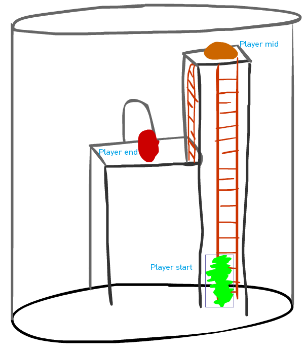
Per a suggestion from one of the ModDB followers, I am updating the ladder silo room to include multiple ladders, to teach upward and downward movement.

Can’t say we don’t include community suggestions! :slight_smile:

Pfft, who cares about the community?
Jokes, jokes.

Like, as in?:

Anyway, I gave Mike my input on the suit. Right now it seems like he’s gonna go based on feedback on his design whether he’ll use any of it. Basically it was some design changes to match Black Mesa’s more closely. If we want it to blend with Black Mesa more, some of the changes would do well, however if we’d like to use the model he has now and stick closer to Half-Life’s design, we can stick with that. Regardless, I’m completely confident that the model will look great.

I’ve added a second silo with a ladder going down. It seems reasonable that there would be a set of silos in one part of a converted industrial area.

Founded in 2004, Leakfree.org became one of the first online communities dedicated to Valve’s Source engine development. It is more famously known for the formation of Black Mesa: Source under the 'Leakfree Modification Team' handle in September 2004.