Hammer questions

Don’t worry, I’ve been on hammer a while now so these questions aren’t too pathetic.

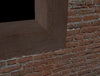
so lately when i am framing a window or a door with smaller brushes, i cut off the corners to make the edge look like this:

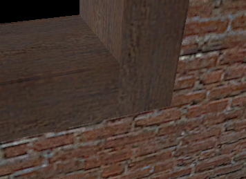
as opposed to this way:

so for this i was just wondering which is better in terms of efficiency, compile times etc. i was thinking of the word that described this better but i forgot it.

and then also i was having a problem with the texture application window. whenever i open it to select textures on brushes, it wont let me use my arrow keys for navigation, instead the arrow keys are set to adjust the texture shift. i know that you use to be able to navigate with the arrow keys in the prior versions of hammer, and I’m way too used to that to let it go easy.

figured that there would be some hammer buffs in here, thanks for the help!

[COLOR=‘Black’]a cat was sitting on my shoulder while i typed this

The first way is better. If you apply a texture to it you will see that it will fit much better.

when I make stuff in hammer I just look in the real world and try to recreate it as exactly as possible

Mitered corners (the first one you showed) are slightly less efficient, but depending on how you texture it, it looks better. So don’t do it for door frames that use the brush-based door textures (with both the door and the frame in the same texture) and window frames that have textures similar to the door models in that the entire thing is a specific texture and not made of, say, a wood texture like seen above. Use it when it makes a visual difference, but don’t overdo it when it doesn’t change how the frame looks.
Any evidence you need is in the above link. :slight_smile:

Oh, the link is missing all the tut pics, as it’s saved from when the VERC went down, but the pics weren’t salvaged, and it’s for HL, but all you need to know to fix this info for Source is that CSG was merged into the BSP process for Source.

wow thanks for all the help guys, its good to know that i was doing it right the whole time! :smiley:

I am still wondering about the arrow keys and the texture application window, is there a way to override the arrow keys so they don’t change the texture shift, and i can use them for navigation again?

thanks!

I haven’t really done any doorways in Source yet but in the Call of Duty editor we always used option one as the second option could lead to problems as mentioned earlier and also lighting problems (light leaking from behind the frame).

i’ve always done it the second way because it’s faster and i’m selfish and impatient

It’s easier, less time consuming, and mitering doesn’t reduce r_speeds or anything, so it’s not worth the effort unless you’re using a generic texture for the frame.
(Which you really shouldn’t if you’re making a door, since there are brush versions with frames for all the model based doors and more)

Usually there are videos on the internet i usually search for them if I have questions, they can really help almost alot of things.

i never understood why people didn’t use them, or why they would use a model door and not texture the walls next to them that you can see when the door is open. i’ve seen people not even bother trying to make a frame at all

I didn’t even start making doorframes until March I feel like such a faggot

If you want to get really picky, mitering the corners can in some cases reduce the number of tris the engine has to render by four (big whoop)(also, this depends on how much of your doorframe is visible). Also, textures fit better, etc etc

Actually, it doesn’t, because all the interior faces are deleted in solid geometry. Unless you only func_detail the top part of the frame but not the sides.

Founded in 2004, Leakfree.org became one of the first online communities dedicated to Valve’s Source engine development. It is more famously known for the formation of Black Mesa: Source under the 'Leakfree Modification Team' handle in September 2004.