CSS: containing element not resizing with position: absolute

Hai, here I am again with my amateur questions about CSS.

So this is basically my (relevant) code:
CSS:

html {
height: 100%;
}

body {
margin: 0;
width: 100%; height: 100%;
}

#bg {
position: relative;
margin: 0 auto;
min-height: 100%;
}

#infocontainer {
position: absolute; top: 430px; left: 949px;
}

#content {
width: 743px;
}

HTML:

<body id="wordpage">
	<div id="bg">
		<div id="infocontainer"></div>
		<div id="content"></div>
	</div>
</body>

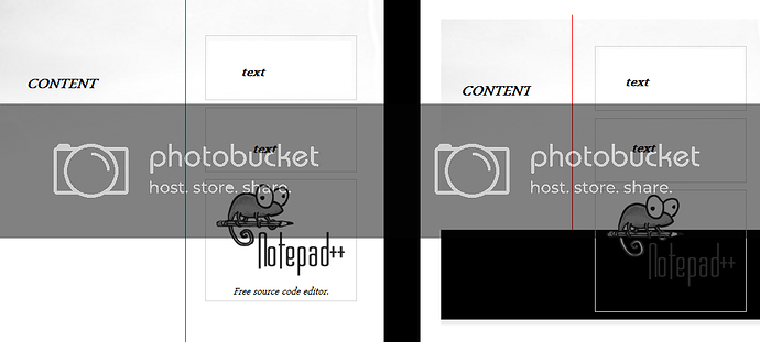
The problem is that the infocontainer div will overflow the bg div, while the content does not. As a result, part of the infocontainer will be outside of the actual page, adding a black block at the bottom.

Hope this is clear enough, and thanks in advance.

bump :stuck_out_tongue:

thank you

edit: he looks like a vulcan without pointy ears

Black block, ehh? Maybe the code has something missing in it that is required in order for it to work properly.

Or too much of something, since overflowing?

Other than that, refer to OrderOfDagon’s pic. :smiley:

well the black “block” is just the body

the problem is that the background div isnt expanding along with the info div

#bg {
position: relative;
margin: 0 auto;
min-height: 450px; (430 + height of #infocontainer)
height:100%;
}

That appears to work, but the height of #infocontainer is variable. I guess I could fix it with javascript, but that seems like a pretty bad solution.

Thanks.

you may be better off explaining the full situation here as if you are positioning that box to be a right side bar column containing lots of content there are better ways of positioning them.

EDIT: Or just assume the largest that the box will be.

Yeah, sorry if I wasn’t clear enough.

It’s a container to the right of the content portion, containing a variable amount of boxes of variable sizes.

This is what it looks like:

On the right is with a smaller window, scrolled down. #bg is only as big as the window (unless #content is filled up sufficiently).
Not sure if there’s anything else you need to know…

Text and red line added in paint :stuck_out_tongue:

edit: I just tried float: right and position: relative, but the same problem remains.
edit edit: I find this really strange, I thought #bg should always stretch to the bottom, since it should be 100% of the body :frowning:

Try adding

float: right and overflow:auto

I’ll help tomorrow should the problem persist. Too damn tired.

There’s no overflow in #infocontainer itself, so that doesn’t work. Thanks though.

Its been a while since I coded, also I did flash so…

Are their any floats that you are using that are bumping into one another and messing up the sidebar? If they are you can clear a float using “clearfloat” helped me out once. It stopped the side bar from wrapping around the nav bar.

And as far as I remember absolute positioning should always come with a width (although I doubt that’s causing your problem).

Look here: maybe one of the templates will help you.

This template seems to be what I want, but when I do it like that it still doesn’t work :frowning:

Edit: I’m going crazy over this. It makes no sense to me. Maybe I should post my entire code.
I’ve fixed it with javascript for now.

Edit edit: Here it is, in case anyone is actually willing to look through it.

Founded in 2004, Leakfree.org became one of the first online communities dedicated to Valve’s Source engine development. It is more famously known for the formation of Black Mesa: Source under the 'Leakfree Modification Team' handle in September 2004.