Communications Detour

Hi all!

I’ve taken a break from my Blue Shift remake for a few weeks and have thrown together this little fun single player map I’ve dubbed ‘Communications Detour’.

Basically the story is that you are on your way to ‘saving’ Earth and a scientist who has been monitoring the security cameras seizes the opportunity to send you on a detour to re-enable a communications relay to aid their escape from the facility.

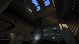
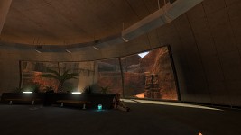
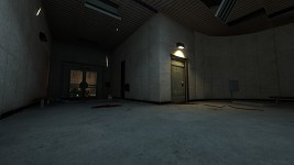
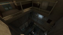
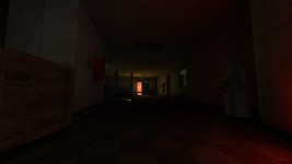
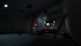
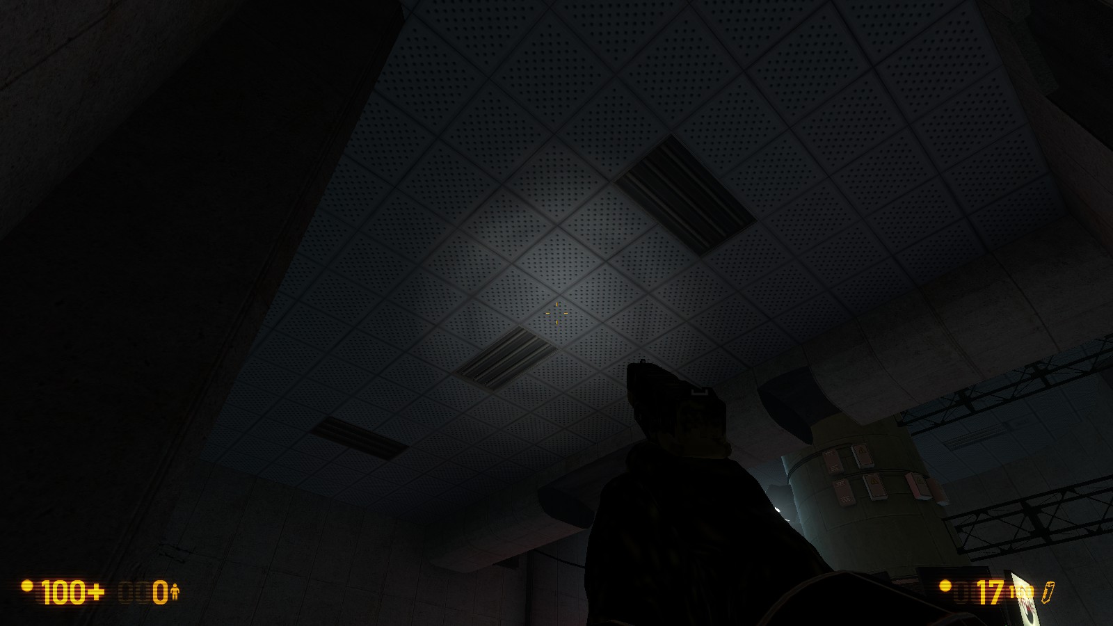
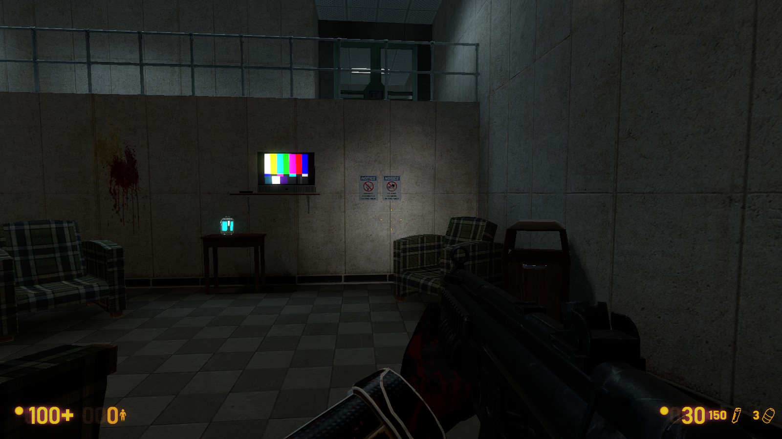
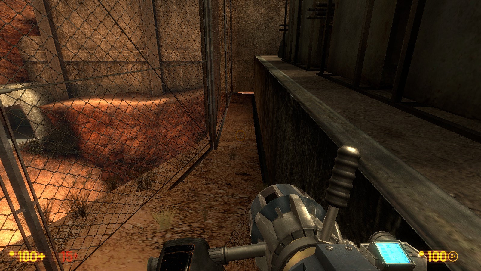
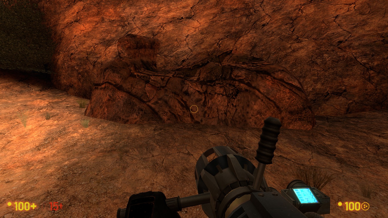
Here are a few beta screens:

There’s roughly 15-20 minutes of game play, though could vary depending on how much exploring or lack thereof you like to do.

I should have this on the Black Mesa workshop within the next month or so, so be on the lookout! :stuck_out_tongue:

Edit:
Released!

Subscribe to it on the Black Mesa Workshop https://steamcommunity.com/sharedfiles/filedetails/?id=550171554

Enjoy!

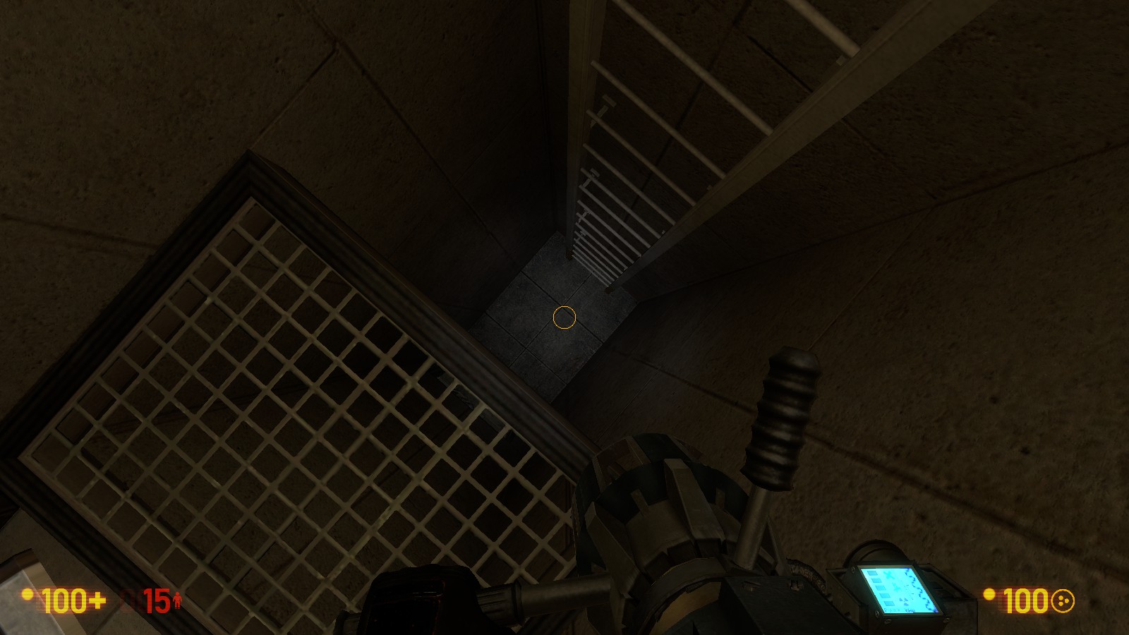
I’m looking forward too playing this :3

This should be neat.

I always thought there was a lack of custom single player missions.

Planning to release tomorrow.

Moddb: https://www.moddb.com/mods/black-mesa-communications-detour

It will be on the workshop and on moddb :slight_smile:

Some screenies:


It’s not perfect but I hope some of you find it fun and are able to waste 10 to 15 minutes on it :slight_smile:

If anyone is experiencing major issues, let me know as I have only done limited testing on this.

Very nice! Is this what’s inside the satellite dish building in dm_stack?

Released a day early! :slight_smile:

https://steamcommunity.com/sharedfiles/filedetails/?id=550171554

Hope you guys enjoy it.

Nice map!
Just a few things:

  • The door at the end doesn’t have collisions, and also has a green illuminated button next to it. This made me think it was the right way, walk right through it after pressing the button, and think that the ending’s bugged. I only noticed there was a ladder to go back through the facility after a bit of looking around.
  • The roof of the observation area that you see from the communications tower is a bit bland, maybe add some more Air conditioning units on top and anything else that might jut out. Something to break up the same texture.
  • Some doors, like the security door at the very start, don’t have ‘locked’ buzzing sounds when you go up to them. I like the satisfaction of that buzzing sound :stuck_out_tongue:
  • Some areas of the main cliff area at the start have repeated textures, some don’t line up with eachother well. Maybe paint some other bits of rocky texture in there and align them.
  • It took a while at the end for the fade-out to happen after I pressed that button. Also, I wasn’t exactly sure why I was pressing the button and why I had started there.

Nice use of music. What was the first track that played when you entered the lobby? It sounded like a remix or something, maybe an unused older track?
And of course, this was a fun and enjoyable map to play, I’m only trying to improve it. You only released it today so if you fix these quickly then all the people after me will have an even better experience!

Pretty solid work! One bit I really liked was getting to see our destinations early on, and then look back at that area once we got there. Nice presentation! :smiley:
Additionally, I liked the way you presented the elevator wait. I didn’t at all recognize the incoming arena until I pressed the button. Usually you can sense it, but it was quite an “oh crap” moment and had me scrambling for cover. Awesome!

I wasn’t trying to find issues, but a few little oddities jumped out at me while playing. Nothing dealbreaking, but definitely worth correcting. ArcHammer named most ofthem.
This first vent be whacky.
While I appreciate when doors open more than 90 degrees, this one got a bit carried away. Forgot to make note of the area, IIRC it’s right after the vort encounter.
Uh oh. The trim texture around the window could use some alignment tweaking as well.

Overall, definitely worth a play, and makes me hope you’ll release more maps in the future. :slight_smile:

Glad you enjoyed it!

Thank you for the feedback though as well, I do appreciate it and will wait a bit more to see what other people pick up on before releasing a fix :slight_smile:

A few things that haven’t yet been addressed by other people:

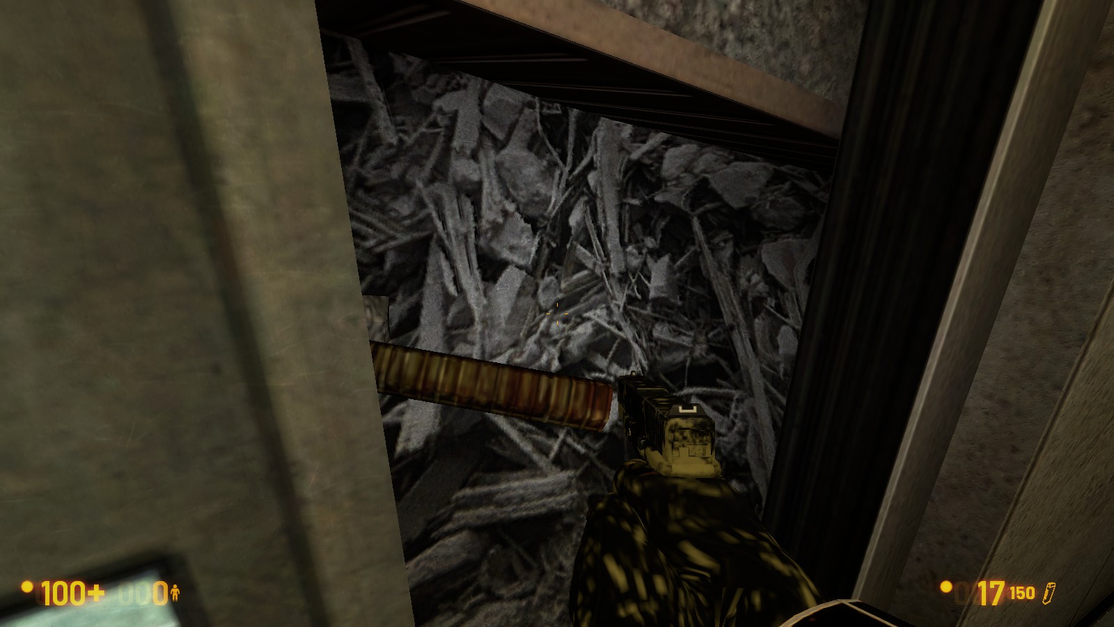
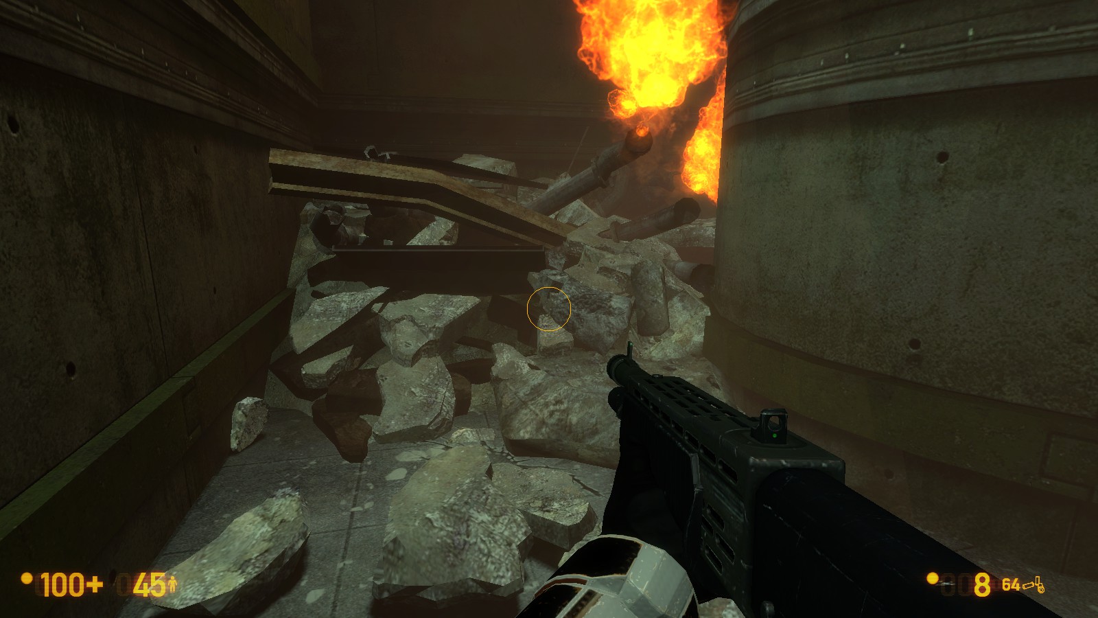
  1. BM typically uses models for rubble instead of the “debris” texture, producing a bit higher quality:

    versus
  2. I’ve noticed a number of places where those two-ceiling-tile florescent lights are placed “sideways” relative to each other within the same room. Black Mesa doesn’t really do that- all the lights have the same orientation, changing only in room transitions where there is usually a door or some other barrier.
  3. Both of the “cafeteria” setups just look extremely weird to me, as they both have just one table behind a sort of strange barrier out in the open. I’d consider redesigning those from scratch.
  4. Similarly, I am not a fan of the “information” sign above the desk or the big metal numbers on the walls- they just seem too mall-like to me, and not in accordance with Black Mesa’s industrial, institutional aesthetic.
  5. It is possible to pick up and give the health kit to the scientist who is crawling towards it, but nothing happens if you do and it just phases through him.
  6. The positioning of the table, chair, and TV on that blank wall in the soldier ambush really looks like the player is supposed to be able to climb it, but there is nothing for them if they do. Over all, that wall could use some additional geometry to look less flat.
  7. Having the windows break after the helicopter crashes implies that there is something important in the courtyard area outside the observation deck, but there is nothing there that I could find.
  8. Having the sort of step-like arrangement of machines on the transformer thingamajig near the comm tower makes it seem like you can climb up there and get over the fence, but there is an invisible wall there.
  9. There’s a hole to nodraw hidden behind the transformer thingamajig, too, where the concrete wall meets the dirt.
  10. It’s possible to clip through this rock in the observation room “courtyard”:
  11. The maintenance area you use to get down from Level 3 is strange, as there’s a door, then a ladder, then a grate, and nothing else to actually maintain. The grate itself cannot provide ventilation, as it leads nowhere but up to a door. I’d add some electrical equipment or other vents or something in here, or indications that this place went somewhere else but has now collapsed.

There are also some things I really, really liked:

  1. Having the Distant Complex from surface tension cliffside be the skybox. It’s a really great way to ground the level in the existing Black Mesa facility, and actually meshes really well with my personal headcanon about what that complex is for: housing service vehicles and equipment for the comm antennas you see on the hills to either side.
  2. The elevator ambush. In between the music choice, and the fact that elevators almost always mean you are through with the fighting for a while in the main game, and just the way the area is lit, it works really well. I was playing with cheats on and still jumped a little in my chair.
  3. The scientist running from the zombie and into the Marine was a nice touch.
  4. The outdoor area where you begin just looks beautiful, and does some pretty involved platforming without seeming contrived. Excellent work all around there.
  5. Is that transformer model underneath the radio tower something you made yourself? I haven’t seen it anywhere before.

All in all I liked it. For the most part it looked good, if a little blocky in areas, and the gameplay was solid and used the common Half-Life tropes well - headcrabs in vents, vorts spawning in at the right times, hidden caches, etc. All very nice. The starting area gave me opposing force vibes, which, intentional or not, was a nice nod.
That said, I did find a few issues, most of which were purely visual. I’ll try to keep my report down to ones that haven’t been said already.


To be blunt, this is just terrible. The vent cover in no way shape or form fits the model, and it just ends up looking terribly like something from somebody’s first map. Please fix this.


Bit of a hairline crack here - not sure if it’s due to nodraw or decimal loss. Hopefully the former, as that’s much easier to fix.

I realize this is the back of a vending machine, but from a distance it looks like you just popped a bookshelf in front of a brush textured with toolsblack.


Both of these doors look identical in every way, but only one can actually open, causing confusion. A red light or barricade, etc to indicate the door on the left is always ‘locked’
would be nice.

Bit of a hole visible when this door opens.


The rooftop is a bit undetailed, and the clearly visible displacement edge is just… ew. Maybe some railings and powerboxes would work well up there? In general the skybox is a little empty for my tastes, but if you were going for the place under the ST cliffs, I suppose that’s not something that can be avoided.

I know exactly what’s about to happen, and precisely when it will. Maybe add a delay between the button and the helicopter spawning, or have it fly in from further away so the sound doesn’t immediately start up?


Not only did I think this door was supposed to open/unlock after the button was pressed, but it doesn’t have any collision. Maybe add a room or something in behind it and have some kind of push event coming from it to encourage the player to backtrack after the helicopter crashes? I spent a good 3 minutes wandering around before I realized that a door had fallen back where I came from.


This glass neither breaks not can be shot through, so I ended up wasting a full Mp5 magazine trying to shoot vorts before I realized it wasn’t doing anything. Makes for good cover, but if it’s for that, maybe have it be an information board instead.

Very small displacement seam I noticed after backtracking to the starting area - which is another issue I want to bring up, and one of the only gameplay ones;

Why is it you have to backtrack the entire level, go into a room, press a button, and then backtrack back out? I was thoroughly confused by this, and only figured it out because I realized you wanted me to go somewhere back where I came from from the enemy spawns.

All in all you’ve made a good map, but it needs just a bit more polish before it’s ready for a 5/5 score.

Regarding the backtracking issue, it would cut out some of the combat in the areas skipped but I think you could make the intended path more obvious and eliminate the red-herring problems of the transformer thingamajig and observation area (addressed in items 7 and 8 ) by using that as the route. That is to say, have the helicopter slam through the fence or whack off a piece of metal to serve as a bridge or something as it flies down, and then the player will be able to climb over the fence, drop into the courtyard, and walk through the destroyed window to get back to the observation area.

Thanks for the feedback Jeff, some of your images aren’t loading for me strangely though.

If Black Mesa didn’t have the 100mb limit for the workshop, originally I had split this into two maps and there was more of a linear progression towards the area that gets blown up in Surface Tension.

Right after the comm tower, there’s a door that you were to go through on the other side which would lead back to an underground section.

When i realised I was in no way going to achieve this, i chopped it back into one, spent less time working on it and wanted to try and stretch out the playtime a bit.

Obviously it should have been quality over quantity but i felt that 7 minutes or so was a bit short.

All in all, i planned originally for it to be two maps, then had to force two maps into one which I shouldn’t have done. Lesson learned for me :slight_smile:

Hmm… The images might be due to dropbox permissions or something - they work fine on my end. I think I may know the reason, but I’d need confirmation - how many are missing?
Figured it out. Apparently not all browsers support the way I was linking some of them - I switched about halfway through writing the post.

Founded in 2004, Leakfree.org became one of the first online communities dedicated to Valve’s Source engine development. It is more famously known for the formation of Black Mesa: Source under the 'Leakfree Modification Team' handle in September 2004.