Changes from WON to Steam: Half-Life 1

I was taking a look at an old WON version of Half-Life the other day and I noticed some things between the two. I’ll list them out just to simplify things:

1.) The camera tilts when you strafe left and right. Just as in Quake.
2.) When you run forward, the weapon behaves differently.
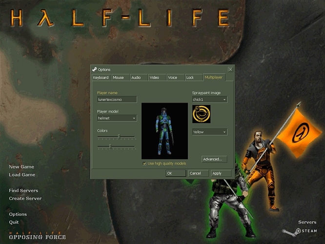
3.) The UI is completely different. The menu from 1998 was much cooler and more animated than the Steam version.

Why would Valve change the game when porting it to Steam? Couldn’t they just remove the CD key from the original and put that on Steam? What was the point of changing it? And from what I’ve seen, only version 1.0 had the camera tilt in it. Why would they remove that? If I remember correctly, that same tilt appeared in the early trailers for Half-Life 2 as well. :hmph:

1.) The head tilt can be annoying. Our brain is wired to ignore our own head tilt when walking or running, so putting it in a game can be a bit redundant.
2.) Don’t remember that but won’t argue.
3.) Valve developed a new UI interface for the goldsource engine that integrates with Steam. Besides, the old UI may have looked cooler but it was clunky and prone to glitches.

The old was prone to more glitches? I’ve seemed to encounter more glitches on the Steam version than the WON version. Especially when entering cheats.

The old menu wasn’t good at all.

I am more annoyed that they dumped VGUI after the orange box and went with some kind of L4D/Portal 2 menu system which takes 3 times longer to navigate through (especially advanced 3D settings)

Yeah, I went all over the internet to find 1.0. I played uplink before I bought the game on steam, and really liked the head tilt.

Also, in the steam version I’ve noticed a horrible glitch when hitting dead npcs with the crowbar. There seems to be no constraint on the rate at which they can be hit, and the gib nearly instantly. This doesn’t happen in 1.0 at least, and maybe all WON updates.

I agree with sersoft. I hate the menus in Portal 2, it’s annoying having to wait for that stupid animation every time you press a button.

Also the old version only supported 4:3 aspect ratios and had other problems with newer gpus.

The only things that really bug me about the Steam version are A) The lack of head-tilt (I thought it was really cool actually, to be honest) entirely, and B) The movement freeze on level-change, it’s quite annoying.

I liked the older menu’s design better. Valve should’ve made the Steam Half-Life menu look interesting, or at least appealing. The menu is so boring in the Steam version :frowning:

I remember playing the won multyplayer hl1 and how we could change the color of our players. i miss the old days. :frowning:

I’m pretty sure you can still change the color of your player.

no, you cant. it used to be in the multyplayer option when selecting the player model. you cant do this, on the source version… can you do it on the older engine version that is just updated for steam?

Not talking about half-life source, just the steam version of half-life.

It’s functional & unobtrusive. The original menu was obnoxious. You’re either looking through nostalgia goggles or you just have a fetish for flashy meaningless effects.

It’s most likely because Valve’s been expanding to the console market more in recent years. I would be fine if they made they just made the options easier to navigate through. Portal 2 especially.

I think that was in all WON versions. What I really hate was that stupid glitch when you gib a dead npc with the crowbar and the animation freezes and it goes into some kind of “hyper-gib” mode. :meh:

That really doesn’t have to do with the UI. That’s within GoldSrc itself. All it took was some simple source code fixing. And HL doesn’t really look good on higher resolution monitors. Some things get stretched out. Like the menu backgrounds.

I know this is OP but it’s exactly the same for HL1.


:retard:

I liked the original :frowning: The original wasn’t really obnoxious just a little more polished. Neither takes long to load and neither are hard to navigate. But the original is considered better by most people.

It happens in my WON version, either original or 1.1.1.0, and I’ve always loved it lol

Personally I’m in love with the WON version’s header.

Forget about the WON version taking longer to navigate. All I fucking want is that flashing logo and the awesome sounds when you close stuff. They could have easily kept that stuff without making the menu clunky.

If you think that stuff wasn’t cool you’re a fucking moron

And honestly, you can make that pretty damn functional if you take that root menu and make it so when you click on the buttons there the steam windows pop up. Functionality problem solved, and stylishness returned. Oh, and it had a mod loader FROM THE MENU.

If Black Mesa had the flashing, scrolling logo in the main menu I would fucking burst

Founded in 2004, Leakfree.org became one of the first online communities dedicated to Valve’s Source engine development. It is more famously known for the formation of Black Mesa: Source under the 'Leakfree Modification Team' handle in September 2004.