Prefer something more recent?
Dear Admiral Sakai! 
It’s really nice to see you slowly but steadily moving towards a second version of restored Office complex.
My 2c: Some offices on left/right on the expanded area (above) could really help to make this whole place more immersive.
They’re going to be there, it’s just not finished yet.
can’t wait to see your finished work 
You are a rock star here, man!
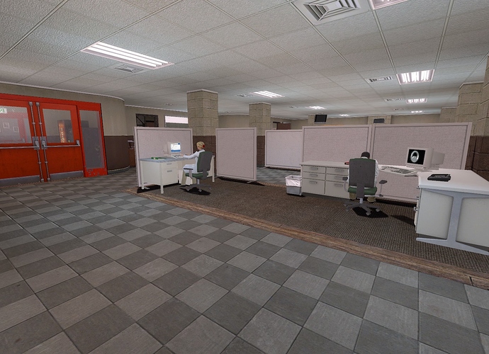
All right, so we’re nearly done with the first half of B Map’s expansion (I’ve again removed the cubicle dividers so that you can see the whole area in one screenshot; there will be dividers in the final release):
It’s taken a while to do because I think I was a little “off” in how I planned the very highest resolution of the area (on the scale of where each room goes). I don’t think the end result looks bad, but I definitely won’t be using this approach in the future.
Currently, the areas behind these doors are the only things remaining to do on this side (also the elevator, but that’s quick and easy- I may even release a partially-functional version of my new system for selecting different floors with one button panel):
I am in fact rather tempted to just re-include an updated version of the maintenance areas that were there before- I’ll have to fix up some things like the tram tunnel, obviously, but I think the basic idea behind that area was solid. Thoughts?
Once it’s fully done I’ll be going ahead and releasing it before starting on the other half. Since the areas are relatively self-contained I see no reason to keep you all waiting.
Making a final debug pass of the expanded South Offices; expect a release tomorrow or Sunday. It will include the first test of my elevator logic system, but the elevators won’t actually go anywhere because there are no other maps that have functional ones.
Once the South Offices are out, I’m not sure if I want to start on the North and finish off B Map right away, or do some long-overdue fixing and tweaking on that troublesome C Map. I’ll probably work on both simultaneously and see what gets done first.
Also, does everyone’s actual game look like the screenshot I just posted? I’m still having a few problems with my monitor, and the actual game is much lighter and greener than the shot looks.
Here’s how your Office Map (with cubicles of sorts) looks like on my ultrawide screen, @Admiral Sakai:
[attach=5232,none,2560][/attach]
This wasn’t quite what I was looking for; the question was posed because on my monitor the screenshots viewed outside the game and the game itself look quite different as far as color and contrast go and I wanted to see which version other people were seeing so I could figure out how to adjust the lighting. However, that screenshot also coincidentally indicated that I am using an old version of the replacement ceiling textures, so thanks regardless.
sorry.
also, the new part of the map is fantastic. I was wondering where you wanted to put it - to the left (when you enter the b map), or to the right. You did it on the left side, and it fits in brilliantly!
[attach=5233,none,2560][/attach]
I had a fun time going over and fixing C Map- it’s definitely the strangest and most difficult of the three Office Complex maps, and only now am I actually able to make some (not even all) of the areas in it into ones I feel comfortable exploring. Some people were complaining about the maintenance sections being too dark, so I went ahead and made them much lighter, but now I am wondering if I went overboard:
On the plus side, the cafeteria- and, more importantly, the common area in front of it, a section that has literally been the end of many a lighting paradigm- are finally looking up to snuff:
I don’t think it’s quite at the ‘done’ stage yet, but I’d call it ‘requires only minimal configuration and tweaking’.It looks really good, the mood feels right.
Only thing now is to add atmosphere to the rooms.
Like that female scientist that is leaning on the pane of glass.
Just make her arms cross bellow her breasts, and make her look
down at the floor, so she will appear to be thinking about something
important.
Looking good, but yeah, the maintenance areas seem a bit bright. You could pull back on the lighting a little.
Also, I believe the cafeteria area could make for some interesting conversations between the scientists, and between scientists and guards, and between the guards. It could be a focal point for that section of the facility.
Scientist: “They just got a new sample they’re taking down the test chamber in a couple days. The results could prove very interesting.”
Guard: “Just as long as you guys don’t mess up and tear open a space-time rip and aliens come in.”
Scientist: “Oh, pish-tosh. That kind of stuff only happens in science-fiction.”
Guard: “Yeah, whatever. I’m going to eat now before my salad gets cold, yeah?”
Just an idea. 
I see what you did there…
Had a bit of mapper’s block towards the end of winter break and the beginning of classes, but I think I’ve got a reasonably good handle on the (deeply odd) construction of the North Wing of B Map.
Looks promising! 
how do you plan the layout of the North Wing?
I use rooms and other space-occupying architectural elements from elsewhere in Office Complex (typically represented by single brushes of the same dimensions) and put them together a bit like Tetris blocks to try to fill in the space sensibly. Then I stretch or compress them to make sure they are aligned to the grid.
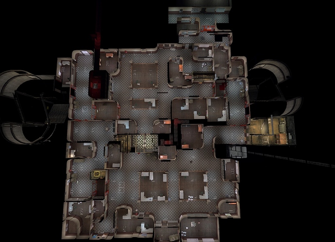
Gotcha.  However it seems to me I didn’t form the phrase the right way. My question was about the actual layout - how will it visually look like, if you’d make a top screenshot of the North Wing?
It looks something like this:
The carpeted areas are offices or cube farms, the tile hallways, and the asphalt/concrete maintenance areas.
fantastic! 
looks quite lovely! 
thanks for sharing 
So, we’re still quite a ways from a release for B Map- cubicles need to be populated, there’s some particularly difficult bits of logic that need to be made workable, and I’d like to give some additional polish to the lighting and general structure in a lot of areas. However, the basic structure of the North Wing is pretty much complete. And while it might not be the largest of the Black Mesa maps, c1a2b is definitely no longer small:


