I’m a little confused as to how one would print this, seeing as how all the different covers people have made are different resolutions.
Because printing works in dimensions, not resolutions.
Lol apologies for coming across rather blunt. It’s just how I am I tell it like it is with no sugar added. I’ve had my nic for years, my mates started calling me Shasta after the short-lived TV series “Shasta McNasty”. So yeah, I’m not bubbly and sugary like the drink lol. Nor am I large and majestic like the mountain. And I’m probably not _________ like the county (whatever the place in the USA is like).
1: The world won’t end if you mess it up. It’s a cheap disk. Burn another one. You won’t learn anything without just getting out there and TRYING.
2 & 3: Most of the stickers stick just fine. Amazingly, sticker companies have learned how to make things STICK.
First, you’ll only be insulted on the net if you say stupid things. If you’re repeatedly getting insulted, perhaps a bit more thought is required in your posts.
Second, you won’t use stickers because I said they’re lame? Who do you think I am, the emperor of the internet or something? I think they’re lame because I like to do things REALLY well, and prefer to print directly onto a disk rather than use a sticker, so that I get that real professional look - real disks don’t have stickers on them. The stickers don’t look bad, but I notice the little edge going around the disk. But I’m just some guy you’ve never met. Why on earth would you not do something just because I said it was lame?
Third, I never said it was YOUR fantasy label. Again, if you spent a little more time at school with reading and comprehension, you’d have read and understood that I had addressed that ENTIRE PARAGRAPH at the PERSON THAT MADE THE LABEL. That’s why I said “whoever made that CD label…”. That wasn’t you, so why did you answer for them?
If you would like more pleasant replies, please refer to my sig before hitting that “reply” button. I know you can do it. I believe in you.
Those last two sentences made me laugh. Sorry bout that, when I read something like this, thinking that I’ve read it through well enough, I almost always miss things.
Nicely done. See - a happy ending prevailed. When faced with their mistakes, plenty of people choose to refuse to admit their mistake, and launch off into an insult slinging match, lashing out in their embarrassment at anyone who pointed it out, and denying that they were wrong. You however chose the high road, admitting your mistake once it was pointed out, and made a cheerful remark. Well done dude. Top marks.
The next trick is to be correct from the start lol.
Happy New Year 2010 for all the Half-Life Fans^_^
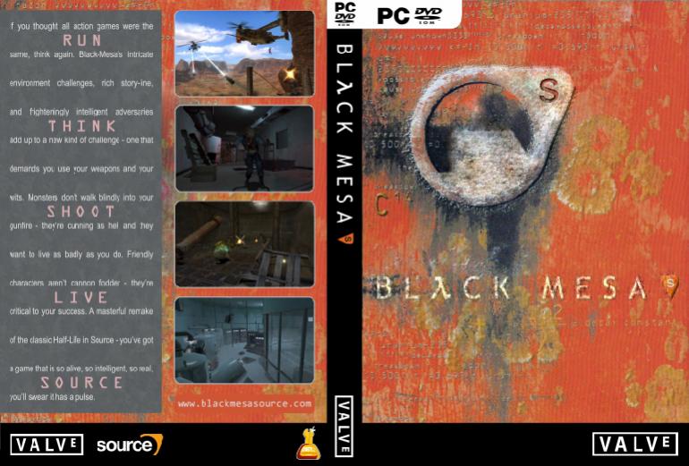
In addition to the classic orange cover, i’ve done a ‘black’ alternative, it’s a little odd but I quite like it:
Yay, everyone is happy 
Thanks, but not to be rude or anything, isn’t that tomorrow?
I really like this one, looks good, personally I didn’t like the orange one as much, I feel like orange doesn’t really fit the whole BM project.
Just thought I would ad a little comment about the pic, to me it seems like the edges on the orange “S” on the bottom right are a little to sharp, at least for the style I believe that you are aiming for. And the line the edge of the Black Mesa symbol where I drew the red line is not very solid, I would (imagining that I had this kind of Photoshop prowess) add a light gray around the edge there. A lot of this is just assumption but hopefully you’ll see what I mean. If not it still looks good.

The black version was only a quick edit so the sharpness on the “S” isn’t obvious on the origional (a page back) - I’ve been playing with the mesa for a while it does need neatening up a little - I am trying to get the rough yet sharp appeance of the outer-circle, but it’s just not there yet!
Thanks for the feedback!
i need the hi res version of your other one. wait… or do I have it?
I thought i’d put a link on the prev page, either way here are both of them, approx 4-5MB each:
Cheers Catz
Hey Catz, its says when I go in there, there is a number for my name such as 23, 24 and 25. :S
To people on another side on earth: Yes.
I’m working on another alternative for my HL-based cover:
It’s almost finished - will get a hi-res version up either later today or tomorrow when i’ve finished polishing it.
I would appreciate any and all feedback :freeman:!
Here is the hi-res copy of this variation of the cover, with the full ‘bms source’ logo:
Don’t doublepost! :hmph:
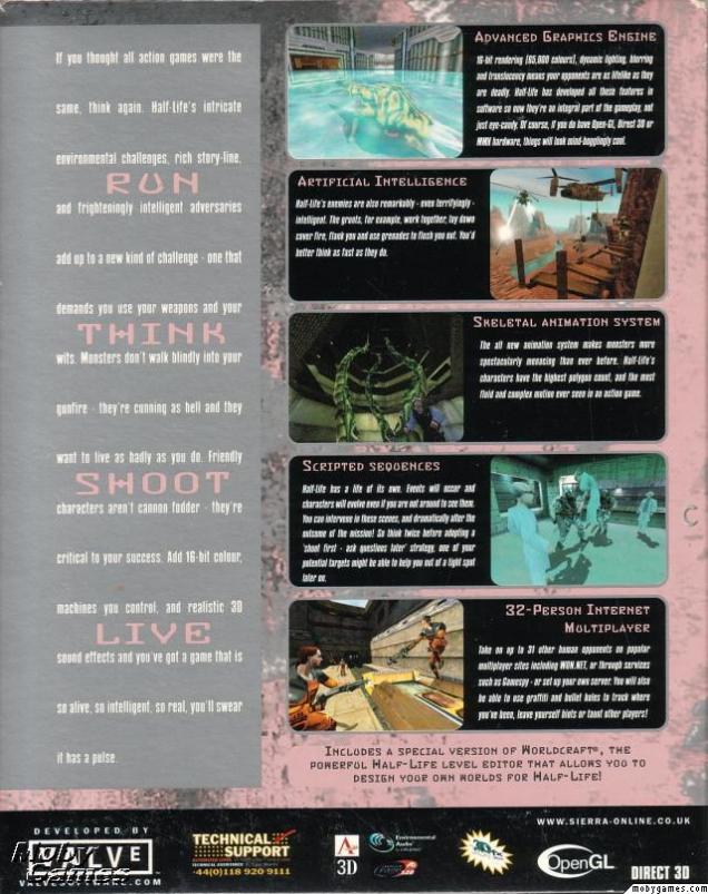
Anyway, those covers look pretty awesome. The only thing I don’t like about them is the description in the back. The spaces between the lines are huge, make 'em smaller and put the “Run - Think - Shoot - Live - Source” on one line instead of putting them under each other. That might look better.
Anyway, all the other stuff looks great! 
So meany good covers to pick from. It makes me wish I didnt smash my printer to bits. You think the devs will pick a favorite to be used?
I didn’t realise my post was still the last one when I posted - given the time between posts 
To the point at hand - The covers are done to imitate the original HL ones. I might edit it in some way if I feel the need, but probably at this stage if I were to do more work with covers, it would be a new design!
Thanks for the feedback 


