
lol, I posted this in the original thread.
God I was so immature
i actually lol’d at this one
So as me.
Do you mind if I print these stick them on cases and host them on my photobucket as long as I give you credit?
gota run turns of flash light =D
who is to stop you? go for it
Dunno if you’re asking me or someone else who posted their covers, but as far mine go, go for it!
That’s what they are here for, to be printed and put on cases for personal use. :retard:
[It’s nice to see this revived.]
lol
ikr -_-
This thread has been going on for a very long time but I joined this forum late, thus I apologize for my outdated comment. I tried to take the time and read all the post, but unfortunately I didn’t succeed(made it to page 5). All these covers have great potential. I already saved 9 covers so I can compare and see what is the best to use, though I mostly like the more modern ones instead of the ones based on half life 1. Don’t get me wrong, the rusty looking covers look very good. Anyway, can’t wait to try out these cd covers and cd stickers. Good job you guys!
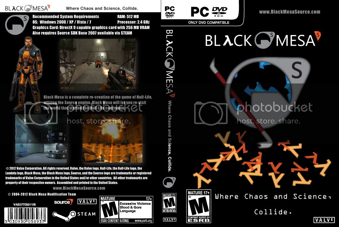
Not sure if this thread still gets read, but here goes… 1st attempt at a DVD cover. Looking for feedback and impressions. After the feedback, I’ll start working towards printable versions with trim marks and all that jazz. Thanks!
For it being your first one its not bad. Its kind of bland, but other than that, its laid out really well.
Thanks for the feedback,
I tried to do everything simple (…still learning Adobe Illustrator). But I figured using mostly vector artwork would make it easier to create other printed media. Like taking different elements to make a disc label or a poster.
From a designers view:
- Not bad for first attempt, Illustrator can do wonders when you start getting the hang of it.
- Spacing and layout, this is not so much for the front than it is for the back. Having structure is key for text and image layout. Spacing out elements gives it a more clean feel than just having it all sat together Tetris like.
- Less is more.
- DON’T use the font Impact for anything other than titles and headings.
Keep on tweaking it till it gets right and you’ll be sweet 
Also, Photoshop can help alot with making the images blend in more with the cover.
Oh noes, he used screenshots that don’t represent the final version of the game, oh wait, game developers do that all the time, nevermind. I have a megadrive game that shows screenshots of a cool looking level that never made it into the final product, bit of a tease.
Made this awhile back. I loosely mimicked the original Half-Life 2 covers to give me a template to work off of. Opinions?
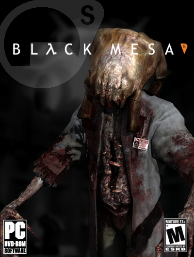
Not bad, simple, but IDK if i like the idea of a headcrab zombie for a box cover
What don’t you like about the zombie? I think I chose him because he seemed to fit with the colors on the box but I really don’t remember. What do you think would go better?
I love the zombie, but I think the logo would be better nudged a little to the right so it all fits onto the front.
I actually did that on purpose. That’s what the Half-Life 2 box art did. I was trying to give it the authentic feel of the original box art 