Black Mesa: Blueshift

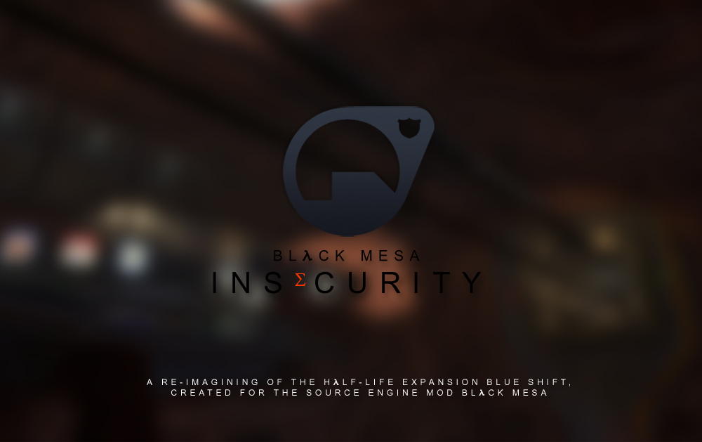
So i’ve been working on like a new logo thing and this is what I have so far:

Thoughts? If anyone wanted to have a stab at making a better one you’ll hear no complaints from me! I’m no graphic designer haha

Anyway the idea was to make something similar to Black Mesa’s one

Also mmmm dat jpeg compression.

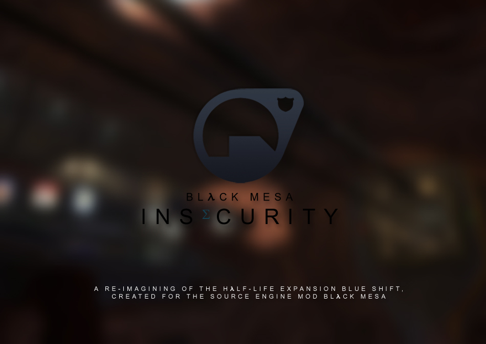
Maybe something like this?


It would be nice to have a picture on my moddb page to represent that mod that doesn’t suck haha

Looks pretty professional, though why’d you make the E smaller and orange? I’m assuming because Insecurity doesn’t have an A in it to turn into a Lambda symbol.

Yeah haha, Black mesa does that with their A, they make it that colour so i thought hmm i might do that to the E.

I don’t think it looks too bad? haha with the E i mean.

Have you considered making the T in Insecurity a lower case Tau, just like the A in Half Life is a lower case lambda? Seems pretty fitting to me, since they’re both used in the Exponential Decay equation.

mmmm i’d rather just leave it as the E, the tau looks too strange compared to the rest of the text. Lambda is very easy on the eyes but tau looks a bit yuck haha

https://www.moddb.com/mods/black-mesa-insecurity

That’s what i’ve done with what i’ve got so far, i think it looks alright

What about a Sigma (Σ) for the E? Sigma’s are cool.

Still too cray haha.

Man, you’s cray. Everyone knows Sigma is among the coolest Greek letters, chillin’ up there with Lambda and friends.

Okay Mr. Someguy, gave sigma a chance

Thoughts?

Cool.

I was just being silly :stuck_out_tongue:

But in seriousness I do like it, I say keeps. Although I have to ask why is it orange again? I know you answered that already but the BM logo in at the top of the page, or in-game, doesn’t look that way. Could be my faulty memory, but I don’t remember anywhere it’s formatted that way.

Orange and superscript inspired by the E in valve logo. Still why orange? Barney’s color scheme is more on blue.

It was because of this

I want it to stand out, and blue doesn’t stand out lol that being said I will try it out.

The blue doesn’t look good lol

Try red or black. Orange is for pussies.

Black doesn’t stand our, red is too sexy

…looking at it again, the orange doesn’t look that bad :stuck_out_tongue: Dumb me, I meant change the rest of the letters to white and make “e” black, or in reverse. It should be made of Barney’s colors, the prominent one is blue and then black I guess.

Not sure if I like the look, if the rest of the letters are white it just looks really strange :frowning:

Honestly, I would have preferred an entire new name with an A in it so you could make a blue Lambda symbol, but since Guard Duty (What’s Guard Duty? :stuck_out_tongue: ) has already taken that, this is just fine. Besides, that’s a HUGE nitpick and one not worth freaking out over. I like it. I don’t think any other mods have tried something like this before, to be honest.

EDIT: Then I start to think, it actually makes more sense for this mod to have a different symbol altogether. The Lambda symbol is identified with the Hazmat suit, Barney is just a security guard. So, this change in lettering is for the better, I think. Disregard the last paragraph. :zip:

Perfect, so moody.

Founded in 2004, Leakfree.org became one of the first online communities dedicated to Valve’s Source engine development. It is more famously known for the formation of Black Mesa: Source under the 'Leakfree Modification Team' handle in September 2004.