Beta Skins Are Here!

Hello Guys,

After a few hours of work, I managed to get the first skin in beta form up for selection. The white skin can now be picked to use by looking at the bottom of the forums and picking it from the theme chooser.

HOW-TO:

Currently you can now test out the white skin. Tons of other skin sets shall be down by the end of the week. Once the beta stages are over. They shall replace this default one.

Please leave all feedback on each of the beta skins here, thank you!

Current Skins:
White *beta
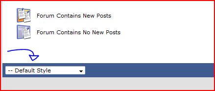
theme_pick.JPG

Oh yeah! I was missing the old theme! (At least, that’s the one I see - weird idea calling it white, but meh :stuck_out_tongue: ) I absolutely LOVE this skin. Dark colors look much sleeker and cause less strain for the eyes.

One thing for sure, I’m glad to see this skin does not have a black/orange color scheme. That would have been way too HEVish… But then again, that might be just what’s up next.

Yes, That and the old dark colors too :smiley:

This is clearly an improvement.
I think there is too much contrast. Make the ‘white’ not so bright.

Sweet, Black is back.

And yeah, like Assassin says, the white stands out too much. But am sure its gonna get iron’d out soon.

A step in the right direction. Good work man.

Yay.

Good work on getting things back together! :smiley:

Wha happm to the old one?

@ Josh : great progress towards the old skin man! :slight_smile:

I also noticed that all our names are in Bold lettering just like your’s and the dev’s. :smiley:

Great progress ! I’ll test right away.
You should add more colors !

Looking good from here.

Edited to add:

The ‘Go Advanced’ button isn’t as cool as it implies…

schweeeeet!
.

YAY the defult skin was starting to eat my brain from the inside out . . . well mayb im exagerating but this new beta skin is another step closer to getting the forum back on track :smiley:

Soory about posting again here, but I noticed something. In the default template, unread thread titles appear in bold lettering, and read thread titles don’t. In the white template, however, all of them appear in bold lettering. And that’s fine, but I thought it was a clear, fast way to check which threads had been checked and which hadn’t.

Maybe I’m just being nitpicky, but I think it would be nice if the white template had such a differentiation between read and unread threads.

Yay! White design!

For the white theme, it might be nice if the post headers (the bits that say “Today, 12:21”) were grey rather than black (maybe #666666 or something). Currently, it’s very high contrast. A slight blue tint might be good.

The CP text is too hard to read now.

to The_Assassin47 what do you meen by that ? for me its fine and im not that good at reading :stuck_out_tongue: ( I JOKE , ITS NIICCE)! which part is hard to read ?

Links could do with underlining in post bodies, otherwise it’s not always obvious that something’s a link (see here for an example).

I think he means the greyish stuff (I’ve also opened the search box in this post as it has a similar issue):

Founded in 2004, Leakfree.org became one of the first online communities dedicated to Valve’s Source engine development. It is more famously known for the formation of Black Mesa: Source under the 'Leakfree Modification Team' handle in September 2004.