Except the Black Mesa Research Facility started out as a massive decommissioned missile silo complex. Not all of it has been converted into labs, and much of it is still boarded off even in the original Half-Life that this mod is based on.
Guys, you’re drifting off topic (again). Discuss the model itself, not the environment it’s in. The location it’s in is a decommissioned area of the base.
Farther, remember that everything represented in the screenshots is a work in progress and does not represent the final product. Additionally, a screenshot is simply just a still shot of an in-game render and may not properly represent what the product looks like in-game other factor(s) such as lighting on the level, brightness, etc has an effect on how it looks in-game. /rant & mini-mod
TL;DR: You’re drifting off topic, new thread or PMs.
And my apologies for derailing it further.
Edit:
Let me re-iterate:
Check the blog rules before posting.[/size] If you want to continue to ignore the rules, be my guest, but you’re at the mercy of the mods and admins in that case. Don’t say I didn’t warn you.[/size]
I apologise, I didn’t think I was going off topic at the time:
The feedback I was responding to was essentially suggesting a cleaner version of the prop texture, the justification for this being that the area itself shouldn’t be abandoned.
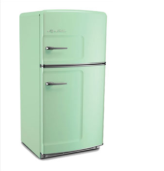
EDIT: bkdale86, you said that the fridge is supposed to be beige? I’m wondering if going half and half between the two versions that you’ve shown us will make that more apparent.
It is set as the 2nd texture on the model. I’m not going to worry about it any more for now.
Finally finished qe_console_large.
Love it!
I especially like the “Drive Failure” in what I can only assume is post AM. Nice little detail! 
That’s really cool!
The consoles look excellent. I like the fact that the dials all show no pressure on the console that shows drive failure!
The new cabinet texture looks spot on to me, much nicer.
Only issue I can see now is the cabinet doesn’t appear to have projected shadows, whereas the watercooler and microwave do?
It’s not a full compile of the level.
it’s getting better and better each time you show something. Really nice job.
Is it the table? I can’t remember if that was there before…
Either way it looks great! I always thought that room looked really realistic and it does even more so now, great work!
Sorry thought I had mentioned the lockers.
My playtesting turned up another prop that was bugging me. Namely the ammo_crate. It had really harse white highlights/ worn paint, which on a wood box looks very strange. Also found out the handles were at least a scale inch or 2 OFF the sides. All fixed and in game.
The new ammo crates look awesome by the way! A HUGE improvement over the old ones. 

Are you opposed to a funky fridge like this or something?
I do think if that fridge is nowhere else in the game then it needs to contrast with the objects next to it color wise. Chrome rimmed / rusty
Old fridges really were this color I quite like this color, it’s a bit daring but it’s also would attract the players eye to get them to open the door.
Or there is also the popular lime green vintage fridge also.

or stick with the yellowish one atleast that could look like gone off white. Pastel colors basically but with perhaps a bit of sheen.
Glass shelves? Plastic interior? Grille Shelves? The inside door shelves texture looks great but the interior of the main fridge looks like it is made of wood.
one more thought but it’s not for you Brian but what about on the door opening a light comes on in the fridge. That is a nice touch if a mapper cares enough to add it in kudos on that one. could be something special that.
Ronster that fridge is used in literally one place in the game. Both Brian and the mappers have a million other things to worry about. Brian improved the model a bit and it looks nice. It’s done - that’s about as far as it needs to go. Let’s keep on topic - the models! Brian’s a modeller, fellas. Not a level designer.
Also, that improved ammo crate is a big step up, Brian. Nice one!
I agree it’s no big deal… I am very fond of interactive objects though so no harm meant by my comments. I can see a huge potential in the object so much so that it is perhaps something that could be made more of and have the object placed in other places in the game. That is not a suggestion or an argument against any decisions.
I will sight this object as the prop with the most potential I have seen thus far in terms of interactivity sound and lighting and particle features it could possess (unless we can drive the loader that is) I understand a million things to do and this is nowhere on the list.
But this really got me excited in terms of potential and I think for good reasons I will leave it there no more to say about it.
There’s going to be a workshop, so feel free to make Fridge: Uncut if you’re that excited! We really want the community to make loads of cool stuff using our SDK. 
Jokes aside, let’s stay on topic now. You won’t like Brian when he’s angry!


 .
.


