BBMIP 14

Well back from vacation and I still don’t know what time zone I am in…so work was very slow over the last few weeks.
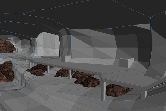
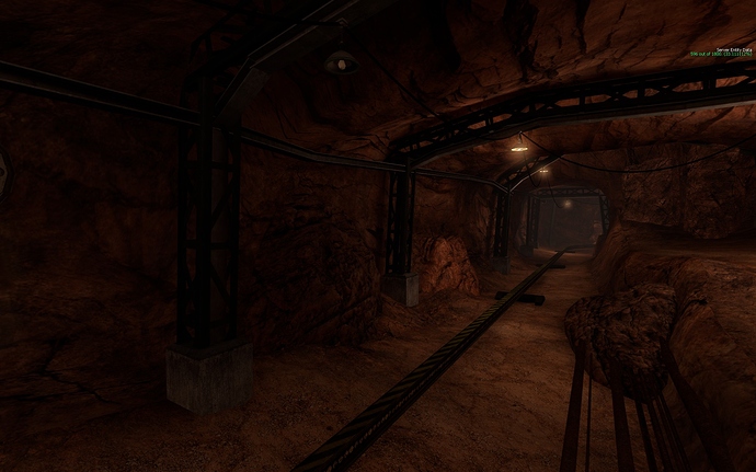
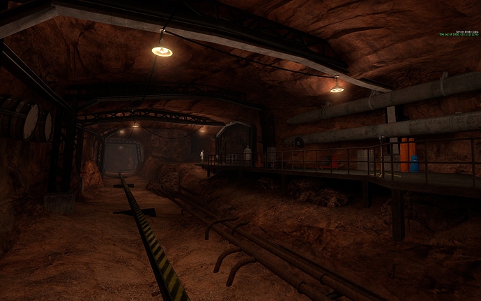
I did manage a few things before I left and a couple today. One of the things I did literally before leaving was to work on some rocks for Inbound b. There are still old ones in the map but the new additions should blend better. The lighting was the main issue with the others along with an iffy looking texture set (I did them YEARS ago). You should notice the AO that was applied to the new models that helps their transition in to the brushwork.


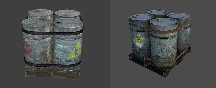
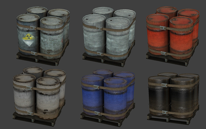
Today I finished these. These are probably a HL2 prop don’t know for sure since they have been redone at least once. I didn’t like the way they looked and wanted to add AO to it to smooth out the texture. Turns out doing that required a reUV and compile. So finally got the time to fix it all this afternoon.


1st is a before and after. The second shows all the variations. The 1st 2 variations are the original textures just touched up, the last 4 are new.

I like the looks of the well worn and weathered straps on the right so much better than the other images that have straps that look new. The only suggestion I have would be to weather the buckle too. It looks too new in all of the images.

[align=center]

[/align]

Really glad to see new skin types for those CS barrels. The constant Radioactive/Toxic combo skin every time I see them in any game or mod was starting to grate. :stuck_out_tongue:

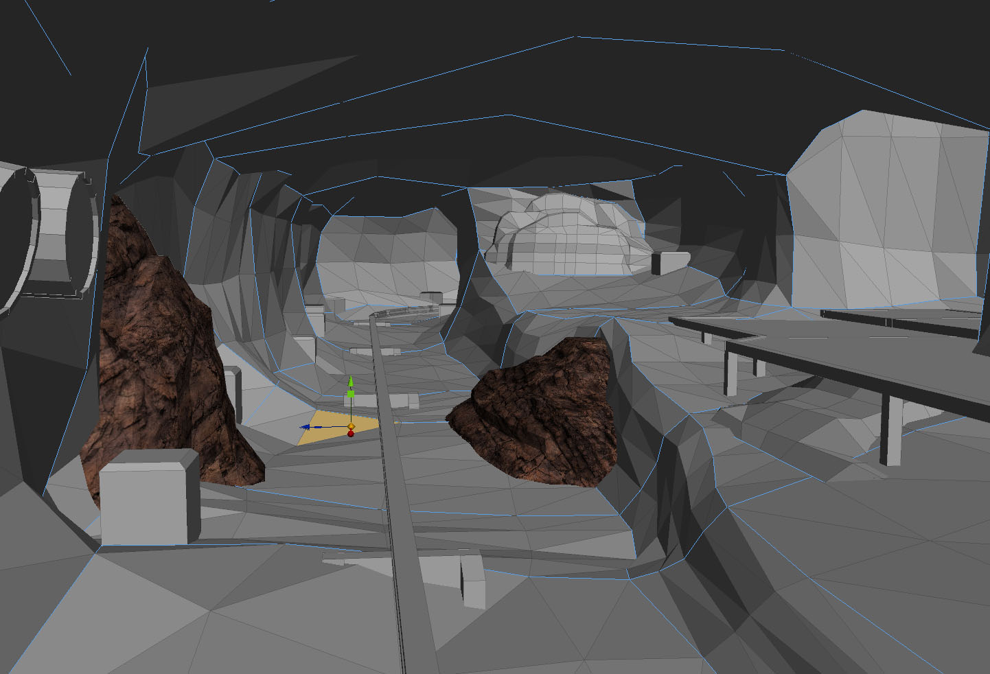
So, am I right in assuming that the reason we’re seeing the map geometry in the modelling program (I’m guessing it’s 3DS max, could be wrong as I don’t use it) with the models is because you used it to get the shadows just right with the rest of the map when you baked the AOs?
That’s ingenious. I’ll have to be sure to use that technique sometime.

Same here :stuck_out_tongue:

I am also curious about the map geometry screenshots, was it taken in a new hammer? :zip:

No, that’s taken from a modelling program. I believe Brian uses Max.

I do use max, but I’m not very fast with it. The pictures are actually from Silo 2 which is what I learned on. The map geo was imported as a dxf. It’s the same method I posted about when I redid the skybox for inbound and made all those bushes. I will be going over exclusively to Max to use wallworm for Xen. You can import vmfs and model detail add textures and then export the map. Haven’t played with the feature yet due to its complexity.
I actually lightened up the straps from the first pic because they were reading too dark and didn’t look like canvas.

Nice!

looks very nice someone should make a vid comparing all 3 versions of black mesa

Very nice. I really like those new barrel renders. :smiley:

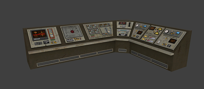
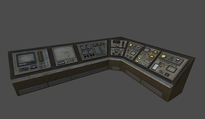
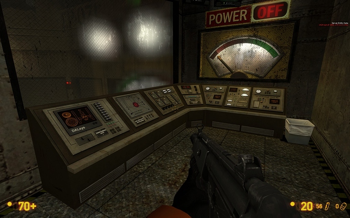
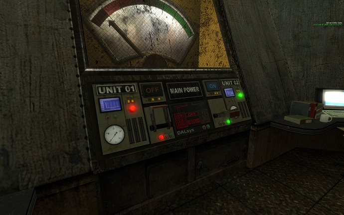
Continuing to redo/spiff up things. This prop needed to have a few things removed so it was a chance to make the prop a bit more detailed and then age it better so it fits into the area better.
Before…


After. The screens aren’t shown.

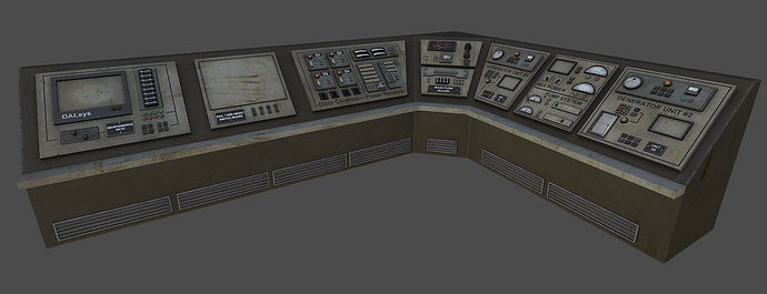
So less colorful which is good and more unified lights and a lot better aged. Also notice the details that were just flat textures are now geometry. The vent covers, the fuses and the individual lights (they were just flat cylinders). I also removed lots of things that didn’t make sense like clusters of lights that had no purpose. The rest of the consoles on this level will probably get the same aging. The rest didn’t have as much odd detail so should be much faster.

Nice, I like it :slight_smile: :slight_smile: :slight_smile: . I thought the console panels looked pretty bad up close on the first release of Black Mesa, no offense:[

Well since I did them all don’t know how I couldn’t. I just textured them I didn’t model them. You should have seen what they looked like before they were redone.

… the first reiteration or the newest one? Because I suspect they’ve already gone through multiple re-iterations.

This particular prop only went through one. The others 2 maybe. They were modeled and textured 8ish years ago then I had Bjorn redo them the last year to 6 months during our crunch. If people don’t like them they are free to change them themselves.
Final pass.

Aye, that’s true. That’s the beauty of PC games. If someone doesn’t like it, they can change it… usually (hardcoded things aren’t all that easy to change).

Looks good though, I take it that console is from Blast Pit?

I’m guessing Power Up, since it has turntable controls on it…

Also, thanks so much for doing these, Brian. Really helps makes the wait easier.

Also, just a question. You mention how the console is less colorful now… is that going to be part of BM’s general art direction in the Steam version? (If you can’t comment on this, I understand.) I always liked the use of the occasional bright color in the mod version.

Well like I’ve said before my stuff is more reality based, instead of cartoony. The rest of the game is at least 90% the same.

I’m loving all of this content. I seriously can’t wait to see it al ingame, I’m litterly going to stand a few minutes everywhere just looking at all the details in the textures, models, and mapping.

I love these updates, Brian. Thanks so much for doing them.


In game. New animated screens added. Also redid the lights on the bottoms image and more animations. Looks really cool with the needles moving and the bar graphs fluctuating.

Founded in 2004, Leakfree.org became one of the first online communities dedicated to Valve’s Source engine development. It is more famously known for the formation of Black Mesa: Source under the 'Leakfree Modification Team' handle in September 2004.