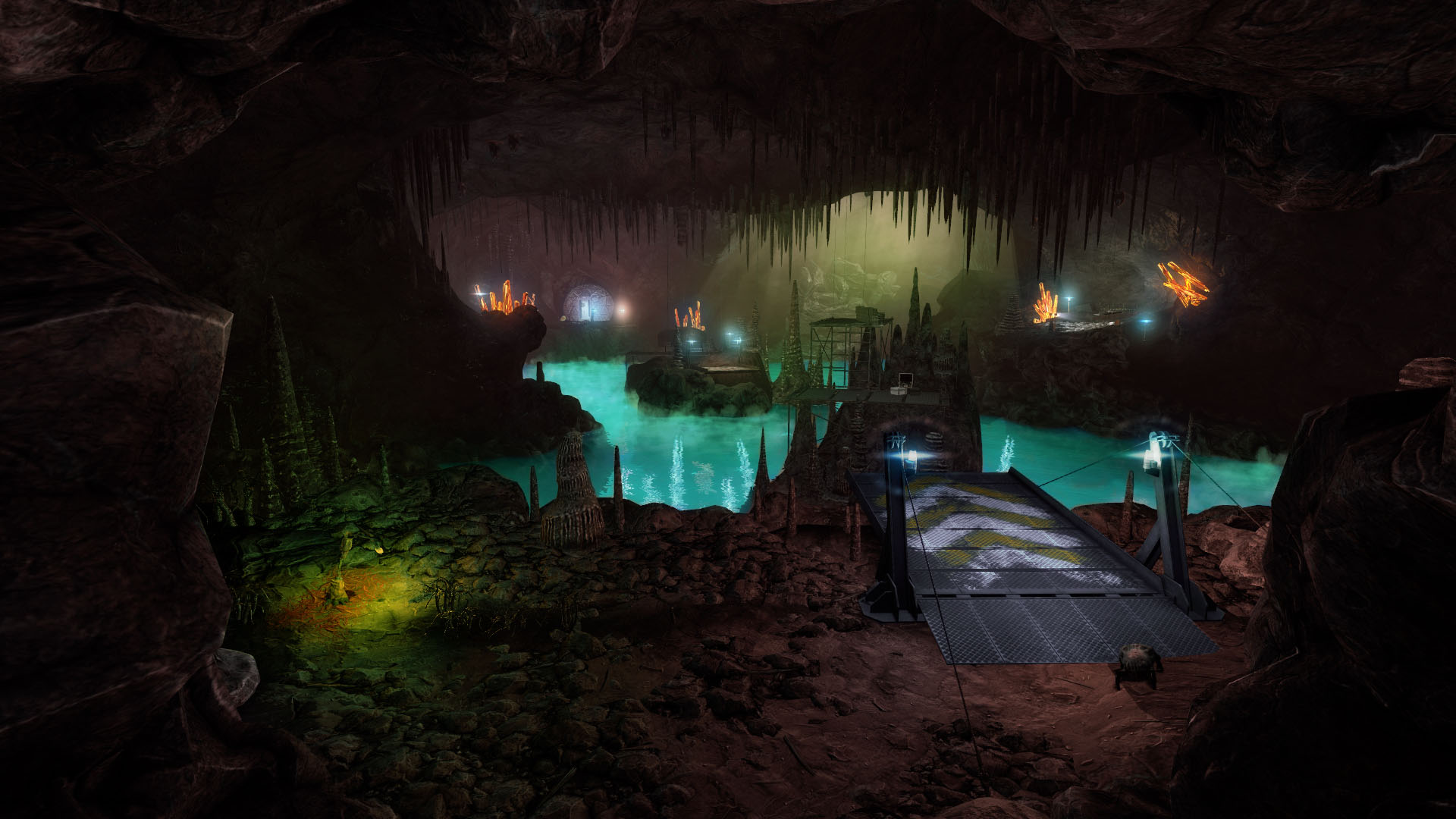
I actually preferred the blue color scheme. What I’m sort of looking at is how to remove the reds and browns while still keeping the area identifiable as Xen.
Guys you gotta keep in mind that Xen is a border world in a different dimension from ours. There is also the possibility that behind that scene some of the Xen wildlife is encroaching on it far more than what’s in the shot (take a look at the lower-left). The level could also be far from done. It’d be logical to assume that there’s chunks of several different worlds there, not just alien matter, but also stuff that looks like it came from our world (though I don’t remember anything in the lore about chunks of our world being teleported there).
Regardless, I like the picture, the level design looks superb.
If y’all are talking about the blue ambiance, I’ve just chalked it up to the blue lights in the cave.
There are also those bioluminescent plants nearby that are giving off orange light, just not much.
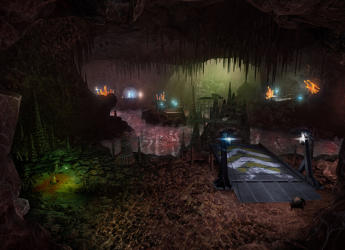
I was so intrigued by the drastic result of a simple color correction by stobing I wanted to play around myself, trying to incorporate some of Xen’s original color palette just for fun. Xen had a lot of flesh tones and sickly greens from light sources… while some of the water was a glowing aquamarine (and some of the liquid looked more like raw gelatinous hamburger.) Here’s an attempt to show the same environment using some of that palette, but with the non-hamburger-water  Didn’t come out exactly like I was hoping but… eh, I’m no Photoshop expert. Plus it’s difficult to capture the vibe with color alone,
[attach=5168,none,1920][/attach]
All of these edits look as pretty as the original screenshot.
I don’t know which one I prefer.
And just for kicks, here’s one with hamburger water and weird calcified sponge/brain textures! OK I’m done now.
[attach=5169,none,1920][/attach]
Really a testament to the quality displacement and model work the devs did that they look good under so many different lighting conditions and texture colours, rather than just the one they went with.
I’ve gotta be honest, I do think the weird flesh-water adds a bit to the cave.
That said, I doubt they only have one kind of water for the xen levels. Plus, given the scale of the new Xen maps, it’s very possibly there’ll be multiple palettes and environments to help create distinct sections of the game.
Agreed, I can’t wait to play with those assets in hammer… I wanted to remake some doom levels in Black Mesa, just to see, but with the CC I did, I think it might fit perfectly for a more hellish setting too
That is beautiful work you guys. I have no idea how you managed that visual quality in Source.
The fleshy textures really add, I gotta agree on the impression that the more organic color tone and also textures add to the strangeness of Xen, which makes the island feel like an organism of its own (Also the cave on the Xen map in the original Half-Life where you get “pooped” out to land on the manta’s back always made me feel some rocks floating aroudn were actually living things). That being said, I’m really excited how the reinterpretation will look like. Everyone moaning (a lot of people were also doing this about Black Mesa not being a 1:1 conversation of HL): Go and play Half-Life if you want Xen the way you like. I’m for one am curious to what changes have been made and how it looks like, then I’ll decide what I like more.
I find it really funny that there are so many comments on here about people wanting Xen to be a living organism, closer to the original.
All I can say is…wait and see…there are MANY surprises in store…
sorry if i ask too early, but are you guys having a plan or something to remake blue shift and opposing force after finishing black mesa?
This has been mentioned before and the team is not going to be remaking Blue Shift or Opposing Force after this is done. There are remakes of those in the works by other teams.
Let’s keep this thread about the Xen screenshot. Thanks!
Looks fantastic! I love the ground textures they light beautifully. tangent space normals or the fancy SS shader from orange box?
The introduction of some human structures makes perfect sense (in the starting area) always seemed odd to me that there was this huge portal device connecting xen to black mesa but they’d only sent over a few HEV scientists.
I do think @The_KillSmith s additional slime/organics brings something to the table but honestly nothing you couldn’t do with some decal work.
My only criticism is I don’t like the stalactites and stalagmites. I just personally imagined something more organic like roots or tentacles breaking up the ceiling.
Mind you I think the fact it reminds me of Natural-selection 2’s good looking but awful gameplay map Mineshaft makes me a hater of stalactites in general so maybe best you ignore that.
You know, I think there’s really something to that. Replacing the rock formations with tentacles or something else equally unusual would go a long way to bringing back that ‘Xenny’ feel and making the level seem less generic.
Great work guys! Though it is not be with my own imagination of Xen, but it is still very gorgeous. Keep your fantastic work please!
Many people want a more organic Xen and I agreed, too. But Xen is an area and it’s not a living creature, so there is still inorganic part in it. You can see rocks around you in Xen in the original Half-Life.
The developers also said that they have more things to show us later, this is just the first screenshot. So just wait for the new medias and do not have a limited view of the whole Xen chapters by only one picture. In Chinese we said that don’t be a man that looking at a leopard through a tube, you will see only one spot after all.
At the end of the day there doesn’t seem to be an issue here, since many fans obviously want more of the original Xen atmosphere, and we are being told in a not-so-subtle way that we will definitely like parts of Xen that haven’t been shown yet. So it seems like everyone is probably on the same page. They had to have known, having chosen this screenshot in particular, that there would be fans that would comment on the non-Xennyness of the art style and color palette, and they posted it anyway to give us a glimpse of some of the hard work without giving too much away. So more patience will be rewarded I’m sure. Save the best for last (let’s hope  )
)
Amazing work guys ! Keep doing a job well done !
It looks nice, can’t wait to die in it a thousand times like I did in the original Xen.


