THE FIRST ITERATION - A NOBLE (BUT FAILED) FIRST ATTEMPT[/size]
An Introduction to Gasworks[/size]
Gasworks was one of the larger maps in HL1DM. I believe it was originally a map for Opposing Force which then got ported to HL1DM. It had a really unique and cool layout, with lots of fun sightlines and interesting encounters.
Most key to the map was that it had 2 very distinct sections. The surface area, and the underground section, with limited means of moving between them. Both areas saw all kinds of unique and crazy combat between their intense sightlines. The underground was well suited to horizontal, close quarters play, and the surface area was very vertical and open. The underground section had a lot of connecting tunnels and hallways, but overall Gasworks has a really simple layout. Jordan (a fellow level designer) summarised it very nicely: “it’s like 2 different maps stapled together”. Maybe a flaw, but I think it’s also one of the map’s most unique charms.
Overall, I have always thought it was pretty much the best designed HL1DM map. It played well from 6 - 24 players. I remember doing some community games on Gasworks fairly recently with 20+ of us and it was a hoot. Might bring those back, at some point.
So, once I finally joined the team, I was given the task of making Gasworks, and told that it would be the perfect trial-by-fire; a difficult map, but one which suited the style of what I’d worked on before. I was thrilled. It was one of my faves from HL1. So I got to work immediately.
Jumping in. That was my first mistake. I’d always been a mapper who tended to jump right in rather than plan and refine prior to starting, and it really bit me bad here. It’s not arrogance; more naivety. I’m not so good at the planning side, I prefer a more hands-on approach. But, alas, this made me suffer in the long run. In the companion post to this I will explore the importance of planning, construction, and references, and why I suffered from having none of these.
Lesson number 1: plan ahead. Think. Don’t just do. A lot of level design is trial and error, but without a fundamental plan, you’ll be trial and erroring forever.
Layout[/size]
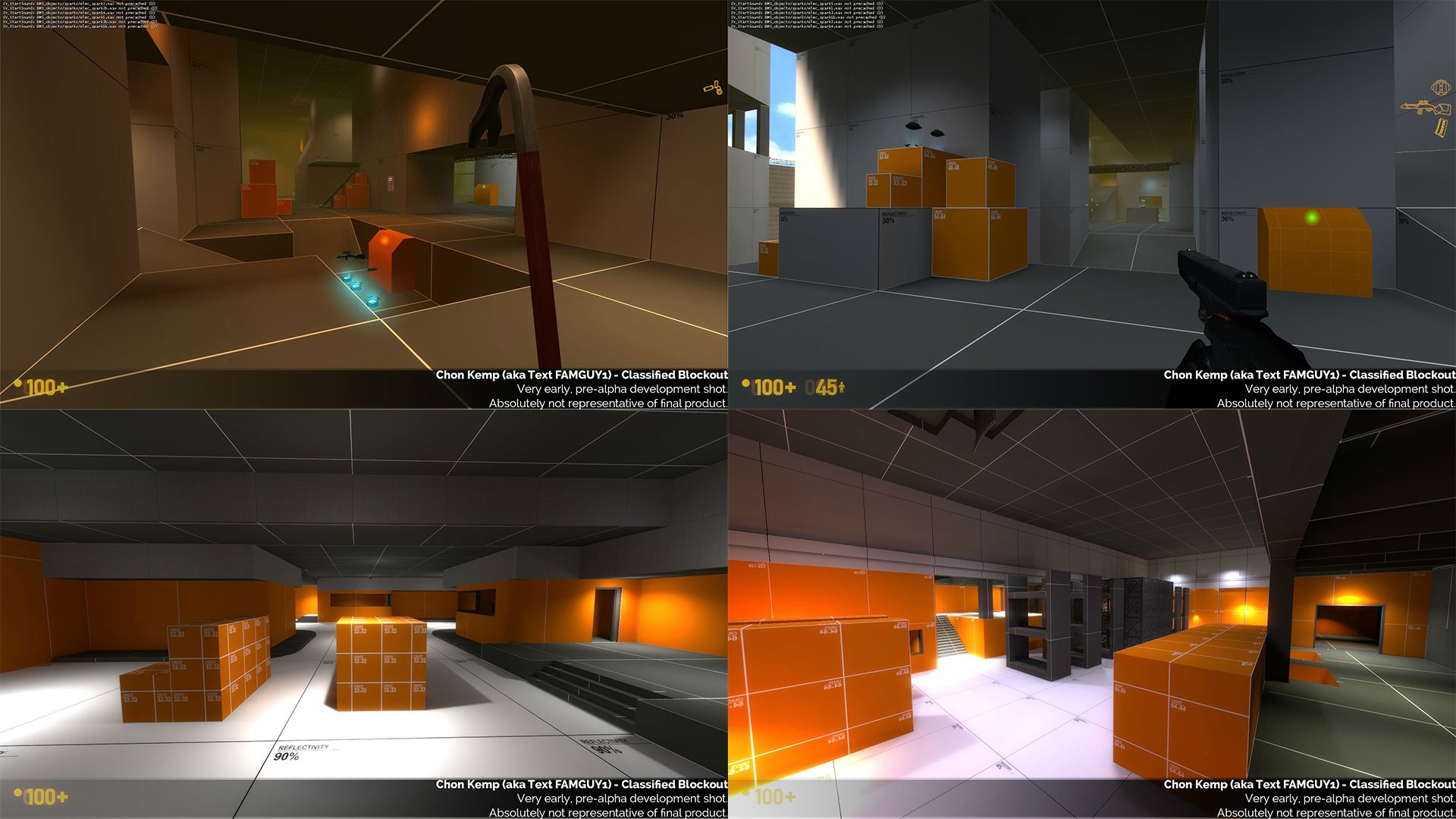
Typically, the actual mapping process, post-planning, starts with what we call the “blockout” phase, on Source called “orange mapping,” which uses orange and grey developer textures. During this phase, you construct the map’s layout in its most basic form - no detail, just the layout. Here are some example blockouts I have done for Black Mesa:
The team’s take on this is that the first blockout of any of the MP maps should be a 1:1, exact remake of the original, with just developer textures (orange/grey/white). The idea is that you can start with a solid, tested base to work from. You set up and open HL1’s Goldsrc Hammer, run it alongside Source Hammer, and create your own version which matches the dimensions of the original precisely. It may deviate in one or two places for the sake of fixing odd/off-grid dimensions. This is how pretty much all the other maps have started. They use ultra-simplistic, minimalistic and clear lighting, and stick to dev textures only. Then - test and refine. Get everything reading and playing great before going into aesthetics and architectural design. Test and document between each iteration.
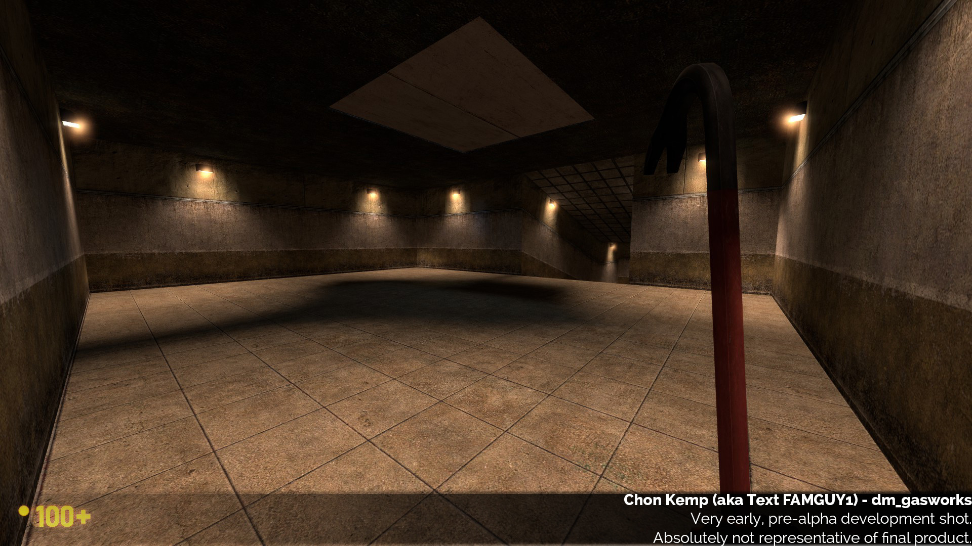
I did not do this. Instead, I spent a long time running around HL1 Gasworks, examining footage and recalling my own memories of the map and how it played. I wanted to immediately fix the flaws of the original, and create more interesting spaces where I thought it was lacking. My first blockout used adjusted dimensions, changed what I saw fit, and had many layout changes and differences. Some were conscious, many were mistakes and oversights. Some areas were too big, sightlines were different; a lot was wrong. I hasten to stress this was not arrogance - simply lack of experience, and overambition. I bit off more than I could chew.
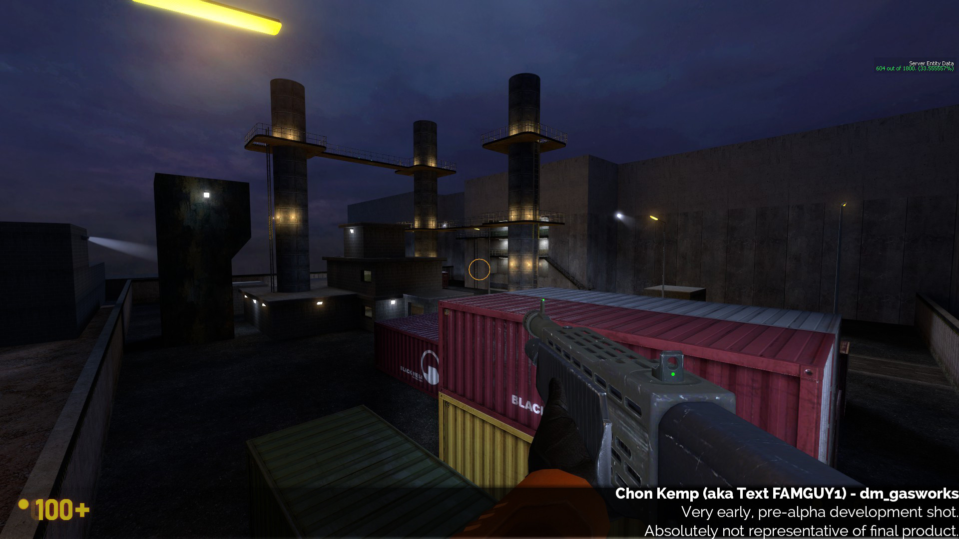
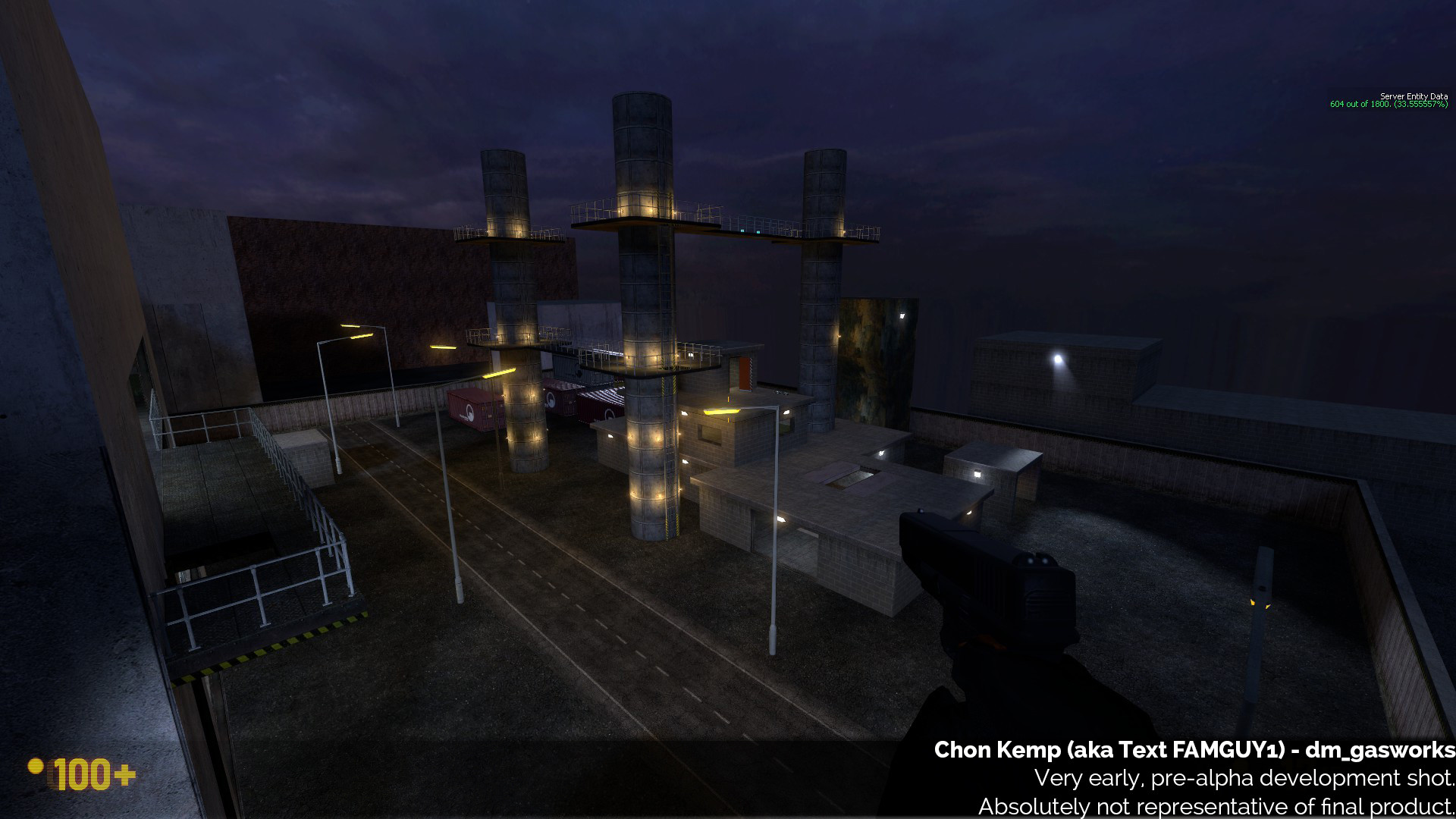
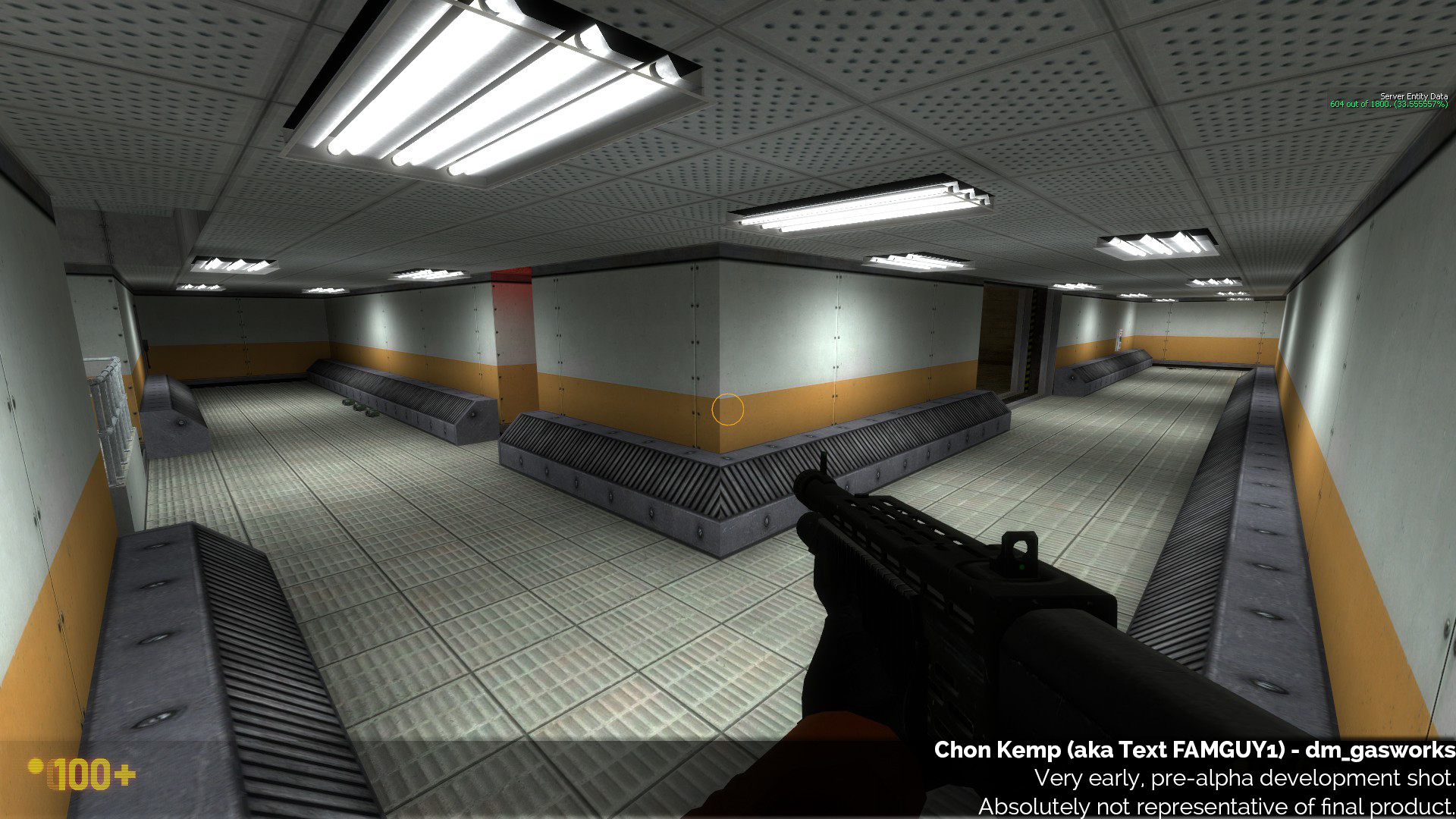
Even the areas which I had intended to be the same were different. Note in the outdoor image the HUGE empty space on the right which was not present in the original. Or the colourful containers which are MUCH larger than the originals. Or the towers being way thicker than the originals too. This all adds up. Or the extremely poor placeholder lighting. None of this is suitable for a very first iteration.
Route Modification[/size]
This whole layout section assumes some degree of familiarity with the layout of the original. If not, my apologies, might want to skip this bit! Or have a run around HL1’s Gasworks!
My version of Gasworks really only has a few major additions to this day, and even those aren’t that massive. Most of the main layout changes were done early on in the map’s development, which is actually a good thing. The bad aspect was I did them in the VERY FIRST version, which gave me an inaccurate baseline to work from, but this is one aspect of the early versions which turned out to be a double-edged sword. I’ll outline some of those changes now (but not all):
NEW ROUTES
The first issue is a fundamental issue I have with Gasworks - in the original there was never much flow between the map’s two main sections - outdoor and underground. At least from my experience, players tended to head for the surface if they were underground, and never return. Or simply stay underground. Both main sections offer uniquely different and exciting gameplay, and I really wanted to make sure that players got a chance to experience both sections equally during any normal game. I wanted to find a good balance. More movement, but not too much.
One of the reasons I identified for the lack of flow, particularly from the surface to underground - was the lack of viable routes leading back underground. To put it in perspective, the original had 5 ways of reaching the surface from underground. The two main ladder shafts, or the three teleporters (one of the teleporters actually has two potential destinations, depending on whether you went in the left or right side). The teleporters are only 1 way.
Compare that with leaving the surface. The two way paths allow you to go from the surface to underground, as does the conveyor door with the drop down. So that’s 5 ways up, 3 ways down. A simple issue of ease of access. To address this - I decided to add a 1 way route which only takes you from the surface to underground - and I decided a good place to put the route’s exit would be in the new control room.
Additionally, all the existing routes from the surface to below, were awkward - particularly the bay doors drop down route. They were awkward because you had to go to a button, press it, and wait for the doors to open, which would then take you on a long route to another drop. Not used much.
My goal was to make these routes less awkward and more usable, and introduce a new one, to facilitate better flow. I eventually succeeded, but early iterations were not perfect.
DROPDOWN DOORS ROUTE
I tried to make the drop down more viable by expanding it into a combat area. Frankly, this achieved nothing. I would later learn that the best way of solving this route’s problems, is to make it as viable as possible as a THROUGH ROUTE. In the original, this area was simply a hallway you could run down. I tried to expand it into a room that combat could happen in, to make it a more complex place which players would be inclined to use. This was the wrong approach. I later worked out the right one.
I’ll explain how I did this in a later chapter. Simply changing the gameplay space for no reason was a bad idea, it just added a lot of useless space, and I hadn’t addressed the root issues.
Also, DAT LIGHTING. For a first blockout, my early lighting tried way too hard to be artistic, moody, and varied. It just looked bad throughout the whole map. The very first version MUST BE VERY READABLE, especially in lighting. You can develop it from there. If the first version is not lit well and CLEARLY directed, it’s very hard to make subsequent lighting effective. This is something which I would learn the hard way in later versions.
THE CONTROL ROOM
This new area came to be known as the “control room” (for obvious reasons). I added this in right from the very first version, and it lives on to this day - but heavily modified.
The control room was also designed to make the hallway which led to the long shaft (from the original) be more useful and viable a route. I never liked that pathway in the original because all it really did was lead you to the teleporter/underground room again, with no real advantage. With the addition of the control room, I was hoping to reward the player with some goodies, and a nice overlook into the main underground room, without it being too strong a camping spot. Again, in early versions this wasn’t hugely successful but as I refined the route, it grew and improved a lot.
NEW VENT ROUTE
I added a new vent which dropped down from the surface into the new control room, again hopefully expanding navigation options while overall keeping things simple. With refinement, this route would become viable, but early versions were not.
I really struggled with this route and it took a lot of time and perseverance to make it eventually work. The biggest struggle was to make it both a 1 way route down, AND a viable one. The first version (pictured here), was simply a drop into the room.
It’s interesting. Even though player fall damage is capped at 10, just like in HLDM, players still HATE being forced to take fall damage on a main map route. One of those weird psychological things - players are happy to take shortcuts which defy the main routes and take falling damage as a result (such as by jumping off the main stacks outside to get to the ground floor), but when they have no alternative but to take fall damage along a proper route - they hate it. So this route did not get used at all, because players wanted to avoid falling damage. At the time, making it a dropped seemed the only good way to make it a one-way route. But I later got creative, and solved this issue. But in early versions - this route was a failure, if a good idea on paper.
Visuals and Art Direction[/size]
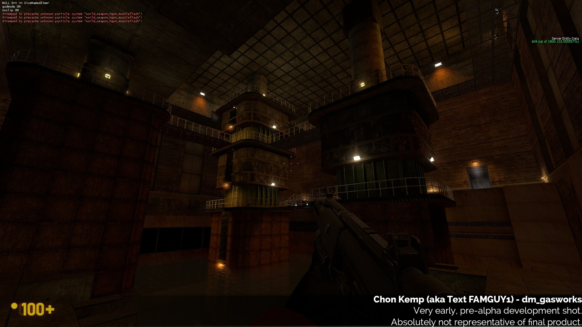
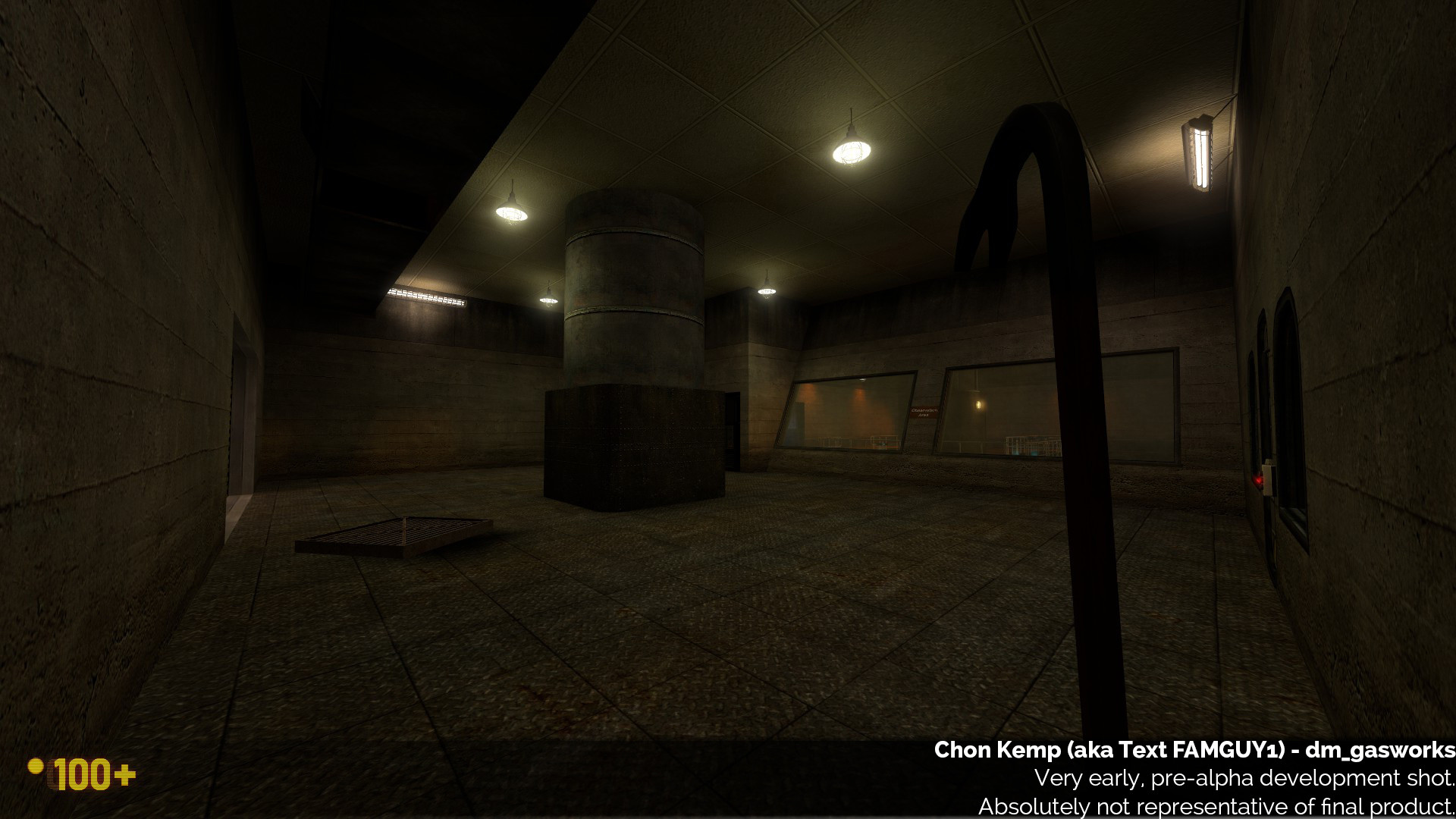
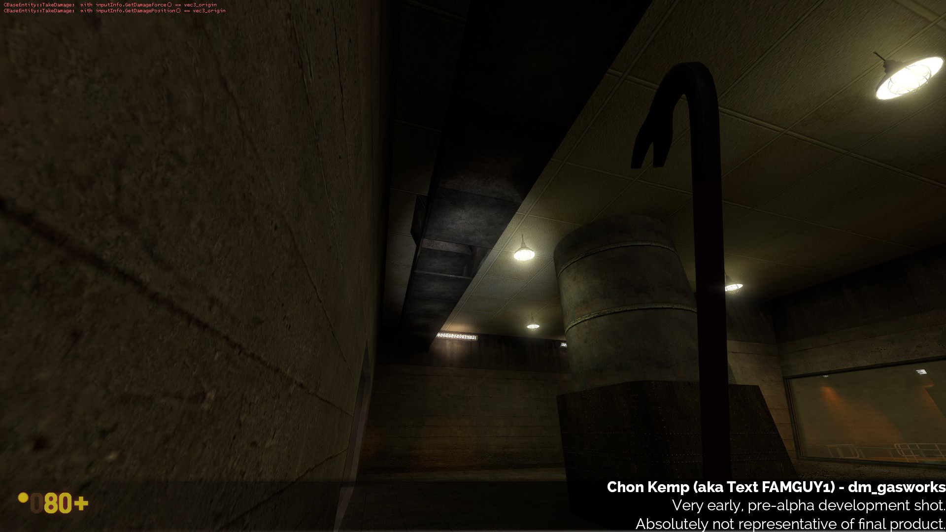
One other overarching issue you will notice from the images; I also did not use developer textures. Personally, at least before now, I had always hated orange mapping. My logic, at the time, was that the textures and theme of a map are so core to how it plays and feels, that testing without at least some semblance of textures and lighting does not give you a representative experience of how the map plays. To me at the time, I felt that texture and lighting choices are so central to how the map plays, and how players navigate and use places, that removing them from the equation does not accurately allow you to test the layout well. This is true, to an extent. But that is also the point! Orange mapping is designed to make it so that you are only ever adjusting the layout and perfecting that, starting from the 1:1 base. I guess you could consider it a “scientific” approach to level design. The textures and lighting COMPLEMENT the layout, and must be considered separately and in their own great detail. The layout has to work, first. Additionally, as Chris (our lead mapper) always stresses - just texturing a blockout is often a really bad idea. Because then you just have textured blocks. Nothing cohesive, architectural, structural, or thought out. You just end up slapping detail onto textured blocks, rather than having a vision and artistic direction. Look again at the screenshots I posted above. Everything is really just textured blocks. No actual detail or design. If you start with this, you end with this.
The first version of Gasworks which we tested, was “artistically” lit and textured. What actually was a mistake in retrospect, had given the illusion of really fast progress. It playtested fairly well, we enjoyed it, and the response was good. Or…so it seemed! I would suffer a rude awakening, soon…
Let’s explore some of the art direction, first.
COMPARISONS
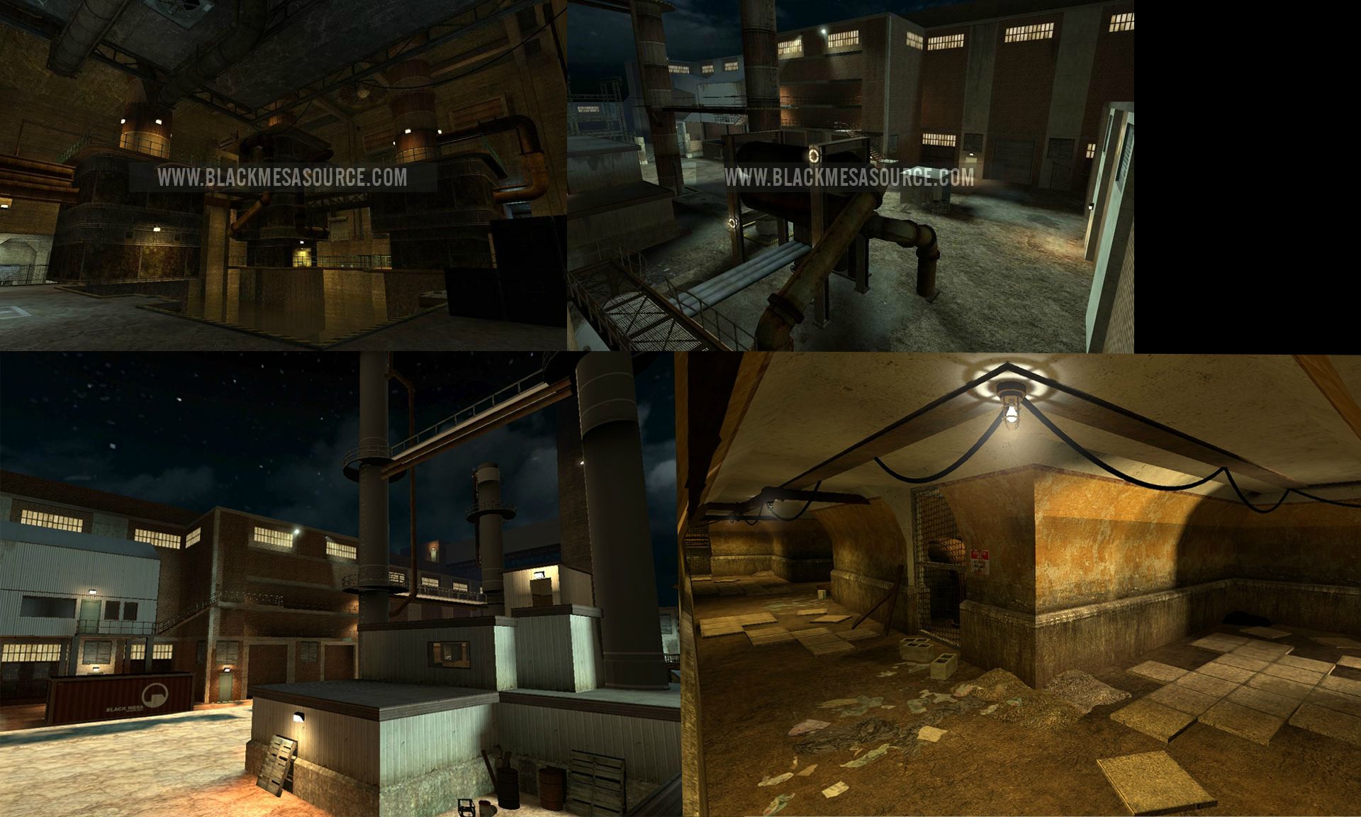
I had something of an advantage with my version of Gasworks. One of our former level designers, Chuck (who has worked on Titanfall), had created 2 previous versions of Gasworks in the distant past for BM, and had very kindly sent me the vmfs to comb through and analyse. The layouts and ideas present in his designs (both of which were unfinished), were solid, but the constructions were not perfect, and the theme and aesthetic was quite at odds with anything else seen at Black Mesa. The team and I had already made the decision not to reuse any material from those versions - it simply made more sense to do a neat, clean design from scratch. We at Black Mesa have a long and illustrious history of redoing maps from scratch - but it’s often the best way, honest. You should see how many times Stalkyard has been redone!
One thing that particularly stuck with me, with Chuck’s versions of Gasworks, was the visual style. He’d gone very much for a 60s, brickwork style of design. It was a very unique and interesting look - but it didn’t fit in very well with the rest of Black Mesa, nor did it fit in well with Half-Life 1’s version. I really liked it, but it didn’t match what I wanted.
Here are some shots of Chuck’s old version:
My initial thought process with Gasworks was to look at what Chuck had done, what the original had done, and then give it what I thought of as the “Black Mesa” treatment. This is where I made my first big directional and visual mistake, and it stemmed from my origins in the community, where I had gotten used to imitating Black Mesa’s style on my SP works, with Surface Tension Uncut and On a Rail Uncut. I did the only thing I’ve really known, thematically speaking. I imitated chapters from Black Mesa’s SP. This wasn’t a conscious or even lazy decision, it’s just the way I was used to doing things, at this point, the idea was to make it cohesive and fit in. Sounds solid, on paper.
One of the thematic elements from the original Gasworks, which I had always loved, was its mishmash of themes and styles. For those of you who are less familiar with the original - aesthetically, it was a mess. It had no real cohesive style or design. Its interior hallways were done in the Lambda Core style, the underground tunnels and huge cavern was done in the style of Apprehension, and the surface was very Surface-Tensiony. I found this myriad of styles charming in the original, and thought that its unique charm could be brought over into Black Mesa. My first iteration tried to preserve this.
So, I wound up brainstorming theme ideas in a group Skype call on how to reconcile this mishmash with Black Mesa, and make it feel cohesive and well-designed, rather than an oversight. Mike Hillard (our scientist voice actor and resident BSP lover), suggested that the Apprehensiony parts of the facility could perhaps be generating power for, and be a cover for the hidden Lambda Core parts of the facility, which would be hidden behind secret/closed doors, which had been jammed open/overridden/broken/whatever, for the sake of MP. I jumped on this, because I thought it was a great idea! It would also allow us to explain the experimental teleporters which happened to be lying around, and give the map a unique blend of ideas, while making some degree of sense. It sounds silly on paper (it is), but it seemed like a fun way to reconcile the stylistic differences between the areas.
And so, I made my choices. The large underground cavern, and some of the tunnels were done in the style of Residue Processing (RP). The hallways from there were done in the Apprehension style. Then you had the Lambda Core hallways, and the Surface-Tensiony surface area. The idea was, I would later design the “transitional areas” to make it appear like they were meant to be hidden, to make it not so jarring. The end result, was not cohesive, and was a mess:
I had no real solid direction. No clear image of where I wanted the map to go. I was working hard and making progress on it, but I hadn’t taken the right approach. The end result was a map which didn’t work well compared to the original, but also did not work well in its own right. My only real visual direction was “copy Black Mesa,” hardly a useful target. A map’s visual style needs so much more than this, something I will explore in the next part. Direction and reference are key.
I tried really hard to make the mismash of styles work - but that’s one of the interesting things about video games. Things are often designed poorly in real life too - the example I always love to think of is tiles lining up with the walls and such. This actually rarely happens in real life. There’s always some misalignment and weirdly cut ones, or angles. But all the tiles in Black Mesa, everything tends to line up perfectly. When these real world imperfections are replicated in a video game, it’s very easy to read it as poor or lazy design. This is the issue I found with the mishmash of themes. Even though there are more than enough places in real life with different styles contrasting one another in a tight space, it just comes across badly and poorly-thought out in a game. Perhaps it’s because in real life, with buildings, you have to make do with what you’ve got, and make it work. But you don’t have to do that, in video game design. Changing a room to make the tiles line up perfectly is a few minute’s work in a game - but months of work in real life! Just a random musing.
CONCLUSION
All I’ve really done so far is look at Gasworks’s first iteration, and peek into some of its failings, with hindsight. The next chapter will talk about my rude awakening, and the subsequent, even worse version which came after it,
followed by its phoenix-like rebirth into something beautiful. Part 2 of this chapter will look at the importance of references, direction, and solid construction at the blockout phase, all of which are ultimately the reason this version failed and was redone from scratch.
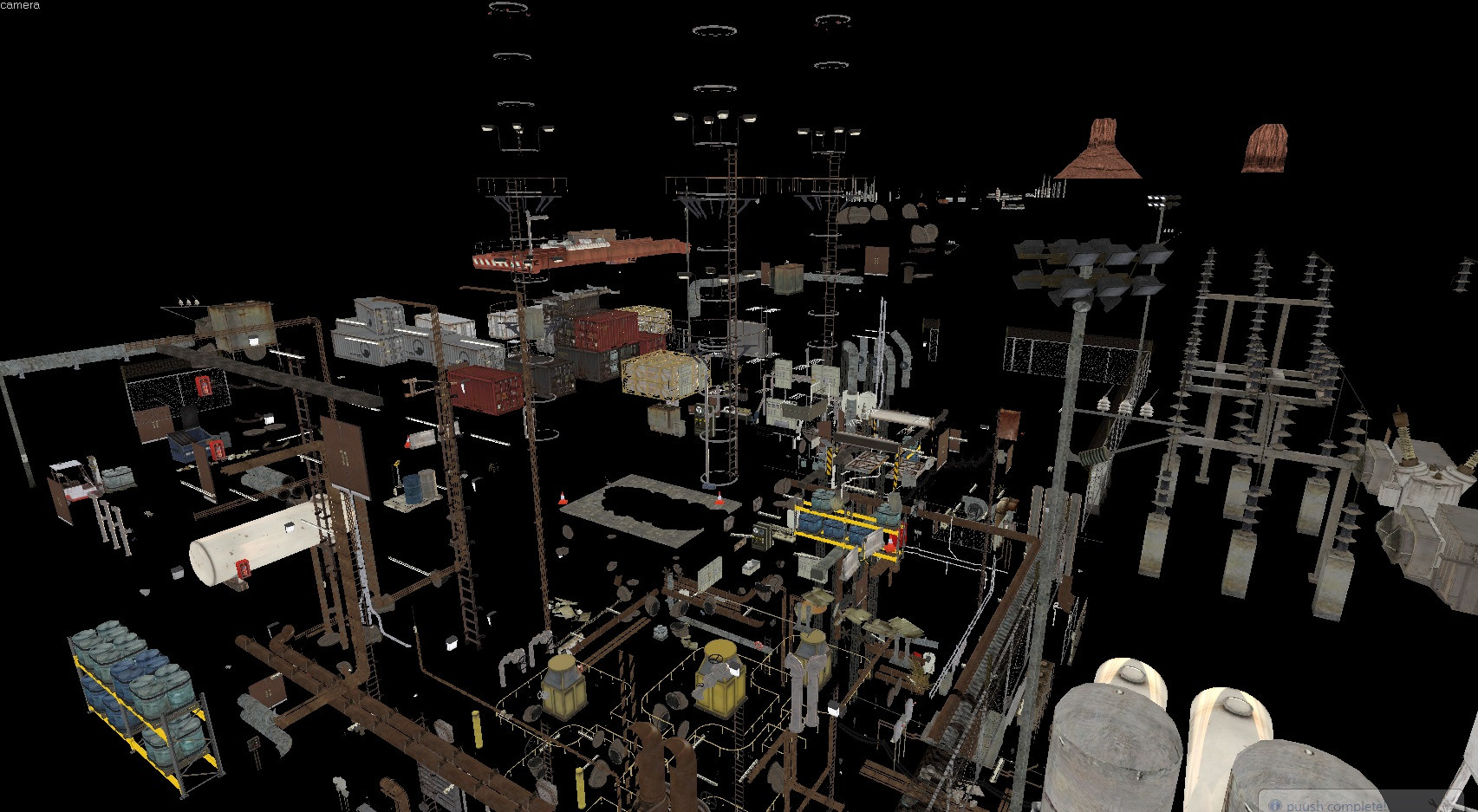
To cap off the post, here’s a fun image of Gasworks. See if you can figure out what it is:
Feel free to give me feedback on what you did and didn’t like about this post, or what you’d like to see more of. Just be polite about it. Tune in next week, for more, if these are well received!


 In fact yes, I think it’s mainly because of the lighting which WAS a mistake.