BACK TO THE DRAWING BOARD[/SIZE]
With my second version of the map being torn apart, I started to fundamentally question what I was doing. How had I got it so badly wrong…again? I’d taken in all the feedback I’d been given, but it still wasn’t good enough. With reflection, I realised that I was suffering a lack of direction and vision.
So, I went back to the drawing board. Figuratively and literally.
In my real-life job, I work for a think tank/consultancy who advise firms with their businesses vision and plans. We stress the absolute importance of a clear vision and positioning within the market. If you think about it, it’s pretty funny that the problem I deal with for a living, was the root cause of my issues with the level. Action without vision is useless. Vision without action is just a dream. Vision and action can change the world, as we say. Always loved that saying, corny as it is.
REFERENCING
So I tried to consolidate my vision, to get it nicely laid out and clear before I did any work. Back to the planning stages. I started gathering references. Referencing is a very important part of level design which I had totally neglected prior to this point. Referencing means collecting reference images of the real world, which adhere to (or help create) the overall vision of the map you have in your mind. Through gathering and refining my references, I started to get a very clear picture of how I wanted the facility to look. You can also reference other games and maps. I particularly latched onto the map de_nuke from Counter-Strike (the Source and GO iterations), as a style of power plant building which I quite liked. The metal buildings look was something that hadn’t been done in Black Mesa, and I thought the lines and materials allowed me to do a bunch of really cool things, detail wise. I thought that style would fit the modern-yet-old look that a lot of Black Mesa has, and the lightness of the metal would greatly help readability in the nighttime.
For the underground segment, I settled on trying to utilise the style of Blast Pit, throughout that entire facility. I would keep a consistent architectural style. I also devised a colour pallet which I wanted to stick to - both for lighting and for world textures. I would later refine this further. Yellow, red, blue and gray. The important parts of the map would be textured in colour (yellow or red), and the rest in gray. Blueish lighting throughout. This scheme would get refined a lot in the future.
Let’s take a look at this third version. The first to have been planned and envisioned.
INTRODUCING…ITERATION 3![/SIZE]
I tore out the previous version, gutting it down to the basic geometry. I was able to keep the old geometry this time, because that was the part I’d done mostly correctly. I simply tore out all of my artistic decisions. A few layout pieces were indeed revised, too, but nothing significant. This was the first iteration which started to resemble a proper, well-designed map - though it still remained pretty far off from how the map is now! Art wise, it was MILES ahead of my previous versions.
There were no huge overarching mistakes with this version, to be honest. This was just the first version of something which would see A LOT of iteration and refinement, as most maps do. Though I’ve learned that on Black Mesa we often end up iterating more than most! Below I will show some of the more interesting design choices on the map:
DESIGN CHOICES[/SIZE]
On the outdoor buildings, I emulated the style of the de_nuke buildings. We ripped out the de_nuke textures to use as temporary textures, while I consolidated the design and came up with my final ideas. I initially went for a slanted roof style of design in an attempt to reduce blockiness, but that was eventually (after this version) scrapped because it looked pretty terrible and random.
LIGHTING
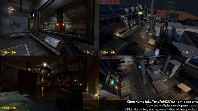
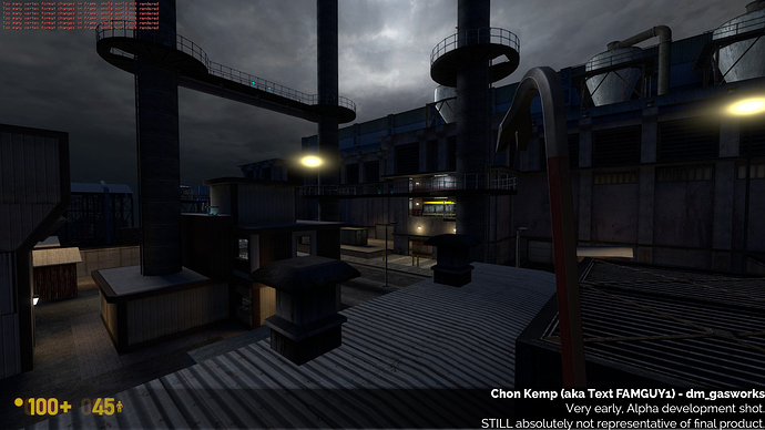
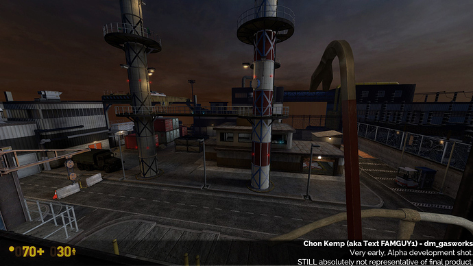
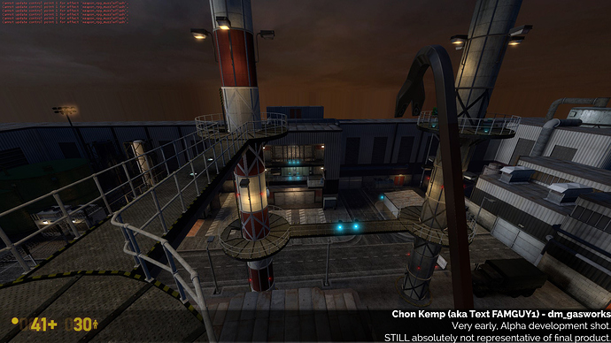
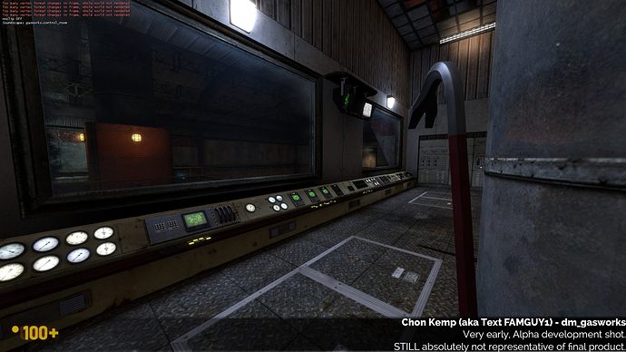
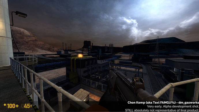
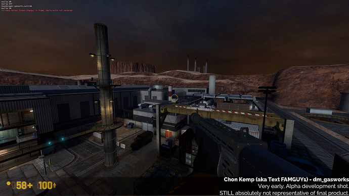
As you can see from the screenshots, this was the first version where I’d start to really try and address the darkness of the surface! The current version’s lighting is still very different to these shots, however. I knew that the previous version had serious issues with excessive darkness and poorly positioned/coloured lighting. So I started off with a very simple lighting pallet - one highlight colour, and one fill colour. The two halves of the maps had slightly different colours, but they were internally consistent:
I think you can see the significant improvement in the shots. The lighting is indeed a bit boring, but bear in mind this is a super early, first iteration. As long as it shows promise, it is no problem. Looking at those screenshots, you can tell I had a decent enough basic shell, because your attention is drawn to the important parts of the scene by the lighting, even in the busier scenes (if you ignore the giant yellow light blobs on the corners in the outside shots - that would be fixed very quickly). It was very far from perfect, but I finally had a base to work from.
You will also note that the outdoor environment light was exceptionally (unrealistically) bright. This was also how it was in the original, too. Though this would later get toned down, in some ways it’s just a necessary evil with a night map. The trouble with night maps is that outdoors, everything becomes a dark patch which needs to be lit for gameplay purposes. On my previous versions you can see that I very badly cluttered up the scenes with lights by having way too many. If you have too many lights it really detracts from the scene by creating too much visual noise and making the lights unimportant and indistinguishable. This has to be avoided. It is much less a problem in SP design than in MP design, however.
So how do you light the dark patches without spamming lights everywhere? 3 basic answers. 1) a strong environment light (moonlight). I did this. 2) using huge floodlights/spotlights in place of many lights. I also did this, later. Tricky to get right, however. 3) Phantom lighting. Phantom lighting uses dim lights with no discernible origin, just used to eliminate dark patches without drawing attention to them. On the BM team, we passionately hate phantom lighting. In most cases, it is simply lazy mapping. It is sometimes unavoidable, but for the most part we avoid it like the plague. It is much harder, but also more desirable, to make the lighting work under real world rules.
HOW DO I DOOR!?
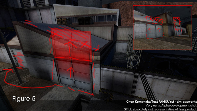
On the previous shots - check out my placement of the garage doors. I seem to have this mental block as a mapper where I do not understand how doors work. This happened a lot on my uncut stuff too. Sometimes, you just don’t think about stuff like that - but you MUST. It is seriously wrong! On Black Mesa we strive to make the maps as functionally and architecturally realistic as possible.
I have since got much better at spotting these mistakes. I do not make them anymore.
PAINTOVERS AND FEEDBACK
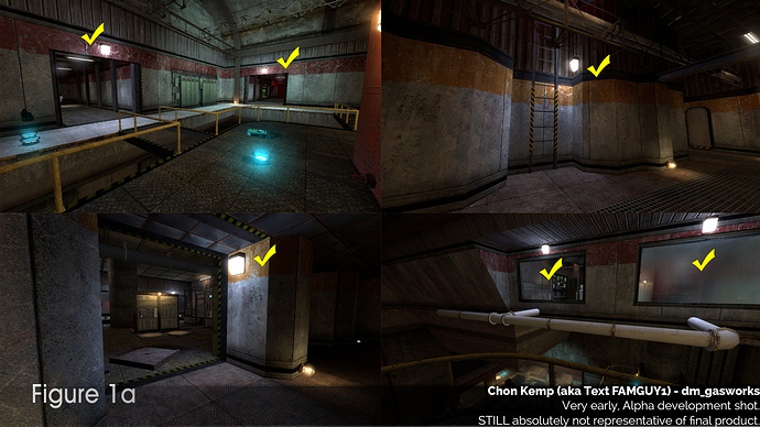
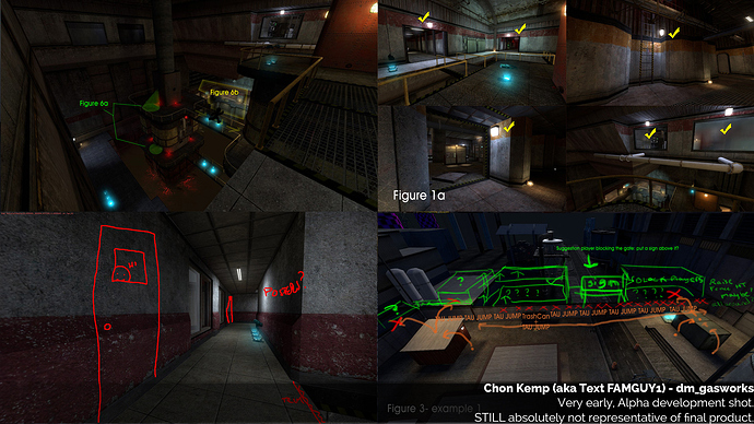
With this version I got a few paintovers - visual (image) feedback from our lead mapper Chris Horn, and our resident beer-ower and security guard lovely man extraordinaire Kevin Sisk. I’ve been using some of them as images throughout this post.
Being an internet team, trading feedback can be…tricky. We have many methods for dealing with this. The most common form of feedback given to our mappers is simply a long feedback post, much like the community did with me during my Uncut work. Anyone feeds back on our maps - it is not just the mappers who give feedback to other mappers. These feedback posts are often accompanied by paintovers, which are basically just annotated images. They’re done with varying amounts of quality and attention (the ones I do, for example, are just AWFUL), but that really isn’t too important as long as the point is communicated and understood.
Check out some of the paintovers I was given for this version, by different people:
That smiley face with the “hi” gets me smiling everytime.
Another form of feedback we’ve been getting into a lot recently, is runthroughs. Runthroughs are something we’ve done a lot over the development of MP. It’s as simple as it sounds. We get together in a Skype call, load up MP, and run around the maps. Not playing, but as a group, like a team of architects might survey a site. We walk around, jotting down notes, and bouncing ideas and feedback off one another. This style of feedback is one which I have found the most useful - it’s very kinaesthetic. I find it much easier to both give and receive feedback like this, mostly because it’s much easier to physically represent your point and talk through it to make sure the other guy gets it. Something wrong with this thing? Whack it with the Crowbar. Run in a line to represent what you’re talking about. Weird sightline allows grenade or RPG abuse? Show the mapper by doing it in front of him while explaining. There’s a route which you can run that is way too powerful? Run it for him. It’s hands on and useful. For any mappers reading this - do this with your team. It’s great. Don’t understimate its value.
NEXT UP ON STAGE…ITERATION 3B![/SIZE]
With this wave of feedback and further changes, we were happy with the direction the map had taken, even though it was still really early steps. The map had now reached a stage where, at the very least, my vision was mapped out and ready for some artistic strokes. It was at this point that we felt comfortable with getting some artists in to work on unique assets for the map. And so - I lit the art beacons! And the artists came to my aid.
Thus began version 3B - similar to the version I’ve just shown off, but with assets being made to artistically beef up the map. I worked particularly a lot with Bard Fleistad (his metalwork is GODLY, he posted a timelapse of him making some gas canister models for Gasworks a while back) and Jason Wells. Bard did nearly all of the map’s textures (though Mark Foreman made the BEAUTIFUL new sky texture for me, which is meant to be a moonrise type deal), and Jason did a lot of the miscellaneous props. Bard made a lot of the map’s set piece models, too.
ART PASS
Similar to version 3A but, well, beefed up. Pretty much the first asset we had made (Bard did it) was the exterior metal textures, which we used to replace the textures that we had ripped directly from de_nuke. He did an absolutely stand up job on these textures, it dramatically improved the readability and reduced the noise of the outdoor area, and fit much more closely with what I wanted:
Gorgeous! From the screenshots, you will also see how I began to consolidate the shape of the buildings and surrounding architecture. This version was a lot cleaner than 3A. I had started to hone in and refine a lot of the design and silhouettes of the buildings - starting to get much closer to what I wanted. It was still quite bare, but that is something which would be addressed in time.
CUTTING DOWN THE SCALE A BIT
One issue I had here in Iteration 3A, which I had problems with in Iteration 2, was my desire to scale everything up to make the world feel huge. Compare 3A’s building at the back (above) with 3B’s (below):
Initially, you might think 3A is better. 3A’s big building, overall, is much larger and more impressive. But - it actually cramps the gameplay space quite a bit. Stalkyard (and Lambda Core/Residue Processing) designer JP pointed this out to me. On the original Gasworks, when you were on top of the 3 cooling towers, you were on top of the entire map. It felt very open and dominant. With that big building towering over it on my revsion 3A, things felt very different, psychologically. It also shaded a large part of the map, causing lighting issues.
It does look very bare - yes. But this can be solved with a distant 3D skybox, rather than having an imposing, dominating structure which cramps the gameplay space. This fits with what I was saying in Iteration 2. In MP, bigger isn’t always better. Lose that mentality! Keep the player’s attention focussed within the map’s playable space.
3 TOWERS
The 3 towers on Gasworks are by far the most dominant and unique feature of the outdoor space. Prior to this, they were a touch uninspired and too samey for my liking. They were on the original, too. With this version, I came up with a system which would help differentiate the 3 towers, and allowed me to build some architectural detail and story into the map. This remains one of my favourite details of the map, personally. Here’s how it works. Textures courtesy of Mr Bard Fleistad.
This gives the towers each a unique personality and also ties them into the other map’s details really well. My positioning of sounds reflects the story of the towers, as do some of the other assets which I had made. The big console in the control room which Bard made has dials and gauges which reflect Tower 1 giving off the most power, Tower 2 giving off none, and Tower 3 giving off moderate amounts. The annunciator panels which Spencer made, which I use twice on the map, also reflect that.
Environmental storytelling rocks! I love it. 99% of players probably wouldn’t notice it, but I always dig these cool little details in maps. Black Mesa had these everywhere.
BEGINNING THE SKYBOX[/SIZE]
If there’s one thing those of you who kept up with my Uncut work will know, it’s that I am a total sucker for a huge, ambitious 3D skybox. One thing which the map Gasworks totally demands, is an awesome 3D skybox. The tops of the towers provide enormous potential for an expansive space and a killer view. The surface area in the original was literally just floating in a void. A lot of potential.
I had the great idea that the map would be set downstream from the vista you see in Surface Tension’s C2A5C (the cliffside map). This would give me license to have a huge surrounding landscape, but also tie it into the singleplayer, locationally - and also keep the surrounding area fairly bare so as not to detract attention.
This was perhaps the first time in the map’s development where I was limited by my TECHNICAL ABILITY, and not simply by having the wrong approach or method. Let me explain. Natural landscape in Source is done using a type of mesh called a displacement. Working with displacements is VERY DIFFERENT to working with anything else on Source - they are super fiddly and hard to get right. Some mappers (quite a few on our team) are brilliant with them, some are utterly useless with them, such as myself (though I’m not the only one)! My poor displacement work made this ambitious, mostly terrain 3D skybox very challenging. My first attempt at the skybox, as a result, wasn’t particularly great. I wouldn’t say it was awful, but it didn’t live up to what I wanted at all:
It had a few problems. Firstly, as you can see, the landscape was quite blocky. The space close to the map was also fairly cluttered and encroached on the playable space too much. If you look carefully at that image, you’ll find that it’s hard to discern at an immediate glance what is the playable area and what is not. That is a problem, particularly in MP. The skybox should NEVER detract from the playable area. Later iterations would be MUCH sparser, and more like wide open landscape than a big sprawling facility. You will see this soon enough. The current iteration of the 3D skybox is rather brilliant, if I do say so myself. I had a lot of help with the current design from our resident cheeky bugger, Craig Mirfin.
CONCLUSION[/SIZE]
This version of the map was what started me along the right path to (what we think) is the GREAT version of the map which exists today. I was finally on the right track. There would still be significant revisions to the map, after this version, however. 3 more iterations, in fact.
Remember the scary anonymous mapper who did a new blockout, which gave me the wake up call from Iteration 2? We’d been working very closely with feedback and runthroughs to keep me on the right track. He would soon take a week to work on Gasworks, cleaning up some of my mistakes and helping me to clarify my vision. This leads us into the “home stretch”. The next iteration might come as a bit of a shock - but again, it was a necessary step to reaching the final product.
Awesome, I can’t wait to see where this ends up…!
Thanks a lot for doing this, Text-Chon. We really appreciate it!
Dooooooooooooooooooooooooooors…
My Kryptonite when it comes to level design. They need to go somewhere when they open.
I love that you included a little story with the generators and towers! Looking around at all the tiny details was one of my favorite parts of Black Mesa, and it’s so rarely done in multiplayer maps. I will have fun inspecting Gasworks inch by inch I’m sure 
And I’m right with you on your love for skyboxes! On the few source maps I’ve made, I think I put more time into my skybox than I did the actual level! Though my displacements are far worse than yours…
Anyway, seeing Gasworks get closer and closer to completion is making me itch to play some deathmatch! It already looks great Text, and I can’t wait to see its final form!
That conclusion sounds so ominous though… please don’t tell us you scrapped the whole thing again and started all over :fffuuu:
Closing in towards christmas at the same time as closing in towards the final iteration of gas works surely feels like the right treat for the community 
Once again, really a nice read, Chon, especially that part of realizing that you actually are doing professional work that needs professional planning!
I am particulary fond of awesome skyboxes, of which Black Mesa had quite a few! So I am really curious how this is going to turn out! Can’t wait for the next chapter in this blog…aw, this is really like reading a christmas story 
Those of you who are paying attention and are interested might want to check the last few pages of this thread or so to find something relevant which might catch their attention. Enjoy.
I read that as Text-chan the first time. Laughed my ass off. No problem, I enjoy doing it. As I said before I wish there was more interest, but what can I do?
Thanks for the kind words. As for the next version, you’ll have to wait and see, muahaha.
I hope this helps people realise how much work goes into even a single map. I’ve been working on this map for over a year now and it still isn’t finished!
Black Mesa had/has great skyboxes. They always add a lot to the surrounding environment but never detract. I think the final version of the Gasworks skybox adds to that count.
Thank you for the kind words. There are 3 or 4 posts left before we hit current version. I’m going to accelerate the rate of posting soon as I get 2 weeks off starting next week.
As always, loving the insight in these posts. I think it’s safe to say I’ve learned more than just one thing or two about proper MP map design, and some stuff that works for SP as well.
For the record, personally I thoroughly enjoy reading your posts and hope you continue them as long as you wish, I just don’t have much of merit to comment.
Displacements in Source are some of the most annoying work on maps I’ve ever done. They’re really tough to use effectively, but can look super nice. Can’t wait to see your final skybox!
It’s quite interesting to see how radical the topside changes were, everything is much brighter looking and looks very film-like, as if the MP map is being seen through a day-for-night lens. This is a very good thing, considering that you have to see what you’re shooting at.
ditto
double dito
Always an interesting read.
Have you bothered to compare the views compared to Uncut stuff and all ? Also be aware that other than the long-time lurkers, I can imagine that the forum hasn’t so much frequent visitors any more, so this may be a reason for the… unsatisfying response
Triple Ditto. They’re insightful. I think we can all agree that we appreciate the time you take to communicate the stuff you do with the community.
Thanks again! As always super informative and awesome insight! This stuff really makes the wait until release that much more bearable. 
It’s beautiful. :jizz:
It is interesting to note here a problem that can pop up. If you are “waiting” for custom prop models in a level or have a bunch of them in key areas…all this iteration kills a modeler. That is unless you keep certain areas from changing. Example would be needing something custom in a certain area in version 2 (or whatever) like console shaped to a particular wall/room…then change the room to where it no longer fits. Sometimes people forget that making a killer model and texture can take 20+ hours and then it might not get used. I’m not saying it happened here but it can ;-).
It can and does. lol You can always file it away in some back folder and try to find it later when you have an Epiphany and say, “I could use that here.”
bkdale seems like he’s talking about a very… specific… circumstance. Jokes aside, that has got to be discouraging when something you make can’t be used at all 
He’s not talking about anything that I know about. I’ve used every prop that’s been made for Gasworks bar a single one which wasn’t even my fault.
They’re not quite the same thing, really. Uncut was very engaging and community focused, and was at a time when the community in general was far more active. I am not discouraged.
It’s release was also always on the horizon. We knew where it was in development, and that “Once he’s finished with it, we’ll have it!” thought was always in our heads… and that was exciting. Black Mesa’s current status is always under-wraps, so it’s hard to maintain that level of excitement… for most people. Honestly, I come here 2-3 times a day. I’m dying for more quality HL-related content since Valve ain’t putting out. 
As for the writeups, I personally find them fascinating! Game design is my passion, but I just don’t really have much to contribute to the dialogue at the moment. 
And we had access to the uncut maps in several beta versions before the final releases so it’s another reason for the high response.

