
THE SECOND ITERATION - AN ARTISTIC FAILURE[/SIZE]
Incoming Rude Awakening![/SIZE]
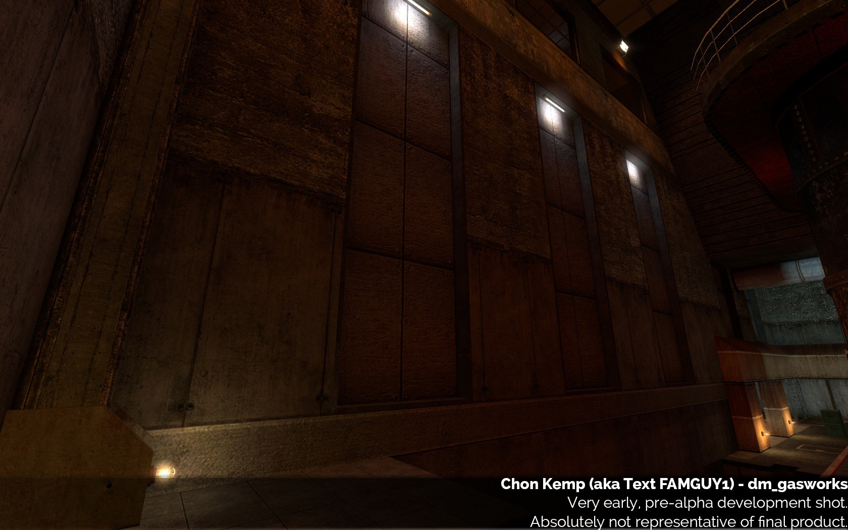
I thought I was doing pretty well. The map was playing pretty fine, for a product which had only had a few weeks’ work it was looking quite alright. I was still struggling to make the contrasting themes work and was in the process of revising the hallways to try and find a more suitable aesthetic. I tried a variety of base themes for the hallways but none of them really fit. I was messing around with different aesthetics for outside (ignore the bad reflections):
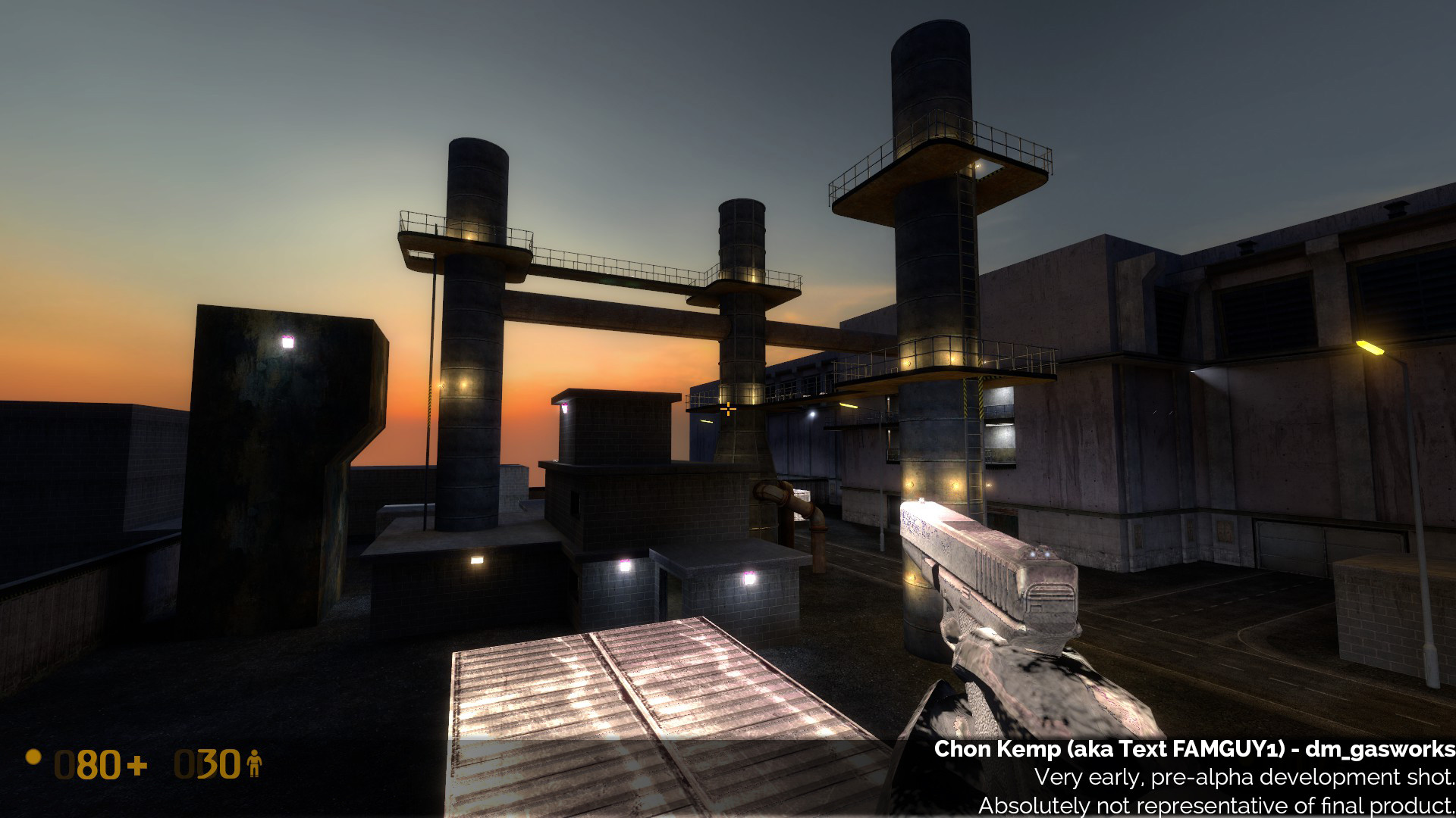
This was when I received my rude awakening, which would cause me to redo the map from scratch.
Blockgate, a.k.a. Block Mesa 2013[/SIZE]
Thus, we come to BLOCKGATE 2013. One of the other, more senior mappers was unhappy with my treatment of Gasworks. He felt the map Gasworks was too complex a map and that I should have been given a simpler, less ambitious map to work on. Looking back at it now, he may very well have been right! And so, he set about showing this in the simplest way possible - by making it himself, in orange map (“blockout”). He posted his blockout to the team, explaining that he’d done it to show what a good blockout for the map, which treats it right, should have been.
This initially created some drama, and I was a bit upset, as you might imagine. But, it turned out to be a huge wake up call. His blockout was GREAT. Dimensionally it made sense nearly everywhere, it was cleanly constructed and designed. Very clear, readable, neat. A far cry from mine, which was messily textured, not neat on a 16/32 grid (very important!), not well constructed internally etc. Once I got past my initial reaction, I quickly realised that he was RIGHT. My current version of the map simply wasn’t good enough - the few weeks of work I’d put in didn’t measure up to what he’d done in a few hours. It was the kick up the arse I needed to get on track. Rather than accepting the premise that I wasn’t capable of doing as good a job, I took it as a challenge. I was going to be that good. But boy, would it take a while.
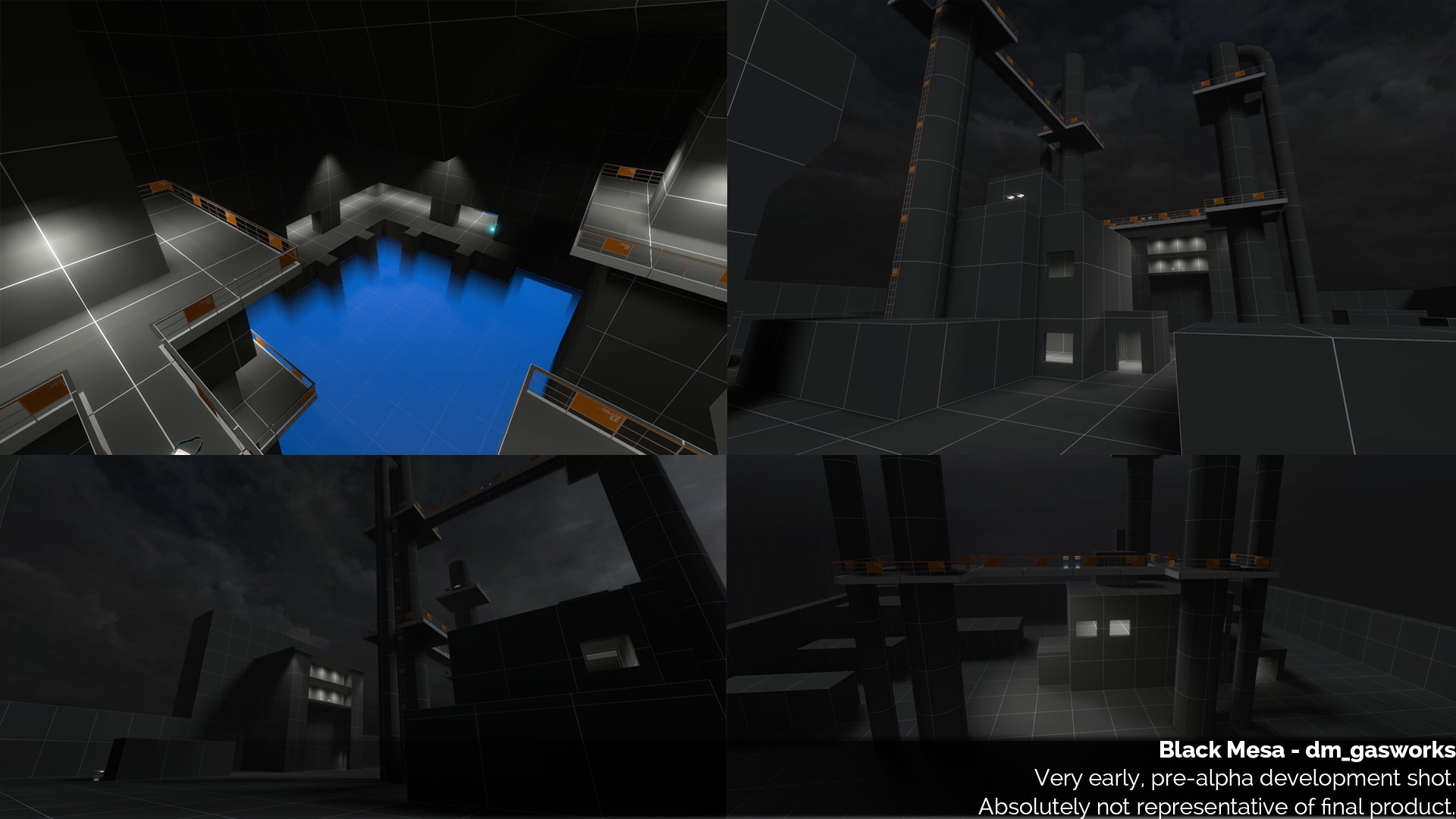
His first version was everything mine should have been.
Please welcome to the stage…iteration 2![/SIZE]
And so, I redid the map…from scratch.
So you’re probably thinking now…“he got this wake up call and will now triumphantly rose to the challenge”. Wrong. Things actually got a little bit worse before they got better!
Part of the reason for this was the “delivery” of the feedback. I’d been made very clearly aware that I had done something very wrong, but I hadn’t fully understood quite what. My reasoning was that the main issue with my first iteration was that it was dimensionally inaccurate and poorly constructed - but I did not quite realise yet that the real issue actually lay with direction and vision. My second iteration set about correcting the dimension and construction aspect, but I still didn’t quite have a clear vision or direction, aesthetically or gameplay wise. I still hadn’t decided if I wanted to stick with the original or not, or what my aesthetic was.
The new, totally redone version which followed, dramatically improved on the gameplay and layout, but failed visually and aesthetically. Worst of all, the problems with the visuals seriously hampered the gameplay. More on this later.
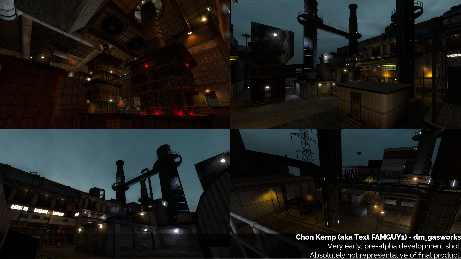
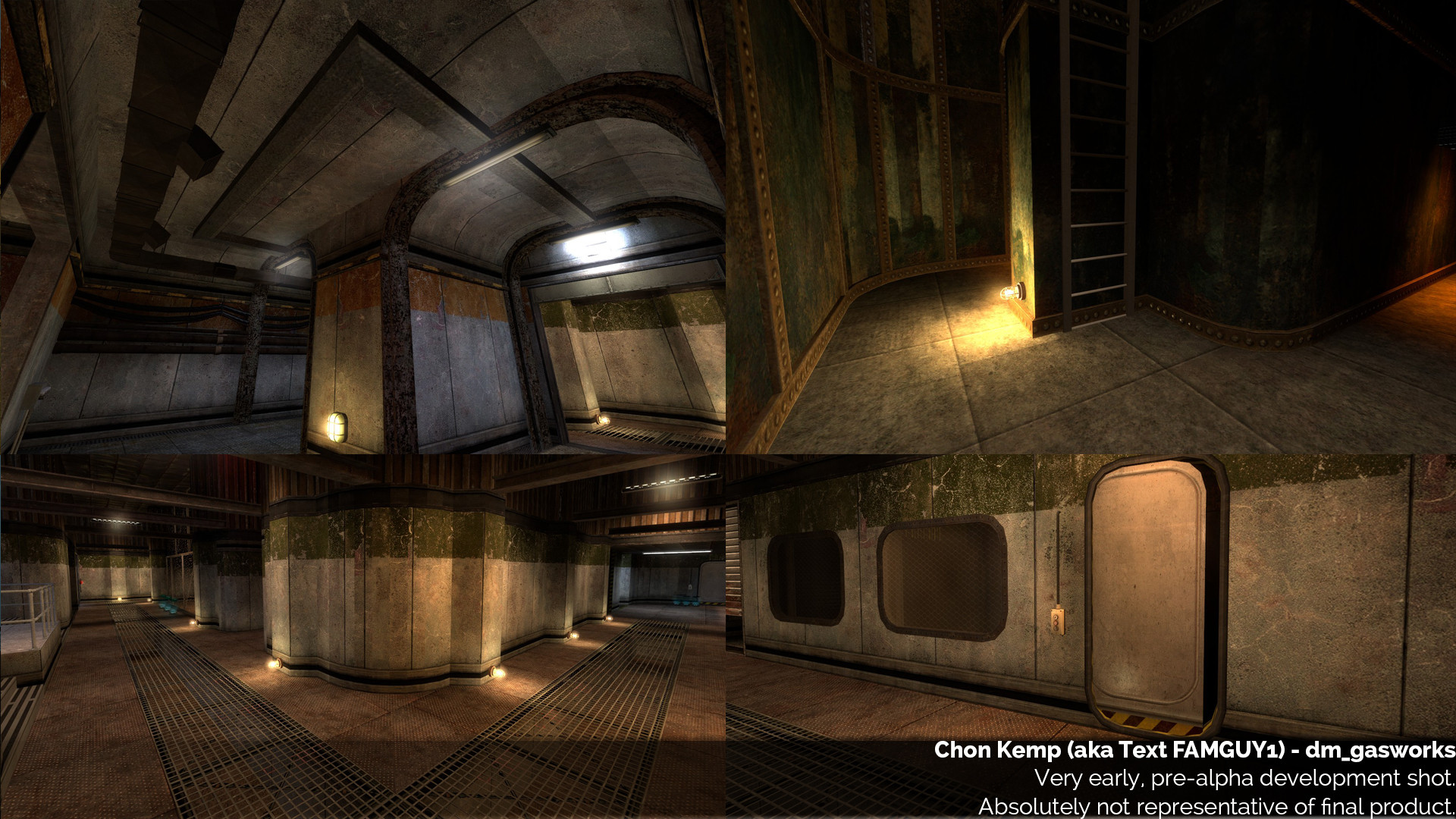
Here are some shots from the new, redone from scratch second iteration. I would later scrap this and start again. We will now explore some of the failings of this second version.
Gameplay and Layout[/SIZE]
I set about remaking the basic layout from scratch. I went as close to the original as possible - sticking to all its dimensions. I had HL1’s Hammer open in one monitor, and Black Mesa’s Hammer in another. This allowed me to easily compare measurements and distances. In terms of following the original’s sightlines and dimensions, this second version was very good.
CONSTRUCTION
A slight mistake I made was that I didn’t correct dimensions to be neat enough. I went a bit too close to the original. Dimensions are important for a huge number of reasons which I shan’t go too deep into. On Black Mesa, we try our best to keep things dimensionally sensible. As our general rule of thumb, the map’s basic geometry should sit nicely on a 32 grid, apart from walls, which are normally 16 units as a standard.
On Source, you want to work in powers of 2, and stick as close to them or the halfways as possible: 2, 4, 8, 16, 32 (48), 64 (96), 128 (192), 256, 512. One reason this is important is because textures HAVE to be sized based on powers of 2. Ideally, you always want to avoid stretching and distorting textures, particularly on major map geometry, as it will look ugly. For instance, on Gasworks, many of the doorways in the original were 80 units wide, a weird measurement in construction terms. Let’s say I place that doorway in the middle of a 256 unit wall, which has a 256 X 256 texture on it, which is a texture of 4 wall panels. With an 80 unit doorway, two of those wall panels will be cut short, and at an odd length, which would look bad and never be designed like that. Even if you move the doorway off center, it will never cut any of the panels properly as it does not conform to the size standards. This also means it won’t line up with floor tiles, placing lights at regular intervals around it is harder, creating a logical support structure on that wall is also harder, etc. Then your support beams and lights have to be unevenly placed, or the door has to be misaligned with them. Modular props (such as our gaspipes, which come in 32 unit, 64 unit, 128 unit variants), will not fit properly either.
Stick to the standards. It saves you a HUGE headache later on! After this version, I had to go back and rework a lot of those dimensions for that exact reason, which could have been avoided had I made the 80 unit doorways 96 or 128 units wide. Deviating very slightly from the original, to fit better dimensions, is necessary.
Not working properly on the grid is a mistake which a lot of mappers, myself included, make from day 1. Don’t do it. Be neat, stick to sensible dimensions within the engine.
HALF-SIGHTLINES
Another problem which some of my details had created, which I later learned to avoid a lot, was the creation of “half-sightlines”. These are where your details create unintentional sightlines which are in some way a bit cheesy or both players cannot fully see one another, for whatever reason. This was mostly caused by my artistic choices but there were a few layout offenders too. Look at this:
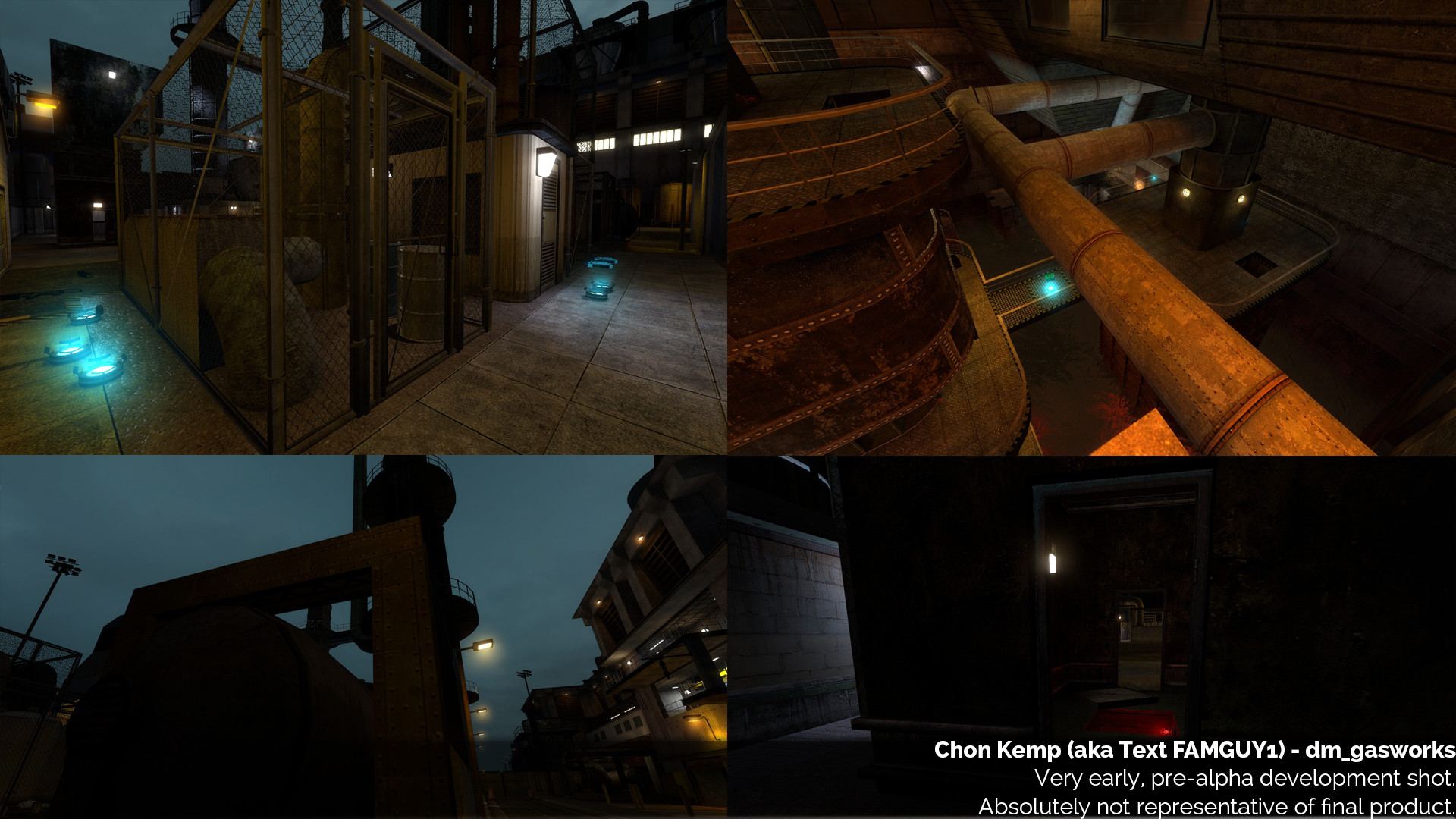
Using these sightlines, it is very hard for the player on the other end to spot the guy standing in the areas pictured - because he is often hidden between tight detail or behind a fence. But the guy standing anywhere in the picture has a full view of the target. Or, alternatively, the sightline is just VERY TIGHT but in a high traffic area, which makes it frustrating and mostly useless. I had intended for none of these - but they really seriously kill off the professional, polished and tight feel of the map.
This is a mistake I see a lot of CS maps make. Avoid these like the plague. Clean sightlines is pretty much always a MUST for any map, otherwise the gameplay becomes unpredictable and frustrating.
Besides from these two problems, however (and a lot of smaller things I would later address, layout wise), in terms of my layout itself, it was greatly improved. The problem came with the art. This is where the most work was needed for the next version.
The Artistic Failure Section[/SIZE]
My biggest failings with this version were with art, and this is where I learned a lot of the lessons which have stuck with me. Again, this stemmed from lack of direction and reference. This is going to be a super useful section for budding mappers and people who want to know more about the challenges of level design art, as I made basically every newbie artistic mistake in the book here. Learn from my mistakes! The art on this version of the map seriously detracted from the layout. It would be in the next version where I would start to nail it.
ASSAULT AND SPAM
I hit a mindset with this map which has, to this day, been quite tough to break out of. This is an excellent lesson for budding mappers to learn. I was arting up the map with the mentality that more colours and more lightstyles and more props and more detail behind walls would make it visually thrilling. MORE MORE MORE. I really wanted this map to seriously break away from the trend of modern games towards a single colour pallet, all gray and brown. I thought that having colourful textures and lighting would make the map stand out and be beautiful.
Instead, it just looked awful. It was a messy, visual assault. There were so many colours and different lights everywhere the player never had any idea where to look.
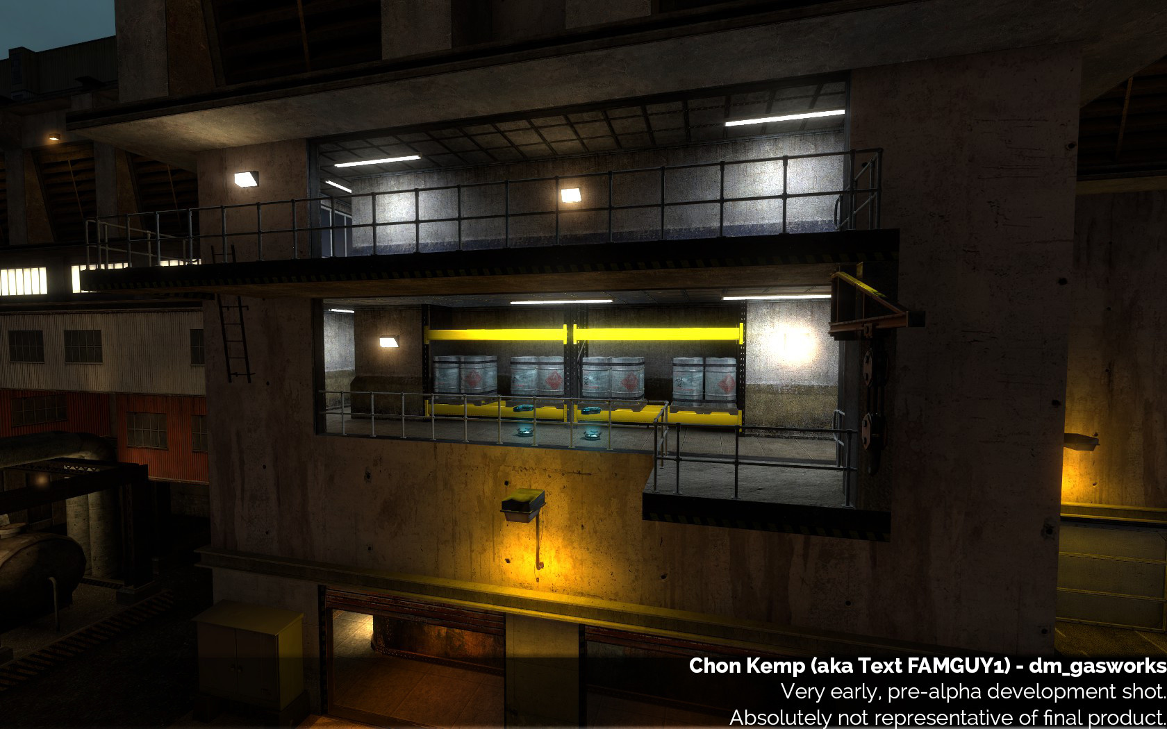
Check out this picture. You can probably see how visually disgusting it is, but might not be sure why. So why is it? Firstly - look at the lights. There are 7 lightstyles visible in that single area - all very different shades. It looks ridiculous. Think about reality - have you ever seen that many different shades of light in one area, even at a rave? Why would it be designed by that? I don’t know where to look. EVERYWHERE pulls the eye. The combination of lights and texture colours turn the scene into a messy, unreadable blob. There is no reason to do this.
Stick to a colour pallet, both in lighting and in textures. Gasworks eventually becomes red and yellow, with blue and orange lighting. Could you even easily describe the pallet in the image above? I know I can’t, without listing 20 colours.
You will also note the map is REALLY DARK. This is something I would address in later versions, too. Night maps should not be dark. Darkness is, generally speaking, really not fun in multiplayer games.
STYLING DIFFERENT PARTS OF THE MAP
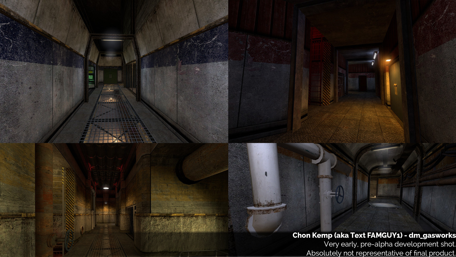
This relates closely back to the previous section. It was my belief that by making the interior hallways very differently styled and designed, it would be easy for players to know exactly where they were on the map at all times, as no hallways would look the same.
Player navigation, and art, in this aspect, is about striking the perfect balance. This is a philosophy which I have learned - everything must be perfectly balanced in a map, ESPECIALLY IN THE ART. Too many styles of hallways, and the player never knows where they are because the halls are all so different. It becomes confusing. Am I even in the same map? Where is this hallway in relation to the 5 other completely different looking hallways? It also separates you from reality. Facilities have consistent styling in their hallways. Conversely, with too few styles, and everywhere on the map looks the same, and you have the same effect. You never know where you are because everything looks the same. The key is to pick a consistent style, and then differentiate the sections subtly.
Focus mainly on the architectural style.
This is one of the interesting things about detail. It actually can get in the way of recognising an area. In the original HL1, all the hallways were totally bare and simple, and uniformly lit. You identified where you were pretty much solely from the layout and wall texture. However, modern games have a lot of detail that can get in the way, different lighting, among many other things. It MUST complement the layout, not work against it. Having all the halls be totally different, works against the layout. This is one of the major challenges of modern game design, vs old game design.
DETAILING DRILLING INTO WALLS
Another thing I got into a habit of doing in this version, which is just lazy and bad, is detailing areas by drilling a hole in the wall and adding stuff there, behind a fence, or window, or partially open door, etc. This ties in to the next problem somewhat. Doing this is lazy and amateurish. It’s very easy to put loads of detail and machinery behind a fence wall - and it sounds great on paper: it’s detail, but it doesn’t interfere at all because it’s completely outside the playable space! You can lay it out and design it exactly how you want, put anything crazy there! It sounds perfect for detail.
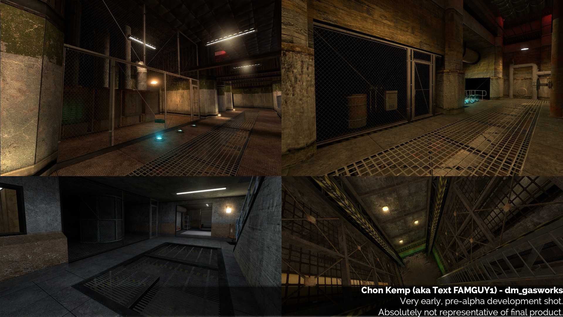
Think about it. It’s not difficult to do. Replace any random place in a wall with a fence/window and slap whatever the hell you like behind it, it doesn’t even matter. Except now, none of your detail is IN the map, it’s all OUTSIDE it. Your playable space, instead of being bare walls, is now bare fence. Rather than putting time and effort into making your details look great within the map, and making them unobtrusive and add to the design and visuals, you’ve shunted them off behind a wall where it doesn’t require any thought at all. Post this version, I learned to AVOID THIS LIKE THE PLAGUE. This is something a LOT of amateur maps are guilty of - mostly because it’s just so easy! Make the effort to make your details work. Don’t be this guy. You don’t want to be like me. I’ve seen this problem on a lot of amateur maps - I myself made this mistake a lot. Avoid it. Take the extra effort to make details work within the map.
That’s not to say never do it. Just do it in moderation! This is much more reasonable to use in singleplayer maps. The principle I am talking about here mostly involved multiplayer design.
EXPANDING AREAS TOO MUCH
In singleplayer, a very commonly used tactic to increase player immersion is to greatly expand on places beyond the playable space. We use it a lot in Black Mesa, ourselves. It makes the world around you seem a lot bigger, and more realistic. It gives a sense of scale and realism. Puts you in a larger world.
This does not work, at least not quite to the same extent, in MP. Expanding beyond the playable area creates a variety of problems in MP, if not handled correctly.
One of the things I’ve learned about detailing in MP games, is that it has to be utilitarian. Having detail in a place the player can’t go or get a great view of, doesn’t add anything to the map. In MP, players will not be wandering around, searching every nook and cranny, admiring every detail, like they might in SP. They’ll be focussing on the important parts of the map - where they kill the bad guys. That’s where you want the detail to be. Look here:
The detail on the wall, and the lighting (on the left) is unnecessary. It doesn’t add anything to the map and is on a totally unimportant wall. That eats up resources and player attention. From a pragmatic perspective, there’s no reason whatsoever for that wall to be detailed - it’s just detail for the sake of it. Detail achieves two (sometimes opposing) purposes. It draws your attention, or you gloss over it. Having detail on an unimportant wall can draw your attention when it shouldn’t. Why detail an unimportant wall? If it is a blank wall, your eyes will immediately gloss over it and go to the lit and detailed area. That is what you want.
Expanding the area beyond the playable space creates the same problem. If you put the expanded areas in inimportant places, it makes it harder for your eyes to gloss over those unimportant areas. Conversely, if you do it in important areas - WHY ARE YOU DOING THAT!? The player’s focus should be ON said important area, not behind it! It can also create confusion as to where the player can and can’t go, as it becomes hard to tell at a glance.
IF YOU LIKED IT THEN YOU SHOULD HAVE PUT A CURVE ON IT
Here’s another bad mistake. Don’t just slap curves on everything. I had no idea how to make the corners on the interiors look good, so I just slapped curves on them. This screams out “I had no idea what to do, so I put curves”. The windows were curved, the doorways were curved, the walls were curved. And why? They served no purpose. NEXT GEN!
Mappers HATE when their maps are blocky. But, just randomly putting curves everywhere, kind of like the fences and drilling in detail, is an easy and lazy way of ignoring the problem. Only place curves where they would make sense in reality.
Conclusion[/SIZE]
The conclusion of this section? BALANCE, BALANCE, BALANCE. I had too much of everything. The art of art design is finding the right balance for the map. A Gasworks is very utilitarian, and has a clear purpose. Everything would be designed for a reason, and would be consistent. They’d have huge teams of engineers planning and designing for months.
A lot of the conclusions I drew in this section were done with the help and very extensive feedback of that same mapper who gave me my rude awakening. I thank him a lot for that! Once I had made this second iteration, he made an extensive (no, seriously) feedback piece, and we ran through the map chatting on Skype for about 2 hours. This finally got me on track, as it allowed me to learn the PRINCIPLES behind my mistakes. This is what made the third iteration.
My next post will detail the version where I finally started to get a handle on the map, and it starts to come together. The next (third) iteration was still very far off the current product, but it was the start of the right direction.
Really informative stuff, you guys are doing amazing work.
A slightly related question,
are you guys ever going to have a multiplayer alpha or beta where the community can test the maps and gameplay and add feedback before release like Insurgency did with early access, or are you gonna keep the testing internal?
Wow, this is like reviewing all the hard lessons and bad habits I’ve learn over the past couple of years, shoved into a single map. It’s comforting, though, knowing even the more talented level designers get slapped with them like a sack of bricks.
I can see a lot of mistakes I’ve made in the past in these older versions.
And some I’m still making - which means now I know I’m doing something wrong!
In fact, I can remember working on my old Goldsource mod - Every corner of basically every wall had a curve on it, and nothing was on a larger than 1-unit grid - back then I used a base 6-unit system for walls, floors, and ceilings.
No wonder I wasn’t happy with how it was turning out.
I’ll be keeping this post in mind if I ever try my hand at multiplayer maps - thanks!
None of us were happy with how that was turning out, either. 
I think it’s overall important to understand that a map being “too blocky” isn’t exactly the same as a map needing a lot more curves. Rather more shape. I think it’s easy to think too much in terms of your tools rather than your options, if that makes sense.
I agree that the overwhelming amount of eye candy/lighting/unnecessary detail can throw someone off track from the objective, and that is killing the enemy. However, I appreciate the amount of work you put into the versions of Gasworks, and the insight you are giving about development.
I love these! I’m not a mapper, and know nothing about game design/mapping/anything like that, but it’s awesome to see the progression and hopefully learn something about the love and work that goes into the games I enjoy.
Good post, as always. I’m not a mapper/designer/dev so I don’t have much to say about the whole process except that it’s very fascinating. I always enjoy reading about the behind the scenes work.
Thank you so much for going through with another part
I find these posts super informative and interesting.
I really hope you change your mind and continue to do long-form articles. These are exceptionally informative and I enjoy reading them greatly.
I myself have been having issues nailing down good SP map design, and these devblogs are teaching me all sorts of good things about what to do and what not to do. Thanks, TextFAM!
Again a great article Text.
Not a mapper or a dev or anything like that, BUT as a college student way back in the day I can relate to your “pain”
I had a semester where I did not have any programming/IT/CompSci classes and got really bored.
So bored that I decided for stuff and giggles to write a system/program a fully text version of the Parker Bro’s board game called Monopoly.
YEAH cue wailing and knashing of teeth and cursing and swearing and tearing up of source code printouts, numerous rewrites, trashing of ideas, more rewrites, etc.
Got it done by the end of the semester and IT WORKED with 95% of the official rules in place.
Thanks for all the comments, guys! Part 3 out…soon?
I can’t answer this question directly, unfortunately, but suffice to say that development of MP will be highly active post-release. We plan to support and develop it (for free) for quite a while, post-release, and have a lot in the pipeline. The community will get a very real say in its direction, we’ll be releasing continuous updates based on feedback and data, and discussion on these very forums!
The key is to learn from them!
Most of these mistakes, I don’t make again, once I understood what I was doing wrong. There are a few (such as drilling detail into walls) which are a bit harder to break out of, but at least for me I tried very hard to not repeat the mistakes. I thought this blog would be useful for people because I find a lot of the things here are principles you may not necessarily learn from anywhere when learning to design levels. Certainly nobody told me any of this stuff prior to me joining the BM Dev team and mucking up the first few versions.
Hopefully it’s interesting for non mappers too, to see the huge amount of work that gets poured into our maps that you don’t necessarily see, and to learn a bit about all the considerations and tweaks we have to make. I think there were…5 complete reworks of Gasworks before the current version? That’s the work you don’t see! All in all, it took…a year!
If you’re going to be disciplined enough to stick to some kind of grid system, make sure it’s the right one! Haha.
I find the whole stuff about the grid to be pretty core to good mapping as well - and again, something I never learned until I messed it up myself. I’m pretty mental about keeping things neat, now. At least on world geo, I would say never go below 16, and try to stick to 32 mostly. Obviously when you get around to detailing and fine architecture you can’t avoid that, but base should always be 16/32, in my opinion. Most of the BMS mappers share that view.
I probably will keep doing them like this. When I try to write concisely it normally ends up being hilariously long anyway.
Nice one.
I’m very curious about how have you made a map set at night visible.
Same way he would a day-set map, I’d assume.
With lighting?
With great difficulty! You can see from these very early versions that the lighting doesn’t really work - players would not be very visible. This is mostly because it was a concern I wanted to address when the map’s geometry was set. Not much point placing lights carefully and setting a logical colour scheme if the map’s then going to change and you’ll have to redo it.
You’ll hear about it in a later iteration - I went on a lighting pass which took upward of 3 hair-pulling weeks. I’d like to think that I found a balance which was both well lit for player vision and also looks beautiful and atmospheric, and doesn’t use too many lights (clutter/spam management). All the testers and team seem to like it, so here’s hoping!
It’s mostly finding a balance between the env light (moonlight) and artificial lights. It’s a bit tricky - lights attract attention both to what they shine on and where they cast from. But you also have to avoid dark spots anywhere on the map. This is moreso the case on a nighttime map vs a day map. It’s not as simple as placing a light in a dark place - because lights attract attention and you want to avoid doing that to less important areas.
Their placement, usage and colour is a KEY CONSIDERATION in an MP map. It requires an awful lot more thinking than an SP map, that’s for sure.
Thanks again for for your deep inside! I must confess I haven’t played HLDM yet (not so much a FP MP player as I get frustated by getting owned al the time  ) but I will definitely try BMDM out, when it’s done!
Apart from the very interesting read about the design issues - even for non-mappers - I must say, that I really like the way that you described the learning process. Altough I am sure that this was frustating at more than one point, it surely shows that BM still is - despite all its experienced contributors - an opportunity for people like you to learn- a lot! It still is kind of a professional laboratory for young and talented people like yourself to try tehmselves. I thin this is a good thing!
So, please keep it coming! This is all just getting more exciting!
PS.: I like your name, I mean your real name, Chon Kemp. I think it sounds very gripping and cool and all. It may be the surname, though. Ever read The Rum Diary by Hunter Thompson? The protagonist is called Paul Kemp. I like that name, too
I like more things about Chon than appropriate, but this is a wrong thread for that I guess.
Thanks for the very kind words.
It’s been a frustrating but very enlightening progress, but I didn’t sign up for easy, so I’ve enjoyed it. A lot of our MP has been designed by the team’s new level designers, being overseen by JP and Stormy, some of Black Mesa’s oldest members (in terms of experience, that is). So it’s been a really fun experience that I think has injected a lot of life and freshness into the game, for MP, while keeping the quality bar super high.
Heh, thanks for the quip about the name. I don’t hear that often! I like it too, but you’d be surprised how many people at my real work get it wrong. I’ve been called Shon, Chomp, Chun, Chen, among many other embarrassing things! It’s actually a short nickname, but I basically have never ever used my full name anywhere except official documents.
That’s hot. I like you guys too, also in a slightly inappropriate way.