The Problem of Lighting in Office Complex

Once again I find myself going over and over the lighting in Office Complex, not out of frustration but out of a perfusion of options. There’s a lot that needs adjusted for Office Complex due to some of its unique lighting issues and constraints, but I’ve discovered a lot of the tools I am thinking of using to address this problem fairly recently so I thought I would open up a dedicated thread to discuss the technical problems they present with more experienced mappers and possibly also the developers themselves.

  • If you’ve run into these issues yourself I’d like to hear about it; if you know of a map that creates the appearance I want under similar constraints I’d like to hear about it.
  • If I’m using tools incorrectly or overlooking something obvious I’d like to know about it.
  • If you have an idea a screenshot of your lighting schema in action in an Office-Complex-like environment would be great, but is by no means required.
  • And more than that I’d like to start documenting everything I’ve found so that it can be useful to others in the future.

I’m also maintaining a wishlist of things I would be interested in seeing the developers add to the engine that I think would be useful to modders in general, although they kind of have a lot on their plate at the moment so I am not assuming it would be given a high priority.

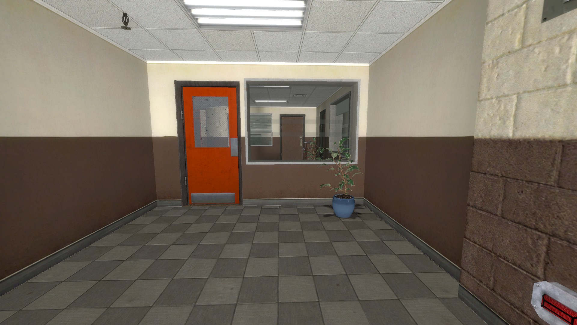
The Fundamental Problems of Office Complex[/size]
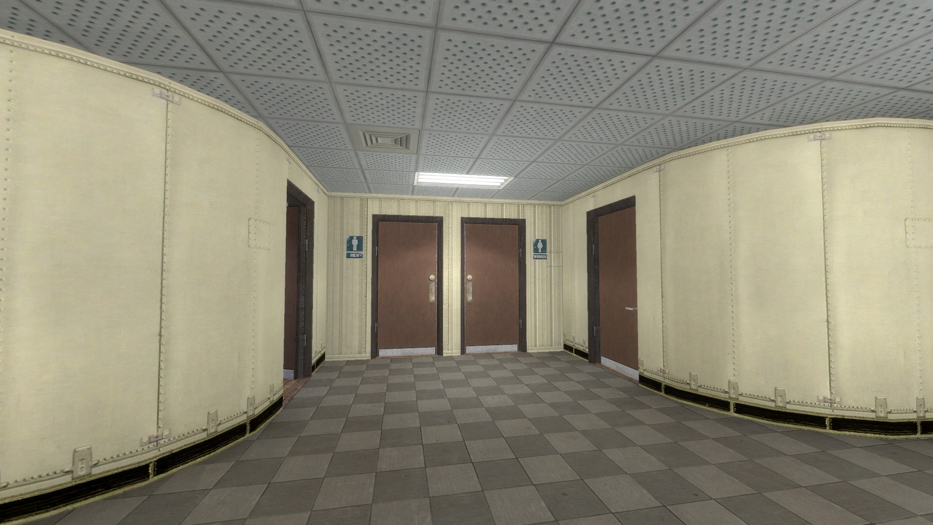
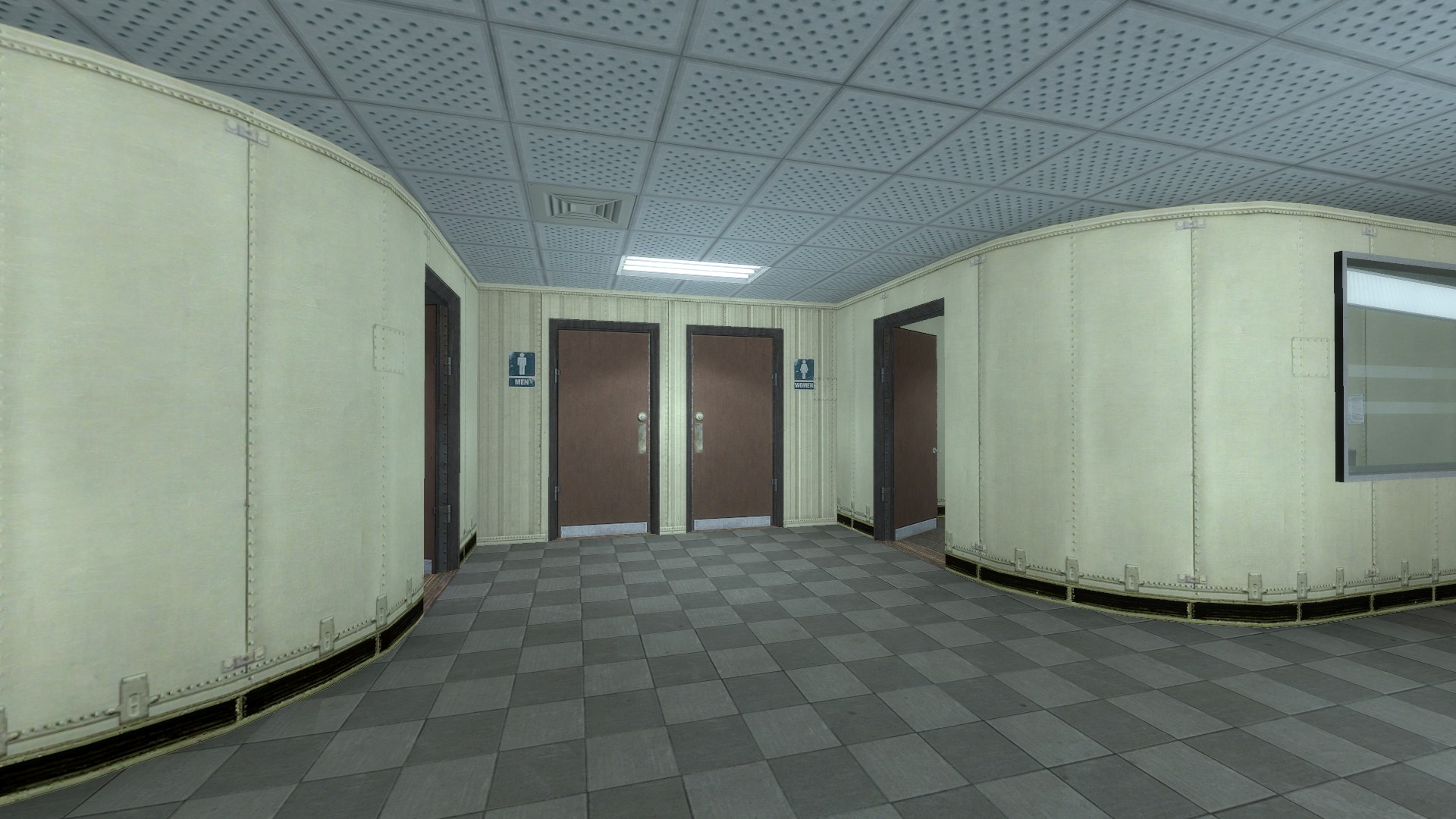
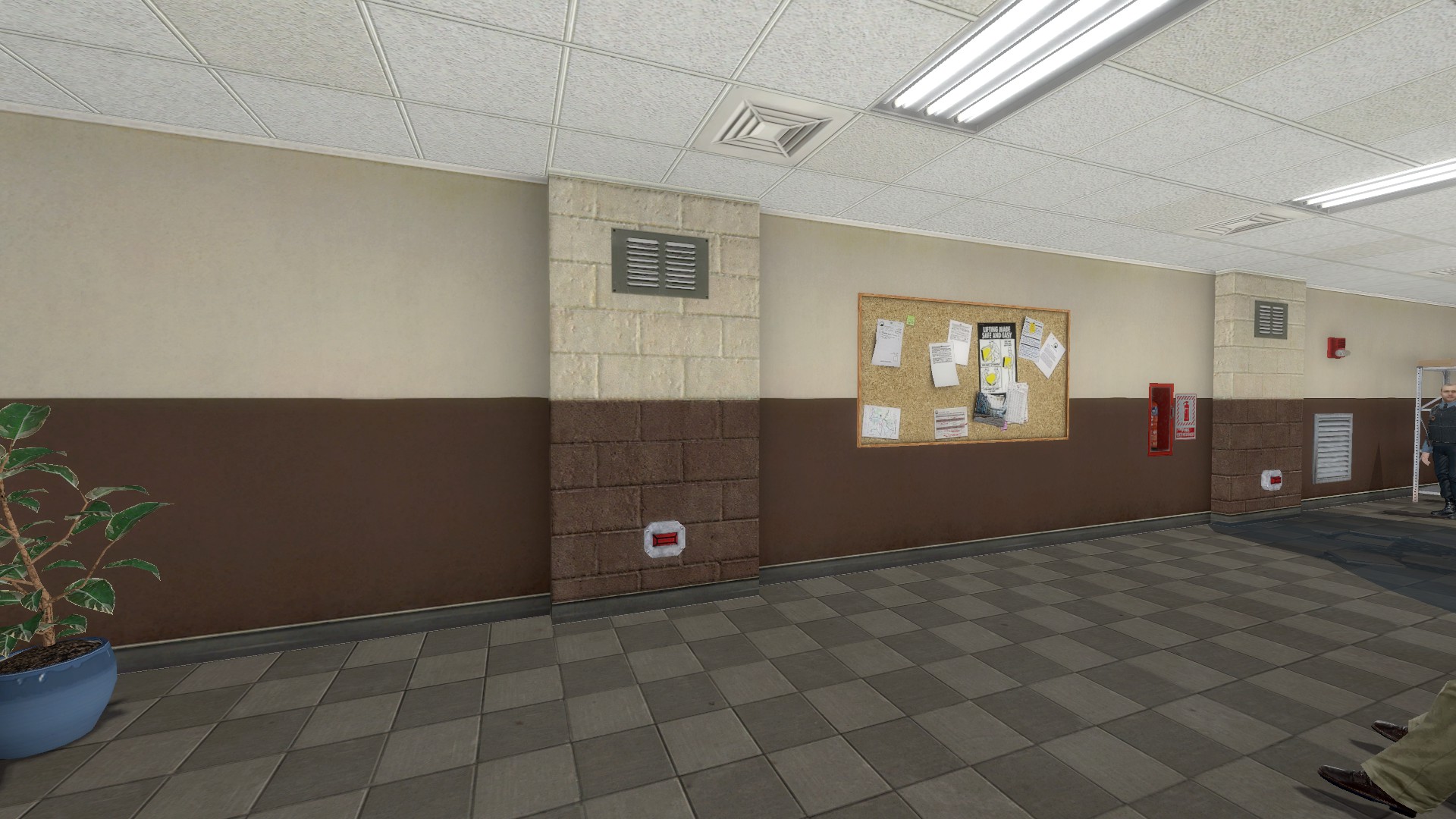
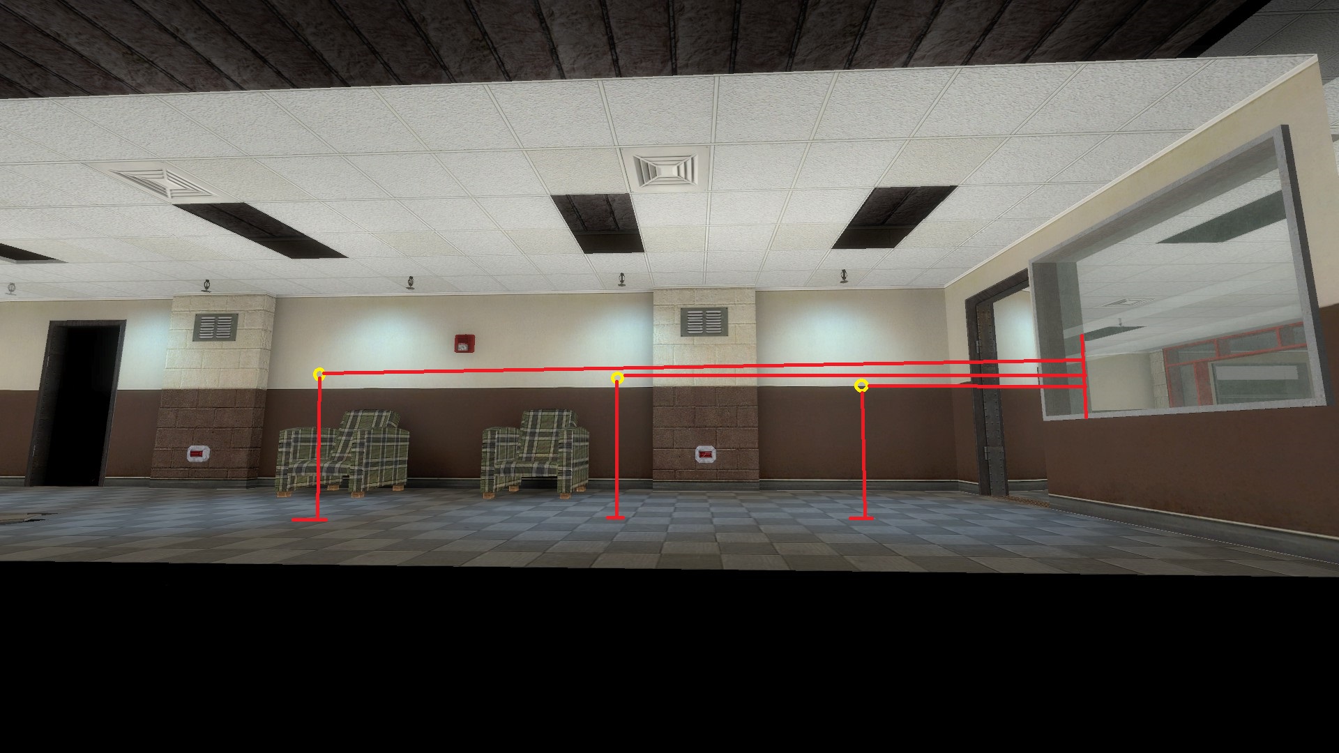
[/size]1: Light Spacing & Unevenness

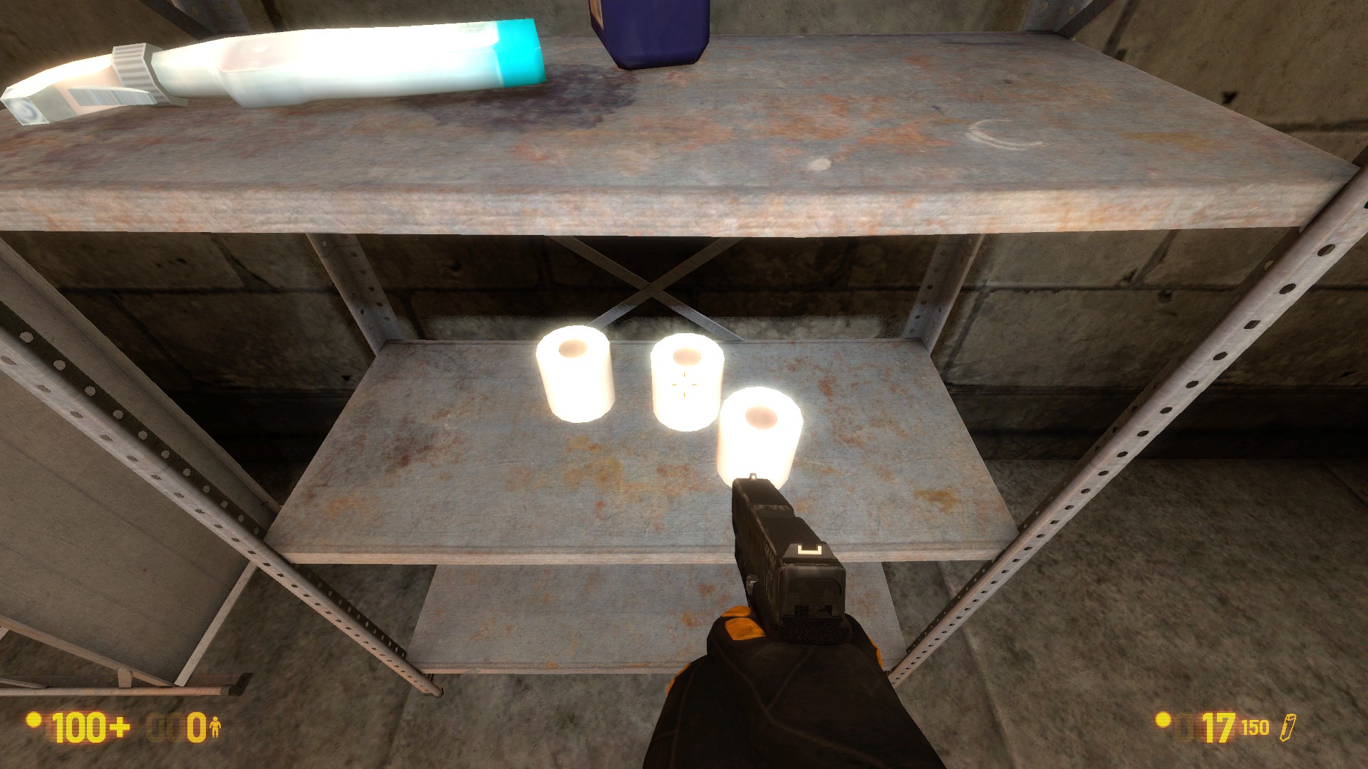
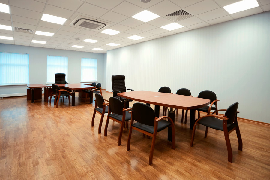
[/size]In real offices, fluorescent panels don’t actually put out a great deal of light on their own- there are just a very large number of them placed fairly close together and a given room pretty much always has at least two. The lights reinforce each other and make the overall area navigable without any one spot being freakishly bright:

:

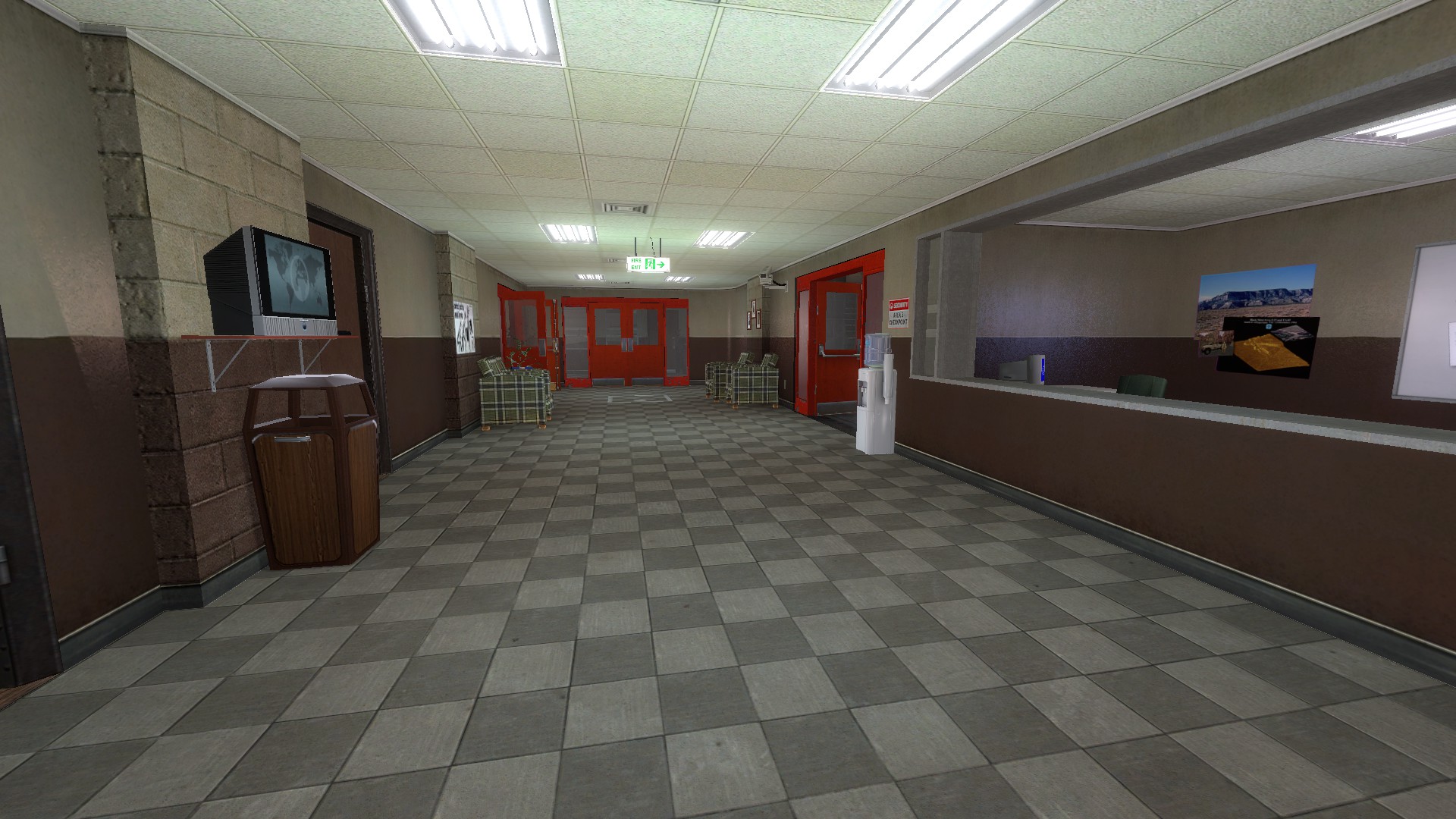
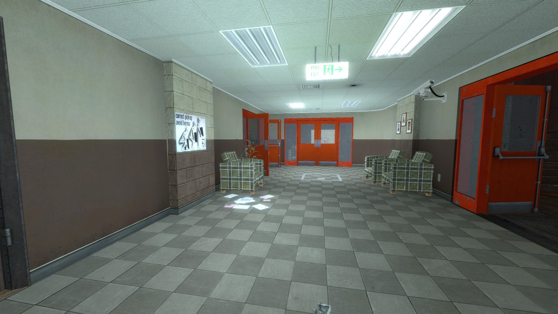
Office Complex does not do that. There are large areas without lights…

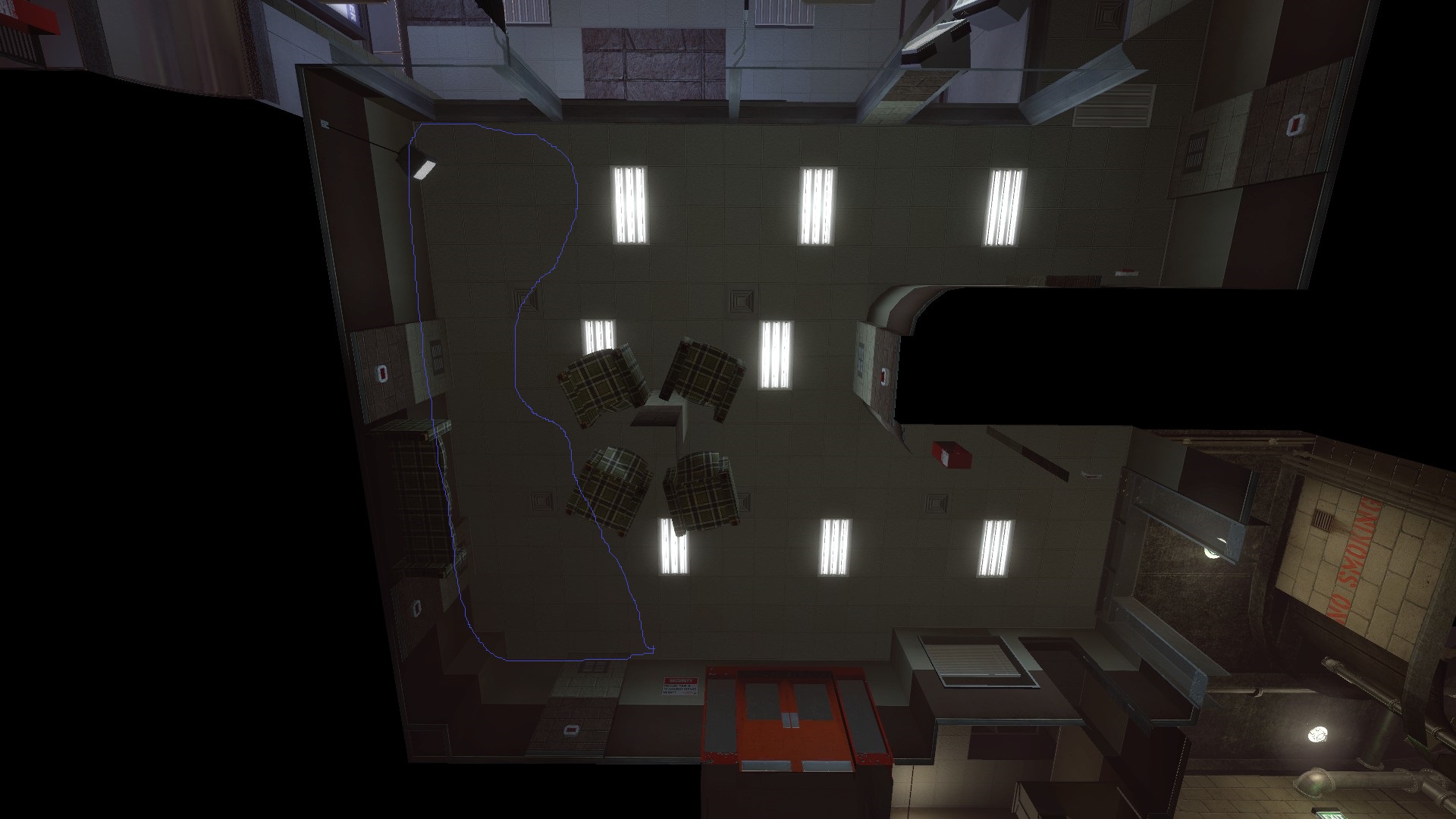
Large gaps between lights…


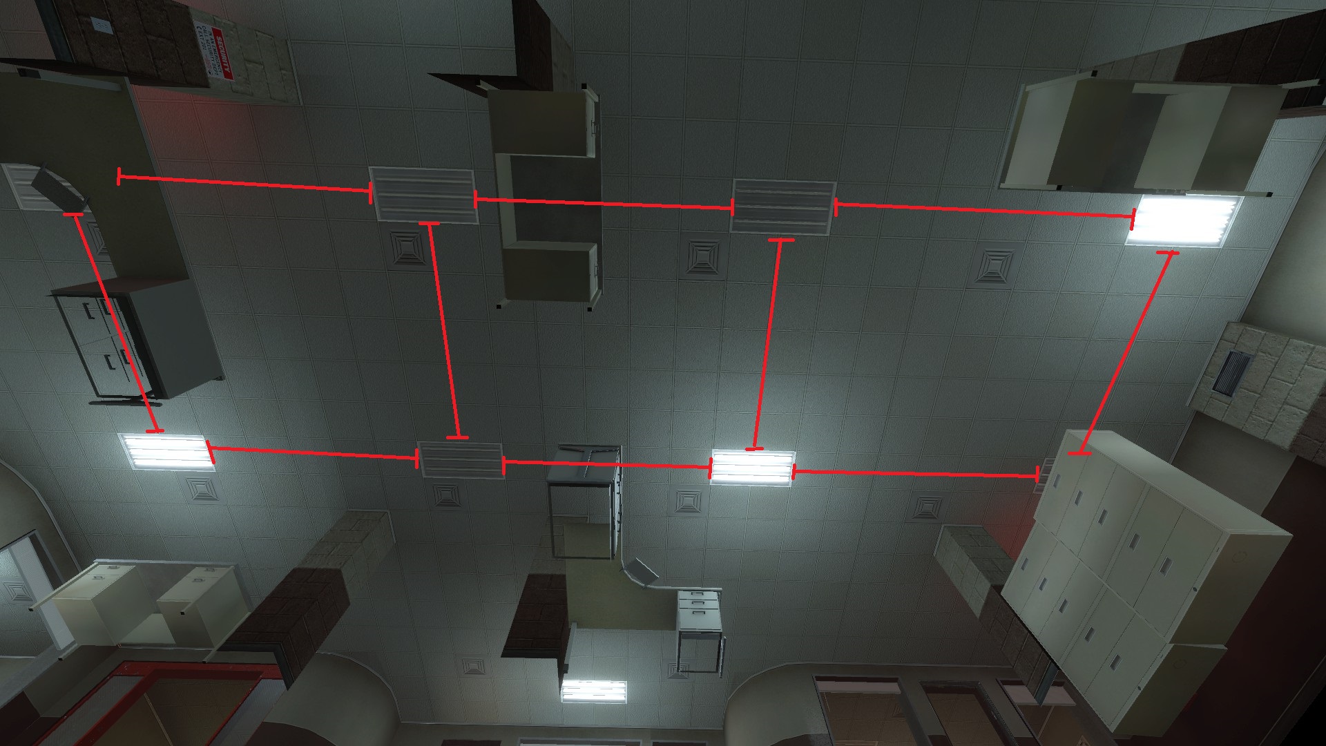
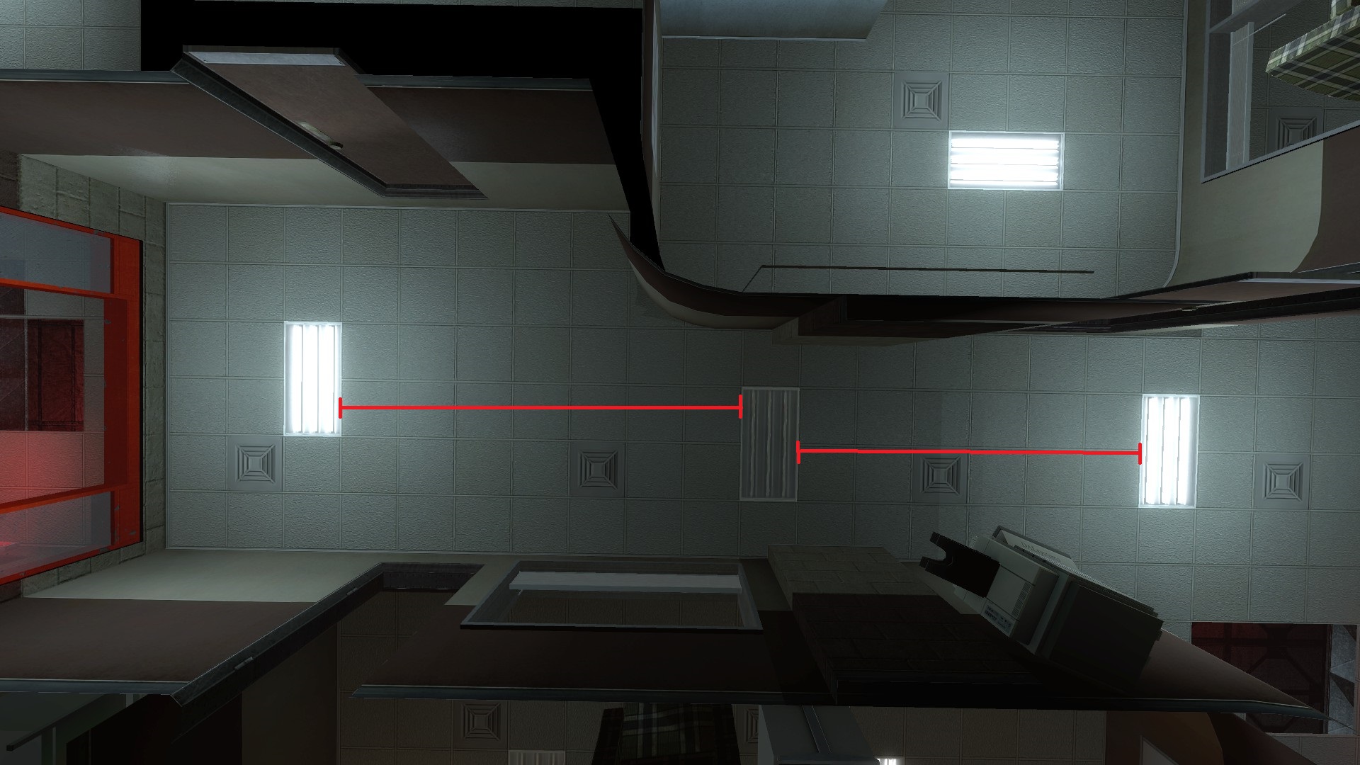
And many rooms with only single panel that (presumably) lights a very large space, which can range from borderline plausible…


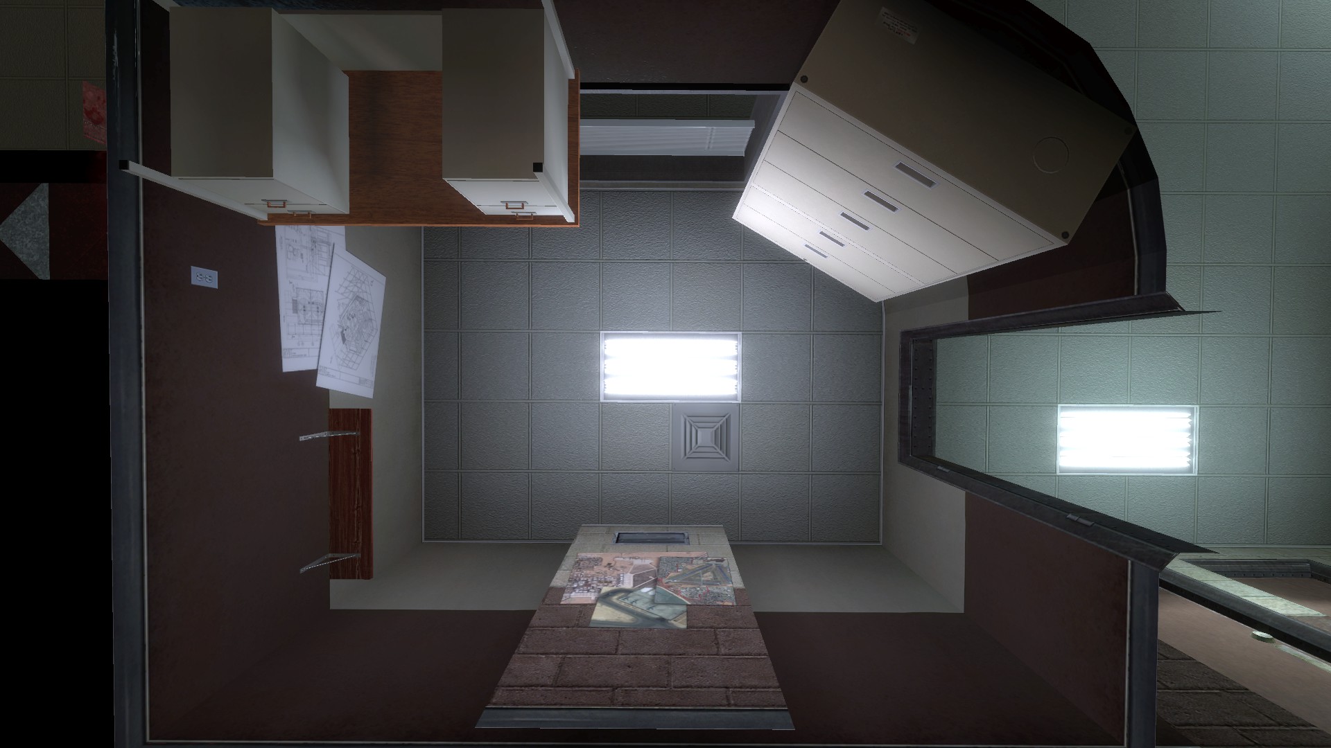
…to simply ridiculous.

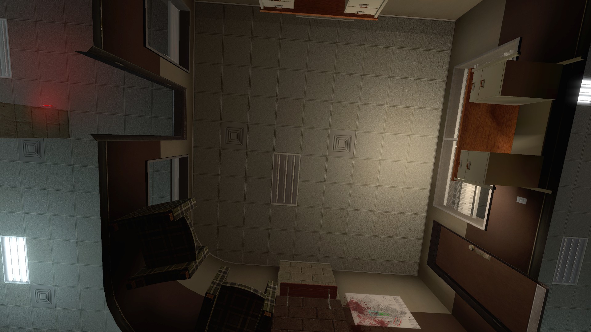
Map B is far and away the worst offender for this, but all three do it to some degree.

I’m not really complaining about this, and can see why it was done- the brushwork for those light panels can be kind of a pain to make, and maps with lights every other ceiling tile do indeed look kind of weird. But when trying to recapture the bright, institutional feeling of a working Office Complex, it poses a problem. It’s especially complicated by the presence of a lot of papers in Office Complex positioned near or directly underneath these lights: the lights have to be bright enough to reach these far-away areas, but at the same time the locations right next to them can’t be much brighter or else the papers will look very bad (particularly in relation to the bloom effect).

2: Color

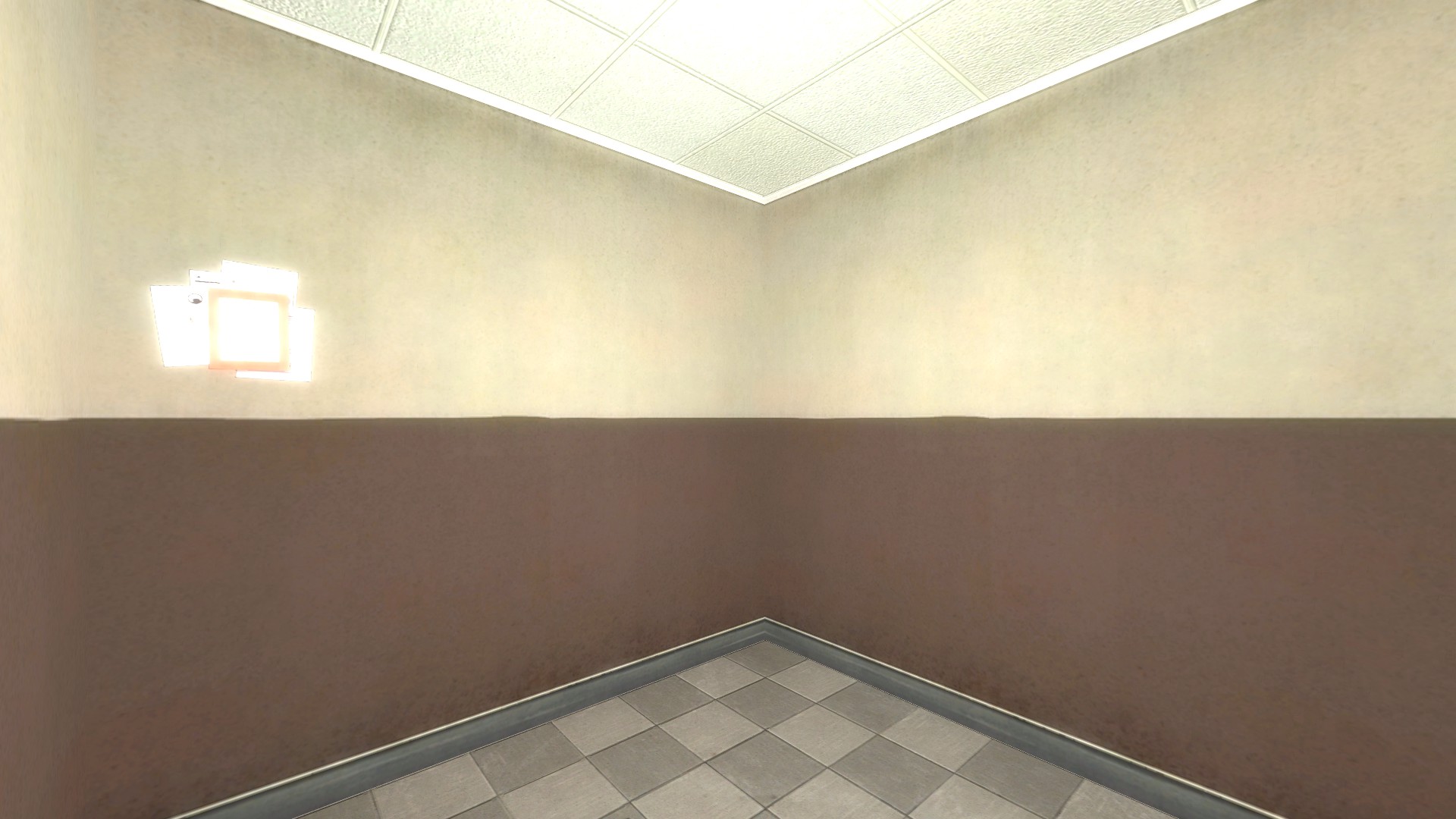
[/size]Most actual offices are lit with lights that are faintly yellow to white or very faintly blue-white. The post-disaster lighting in Office Complex, however, is a very saturated blue-green. Even when desaturated substantially, that blue-white or blue-green coloring just does not go well with Office Complex’s tan and brown walls. Take, for instance, the lighting from QEPD- in its natural, blue-on-blue environment, it looks like this:


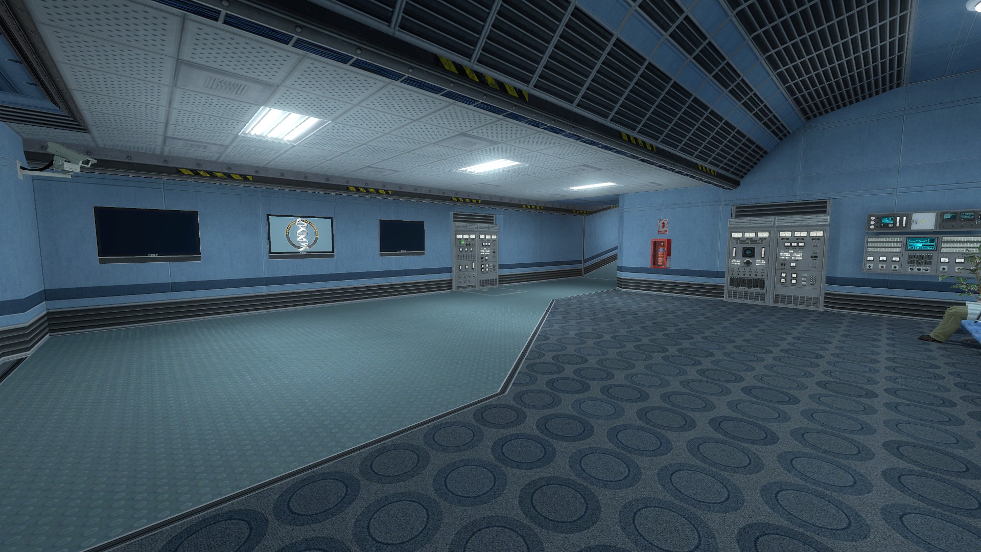
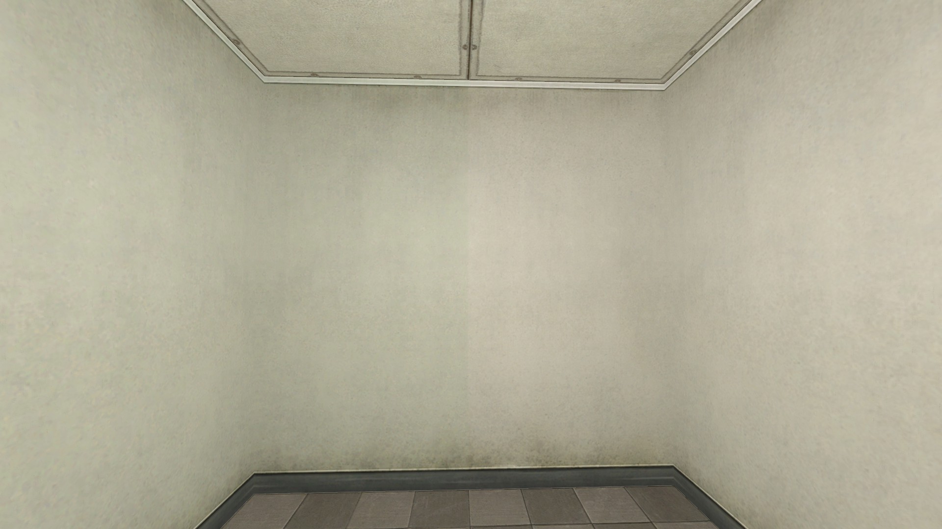
However, transplanting those same lights into a “clean copy” of a corridor from Office Complex’s B Map makes the entire area (even in the bright spots right next to the lights) look like it is underwater:The textures involved really look better under white or slightly yellow lighting…

but I don’t want to lose the cooler “feel” of the lighting in Office Complex completely. My ideal solution would be some way to use blue lights as "accents"around the light fixtures themselves, providing a clear connection to what we see in the post-disaster version of the map, while actually doing most of the illumination of the complex in white or yellow.
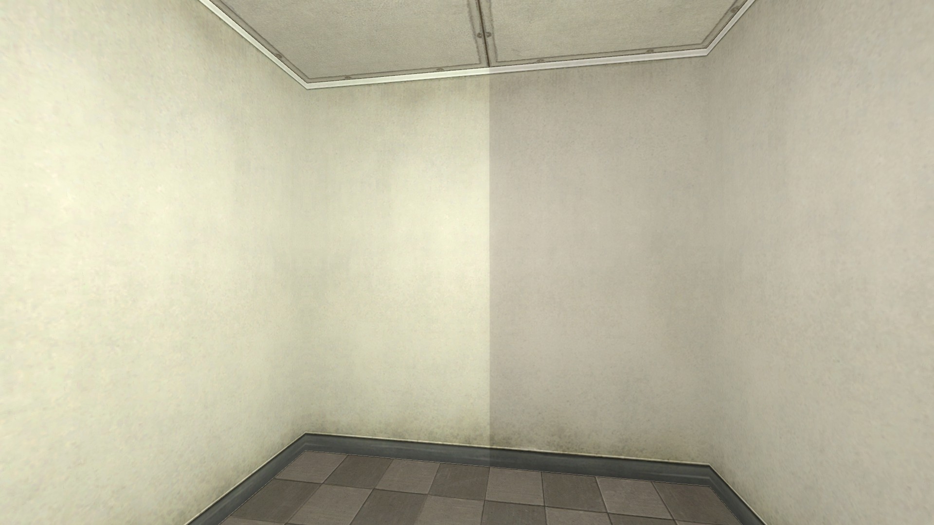
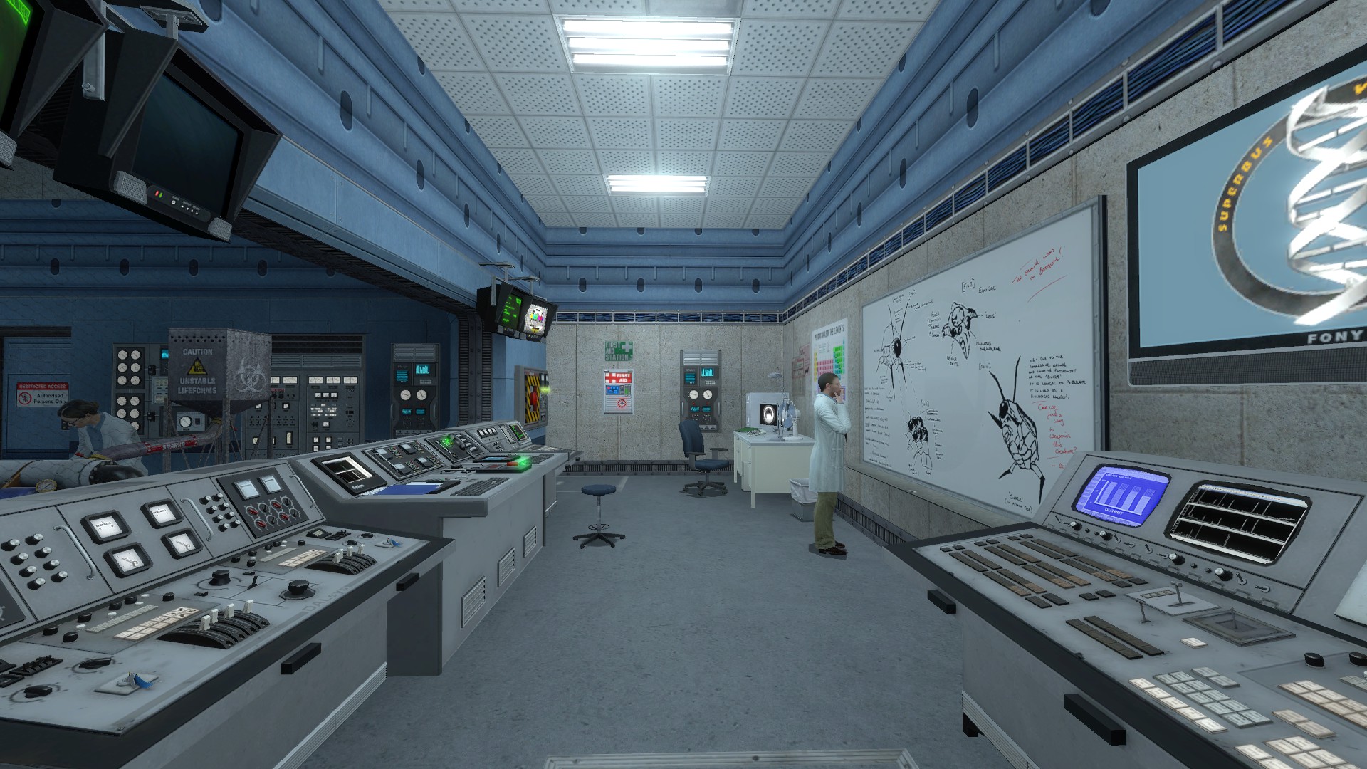
3: Grimy Textures
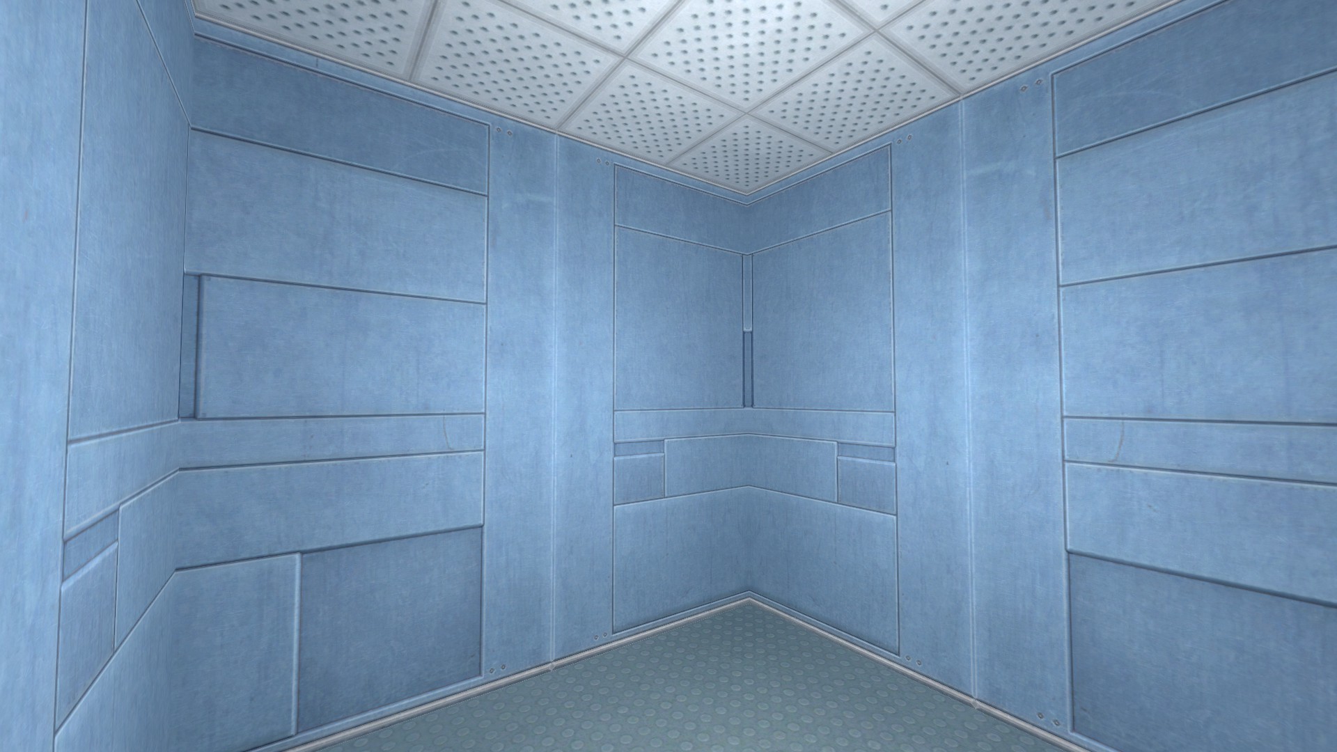
[/size][/size]Notice that even with very bright yellow-white lighting, the shots up above still don’t look very good. This is because, as I’ve mentioned previously in other threads, the textures in Office Complex seem to have been developed specifically for a very dim lighting scheme and therefore have a very dark, claustrophobic quality almost baked into them. To illustrate, here’s a simple 128-by-128 cube done in the Questionable Ethics texture set, with a single, pure white, brightness-30 quadratic light positioned dead center:

Looks institutional but still lively, yes? Perhaps even a smidgen too bright?

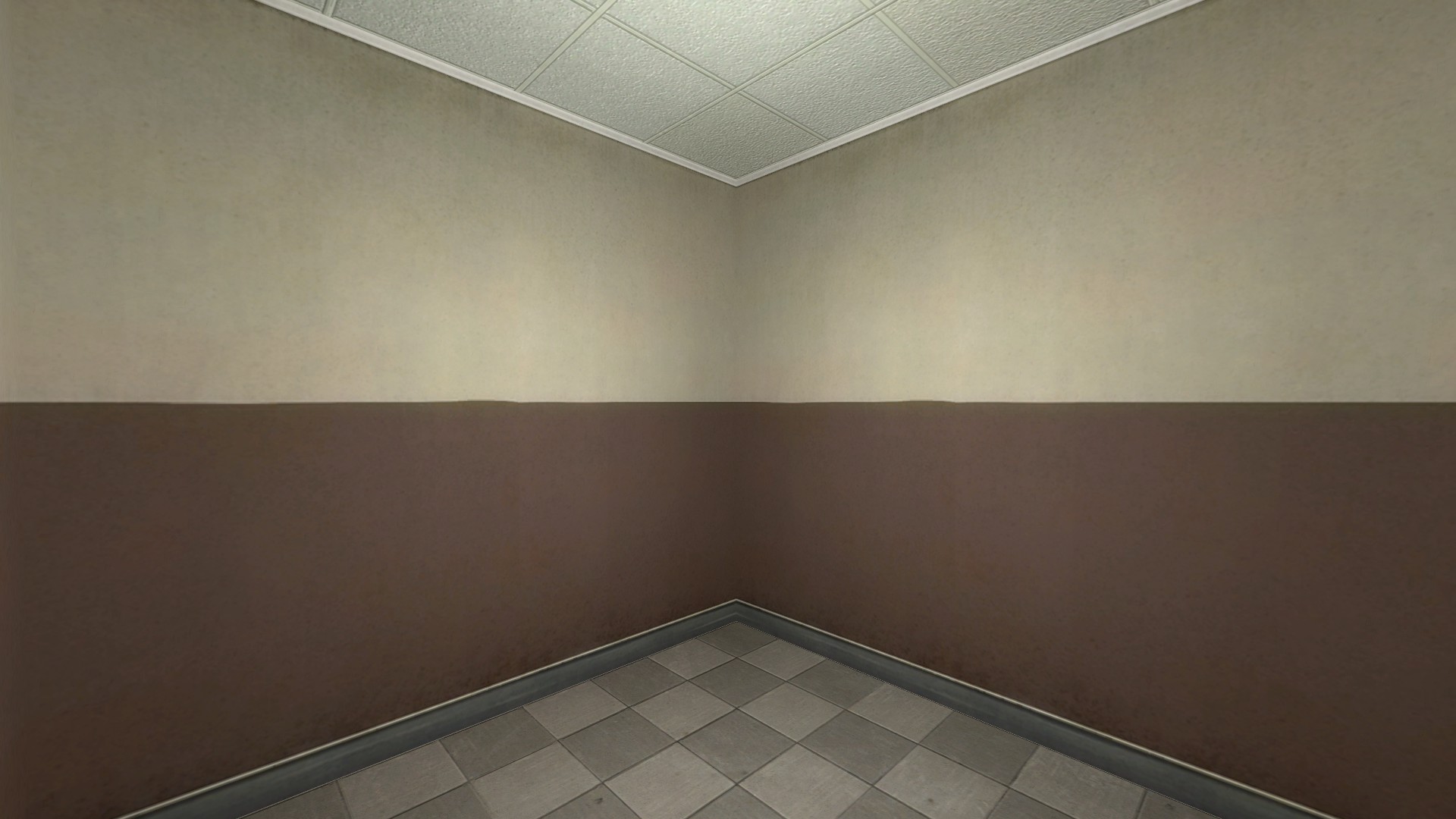
Here is that same cube redone in the Office Complex texture set, and it still looks like the sort of abandoned building you’d find in a cheap survival horror game. Especially near the corners where the light isn’t shining directly on the walls, where it develops a weird greenish tinge:

These are, essentially, the problems I face when working in Office Complex. To some degree they are all interconnected- the dimness of the lighting is enhanced by its blueness and the natural griminess of the textures; the grimy textures are shown off by the blue color scheme and the fact that lights are few and far between; and the blue lights look even worse because they can’t reach the corners and show off the griminess of the textures. I’ve tried a lot of solutions- many of them were promising, and even the failures were interesting, and some of these problems are mostly solved- but as I will likely be pushing into a wordcount limit before too long this seems as good a place as any to stop this post and start on another.

Beating the Fluorescent Lighting Blues[/size]
The effect of lighting color on Office Complex’s general suitability as a work environment cannot be overstated. To remove the effect of grimy textures I ran a quick find-and-replace on Map B’s textures to turn them into the Anomalous Materials ones, which are also yellow but are reasonably clean, and focused on one particularly well-lit area near the bathrooms. One photo is lit with white lights, the other with Office Complex’s native blue. Which ship would you rather work in?


Failure 1: Yellowish Lights with Blue Accents[/size]

The idea here was to simply add a second set of blue “accent” lights near actual light sources (which wouldn’t be very bright and would have sharp falloffs) and then light the rest of the map in white. Then I realized that since the blue light was still reflecting and making everything else blue anyway, I’d need to make the main lights yellow to counter this. It proved very difficult to balance the two on a room-by-room basis, the yellow lights invariably showed up too strongly in the corners, and the overall effect was… yucky.

Failure 2: Reflectivity Values
[/size]I tried to do the same thing by making the walls simply not reflect blue light by using the $reflectivity shader parameter. This proved to have the same yellow-buildup problem as the accents and area lights, with the added bonus of needing a material for each room if I tried to tweak it room-by-room. It was not a good choice.


In this test map, the far light looks almost normal, but the first two are completely broken. This is because the same shader reacts very differently to slight changes in the way lighting is configured, say from map to map or room to room.

Partial Success: Named Accents

[/size]Eventually I realized that since my problem was with blue light bouncing where it was not wanted, I could just name the accent lights and they would not bounce. This is the system currently used in the published OCPD maps, and it works fairly well… it does, however, have some problems.

  • It requires a lot of lights: Typically I have one accent light_spot for each surface the light is supposed to shine onto- one for the floor, one for the ceiling, and typically two walls. Trying to use a regular light_spot that illuminates the floor and the walls at the same time typically results in the entire floor being turned a bright blue (along with whatever NPCs and objects stick up from it), because the lights need to be fairly saturated and most importantly very wide in order to show up on the walls.
  • Those lights add to entity data: It’s typically around 30 or 40 percentiles for a map the size of pd_c1a2b. It’s not crippling, but if I were to do a bunch of other very entity-intensive things on a very large map I would not want to have very many of these accent lights.
  • They need to be very bright to show up over top of the base illumination: This typically means I have to knock the bloom scale down to at most 0.2 to compensate, which makes it much harder in turn to make the base illumination realistic.
  • The lightmaps need to be made very small wherever accent lights are used: Anything less than about 8 results in these big blue blodges that don’t really look like anything.

So, I guess, essentially what I’m looking for is a combination of two things:

  1. A way to make blue accents show up against a bright white background (almost like a negative light that makes the things it shines on less yellow and therefore more blue) without making them super bright.
  2. A way to make that effect not bounce. I’ve looked into the “maximum distance the light is allowed to cast” parameter and it seems to have no effect at all; the 50% and 100% falloff values approximate what I want but even with “hard falloff” set still bounce with very bright lights. I can very probably live with the light still taking up entdata as a named light or similar, though, if there was just a way to resolve #1.

Putting A Cleaner Face On Office Complex[/size]
The very first thing I ever noticed about Office Complex when I tried to restore it was how dark the ceilings were. For the longest time I thought this was a problem with my lighting scheme, but really when you look at them in a perfectly well-lit room (like my old one-light cube) they’re just naturally this weird greenish-gray. Actual ceiling tiles, even ones that have been around for a while and accumulated some dirt, just aren’t that color.

For a while after that I figured the ceiling tiles were the end of it, but really there’s problems with the walls- they have an odd, ruddy, grimy texture to them that’s not at all appropriate for a working office, but most insidiously this is not immediately apparent. In the canonical, post-disaster maps, the easiest way to approximate what Office Complex textures would look like under realistic lighting conditions is to shine your flashlight on them. When doing this, it looks like the light is weakly illuminating a bright, sort of buttery-colored tan wallboard…

… when in fact this is the result of bloom and HDR-like effects (from a flashlight that is in fact extremely bright) dramatically altering the appearance of the underlying material. Look what it does to things that are actually white:

Once again I have a pretty good idea of why the devs made the textures this way. They make Office Complex look extremely dim, without actually making the physical lighting so dim that players cannot see what they are doing. The problem is, that is kind of exactly the opposite of the effect I want, and sets the bar for the appearance of bright, work-friendly lighting extremely high. That bloom effect can be duplicated by turning up the brightness of the lights in general to ridiculous levels (like here in the light box, a single constant-attenuation light with brightness 120), but in doing so it causes naturally brighter objects (typically papers and various props) to simply glow:

Obviously, this is a major problem, but there are more than a few tools available to help deal with it. Really, the issue with replacing Office Complex’s textures isn’t one of things not working as it is there being a plethora of options available with a variety of different strengths and weaknesses.

Directly Editing Textures[/size]
One of the more obvious ways to fix the Office Complex textures is just to extract them from their vtf format and edit them in an external graphics program like Photoshop or (my personal choice, since it’s free and easier for someone with no formal graphic-design training to use) GIMP. The ability of a skilled graphic artist (or someone like me who has worked on the algorithmic side of image processing in the past) to modify Office Complex’s textures to fit a specific tone or concept of the area is in theory unlimited, but there’s a catch. By default, the vtf format uses lossy compression. This means that what you extract a texture, change it in an external program, and put it back into a new texture file you won’t see exactly what you made in-game. Now, in most textures this difference is small, but in the case of Office Complex’s walls develop this nasty green tinge.

In our old cube room it’s not particularly obvious, but it does give the walls a notable grimy quality, especially in the corners.

At the moment there isn’t really a good way to deal with this, as the user-friendly VTFEdit does not allow disabling compression completely. I’m stuck, then, compiling textures using good old-fashioned vtex.exe, which allows for the “nocompress 1” compile parameter. It’s also possible to try to anticipate the greening effect and compensate for it when creating the base texture, but this is an inexact science.

The $color Shader Param[/size]
Shader parameters are powerful magic. $color is mostly useful for tweaking the appearance of custom textures without having to re-edit, re-save and recompile each time, but it does allow for the R-G-B weighting to be pushed up above 1.0-1.0-1.0, and this has some interesting properties:

Here the texture on the left has been “scaled up” by a factor of 1.5: it looks lighter, but the difference is a lot more pronounced on the white main section than it is on the black rubber. I think the effect is (as the fact that we’re adjusting values from 0 to infinity where 1.0 has no effect at all would indicate) multiplicative: Dark areas will stay pretty dark, but light areas get much brighter. This could potentially be useful for making surfaces “take light” better and appear better-illuminated with less actual light falling on them, but thus far I have not put this effect to use in Office Complex. Perhaps I’ll investigate in more detail when I do the post on evening out lighting.

The $reflectivity Shader Param[/size]
For a while I thought this was going to be a silver bullet to resolve Office Complex’s dim-ceilings problem, going off of information from a post on nodraw.net describing it. Barring a radical restructuring of the basics of Office Complex lighting I don’t think I’ll be using that exact technique here, but I did learn a bit about modifying reflectivity in general. In a very rough overview, the higher you boost the reflectivity of a surface, the more light will bounce around, which makes the overall brightness much more even- dim corners will be less dim and the effect of a single light source will be more spread out. This is most of what we want, but it also means the area immediately under a light will stand out much less, and this can make the entire map look very “fullbright”. And since the change is part of the material used, it’s universal across maps and can’t be fine-tuned to match the lighting of each individual room.

Color Correction[/size]
I haven’t messed around with it a great deal, but I’d additionally looked into color correction in order to deal with the ‘greening’ of my custom textures. Now that I’ve ID’d the problem as a compression artifact and more or less resolved it that’s not an issue, but I am wondering if color correction may be of use in dealing with the blue-lights problem up above- turning bright areas bluer and dim areas yellower, for instance? In particular, I am encouraged by the fact that color correction is volumetric- that means I don’t need to worry about it doing weird things to non-office areas that should be lit more normally.

So I guess at the end of the day I have (from a Hammer perspective) a good, working solution to the problem of grimy textures- I’ve made what I think are some pretty good new ones by colorizing the top and bottom sections of the plaster walls to how they look when the flashlight is shined directly on them, and while having to use vtex instead of VTFEdit slows down development a tiny bit it’s really not a big deal as I don’t repeatedly revise the textures and it has zero effect on the final appearance of the map. Additionally, several things like $reflectivity and color correction, could in theory be used to help resolve the blue-light and even-lighting issues respectively, but that will require some additional experimentation and tweaking.

Evening Things Out[/size]

At first the problem of evening out the lighting in Office Complex seems pretty simple- just fill in the gaps between the real lights with phantom lights that are centrally located and set to a constant attenuation so that they don’t seem to be emanating from any one source in particular. Black Mesa itself uses this technique a fair bit to light up particularly dark patches, but it is unsuited to Office Complex’s environment of long corridors and broad, flat expanses with relatively low ceilings. Here’s why.

Constant Lights Aren’t Perfectly Even[/size]
Here is a single constant, brightness-20 light in a corridor in Map A. Notice that not the entire ceiling is lit evenly:


The farther we get from the light itself, the dimmer the ceiling becomes- not necessarily because the light itself gets weaker, but because it is striking the ceiling at a flatter angle. So why not put another constant light every ten or twenty feet to insure equal coverage?

Lighting Pileup[/size]

Adding a bunch of constant lights to fill a long corridor or other flat space causes an annoying problem. Here I’ve added a constant brightness-40 light under each fluorescent tube, which does indeed make the ceiling and most of the walls look pretty good.

But let’s take a look at the far wall with the door.


It appears to be glowing when all else around it is dim. Why? Lighting Pileup.

The basic idea behind this is that if you have multiple lights with a constant or near-constant attenuation arranged in a row or flat plane (as you would need to evenly illuminate a long corridor or a broad, low-ceilinged room like the cube farm in Map B), you will have some surfaces that are lit at a direct angle by more lights than other surfaces. And since the lights have little attenuation, all of those lights will strike that surface with the same individual brightness, making the surface look brighter by simple addition:

How to deal with this? Well, for the longest time I tried tweaking the 50 and 100% falloff values to get a light that looked constant but then fell off sharply after a specific radius, and it didn’t really work too well. The lights fell off quickly, had this bright “core” that meant they couldn’t be placed too near walls or props, and just generally looked bad. I’ve found that the best thing to do is actually just to keep the constant and linear terms set to ‘1’ and the constant term set to some very high number (typically 1000 to 10000). Why this behaves so much better than actually setting the first two terms to exactly zero, or setting them to very small numbers while leaving ‘constant’ at 1, I don’t really know.

One thing I am thinking of doing to resolve the various issues I have with the OC lights was to create a filter material- something with a multiplicative or subtractive effect where perfectly black objects (RGB = 0, 0, 0) would stay perfectly black, but brighter materials would have their channels multiplied by the base color and thereby tinted (for example, 128, 128, 128 * 0, 0, 1 = 0, 0, 128- that is, a gray material becomes blue). Note that this has nothing to do with lighting in the engine sense at all- it’s just an effect of a material between the player and whatever they are looking at.

If I had such a thing (preferably determined on a pixel-by-pixel basis by the underlying material) I could just place thin brushes over areas that were supposed to be blue, and save myself not only the over-bloom concerns of actual lights but the entdata and lightmap overhead as well.

Sadly, I am not certain how to go about specifying that sort of behavior. I am reasonably sure that the Source Engine does support this since colored glass existed all the way back in Half-Life 1, but I am at a loss as to how to invoke it. There’s a $multiply shader param, but it has no visible effect on materials and IIRC it is actually related to blended materials.

UPDATE:

Turns out that what I’m looking for is the “refract” shader, with the parameter “$refractamount” “0.0”. The color can be set using the $refracttintparam, and an alpha map supplied (somewhat hackishly) with $normalmap. This is… well, it’s everything I could want and more. I’m going to mess around with it, and see if I can do things like stick it onto decals. In theory I could replace every single named accent light in Office Complex with these filters, either as decals or brushes… however I will probably end up keeping at least some of the old lights around to light props, etc.

Founded in 2004, Leakfree.org became one of the first online communities dedicated to Valve’s Source engine development. It is more famously known for the formation of Black Mesa: Source under the 'Leakfree Modification Team' handle in September 2004.