Surface Tension Uncut - Re-Adding Cut Areas/Scenes (Expansion Project)

This seems thoroughly unprofessional, so I apologize, but I have university tomorrow so I need to go to bed now.

The video will be live at:

https://youtu.be/EqHPWb2Fscs

But not for an hour and a half roughly. So, check back at that link in an hour and a half and you can watch my video. If for some reason that doesn’t work, you can just find it on my channel through one of my other videos. It’s not groundbreaking, so don’t get too excited! It’s just a large step forward from the previous version in terms of visuals and setting. Short and sweet video too, hopefully.

Hope you like it. Let me know what you think. I thrive on criticism (with the occasional bit of praise)! It’s the reason I’ve got this far in the first place.

As for the alpha test list, I’m not going to post it. I decided against it after some thought. If the general public knows who exactly the alpha testers are it increases my chances of a leak which really isn’t something I want. Suffice to say, if you’ve asked me to test, and you’ve posted enough times in this thread that I know who you are, you’re in. I think those are very fair selection criteria. So, basically, those of you who are my testers will know who you are. At release day you will all get a PM with a download link. And if you’re not a tester, don’t fret! A public beta release is definitely not far off. I can’t see it being more than 2-3 weeks, in fact!

My progress has been good - I think I’m on track to keeping my word on the date. I can’t see C2A5H being much more work than C2A5G was and I blasted it out in 2 days. I still have 4 days to go. We’ll see.

Sounds good. I’ll likely demo my first play through of the alpha levels. I’ll also take a detailed list of improvements that could be made to the levels after that is done.

I will post one or both of them on Mediafire or some such after I’m through. I’m not going to upload a file to Youtube, it’s likely that the Demo’s AVI file size will be too large, plus Steam’s on my 128 gig SSD… won’t have enough room. I do hope y’all are familiar with playing demos through your BM clients.

@Text My custom Skill.cfg is similar to yours, but I also buffed the marines and the NPC weapon damage appropriately for tougher fight(s), and I will use that for testing… that being said, I’ll likely die quite a few times before completion.

Good luck with your classes on Friday, I have that stuff through out the week and I know what it’s like.

Add autosaves in the hard puzzles part in the map.

Video is live!

https://www.youtube.com/watch?v=EqHPWb2Fscs&feature=youtu.be

Showing that Hangar room is a bit of a tease, imo you should be able to go in there, just have it closed off and littered with a bit of ammo, most players haven’t seen the jet up close yet.

just wondering are any of the grunts medic grunts? if not might want to put some in.

Great work so far, I’m very impressed with the rate of progress, like so many others following this project.

Just want to ask about the skybox area, which has a couple of control towers, what looks like airstrips along with the large power-line towers.
Even though I like the look of it with the power-line towers there, it seems odd that they are in such close proximity to the airstrips out there.
I’d suggest putting the power-line towers way off in the distance, behind the airstrip section, to provide a sense of depth and scale.

Edit: Also while I’m here, it strikes me as odd, that both in BM maps and yours, the road edges where the terrain is lower than the gutter edge, is there a technical reason why it is made this way?
Not that it looks particularly bad, just seems like the road should have been cut in to the surrounding terrain and there would be a step up out of the gutter and onto the dirt areas.
Even though this is a small criticism, I think it’d add a sense of realism to change this.

The ambush explosion looks great!

Bravo man! This area is really starting to change from amazing to phenomenal! I like how you are now starting to test with the BMS skill.cfg and that you are working with near-full ammo for your weapons, which is what you will realistically have by this time (make sure to delete the gluon gun, fix the MP5, and use this ammo layout for the alpha). The explosion in the car shop is excellent, as is the new hangar revision. Air traffic control towers are also a great feature (this redeems that shit road Ronster :p). Here’s some suggestions to finalize the polish:

  1. If the .50 cal vort shootout is still at the beginning of your C2A5G remake, don’t forget to add some xenofauna at the end of the tunnel. The area is currently a bit bland and needs some sprucing up, which would also make it consistent w/its appearance in HL.

  2. I’m still having issues w/the particle effects in the car shop for the same reason as in the marine-tossing scene in C2A5H…the particles almost look like snowflakes that you shake up in a crystal ball. Make them greyer if possible and/or put fewer particles in the room. Otherwise, you can delete them altogether as the car shop looks just fine without them.

  3. The explosion in the car shop looks very nice and hopefully you can fix the clipping issues. However, when the window breaks, there is no debris anywhere to be found. Can you add some?

  4. Thank god that road outside the car shop is not hideous anymore! It could certainly do with some more polish, but otherwise much better. The main issue now is the logo on the ground. Currently, the last part of it says “NO PARKING N.” The logo should be changed such that the words “NO PARKING” should never be truncated because that’s how it would look in real life.

  5. The lamppost you put in is unfortunately in line-of-sight of the TOW and nearly in line-of-sight to the Agrunt hangar. This could present some serious gameplay issues because it makes the Agrunts hard to see, especially when they start fanning out to the left side as they do in your video. On hard mode, they can cut you down quickly if one of your TOW shots misses and hits the lamppost (plus you don’t have good places to hide from the hornets). Some possible solutions: 1) delete the lamppost altogether, 2) move the TOW launcher to the right and all the other boxes and stuff to the left, 3) make the lamppost destructible with TOW, explosives and Tau.

  6. I do agree w/previous poster’s power line tower comment in that it’s a little too close to the airstrip. It does look nice though and I don’t think this necessarily has to be fixed. Do w/e you want here. Don’t forget that harrier take-off. Your setup now is perfect but you will need to test the takeoff timing a bit to optimize. With regards to the road gutter, it probably shouldn’t be fixed as all of the other roads in ST would need to be revised.

  7. The TOW hangar and the Agrunt hanger have some metal walkways on top of them which should ideally be deleted. Why would they be there? Could maintenance workers actually access them?

  8. The globe building that you see in the Osprey scene and the air traffic control towers are exceptionally white and kind of stick out. If the globes are actually like this in BMS assets, keep them that way. However, consider giving the air traffic control towers a similar grey color palette as the rest of the buildings. It might look a bit nicer. With regards to the terrain surrounding the control towers, are you planning to make it more detailed? It currently looks a bit redder and plainer than the actual gameplay areas.

  9. When the Osprey explodes, try to keep the majority of its frame on the helipad or if this is not possible, keep some debris there. I found it hilarious that the manta made the central pad area super clean during the script. Don’t forget the Bradley fix either.

  10.      The helipad overlaps fairly significantly with the white door and the road, which is unrealistic.  Perhaps this can be fixed by moving the hangar further left.
    
  11. Although the orange doors w/the black and white strips are design elements of ST, they are pretty hideous and stand out like a sore thumb, since they are usually meant to direct you to where you need to go. Ideally, you could delete them from the TOW courtyard and hangar and replace them with something less visually offensive, since the player won’t be accessing these areas.

I think you have done a great job on this and the only things I think you should add is that in the area where the hanger is put a ladder to a higher platform so we can get a good look at that area especially for players who don’t know about no clip… Obviously not so high that it causes you too much work but high enough to take in the view of that 3d skybox

People should get to see that view under normal game play circumstances because it’s a great view and players should see it. This means you may have to touch up the double silo bunker roof a bit but I really think it’s worth it.

The only other thing is the garage interior still needs a little more prop detail along the walls and the vent still drops down rather than only a function breakable… This is all very minor though but the vent to be as in the original would be the icing on the cake

The Garage is a major area that players will spend time exploring adding physics props like tools boxes and lockers or metal cupboards that open is what the room needs a bit of… it’s small things but will help improve the feel of the room and a bit more interactive other than the car lifts.

Basically cannot see anything bad in it and I really like the new hanger it’s much better than what you had before and the silo doors are also much improved now

another suggestion is change the glass window in the garage from a func_breakable whole solid to a more expensive no draw glass with a func_breakable frame… so that it still blocks your view and breaks gradual when you and enemies shoot through it the bomb destruction I think looks good and could not spot the error??? all the glass would break on the bomb but obviously fall apart gradual and the frame break in grouped sections when shot.

If you decide to do the harrier take off by the garage this could be triggered by naming the hecu soldiers outside and triggered on the last soldiers death in a logic counter set-up perhaps… Again it would be a nice touch but not essential

overall brilliant!!!

Looks great, only tiny thing i saw was as you did the look around after the battle i saw a jet just hanging in mid air. Is that parked after the flyby or something else?

Everything is greate,but…
1)please change fire of fighter, add more black smoke and decrease amount of fire
2)make roof of hangar bigger

The “technical reason” for elevating the road above the ground surface (at least for me, I don’t know why the BM team did it though I can guess it’s for the same reasons) is because lowering them into the displacements means you have to cut up the displacement to match the road shape - which quickly becomes highly unmanageable once you have a few curves in the road. Just cutting up one displacement to fit a single 90 degree curve can rocket you from 1 displacement to 16. This quickly becomes a nightmare on big roads especially when you need to sew them together. There are workarounds to that as well, but they’re messy. It’s much neater to do it this way.

The power lines in the distance are an aesthetic and slightly thematic choice, as in the TOW section there is a power station next to the courtyard. Maybe I didn’t get a good perspective of it in the video, but they don’t overlap the runway at any point. They don’t even come particularly near it. It should be okay. Either way, I like what it adds to the visuals enough that I don’t mind what it detracts from the realism.

Here we go!

  1. Will do. Low down on my list of priorities for that map though.
  2. Will make them more transparent. Low down on my list of priorities for that map though.
  3. Will do. Low down on my list of priorities for that map though.
  4. Will also do. It was just a temp fix really. But, low down on my list of priorities for that map.
  5. It hasn’t felt like a problem to me in the times I’ve tested it. I’ll make it so you can collapse it with a TOW shot. That’ll be neat.
  6. Addressed above
  7. I’m not sure what you’re referring to here. The metal walkways I added are all accessible. In the hangar there are 2 doors leading out from other buildings onto the walkways and I’m going to add ladders. And the one by the helipad is clearly accessible, seeing as I go up there.
    8 ) That’s how the globes look in ST. I used the same model.
  8. I have attempted to do this but with difficulty. I will see what I can do. Kinda low down on my list of priorities though.
  9. The Helipad doesn’t overlap, but the walkway around it does.
  10. Actually they’re used all around ST for doors in the distance. I’m just keeping to that theme.

For the glass smashing I intend to use cinematic physics though that’s looking increasingly distant as I still don’t have someone to model it for me.

Making the view by the helipad accessible easily means touching up lots of nodrawwed faces and areas, which is simply a lot more trouble (and a lot more performance hit!) than I think it’s worth. I went over it very quickly, but I think the view from the TOW courtyard is adequate enough.

I will carry on making minor adjustments to garage but nothing major I’m afraid. Too many props inside the garage will make performance horrible, as my map is already pretty intensive.

The Harrier take of will most likely be triggered 20 seconds after the player jumps out the window. Seems the simplest solution to me.

lamp post should be on the one side of a road, but not in zigzag

In the hanger with the harriers I would use one big door that slides open, or two doors who slide open, like real hangars not those seen :slight_smile:

Those power line towers are indeed too close to the landingstrip, but I wonder why the harriers are on the one side and the control tower totally on the other side?

But I think once we see the map for ourselves, we have a better view to it.

I completely understand textfamguy on the view of 3d skybox… It’s a shame that not really feasible but would have been nice… Anyway to give us a better view from the TOW area by ladder?

I have some time today and I will mock up the window for you as an example… Should not take long I think although cinematic physics has it’s place the better option could be nodraw glass with a breakable frame simply because it will react to physics real time anyway I will have a play with this later as It is good to put ideas to the test as it may be flawed until you try it you don’t always know

A very quick one… Small detail how about adding the small yellow posts to the corners of the roads (4 posts) where the hanger is? It might round them off by having them there on the 4 straights where they meet the main road

as for the interior garage making the vent the same as the original should give the space for a little physics and interaction improvements? i.e. vent only destroys does not fall from ceiling?

Your hinting at or eluding to removing that bunker the APC / Tank comes from… and creating a taxi road to the runway from the hanger?

This is not such a bad idea but again it’s a complete redesign!!!

but we would get the view from the helipad platform this way? This could work and Have the APC come from the doors straight ahead next to the helipad?

fence on wheels across the taxi road

I’m not for this idea but I am undecided on it really

Pros

I’ve just seen your video and first thing that I want to underline is the Skybox:
it’s amazing, really well done! :slight_smile:
I’m glad that you got rid of that green windows, in terms of gameplay they didn’t make sense.
I like your idea of that tent at the end of the map, make the layout of your map more realistic.


Possible Improvements

Flicker issue
Everytimeyou shoot there are some metal elements that flickers
(See the image below)

an Idea for an additional Area

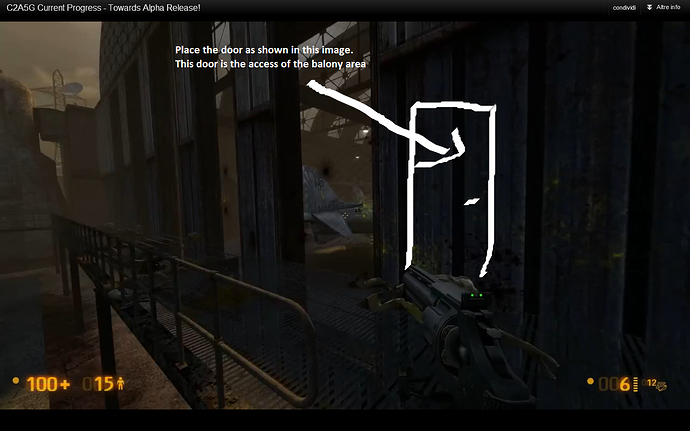
You should add a balcony in the hangar area:
-this balcony should be closed with a metal grate in order to avoid that a player can reach the ground floor.

-This new area would add more exploration in your map.

-At the end of it, you could place a health charger or some health kit as reward.

-This new area gives a cool overview of the hangar

-Player can access this area through a door(see image below).

I guess the helipad is too close to the wall, normally a helipad is in an open field, cause we have static electricity of the blades, the span width of a Heli and such…

The Helipad is above the road, you should move it more to the left.
Picture

I guess the problematic road after the ambush could be improved with a more realistic aproach, using a T-Junction.

The light lamps between the TOW and the destructible-door breaks a little the flow (and the fun) of the open fight. Sure, they serve as a cover, but maybe without them the fight could be more challenging.

So, using a T junction road, at least two problems – well, what I see as a problem – would be solved: the lamps and the road design. The lamps could be moved to the sides of the road, being more realistic and in-line with the rest of the road after the destructible door, and the strange triangular textures saying “NO PARKING / NO PAR / ING NO PAR /” could be removed. Also the empty area around the road could be filled with a parking lot maybe, with military stuff scattered around.

As always, I made another of my well known crude paintbrushed-mockups to explain better my idea (again, don’t care about proportions, perspectives, etc. It is just to get what I mean):

https://www.dropbox.com/s/uc6m798u6kj93ug/C2a5g_T-junction.png


Besides this, impressive evolution in the map! Looking really good.

Founded in 2004, Leakfree.org became one of the first online communities dedicated to Valve’s Source engine development. It is more famously known for the formation of Black Mesa: Source under the 'Leakfree Modification Team' handle in September 2004.