Surface Tension Uncut - Re-Adding Cut Areas/Scenes (Expansion Project)

I’m not sure on the resolution of the displacements you are using, but I’d like to suggest something that I came up with all the way back in my RTCW mapping days that may or may not apply.
I assume from your description that the displacements span underneath the roads, so…
If you were to move the whole displacement up, grab the verts that are under the road sections and move them a long way down until it has the effect of clipping through mostly at the top edge of the guttering.
Adjust verts further back from the road edge to provide a nice smooth curve up to the rest of the displacement. From the setting, it wouldn’t really matter if some of the poly clip further than the start of the gutter, because it would show like dirt had piled up in it.

Anyway, I used this in RTCW terrain and it had a really nice effect, just an idea.

Fair enough about the power lines, and again, awesome job so far, can’t wait to see more!

Everything that had to be said has been said, and some more… the only things lacking are some crates, ammunition etc.
Other than that, I see Surface Tension turning out to be the best BM chapter at this rate… it was already great before your “additions and adjustments” so that’s something to say.
Also I consider Surface Tension and Forget About Freeman to be one and the same chapter in my head, they blend so well together :slight_smile: the most epic and action oriented parts of the game.

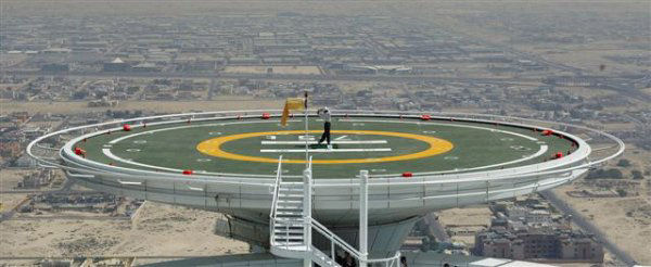
a helipad is never that close to a building, but more in an open field or on a flat building :slight_smile:

Looks great here, must be something like this

I have done a couple of videos regarding the window… To see if people would perhaps think it would work… Basically the grunts will happily throw grenades in it has to do with the height of the window as to why they won’t throw grenades in.

Ok anyway I did this rough mock up what do you think for concept of this destructible window.

https://www.youtube.com/watch?v=lfM2tfGSHDE&feature=plcp

https://www.youtube.com/watch?v=UvwLHDq_i6c&feature=youtu.be

Heya guys, just gonna give my opinion here.
In the Hangar building, I think the way the metal walkway texture goes all the way to the windows looks a bit unrealistic (and ugly - no offense), contrasting a lot to the rest of the beautiful and awesome map.

I think there are two (three) ways of fixing it:
A. Either make the windows smaller in height or split them into two windows each - one below the walkway and one above it.

B. Add some sort of transition between the walkway and the windows and walls.

C. Do both things. :stuck_out_tongue:

Here’s a mockup, using elivance’s image from last page:

Just my two cents. Keep up the great work, can’t wait to play it myself. :jizz:

Looks great, just waiting till second vid is processed

Cheers took a couple of hours in the end… One large window with breakable frame it’s a bit of a cheat but the result is ok in terms of reacting with bullet damage and physics…

Would need a small trigger hurt placed on the window only to shatter the pane when the bomb goes off I guess and the guards to wake on the car lift button being pushed as it’s a see through window different from the texture fake window.

Though your window prefab is alright, it’s not good for the purposes of what I want to do. It seems to me like you’ve looked at my windows, gone “oh, that’s ugly” and tried to make it un-ugly, without thinking about why I’ve made it like that.

It has to be opaque and ENTIRELY unbreakable prior to the scripted event. It is a necessity. If the player can see out the window prior to the scripted event, they can see there are no marines there (the marines don’t wake up until the scripted event). They’d also wonder why if the Marines can see them standing in the window - why aren’t they trying to attack him? Why aren’t they doing anything? I’d have to code all of that to make it make sense. Pain in the arse, and a pointless hassle really.

I will make it look better eventually, but it’s going to function in the same way until then. I will not make it a non-opaque window. Not happening.

As per Omegalucas’s request, I’ll make the transition between the windows in the Hangar and the walkway look better.

And I’ve already explained my reasoning concerning the helipad. It doesn’t really need to be discussed further. I may tweak it a little but it’s not being massively revised. It’s in the best possible place from a level design perspective. Realistically I know it doesn’t make sense, but it doesn’t cross the boundary of suspension of disbelief, I don’t feel.

On the subject of the T Junction in the TOW courtyard, I really have two minds about it. I just love the curvey roads! They look the business, and getting rid of them seems a shame. But I do know a T junction would make more sense so I’m torn. I’ll have to think about it.

No more parts of the level are going to be massively revised, so don’t bother looking for me to do it. I want to make that clear now because it’s wasted discussion which could be better spent elsewhere! There’s so much more that needs to be done.

After a rough day at uni, I’m going to unwind, have a few beers, then crack on with C2A5H. Hoping to have the major works on that done by tomorrow evening. Then it’s minor adjustments all the way until alpha.

https://www.dropbox.com/s/uc6m798u6kj93ug/C2a5g_T-junction.png
Conti’s solution is actually your best one by far. The T-junction is essentially the same as your original layout (you just had a second road that veered to the left) and offers several benefits including: 1) keeping all lampposts on the side of the road, instead of the middle, which is consistent with their use in later sections. 2) no need for destructible lampposts (which is nice because then you’d have to add the effect to the other lampposts to keep consistency) 3) makes the Agrunt hangar/battle crystal clear 4) you don’t have to deal with the “NO PARKING” logo. 5) just looks more realistic and less cluttered.

If you implement this, make sure the T-junction road curves toward the left rather than having just a straight road. The parking lot section in Conti’s image is a little too small for a parking lot and wouldn’t make sense, since the hanger is essentially the parking lot for vehicles. I say just add some military crap there.

You can see the horizontal walkway in Conti’s picture…it’s that black rectangle-like area just above the Agrunt hangar. If you’re going to add ladders to the TOW and Agrunt hangars, that could work, but from a design perspective, the walkways should not be there at all because none of the hangars in the rest of ST have them.

Any plans for the recoloring the control tower or the surround terrain?

Tis true but unfortunately it’s still a serious design flaw and the image below really highlights it. How could you possibly get a vehicle through the white doors?

I imagine that fixing this issue by moving the hangar and everything on the left further left would be a real pain, but I do think this area really needs to be addressed. What’s your take on it?

…sigh! :frowning:

ok. I’m looking forward to see how you’ll modify your C2A5H.

from what I can see this looks epic so far, to me a map is good as long as it looks good an functions well which textfamguy1s are, they only problems I have is lack of movable props and ammo, but it is before the beta so that is to be expected… just a note if I can’t get out of a map I think of it as a good map, there are 4 maps in BM that I have been able to escape (out door areas need player clips at the fences or you will get players finding ways out of maps people)

Ya I saw this too at the very end of the video. You can’t see it w/o no clipping so I guess it’s a non-issue.

Well the helipad needs to move on top of a building with a little building on it which holds the stairs to it

I did not think the window looked ugly… I thought it would be better to feel more interactive with physics only and was a suggestion or idea… Seeing as I could not see out through the window thats already there I did not know that was the case that they are standing there behind it so please understand I was just trying to help out with ideas and not cause you loads of extra work in fact I was trying to make you less work… Because I know you are doing a great job of it and well it must be difficult to get a lot of critisism even though it’s really great map…

anyway hope you don’t mind me trying to offer up ideas not trying to cause you a problem at all.

Not a problem mate, sorry about the slightly aggressive tone, it’s been a long day so I’m a little wound up. I don’t have a problem at all with you suggesting or offering up stuff, I even like it in fact, so thank you. But…unfortunately your window, while good, doesn’t work for what I want.

It’s the Harrier take off scene which I attempted way back when I started the map and haven’t touched since then. The paths are fucked. I will mess around with it before release to make it actually fly off. It’s just a remnant of the old version.

just wondering could you make one of the hecu grunts use the grenade launcher in street battle or the one you see from the roof. (currently the only place a grunt uses on is in on the rail when they take out your tram) would be cool…

We all find ur maps very very good and personally I couldn’t achieve this, I cannot map, cannot code, cannot skin, just have an eye for detail and realism.

That’s why alot of mod teams took me as their researcher and tester.

Even now I can be part of an dev team to playtest their new game (thanks to a mapper I know in the US).

Even got the email of Cliff Bleszinski (long time ago I mailed him, need to do it again), go the email by the same mapper I know

So I’m not good in anything but testing :slight_smile:

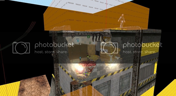
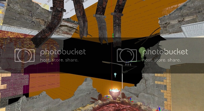
Progress. Looks fantastic. Took me about an hour and a half.

Don’t leave me an annoying comment about the beams. I haven’t finished them yet!

looks good, though if it was up to me I would have the mechanical lights taken out or destroyed for that room, only “natural” light and the xen plant light, reasoning being that room has taken some damage so the lights should be shattered.

Founded in 2004, Leakfree.org became one of the first online communities dedicated to Valve’s Source engine development. It is more famously known for the formation of Black Mesa: Source under the 'Leakfree Modification Team' handle in September 2004.