
Which orientation, velocity and angle types are you using for the func_tracktrain? You have obviously tried them all out right? Also doubt you’re going to get it perfect. Just gotta get it believable enough to pass as a takeoff. I really doubt the average gamer is going to say “hey it’s not perfect”. But I would rather it still be in there because it’s a part of what adds to surface tension. It’s a lil bit extra that makes the fighting on the surface more real.
Yes. All of them except the defaults are buggy, but linear blend looks the best for my purposes. The orientation type changes per path_track rather than overall, with it initially using the path_track’s angles when on the ground (otherwise it looks weird) and then switching to direction of motion upon take-off. That’s not the problem. It’s just that tracktrains have jerky motions.
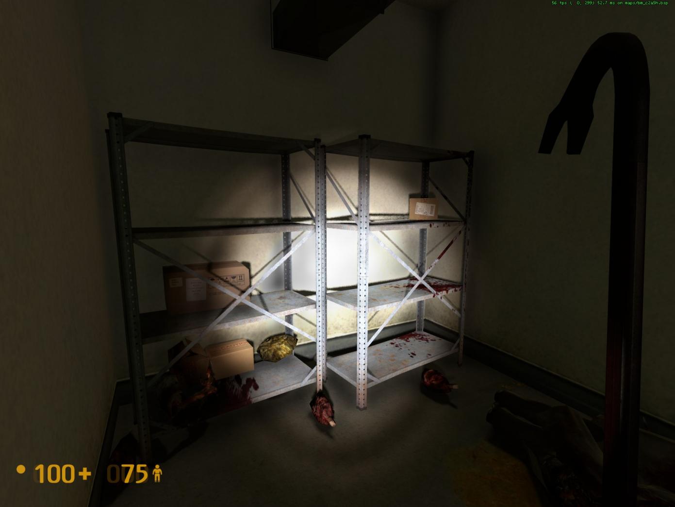
The revised furnace room lighting looks grand (careful not to go too dark, now).
================================
Following up on your response, too bad we can’t get sparks to behave in the proper manner on a consistent basis.
================================
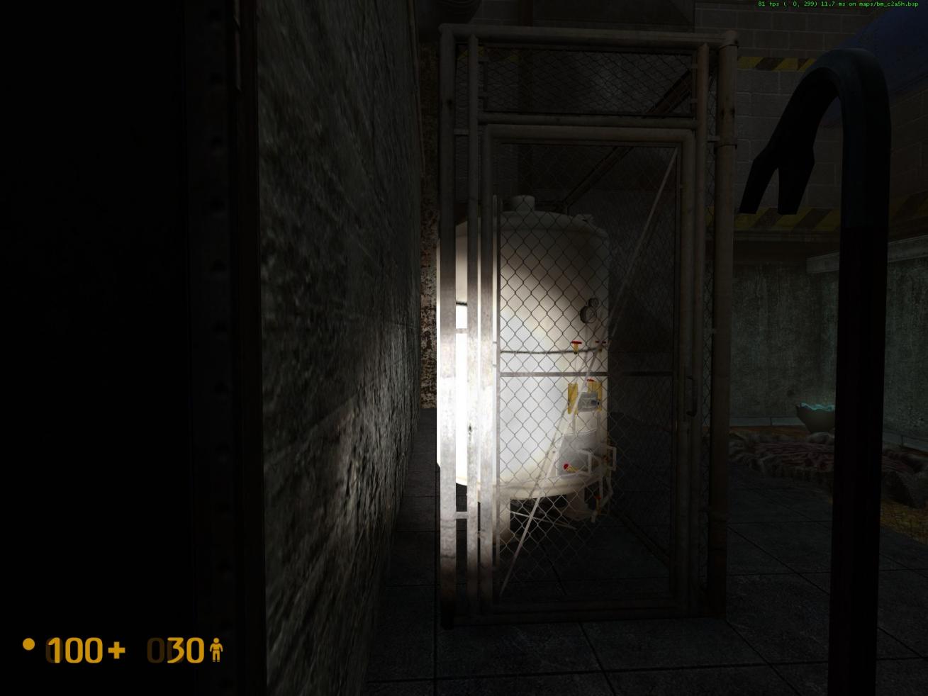
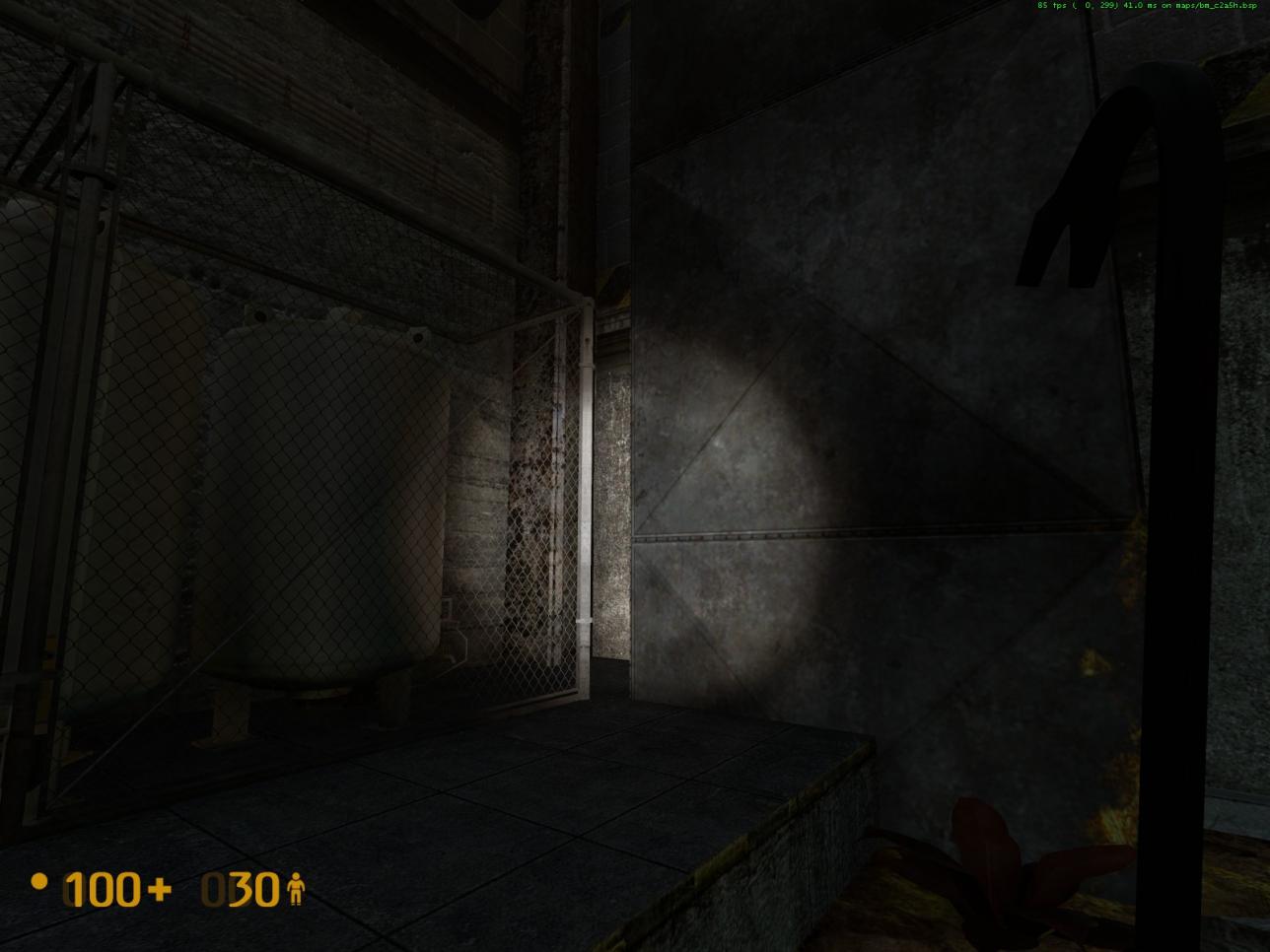
In the tank yard to the right of the security hut, over next to the jump pad:
-
To eliminate the sizable gap between the wall and the fenced cage, can the two large tanks be moved closer to the wall and then shift the fenced cage to the left, up against the wall.
-
Move the cage backwards so that the vertical corner post at the rear of the cage is past the face of the large gray vertical vent.
-
Move the large gray vertical vent to the left up against the repositioned fenced cage to eliminate the gap between them.
-
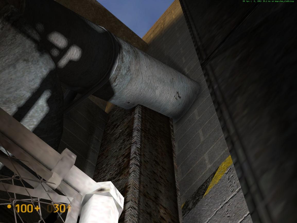
Up above the rear of the fenced cage, the vertical corner beam is clipping through one of the large pipes.
-
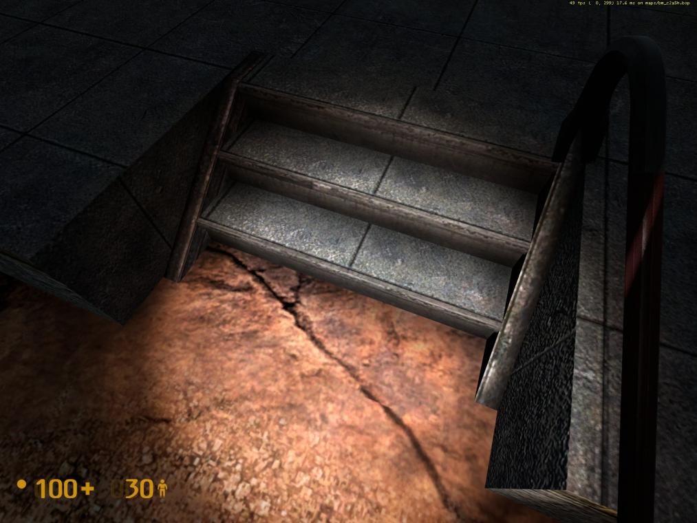
The steps outside the security hut have a flickering texture anomaly on the ground.
Please see the pictures provided. Thanks in advance for your consideration.

Does the Distance Between the Wheels make any difference? What do you have it set at? I never really bothered playing with that option much. What about the spacing between each tracktrain entity? How much distance is there between each turn?
As I said I do not know anything about mapping so I do not know what limitations you have to deal with, but in my opinion the animation just needs a straight moving track in a slight upward angle, starting from the ground just behind the Bunker (hidden from the players view). The Jet is connected to that track with its nose on a slightly higher pitch, than the actual flight path (as seen in the second video I have posted). The jet itself does not need to move or tilt, other than along the path of the track with a constant and fast speed. So the jet enters the players perspective when it is just leaving the ground. This along with a really loud engine sound I think would make a cool take off sequence.
I would hate to see the take off sequence taken out 
Old or new? Neither. No way to do simply this (bad photoshop incoming)?:
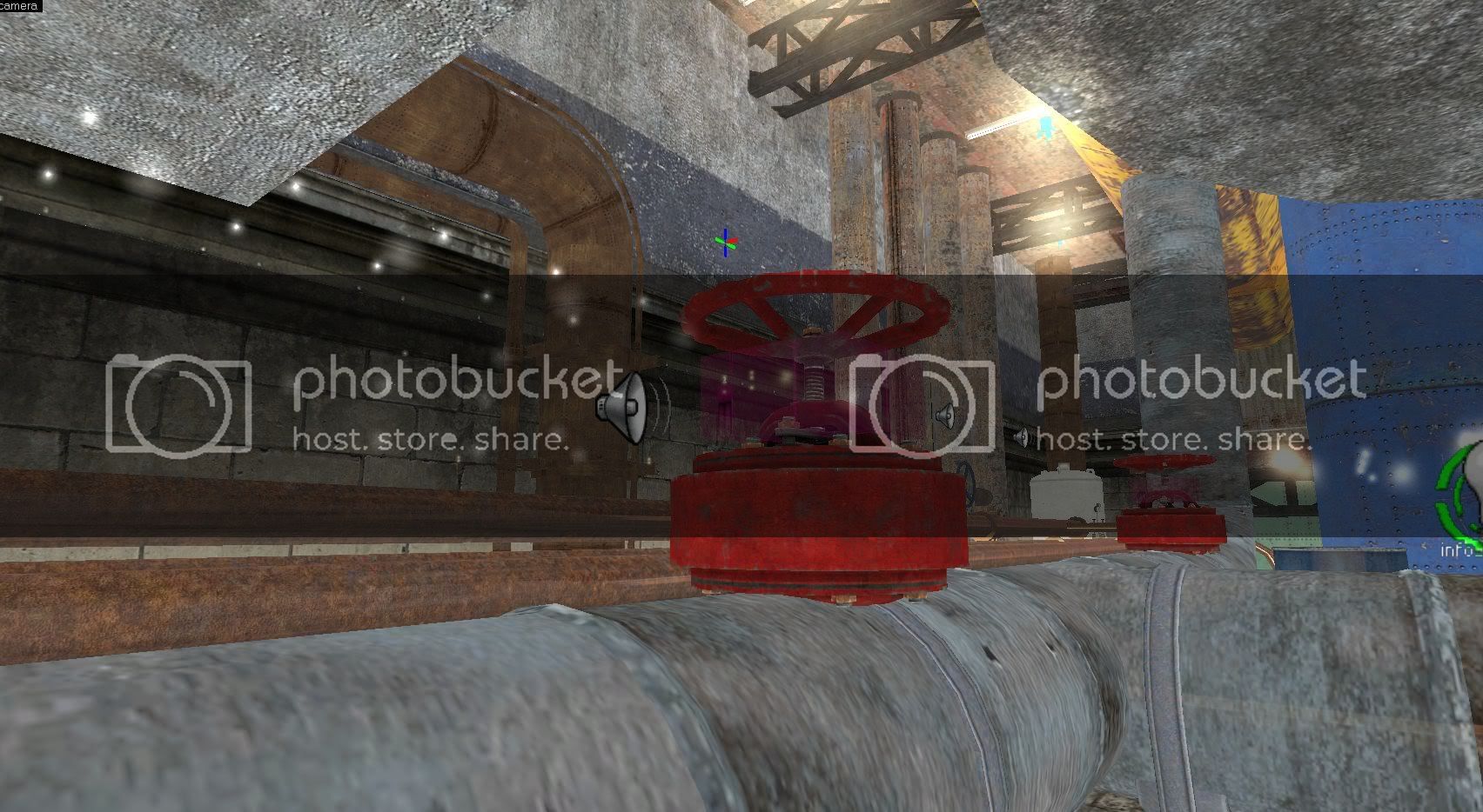
I like the red valve too, specially its clean red base seen throughout the whole game. My problem is only these dark things attached to the red base, which gave me the impression of something clipping there (or the valve poorly implemented above some pipe element).
But if it isn’t possible to use the clean red base, so I stay with your new suggested design. I’m not fan of it too, but if I have to choose, I prefer the new one. It is a pitty.
Here we go again… Does that not interest you ? See my previous post :
https://forums.blackmesasource.com/showpost.php?p=527100&postcount=1903
Conti’s valve is ideal.
It’s just a matter whether or not it’s possible. I agree with him about the new and the old valves. But we disagree about which one is “less bad”, so to say. I’d keep the old one.
I’ve done Conti’s suggestion, it looks alright, but the fat base of the valve contrasts a little bit with the thinner pipe.
I don’t consider this an important issue, I’m afraid. Let me get the important issues out of the way first. Then I may address it, depending how I feel.
That new valve is looking good, Text.
=================================
Quote from TexFAMGUY1
“Ladder brightness and props changing brightness randomly seems to be a feature of BM Props. No idea why, though. If you played Hezu’s Uplink remake, you’ll see his doors do the same thing my ones sometimes do, as do several on Black Mesa by default (particularly on WGH). At this point, there’s nothing I can do about it. At least it’s a consistent bug though!”
I think the ladder lighting glitch is a result of some interaction issues with the Garg. In my screenshots, you can see him patrolling around above me. Just played the same level again, after killing the Garg, and the ladder lighting issue is gone. More for your brain to ponder.
=================================
Additional Issues Found In The Tank Yard v1.0-RC1:
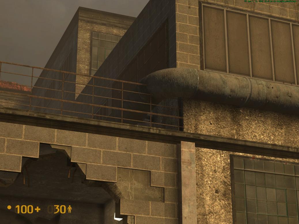
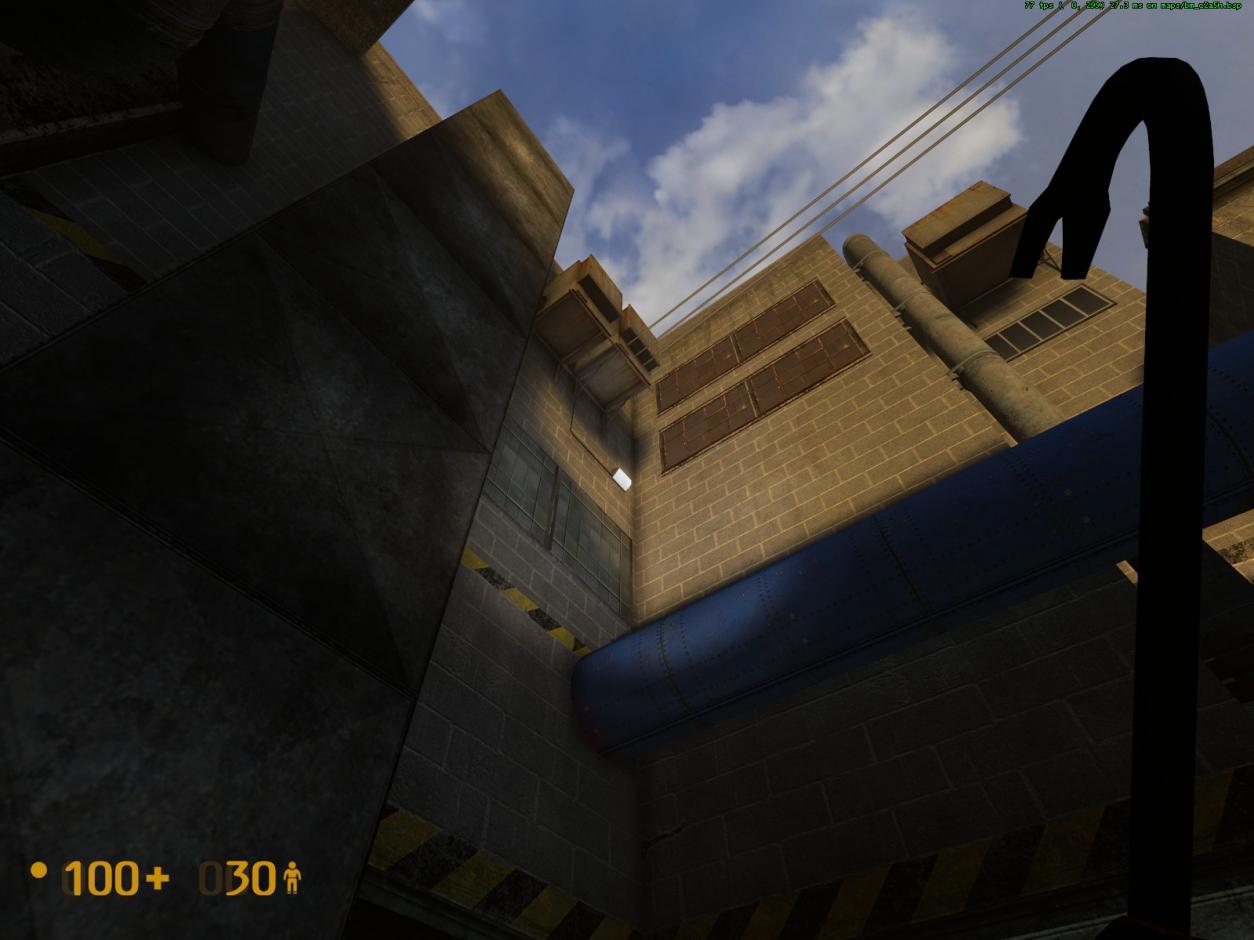
- Railing above the hole in the wall is clipping through the large pipe (see picture).
- Overhead electrical wires entering/clipping into front of AC unit (see picture).
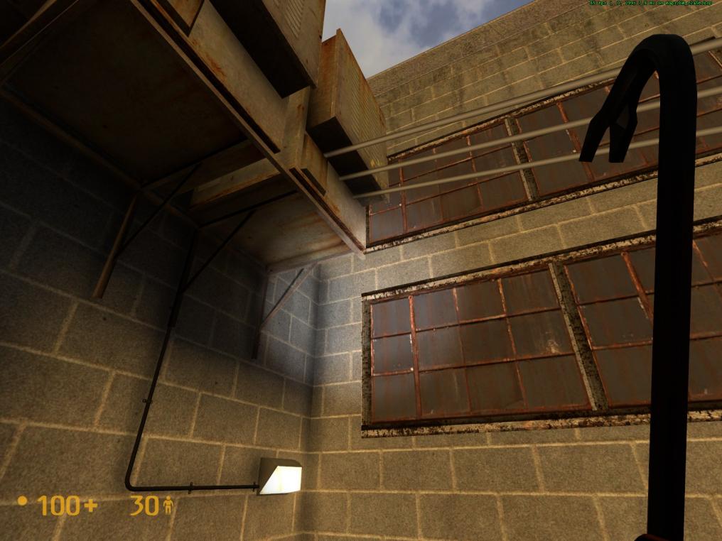
- Oh my god! Why would a light be situated way, way up there (see picture)? Another instance of hand-holding the player with another “obvious” directional clue? Instead, put up a neon sign that says “Hey you, this way”. Sheesh. (Text, did I take it too far? Sorry, if I did).
- Both metal shelf units outside the women’s bathroom are back-to-front (see picture). There was also one in the storage room after jumping out of the broken furnace pipe with the flame, that someone reported. Was that one ever addressed?
- Move the blue garbage container, just down from the security hut, off of the wall a tad. The corner is slightly clipping into the wall.
- Move this door control box closer to the door. Seems a little too distant from the door compared to other control boxes (see picture).
Been hard at work mapping today, got a lot done, that’s for sure.
Probably the biggest part of RC2 is that I redesigned some parts of the gasworks (specifically the emptier “walkway” portion). I was going to keep it as a surprise for tomorrow’s release but I figured I’d get some quick first impressions from people on here to make sure it’s okay. I’m very happy with it.
Quick video (50 seconds) showing off new changes.
How many RCs till the final release?
This one is the final release candidate.
Notice I didn’t say “should be” or “will probably be”. It’s the final one. After that I will do the final release. No ands, ifs or buts. It has to end somewhere and that will be it. Patching up the empty part of the gasworks was the final seriously nagging thing I wanted to clear up, and I’m glad I did it.
EDIT: Any opinions on the “redesign”?
Don’t like it. I’ll explain in an edit.
In that case I’ll chip in my two cents on what I’ve seen so far:
Outside garage
Give the new window frames a slightly darker color to better match the rooftop. Make sure it’s also reflected w/in the carshop as well.
Gasworks
I don’t like most of the new changes. You’ve introduced too many themes here, kind of like the TOW courtyard background. This area is a gasworks but now there’s power cables, two types of generators (one of which belongs in LC) and a storage area w/all kinds of colorful stuff and barrels. What exactly is this area now…a gasworks, a power generator plant or a storage unit? The last version fits the theme of a gasworks better as well the color palette…for me the common theme of the gasworks is pipes, drums, and storage silos plus a mostly drab coloration, which you’ve departed too much from. I think you should stay w/this theme for consistency. Note that the gasworks is generally a bland-colored area and you added too many colors w/the new changes. The bright blue pipe is ugly, partly because of its abrupt bend. It was necessary in earlier areas of C2A5G to direct the player on where to go but serves no useful purpose here so should be replaced w/a pipe that matches the gasworks scheme and has nice bends. The power wires stick out and should be deleted as it’s kind of a distraction to the player. In general, this area serves no useful purpose gameplay wise so by sprucing it up, you’re kind of drawing attention away from where it needs to be, which is the steam puzzle. In general, I’d say keep this area simple.
I think it looks good, it looks better then just bare nothing. However it does look as though you picked random objects just for the sake of “cluttering it up”. Im not sure what would look better there but im sure someone will give better 2 cents. I would be happy with the way its set up currently.
I do kinda agree that the redesign looks a bit cluttered.
Unrelated to gasworks, but someone posted this on another forum
https://i1336.photobucket.com/albums/o657/Stefan_Fueger/uhoh_zps6e925743.jpg
Nevermind
I’d have to agree with Wang here, the Generators and such look out of place, I can understand for the sake of realism you’d want one or two there to run a pump station of sorts (perhaps a sign on one of the back walls that explains there’s a pump station near by?) but overall, it looks out of place, 'specially that fugly giant ass AC unit in the far-right corner.
I’d say keep the pipes, and perhaps have them enter the ground at one point or another so they’ll “connect” with the steam pipes (they’ll be pipes for waste gases, doesn’t have to just be steam)
The blue pipe was already there, it has just been extended. It’s a continuation of the very same pipe seen throughout the rest of the map, so why should it suddenly change color or style?
It’s just Wangman being Wangman, it’s another thing he’s pointed out that hasn’t really changed much at all. It’s okay, we all make mistakes. The abrupt bend has ALWAYS been there, even since 0.8. It’s unavoidable unless I use toruses, and trust me, neither me nor VBSP wants me to use toruses, particularly not on a 64 unit pipe. All I did to it was merge it with a light blue pipe which was very closeby anyway. It looks fine. That kind of pipe is seen all throughout Black Mesa, and seeing as it’s a continuation of the same pipe you were in earlier it’s not a problem.
Having read the feedback on the latest iteration, I’ve changed it a bit. I’m not gonna lie, the criticism stung a bit. I worked for a good 2 hours on all this, I’m tired and demotivated with mapping. Just, could you guys try and be a -little- bit nicer with your criticism? Still criticize, of course, but sometimes there’s a lack of…tact. But that’s besides the point. I’ve changed it. I’ve removed most of the power units and wires to bring it more in line with the supposed “theme” of the area. However, having a small storage space in a gasworks isn’t exactly as unthinkable as you seem to think it is, Wangman. Though the rack didn’t look good, I agree, I’ve just changed it for a small little stand. Here’s how the latest version looks:
Come come now, it’s definitely better than before, even if it’s not fantastic. I’ve done what I can with that small space. It was WAY too bare before.
Can I have a link to the thread please? I don’t quite understand his objection and would like to see it in context. Plus, if there’s discussion about my work going on, I like to be privy to it, even if I’m not contributing to the discussion. Thanks!