I think you guys are completely misunderstanding this whole Havok business.

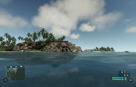
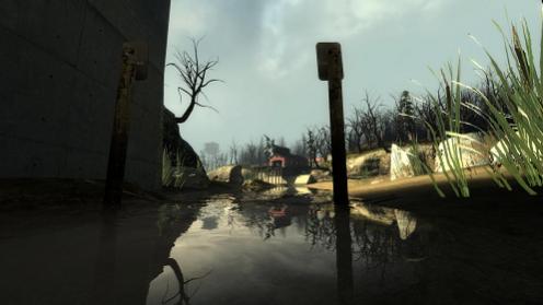
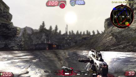
COMPARISON TIME: (these were all taken by me, with the settings maxed out). First one is Crysis, second is HL2, the third is UT3.


It’s wrong to compare such screens because the don’t truly represent the possibilities of the engine itself.
The main difference is the technologies used and tools that help you use them in a proper way. The same scene built in Source might look nice but after adding a ton of eye candy from UE3 or CE3 might blow your mind…
Nonetheless we shouldn’t talk about Source just yet, we don’t know what Valve is preparing for us when HL3/Episode 3 comes out… I bet it’ll be mind blowing  .
.
I’d wait for Portal 2, Crysis 2 and whichever UT3 game is coming out next before we really compare these.
Portal 2, Crysis 2 and Gears of War 3… Yeeeeeeeees…
Too bad it won’t make it to PC’s :|.
what about bulletstorm as preview of the new PC UE?
Works for me.
To be honest, I think it all depends on the game and level design. Gears of War 2 is really brown and not so nice to look at compared to White Forest in Episode 2, but neither can hold a candle to most of Mass Effect 2, which IMO is nicer to look at than Crysis.
Then there is id tech 5 for rage and doom 4
It’s just technology demos when it comes to Tech 5, let’s wait till it comes out…
