Where’s the screenshot?
well even without the screenshot i still love you great progress m8

Where’s the screenshot?
well even without the screenshot i still love you great progress m8
I like this idea; maybe have some completely unopenable or blocked doors at the end of the conference room corridor and the far end of the office room (or somewhere else) to suggest that the complex extends for even more than the player can see.
Uploading the pic is very slow and it ends up worse. so link to my 3rd Tumblr blog with seriously 2 followers where u can find the pic:
https://dai-ichi-kokou-sentai-k.tumblr.com/image/159031214319
btw, thought i never saw that. thank you!
Umm… where?
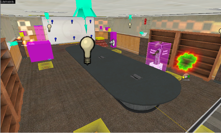
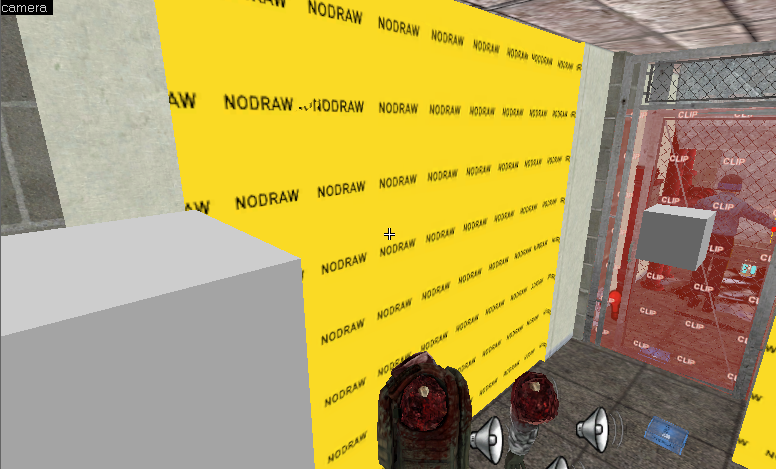
Looking at the conference room since the maintenance(?) area seems to just be one big NODRAW section at the moment:
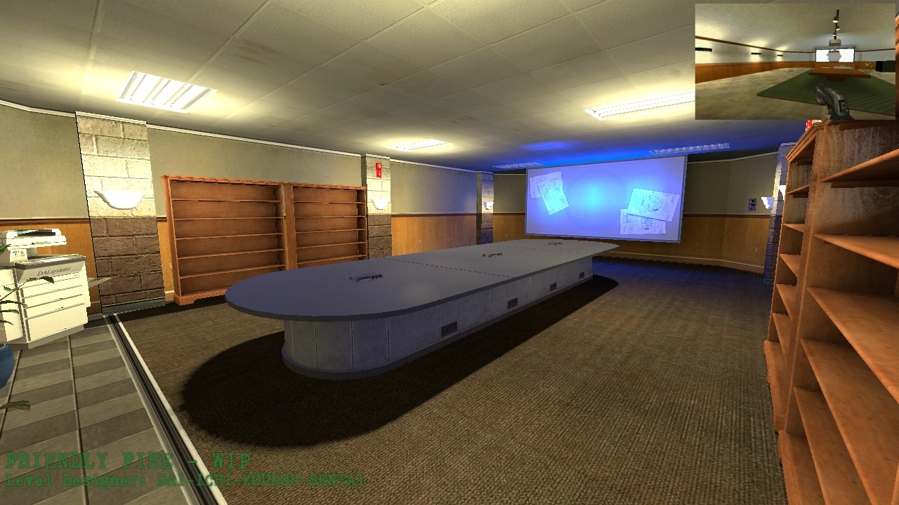
I am not sure what texture, exactly, you are using for the ceilings, but it’s not one of the regular Black Mesa ones and it looks rather strange. Office areas in BM typically use one of the textures in the tile/fifties_ceiling family, very rarely a heavily downscaled tile/ceilingtiles01 texture.
Additionally, the fluorescent lights do not appear to be aligned to the tiles.
You have a number of relatively bright, quadratic lights positioned very close to the light props, producing these blinding circular halos and leaving the rest of the room relatively dark. For bright lights, it is best to move them some distance from the prop that is supposed to be emitting them to prevent this from occurring.
Just in general, let’s talk about lighting. In the original Half-Life, Office Complex had very bright, even whitish lighting except for areas where the lights were broken, which got very dark very quickly: this was very effective at making the area feel soulless and institutional, and also communicating the fact that it was all deep underground. In Opposing Force the lighting stayed even and pale, but the areas where lights were broken were much brighter and warmer- the same institutional feel, but now indicating the player was much closer to the surface (the conference room in particular looked pretty much like it would have before the disaster). Black Mesa took a very different approach and made all the lights very dim and very blue, which made the maps look ‘grimier’ and more damaged (playing up the fact that it had been hit hard by the systems failures caused by the disaster) but at the same time less claustrophobic.
I am not at all sure what feeling or tone you are trying to set here, which tells me some additional thinking and planning on that topic is badly needed. Is this area supposed to look relatively untouched by the disaster, or is it supposed to have been completely wrecked? Is it supposed to be near the surface, or deep underground? Is it supposed to follow Half-Life’s take on the offices, or Black Mesa’s, or something else entirely? Try to come up with answers to these questions and create a lighting scheme that matches the tone you are going for.
Weird, empty bookcases look weird and empty. Why are bookcases even in a conference room to begin with?
There are no chairs or other small detail elements, even though the addition of enemies and fire alarms, etc. implies the area to be relatively “finished”.
When there are props in front of them the wood-paneled walls don’t look terrible as a detail element, but when exposed they really show as not being of the same quality as Black Mesa’s own textures. More to the point, they clash oddly with the cinderblock support pillars. Your building walls out of two different brushes with two different segments is a perfectly valid strategy, it’s just that one of the textures you are using is simply not ready for prime time.
I would really consider just using the same textures as elsewhere in Office Complex- failing that, try mixing together some other textures from the “lab” and “office” sections that are of better quality.
I really don’t know what’s going on with that projector screen. Why are there blueprints on it? More importantly, why are there six very bright, very blue lights shining on it? If you want to have some sort of projected schematic, I’d suggest putting a very thin func_brush in front of it and messing around with the render modes.
I strongly suggest combing through Office Complex and really studying its design language carefully, with the finest tooth comb that you have. What you have here is a nice first attempt but its ultimately very sloppy and unfocussed. Admiral Sakai covered it nicely but I can see about 5 additional points that I think are off, which I’m sure that he just didn’t mention to save space and time. I don’t say this to discourage you - take this as a challenge that you will be able to rise above.
@TextFAMGUY1, @AdmiralSakai, btw, I’ve been doing the idea thing you’ve been telling me… and I’m starting to re-texture and modify things…
Books, Records, Research and stolen memes from Aperture Science…
@TextFAMGUY1, @AdmiralSakai, btw, I’ve been doing the idea thing you’ve been telling me… and I’m starting to re-texture and modify things…
I think conference rooms should have more administrative things. Bookcases should be left to the research or archives people.
The printer looks off as well, but eh what do I know about stuff
@TextFAMGUY1, if you’ve had a friend request from some guy in Facebook with a yellow profile pic, that’s me…
I just sent you a friend request so I can send easily send photos of my ideas for checking it. Thx and if you don’t want to just don’t accept the friend request. I’m from the Phil. and some of my posts is random rants in my home language.
Anyway, I’m doing what you guys told me. So i restarted the idea. and theres more added time for me to make the map.
Home prison… What did you do?
I’ll ask since you’re throwing it out here.
Got grounded for not using the grid
Yep.
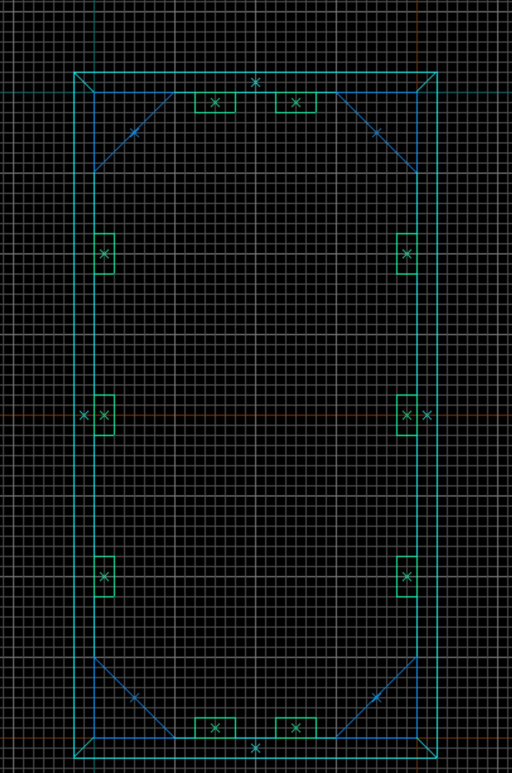
This still doesn’t fit properly on the grid! Work in Powers of 2, or the halfway points! Use the major gridlines to properly align your elements. There’s still no consistent spacing logic.
1, 2, 4, 8, 16, 32 (48), 64 (96), 128 (160), 256 (384), 512 (768), 1024, 2048, 4096, 8192, etc.
At this point it’s nothing like as big a deal as it was before, what you’ve got here is indeed a significant improvement over how you were making it before. But why do it only 80% correctly? It really isn’t the biggest deal in the world but it subconsciously will take a lot of the polished feeling away from the map, and it isn’t really necessary if you just work using the major gridlines and powers of 2 to begin with. Saves you a lot of headaches by standardising everything for the future. The map will be infinitely easier to work with later on down the line, particularly if you need to make major changes.
Here’s one I knocked together in about 30 seconds. This is how it should be (focus on the grid, not on the actual design):
What exactly do you need in order to access your other account?
This is probably a random bit of advice, but as far as conference room design, the second half of Portal had lots of conference rooms, so if you have the game maybe you could go noclip around and see how Valve does their own conference rooms.
Of course, when in doubt, never be afraid to check Google for a couple reference images!
This is my legacy
Some progress screenshots

GOOD STUFF.
Founded in 2004, Leakfree.org became one of the first online communities dedicated to Valve’s Source engine development. It is more famously known for the formation of Black Mesa: Source under the 'Leakfree Modification Team' handle in September 2004.