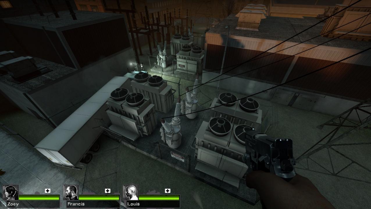
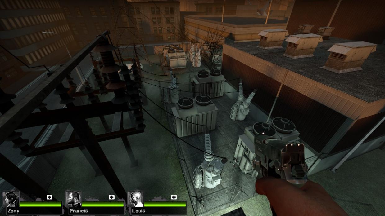
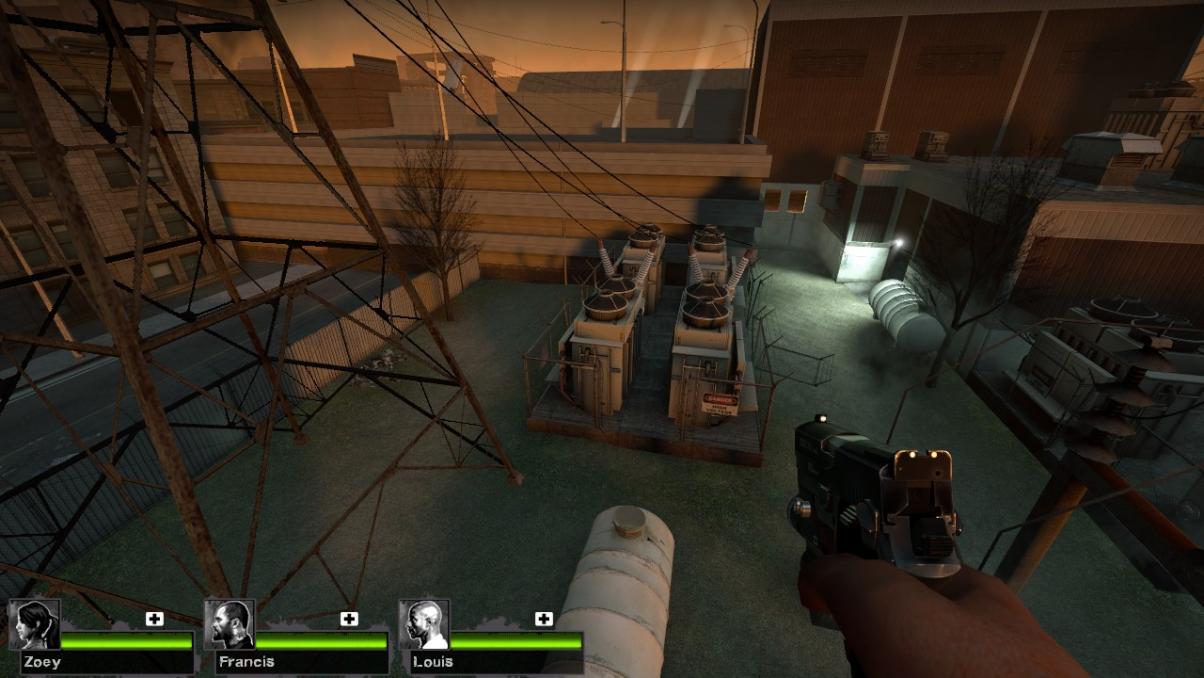
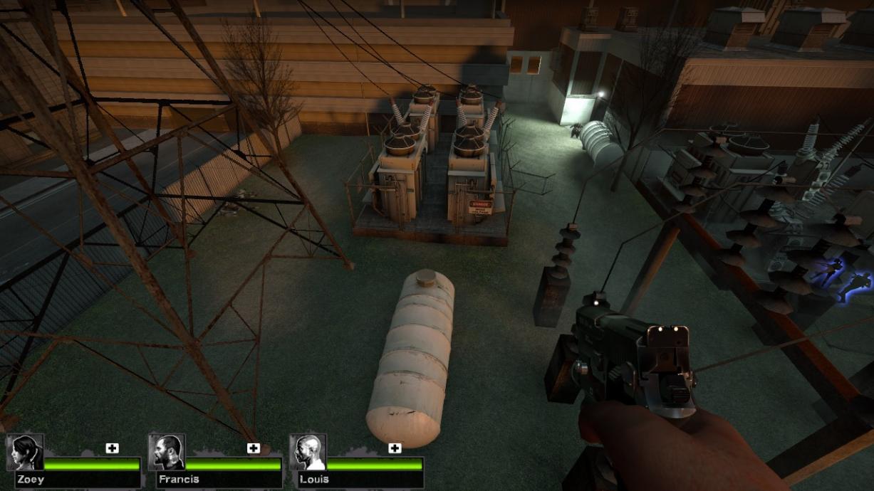
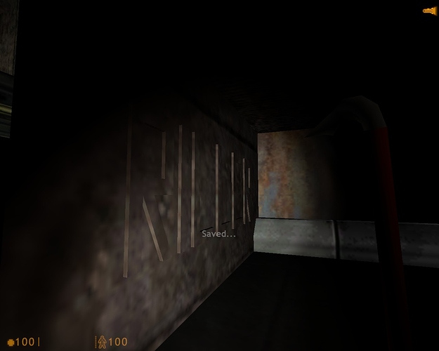
After watching the video again, this time without audio to just focus on what’s on screen, I have some other suggestions. First, I would make the crane control room a little less crammed, personally. Widen it juuust a little bit. Also, I said what I said about the clutter after seeing the screenshots but before watching the video. After the video, I think it’s pretty much okay. I still wouldn’t add crates on the hallways, but oh well.
Also, what’s the logic behind the blue and white lights by the tracks, in the crane room? Are they there to signal that cargo is uploaded into the tram there? Because there are other rooms with that purpose in the whole chapter and those lights are, as far as I remember, only in your room there. A little out of place considering the general chapter design, that’s all.
And, shouldn’t the Blast Door after you solve the Crane puzzle open when you change the tracks, instead of when you actually go through the tracks with the tram? Is the old tram system that high-tech, really?
And I know you said the signs were placeholders, but the one about the toll-gates being overriden in the Office Complex 2nd floor are a bit too obvious, aren’t they? A bit to “gamey”, if you know what I mean. “Here’s your next objetive.” It’s not using the typical language used in signs. Also, the toll-gates there are not technically toll-gates. It’s fine for us to call it that, but the sign wouldn’t say that. The whole phrasing is a bit too coloquial, more like a note that someone put there than an official sign.
The room with the Black Screen of Death would look better with the computer as the only lighting. Blue lighting, only.
Is the folded rug in the room-in-construction a placeholder? From the side, it looks really iffy. The folds should be there, bit it’s just the normal rug texture.
Also, when you override the toll-gates on the second floor security room, the camera that lets you see what you did is in that old computer. Shouldn’t it be in the Security Room Console? That big computer on the wall. That’s usually how it’s shown throughout the game, although it’s another, newer console model.
Also, the battle you see through the grates. Maybe the open grate should be in front of you when you come down the stairs, instead of behind you? A lot of people would miss the iconic scene, I imagine, place there as it is.
Finally, is it just me, or is the big red light (at the maintainance room, after the below-the-grate fight) very distracting? It looks as if something should be pressed on that room to make something work, but that’s not it, right? That red light looks a bit superflous and confusing.
And… that’s it, really. And these are just little details. Otherwise it’s great. I know you don’t want to change the cafeteria at all, but since others are still defending the idea of putting some glass there, I will jump on the bandwagon.

