OaR - Loop Mod

Though I’m not sure of the specifics of your problem, it sounds to me like that might be an error in the path branching from the switchable loop, if deleting the part of your track that connected back to the main track solved the issue. More specifically it could perhaps be that there’s a path track that has 2 other path_tracks as its destination (most likely where the loop rejoins the main path), which would royally confuse the fuck out of an already convoluted entity setup.

If I’m right, just make sure you’re using branching tracks properly on the loop. This should be as simple as making sure that the loop’s paths are in a “closed” loop (don’t connect back to OaR’s main path), and then setting the main path’s node as a branch path, which gets enabled by your button. If you’re not sure what I mean take a look at the path setup by the crane on A1.

Of course, this is all purely guesswork, I may be off the mark by a considerable amount, so simply disregard me if this is wrong, which it may very well be.

Good luck in fixing the problem.

You were absolutely right. It was the fact that one path_track had two saying it was its destination. I find this very very odd though because, believe it or not, I did have it set up just like A1 from the beginning. I just don’t know why it works there but not here, but I believe it’s because of how the tram elevator works. It literally plucks the tram off one line and puts it on another. I can support this by the fact that the badpath errors did not show up until the elevator started to move down.

But I seem to have solved the problem in a fairly safe way. To demonstrate, I’ve made a few crappy mspaint diagrams.

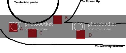
Here is how the intersection was set up where the mod loop joined back up with the main track.

None of these had any special properties. However, both B and D pointed to C. As you said, this heavily confused the engine.

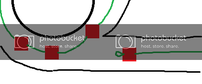
So I tried a few things and what I found worked was making sure D did not point to C. That way, C could start out with only one path pointing to it. The engine can understand that.
So at the moment I have D pointing to itself. The tram can move through this section now and can go through the entire loop. But once it arrives at point D, the tram locks up and can’t go anywhere.
I also tried making D a branch path for C, checking the ‘branch reverse’ flag (and I have no idea why noone bothers to explain flags on the internet, I couldn’t find any information on this which I might have desperately needed). With the branch enabled, the tram can go in reverse to D. I can even go all the way through the loop. But once it’s going forward again and it reaches D, it locks up.
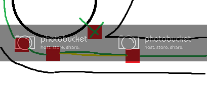
This is where A comes in. I have this point as my little ‘track switcher’. What this does is it first completely kills B. It deletes that path. Then it says, ‘open branch from C to D’. It connects those two. Finally I do one more thing, I set D’s alternate path to be C, so that it doesn’t connect to itself anymore. A now says that the alternate path is active. Our diagram looks like this now.

I have tested this and it works exactly as I want it to. The error is gone. Better yet, I have been able to play through the entire level. Got the tram through the electric puzzle. Oh yeah.

With that out of the way, I can work on those little details now!

EDIT 5:09EST: Things are going great. Planning on a video within the next 24 hours.

Super! Looking forward to it.

Not to rush you, but have you worked out a tentative timetable for your alphas, betas, RC’s and final releases yet? Probably won’t need that many releases, considering the size of the mod. Depends on how well polished you want it to be.

It’s good that you bring this up. See further down.

[COLOR=‘Red’]Important announcements[/SIZE]
First off, the video is done. You can find in the link below.

https://www.youtube.com/watch?v=B67JllqY1Kc
Commentary volume increase, courtesy of Mr. Someguy: https://dl.dropbox.com/u/87931465/OAR%20Vid%20Sound.wav

Feel free to leave me suggestions on both the video page and in this thread. I will be reading all of them (and hopefully answering all of them too). This will help me get things in shape for the beta.

Now for the release schedule. It is as follows:
Beta - 2-3 days from now
Release Candidate - 10 days from now
Final Release - 15 days from now

The times for the schedule are subject to change, as I might not need as much time as I have stated. It all depends on how things work out.

The primary function for the Beta will be to distinguish the flaws with the current layout, as well as generate suggestions for any major changes that might be needed.

The release candidates will make work on the final touches of the mod, and will probably be more for aesthetics than function.

The final will be, of course, final.

So that’s the tentative plan for the upcoming days.

Nice video! More houndeyes I guess.

Well done.

Just wanted to point out that in your timetable, you mention “release candidate” (singular), but further done you state “release candidates” (plural).

Here’s some feedback for you, based on the video:

a) Sure are a lot of control panels. Maybe too many? Remove some and have a desk-type area, at each end, in their place.
b) Lights above hallway doors at 5:10 seem a little too high. Should be at/around the horizontal seam. Check out Text’s positioning.
c) In the security office, can there be one uninterrupted length of handrail, instead of having them clip through the vertical beams?
d) Consider removing the blue crate in the control panel area. It looks odd there and I believe it’s too big to have fit through the office door in the first place.
e) Consider replacing the existing desk with a larger type model, with adequate lighting, and with a small fan on it.
f) Standardize the lighting fixtures used in the tunnel area and in the security office. In the tunnel, those small circular lights are not usually used. Lights are almost always attached to the tunnel walls. In the security office, consider using fluorescent lights instead of the small circular ones. Be of the mind that the same electrician installed all the lights throughout all of BM (yeah, I know, he’d still be working at it today).

Looking forward to your beta release, coming within a few days.

Just watched your video, very nice job. Only 2 things stood out to me from my first look.

  1. In the pipe room, the tracks that traverse over the pipes look a little boxy. What I mean is the angle of tracks go from horizontal to a very noticeable 45degree angle. I know its done elsewhere on the map but your part just stands out to me. Really now that I think about it rally doesn’t matter.

  2. The placement of barneys body looks awkward where and how its placed. You said the office was used by a “couple” of barneys, I would have them placed both on the floor next to the houndeye that’s watching the monitor.

  3. That bullsquide behind the locked door should really be doing something then just standing there starring at you, he should at least be walking around exploring his surroundings.

I do mean singularly. I’m not really the most effective at communicating at any point. But, if for some reason the first release candidate goes badly enough (which I can’t imagine why) then I might do a second one.

And now some replies.

a) I wasn’t (and still am not) sure about that. It is true that I have yet to very sure on how to do that. Filling the entire row was the only option that really looked good as an end product. I may end up tapering one end, but I need at least one end of our console row to be connected, since there will be quite few.
I do think some desk space would be nice, but it’s now really a matter of making it work.
b) They are already at the exact height as Text’s.
c) I can try, but I can’t promise anything. The geometry there is just a bit tricky, though I do agree not having it clip would make a bit more sense.
d) Is me trying to fill in space. Ugh. removes
In my defense, I did see a crate like this in Text’s security office, so I thought it might be fine here.
e) The problem here is that there’s little in the way of desk models. They are either the exact same size or are too nice. Plus, I want our desk to be a physics model so that it can be thrown by houndeye attacks. This is an enclosed space afterall.
And there was a fan there, but I don’t know what happened to it… Hmmm…
f)As far as the office goes, you’re right. The lights probably should be changed. Funny thing is I did start out with florescents by taking them from the gate booth at the end of powerup, but they didn’t light the area well enough so I derped and grabbed these brighter things. I am sure I could compromise by using the florescents but turn up the brightness so that it adequately lights the area.
As far as the tunnel is concerned, no. They are consistent with the stock material, being used both in the room at 1:56 and 2:08.

  1. You probably get that because this is the first time you can really get a good look at the inclines. But it is the exact same angle as the one found at 1:25.
    That said, I am considering lowering the grade, since I’ve had some issues with falling off the tram. Although that would probably realistically happen when going at full speed…
  2. Well, I wanted to make it look like the houndeyes had blasted them. That’s why the first barney is slumped over like that. The second… he likes to disappear for reasons I don’t know. But he got tossed out the door, and it’s also why the door is blown off too.
  3. I agree with that, and I already have a plan on him doing something interesting when you look down that hall (spit at you and then walk behind the corner), but I just haven’t figured out how to do it yet.

I love how you’re handling the mod but I could not understand a word you were saying because the mic volume was so low. I had all my speakers turned up and I still couldn’t hear you. XD

Sigh, and I had my mic settings up all the way too. My setup is terribad for recording video games. I should not get into the Let’s Play business :stuck_out_tongue:

b) I could have sworn his lights were slightly lower. My bad, sorry.
d) That’s quite alright. I mentioned the same thing to Text, for his security office (he has two), in my feedback for OaR Uncut alpha.

ONE QUESTION ONLY : Is this compatibile with on a rail uncut ? If yes then I surely play it !

I’ll give a few comments based on the video. Firstly - great job. Good commentary and video. I will just point out however, that the low framerate made it quite difficult to watch. If you’re playing back a demo and recording from an external program, there’s a way (I don’t know the specifics, but it is definitely doable) to force a framerate of 30. I think the game prerenders the frames or something like that. There was an LP of ST Uncut on Youtube I watched where the guy said while playing he had 1 - 5 FPS average, yet you certainly couldn’t have told from watching it. Also, your mic seemed just fine to me.

On a brighter note, the architecture of the pipe room in particular is very well done, you did an excellent job of expanding from the original.

Coming at this from the perspective of a fellow modder, I’ll try and give you feedback which is as useful as possible from a mapping perspective. Bear in mind these are PURELY observations from the video, so many of them may be inaccurate. Take it all with a pinch of salt. I think you’ve done a great job.

  1. On a more general note, there is a vast number of lighting origin bugs on the map. I spotted at least 10, if not more. I’m sure you know what this is, but I’ll clarify just so everyone knows - it’s where a static prop’s lighting is inconsistent with the world around it. Prop lighting is sampled from its origin and when placing props it’s very very common that the origin ends up inside the floor or a wall or whatever. This makes some objects appear pitch black or darker than they should be. Fix this through very liberal use of info_lighting entities. Nearly ALL 90 degree tracks need this to be done. If you’re worried about entity count, don’t be. Info_lighting doesn’t exist at runtime, it’s an internal entity.

  2. Lots of the lightmap shadowing on the map looks very wrong to me, though it’s hard to judge from the video. It’s got VERY rough edges and it looks like you’ve used a scale of 32 throughout, with no deviation. If you haven’t already, make sure you do a lightmapping pass. Use a high scale (8-16) for the tunnel walls with lights - 32 is fine for the tunnel floors and ceilings. In the hallway and security room, floors/walls should be 8, to improve the look of the lighting. In general, any walls which have the sconce lights (such as the ones in the pipe room) should have a scale of 8. This should improve the lighting A LOT.

  3. None of the AI running scripted_sequences react properly. That’s apparent. The way Black Mesa dealt with this was very inconsistent. The method I found works best is a combination of outputs and aiscripted_schedule. The method I use involves setting the NPC’s outputs as follows:

-Output: OnFoundEnemy, Target: scripted_sequence, Input: CancelSequence
-Output: OnHearCombat, Target: scripted_sequence, Input: CancelSequence

Set the sequence’s output as follows:

-Output: OnEndSequence, Target: NPC, Input: UpdateEnemyMemory, Parameter: !player
-Output: OnEndSequence, Target: aiscripted_schedule, Input: StartSchedule

Then you just have to set the aiscripted_schedule to make the NPC target the player, set its state to combat, with the interruptibility set to “Death”. I find this to be the best method by far of having scripted sequences be interruptable, though there are almost certainly better methods for doing this. I also typically surround the NPC in a trigger_once, spaced out to a believable distance, with the following outputs.

-Output: OnTrigger, Target: scripted_sequence, Input: CancelSequence
-Output: OnTrigger, Target: aiscripted_schedule, Input: StartSchedule, Delay: 0.05
-Output: OnTrigger, Target: NPC, Input: UpdateEnemyMemory, Parameter: !player

In addition it seems like the Bullsquid might not have enough turning space where he is at the moment, which is another reason he’s probably a bit bugged. Increase the width of the area he’s in.

  1. If you really want to make a corpse “sink” in the water, you could combine phys_ragdollconstraint or just phys_constraint with the ragdoll being positioned on the ground, and it should work fine. There may need to be some mapping wizardry employed there if you really want to do it. One method you could use, in addition to the constraint, is create an invisible “roof” above the ragdoll, make it a func_brush, and use a name filter set to “Allow ONLY,” so the func_brush ONLY provides collision for the ragdoll.

  2. The lighting in the security room could be a lot better. I think it needs some variation. Maybe throw in a red light by a power box or something like that. I think going for a slightly darker look, with some busted/flickering lights, might improve it a lot, but ultimately that’s up to you.

  3. This could potentially be the most serious point, but I think the design of the loop itself is unclear and needs to be looked into. You have a similar problem to the one I have with the security room and boom gates on A2. The method of solving the loop “puzzle,” is simply not intuitive. I’d imagine that, like with the security office puzzle on A2, the player will probably eventually stumble upon it on their travels, by accident - and maybe that’s satisfactory enough. The problem is there’ll be a lack of a sense of purpose and direction in the interim, and that’s not particularly satisfying for the player. Perhaps some kind of (don’t know how) sign by the loop’s branch directing the player to a security office, then making sure (through use of cameras or something?) that it’s clear what the switch he’s pushing does. That might help, but ultimately it’s a tricky issue which I’ll leave up to you.

Hope this has helped. Like I said, view all these with a pinch of salt, they’re just my ideas of how to do things based on a video. Hopefully I’ve provided some helpful insight. Great job again, I look forward to checking out some test versions.

He said it will be. Couple more things, I looked at your video again and noticed in your pipe room that the one pipe looks orange? is it not suppose to be red? traditionally or was it just the quality of the video that made it hard to tell. In your security room you have 4 sets of rail switch controls. my first though would be to spam them all trying to make them work and see what they do. Try adding 3 red lights to them and leave the 4th green so the player knows which one to use.

I recorded the video sound and increased the volume. It’s panned to the right side though because I had distortion issues with it coming through the left, and I’m not skilled enough to know how to fix that… https://dl.dropbox.com/u/87931465/OAR%20Vid%20Sound.wav

Anyway, with that you can just hit play when you start the video, it’ll match up well enough.

Onto Feedback:

  • At 2:35 there’s the problem with the Bullsquid. You could try widening the hallway to see if that fixes it.

  • Also at that scene, maybe you could make the Soldier a medic and have the healthpack more next to him, but you’d need to make it a modern one for that.

  • 3:15 there’s the body in the water. In garrysmod you can freeze ragdolls, I dunno if you can in hammer though. A really rudimentary workaround might be to remove the water just around the body and encase it in a clip to keep it from moving?

  • 5:30 You could have a light in the room so it’s a bit more visible. Also, you could maybe have the bullsquid eating a soldier before he sees you and does what you mentioned above.

The Security Room:

  • I think the Houndeye watching animation was unique to Office Complex, where a Houndeye can be found staring at the fuzz on a television. Besides, the monitor isn’t really doing anything here, whereas the fuzz is constantly in motion. Maybe you could have this little guy feasting on a Security Officer instead.

  • One way to take up space might be to add a bit of a lounging area. Maybe a couch, a fridge, and a water cooler? If these guys are here all day then they must take their breaks here too, right?

  • Another thing you might wanna do is set up one of those large Security Terminals like the one Text used in his security office.

-I agree with removing the crate, there’s no way it could have even gotten there.

  • And finally the panel wall, as said before there’s way too many of those panels. It’s very repetitive and just looks bad overall. You might want to cut them short about half way and find something else to fill in the area. Maybe even consider redesigning that side of the room to accommodate the changes. Most importantly, remove all the grey panels that aren’t essential to progression. The entire reason they were created was to draw attention so the player sees they’re different. Having many of them don’t do anything important is contrary to that and to how Text is using them in his maps, this creates an inconsistency that should be avoided.

On the topic of letting the player know they’re in a loop, I was think a sign along the lines of;
[align=center]SILO ACCESS RESTRICTED
CONTACT SECURITY OFFICE FOR CLEARANCE[/align]
Or something like that.

Ya but the reason he has 4 different grey panels is because there are different junctions around the map and his main security office controls all the different junctions. I don’t think it makes sense just to have one grey panel control the very junction you need turned. Did you see my post ^ before about having red lights on them but leave one green.

Also after reading texts post on trying to let the player know they have to get to the office to switch the tracks. One solution that may work is to have a sign placed over the LED arrows stating “Contact Track Control Booth A1 for Rail Switching” at all junctions.

I’d suggest labeling the junctions and their corresponding track controls, but judging from the Let’s Plays I’ve seen of BM, nobody reads signs. Ever. Maybe label the proper switch “SILO ACCESS” or something.

You wouldn’t mind fixing this pipe next to the elevator, would you?

https://puu.sh/22mrd
https://puu.sh/22mra

Hey everyone! Thank you so much for the replies! I had not expected this level of feedback from my crappy video at all, so this is absolutely wonderful. This will really help me in polishing the level before the beta comes out in a few days. And, actually, it’s inspiring to know that you are all so interested in this mod. It truly gives me the motivation to continue, even as I now delve into the less-fun parts of mapping. I’ve already made a list of things to do before the beta.

I’m going to respond to chunks here, so if you see me talking about something that you mentioned in your respond, then assume that I am addressing you. I’d like to respond individually, but I’ve been a gigantic bag today.

Loop intuition
I’ll talk about this first, since it does have a great deal if importance.
This was one thing I had been mulling over for a while. One of the reasons I haven’t done anything about it is because I haven’t quite figured out how to solve it, although I see some really good ideas here. I definitely want to put some sort of sinage above each of the track switches so that people know where they are going. I’m thinking of something like this:


^Silo
Security>

And do signage like that all over the map.

The alternative to that would be a sign that says, “Incase of switch breakage, contact security office.” above each of the switches. By the time they actually reach the security station, they will have seen this sign four times, so it could have a chance. I personally perfer this option over the first.

One thing you probably don’t notice in the video is the use of the LED signs. One reason I wanted to use them was consistency with uncut. The other is far more important though in that I am able to provide subtle hints to the solution. The LED has the option of green arrows, red arrows, and X’s. I’ve been using the X’s to notate which paths the player has no chance of going down. Thusly the only switch without an X on it is the switch towards the silo. It’s a nice touch, I think.

Lightmapping
I wanted to make sure the geometry was down before I started working on that. I could probably give it a quick pass here and then save my full lightmapping run for after the beta (as I had initially planned).

Info_Lighting
Holy heck, I would never have thought to do this if you hadn’t mentioned it. Thanks!

Scripted AI
…Yeah, I guess… I mean, you’re right in that a simple blue screen doesn’t really warrant a houndeye just looking at it. Having played through the section though, I think I’m going to remove their scripted sequences altogether, because you already have some scripted houndeyes literally two rooms before. I think the section might actually play better that way. You don’t even see the other two anyways, so it’s the one on the bottom floor that I have to worry about the most. I may have that one eating a security guard but I will want him to notice you.

Funky Bullsquid
I too figured this was the case and already have plans to widen that area just a bit.

Floating marine
I’ll definitely try that stuff, thanks.

Security room consoles
I do agree that there are a great deal of consoles in this row. After having a night to think it over I’ve actually become a little more comfortable with halving the console row. That being said, Strider pretty much hit this one on the head; the blue consoles, as many as there are, have to stay for the reason that there are multiple tracks.
That being said, there are other ways to point out which track switch needs to be pressed. They are as follows:
Green lights indicate which panel is to be used. Other panels have red lights.

  • Each panel contains a map, with emphasis on the location of action. In which case, there will be a thick indicator on our map showing the intersection we are switching.
  • Each panel will be labeled with the correct name. To guide players, the name of our panel will say the word SILO on it, indicating that the switch they pulled will point them towards the silo.

So really there are two layers of identification here. The blue panels will draw the players to a section, and then everything else will point to the individual.

Lighting variations
I think I will add some lights to those panels on the wall. I’ll probably play around with the office’s lighting situation too. I might add a flicker here or there. But if not there, then I’m going to have a flickering light in the tunnel itself. I feel that the section after the office is pretty boring at the moment, so I want to spice it up just a bit.

Lounge area
I also think that the lounge area could be a bit bigger. I did start out having one, as you can see by the table and chairs between the doorway and the computer desk, but I think it could be a bit bigger. What I think I might actually end up doing is moving the desk up onto the balcony, in place of where the box is now. That, or I might chop the desk entirely and move all the stuff that’s on it to the space I’m making on the windowsill.

Holy doody. I never noticed this for all the times I’ve jumped through this area.

Consider it fixed.

Founded in 2004, Leakfree.org became one of the first online communities dedicated to Valve’s Source engine development. It is more famously known for the formation of Black Mesa: Source under the 'Leakfree Modification Team' handle in September 2004.