I still vote for “Contact Track Control For Rail Traverse” over the junctions. But your design works too if you go with it. However, what are you going to place over all the junctions because it may look weird having a sign over each spot saying silo or security, or is it just going to be over that one section of track?
Actually, I think I’m going to go with the “Track control sign” idea, because this other option is just plain icky.
A couple more things from your video:
a) The arcing spark from the defective elevator control panel seems to originate just above it. It should emanate from in behind it or from its top edge.
b) There appears to be a shelf up above the entire length of the control panels. It appears there’s nothing on it. If it serves no real purpose, consider removing it. You don’t want it interfering with or blocking any light dispersion. Or are monitors going to be placed on this shelf?
And the usage of the word/phrase “Incase…” is actually “In Case…”, just in case you decide to use it.
Crazy idea inbound
There was a large blank wall in the security office. I also noticed that said office had control over all the tracks in the area. I thought to myself “how would they keep track of everything if the office itself only has a view on a single junction?” (Looking back, there’s some computers set up against it. Assuming anyone likes this, they could probably be moved.)
I present my crazy idea, a wall-mounted switchboard, which might look something like this:
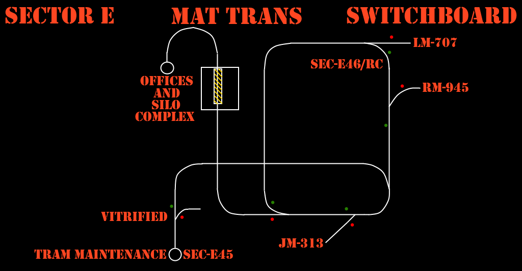
Obviously just a rough sketch and iffy idea at best, but if it could be implemented, I think the player would have an easier job visualizing their goal.
a) Fixed it, thanks for pointing that out~
b) Yes, there will be TVs hanging from that shelf. I haven’t completely decorated the office because I can foresee it possibly redesigned.
As for the word/phrase, thanks for the heads up. I probably would have caught it when actually designed (i.e. actually taking the time to think of word usage) but it’s something to keep in mind.
No, that’s not crazy at all. In fact, I think it’s a very excellent idea. And that picture looks really really well done. You could call it rough, but to me it looks fairly passable. But if anyone thinks that it could use some improvement, then that’ll be done.
Actually, I had considered adding one of these in, but the major problem is that in the current floorplan there is no logical place for it. All of the rail switches are on the top floor, and I want to place the lounge downstairs. The only real place for it would be on the stairs.
I’m actually considering raising the whole floor and making the office just one level. The ledge in the middle, as cool and functional as it is, keeps me from truly designing the office the way it probably should be. It’s a shame too because I really do like the bullsquid ambush that you can’t see. There’s some issues though; having the guard lounge right as you enter seems awkward and the ledge really really limits what I can do in terms of sectioning.
But having a flat floorplan would give me a much greater deal of flexibility. I could actually place the lounge and security into separate sections without having to work around geometry. I can mentally picture where everything would go too. There would be a definite place for the switchboard.
But it would take me some time, and I would have to push the beta back by at least a day to do it. I am not sure if you guys would be okay with me doing this, but I do need to know since everything that I have on my list of things to fix concerns the security office.
EDIT: Nevermind, I’ve already started renovating. This is just the better option, period. I don’t really know why I kept drawing a blank on it before…
I like it, but could use some work. I would suggest coming up with better names, also the first tunnel isn’t vitrified, it’s collapsed. Make it read something like “SECTOR E SUBSURFACE”, then the others could just be like “SECTOR G TRAIN YARDS”, “SECTOR D INDUSTRIAL FREIGHT”, “AREA 9 TRANSIT CENTRAL”, etc. Most importantly though, the track you need to take should be labeled “HIGH ALTITUDE LAUNCH CENTER”. Also make it more clear which track is active, maybe have the active track coloured green and the inactive tracks red.
I’m hung up on what to do for track indications because I’m not sure “when” something like this would’ve been implemented. I get a 50’s-60’s vibe from OaR’s infrastructure, but it also has been retrofitted with LED indicators at junctions. If it’s a modern upgrade, then the colored track idea works. If it’s been there since the place was built, I’d lean toward using Red/Green bulbs, which is what those dots are supposed to imply.
It’s very much an early idea, and the BlahBlah-3DigitNumber is just a placeholder for the time being, but I was just going off the markings stenciled on the walls in the Power-Up turntable room.
Actually it might not be that simple, because ultimately there are two flavors to they layout:
*The elevator indeed goes to the silo, validating the label (Stock Black Mesa)
*The elevator lets out at a storage area and then an office complex, where the label wouldn’t make sense. (/w On a rail Uncut)
A simple fix would this would be to package a separate switchboard in with the OaRUncut-compatible version of this mod so that both options are used. I could easily do this, it’d probably be as simple as recoding a func_brush or something. Heck, I could probably use entspy for it and spend all of ten seconds to do it.
I think as far as other labels go, -snip-
EDIT: Now that I think about this, this loop might be one of the smaller rail sections in the tunnel system. Other loops elsewhere along the line probably service those different areas and are probably bigger than this one. So those other suggestions could probably work.
I think it’s important that it be named “HIGH ALTITUDE LAUNCH CENTER” regardless of whether OAR Uncut is installed or not. For one, that’s where the track ends, so it’s not necessarily wrong, but most importantly, it’s your destination. You’re told to go find the rocket, and if a track is labled “HIGH ALTITUDE LAUNCH CENTER”, it’s logical to assume that going that way will get you to a rocket. It can’t get much simpler than that, aside from having the tracks switch themselves!
In short, from a design perspective, that name tells you where you are to go.
I suppose you’re right about that. I was just worried about the labels being inconsistent with each other.
In other news, I’m still not yet ready to release a beta. The truth is I hit a wall Sunday (it was unrelated to mapping) and have been in a funk all the way into yesterday night. I finally was able to get back to working on the security office today, but although I’ve started placing things again the work has been fairly uninspired. I’m nearly sure by the time I can work on it again tomorrow night it’ll by then have come to me.
So that’s kinda where things stand right now. I’ll be sure to keep you all posted.
Hey everyone! I know ive been quiet the past couple of days. I think its time for a small update.
Ive gotten quite a bit done in the past day or so, including something i did not think would be done until after the beta. They are as follows:
- completely revamped the security room. The whole room is on the same floor. I was also able to decorate it to keep the bullsquid ambush, which I am very happy about
- fixed movement problems. All enemies now move correctly, especially the bullsquid in the pipe room.
- decorated tunnel after security room. I knew it was bare and wanted to make it more interesting from the getgo. I think it turned out well.
- created custom rail console props that display a mimimap of their target switches. I didn’t think it would be done so quickly.
There are just a couple things here and there that still need to be done, and since it really hasnt worked out so far i figured instead of saying ‘beta tomorrow’ i will go ahead with the ‘when its done’ approach. I don’t imagine its far off though
I know. I know. Teh dreaded triple post. But…
[COLOR=‘Red’]LOOP MOD ALPHA IS NOW LIVE
You can find it here: https://www.dropbox.com/s/q8ik53e37wgefxt/LoopMod.zip[/SIZE]
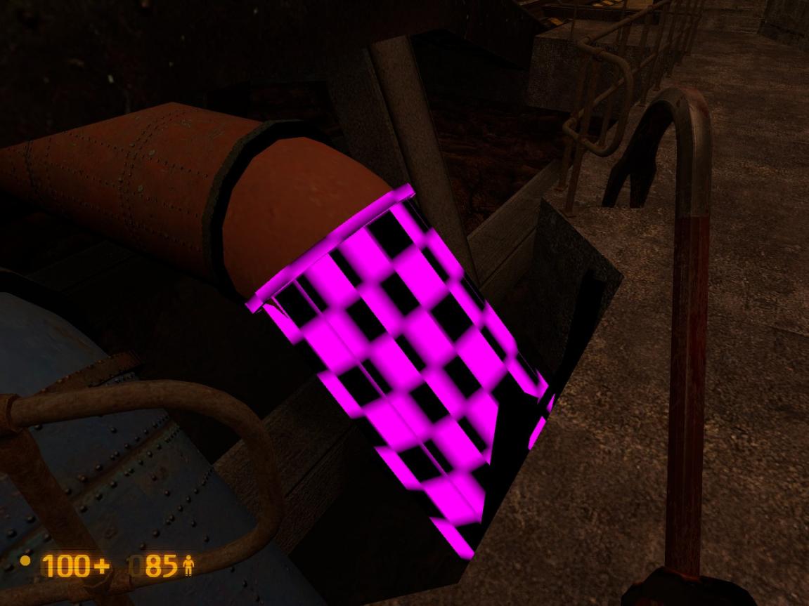
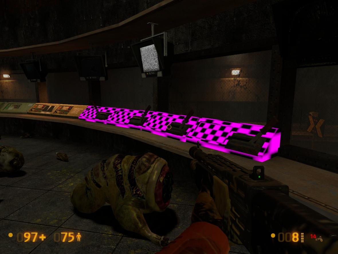
Please let me know IMMEDIATELY if you see any purple/black checkboards or giant error signs anywhere. This means that I have ultimately missed a texture or model. I will provide a hotfix if I miss anything.
Firstly I’d like to apologize for it taking this long. Ultimately though it was a combination of having to descreetly chop down existing material, having inspiration blocks, and learning new mapping concepts. I think though that as it is now though it’s in really good shape. I mean really good shape.
But it’s not perfect by any means. I am hoping it turns out really well, but I also hope that during the course of this beta we can all find things in it that can be improved.
Bear a couple things in mind though:
I am sitting within 400 brushsides of the limit at this moment. This actually gives me little room to optimize visibility. Therefore, asking me to add new areas is not an option. As much as I would like to add one more branch of track, that would eat up valuable resources that could be used in enhancing play quality instead.
Read the readme. I detail a few known issues in there that I already have plans on fixing. I encourage you not to comment on these unless you can offer a solution to them. It also contains vital installation instructions. You must follow those instructions for the mod to work correctly.
Aside from that, any and all comments are greatly appreciated, just so long as they are put forward in a civil manner. As I have been doing so far I will try my absolute best to address all of the points.
Now for the map of the road ahead; soon after this I should have a release candidate going. Soon after that, this mod will settle into it’s final version. I cannot say how long it will be between these iterations as this largely depends on the feedback. If there aren’t lots of things to be fixed and I don’t expect there to be (hopefully) then it won’t be long.
I hope you all enjoy playing it as much as I had in making it!
I did a quick run-through before bed, and noticed a few things you might wanna fix immediately. First off, the readme is inaccurate! The readme says to start On A Rail from the menu or go to bm_c2a2a from the console. But bm_c2a2a isn’t actually replaced in this version, instead we get files for bm_c2a2a_editA and bm_c2a2a_editB. I cannot tell the difference between the two at a glance.
As for textures, in both editA and editB, several textures were missing. Screenshots here:
https://puu.sh/2jM9u
https://puu.sh/2jM9A
https://puu.sh/2jM9G
https://puu.sh/2jM9Q
Also, in the editB map, the doors are missing in the bullsquid hall: https://puu.sh/2jM9l
There are some odd lighting issues that make certain models appear with a chrome-like texture, I’m not sure what causes those. It’s most noticeable on the metal tunnel supports. Anyway I’m off to bed, I’ll do a much more in-depth review later.
Hotfix’d. The link is still the same. Boy, do I love dropbox…
Well, part of it was a matter of forgetting textures. The other part was that the map was pointing to places that didn’t exist (because I changed some texture directories when I zipped the custom assets). The other part was that some textures didn’t even generate. I had to completely redo the pipe props because I had gotten rid of the original brushes after using Propper.
At least it game me the chance to fix an issue with the pipes as well.
Wow, ST and OaR are shaping to be the best chapters the mod has to offer D:
I can barely hold my nerdgasm atm. I’m already playing it inside of my head. Unfortunately, I have uninstalled BM as I have sworn to myself that I CAN manage to wait till it’s fully done, Xen and all, till I replay it again.
Kinda offtopic, but from the way Gabe talks about user generated content, it appears that Source 2 may support modders even more than ever before.
And since the HL community brings more goodies as of late than guys at Valve do, good times seem to be ahead of us, or so I hope.
But back to where I was, I’m gonna download BM immediately again, as I rarely keep on with my resolutions for long anyway, thank you Mr. Sunny, for taking my will from me :fffuuu:
So just did a playthrough and I must say good job your making OaR feel much bigger and less liner. Few things to point out,
- Pipe is missing texture.
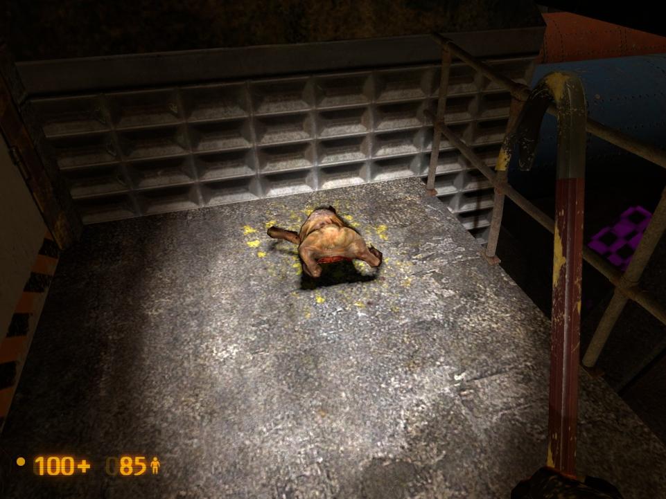
- Why is this headcrab dead? when you arrive.
- Control panel is missing texture.
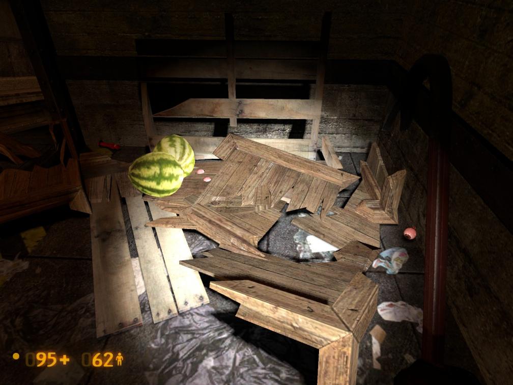
- The crate just past the control room contains watermelons? and eyeballs?
- the control room switch should make a bell noise like on Texts switch map, yours it does not.
- Your map does not have HDR, stock wise it did before.
Personally I always felt Black Mesa needed more dead alien bodies. It’s like asking “Why is that HECU dead?”
It got a stroke, get it? :retard:
Thanks for the feedback. For responses:
- & 3. Is this with the hotfix installed? If that’s the case I’ll need to make another hotfix. Again. There are a few things that can wait to see fixes at the release candidate, but missing and erroneous textures is not one of them.
- Yup, Mr.Someguy nailed this on the head. I mean, why not?
- I knew it contained watermelons… but eyeballs? Maybe it is just a tad out of place.
- Actually, it is consistest with Text’s map. You see, the bell sound that you heard on his map originated from the LED display, not the track switch itself. That’s why you can’t hear it here either. That, and considering that you’re way on the other side of the loop, you’re probably too far away anyways.
Admittedly I haven’t tested to see if it actually plays (though it should), but I wouldn’t count on any noticable difference. - Partly because I wasn’t sure if it should have HDR or not, and partly because of time (I was compiling at 7AM, and I’d rather be sleeping). If stock maps have HDR then I will too in future releases.
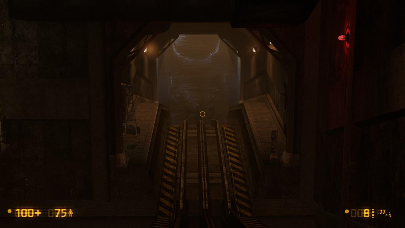
Just downloaded it. I’m getting the checkerboard textures in the same locations as was pointed out earlier. The water at the beginning of the level and you’re standing up at the top of the ramp shows as if you put in an area portal that triggers prematurely… look carefully at my attachment. The center doesn’t look right. But over all, well done, as always it could go for some improvement and refinement, but what doesn’t require that.

