
Well, I hope this is at least a bit better then the last piece of crap I made.
P.S. This is my first real Photoshop creation, so be nice. 
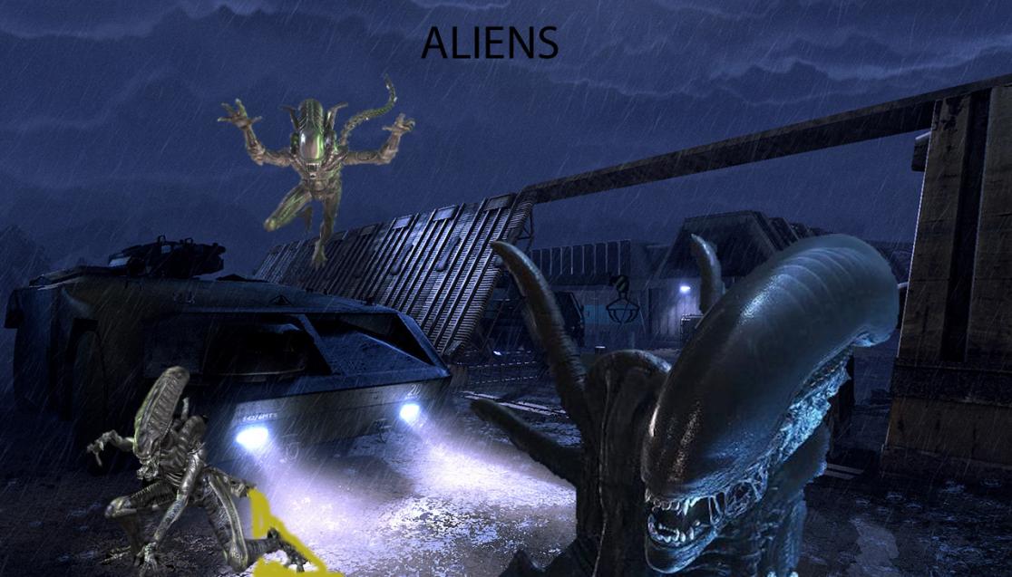
Dude.
You cant just slap images on top of each other.
- THe aliens text is super boring.
- The aliens themsleves dont fit the background. THey dont blend in. They really need to.
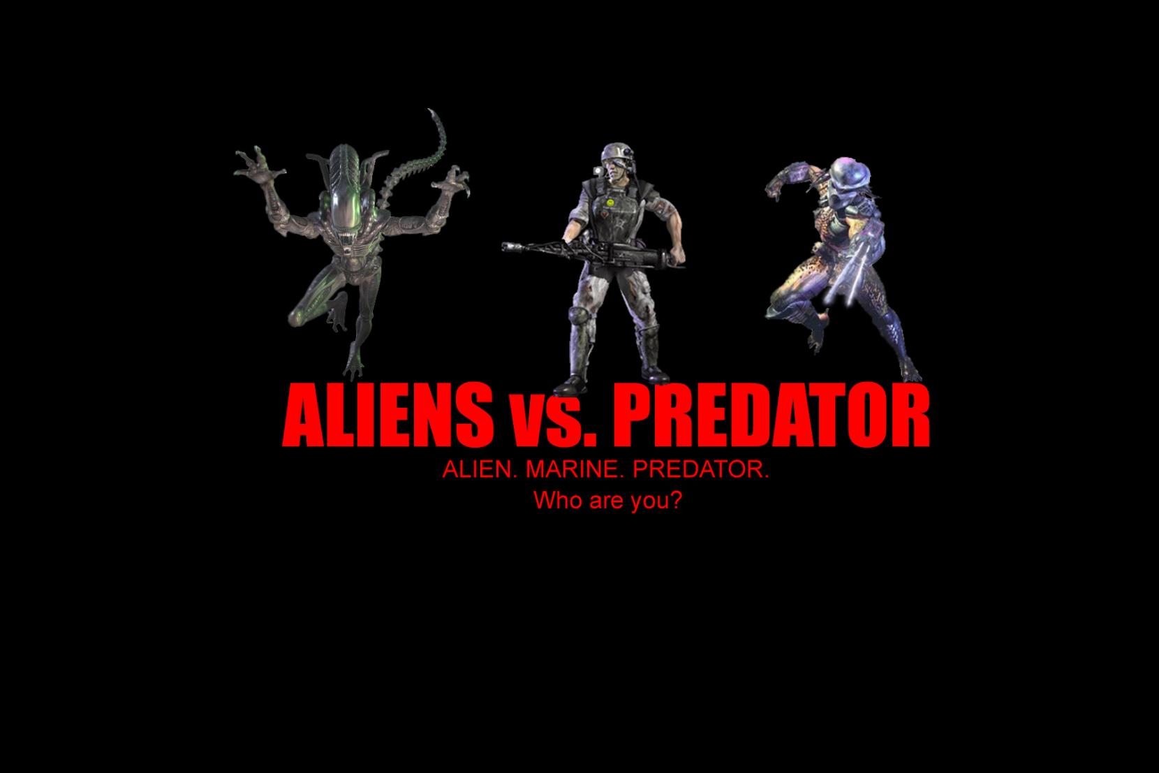
here is a wallpaper made the same way. cut out images on a background. but see how everything blands in?
Its because they used high quality images, and blurred it, so that it looks like natural lighting.
This one
https://hq.dpics.org/wallpapers/57/AVP_-_Alien_vs._Predator%2C_2004.jpg
Heres a professional wallpaper, and look how did the same things, the same blurring and quality image cutouts to ake this pic.
https://image.blog.livedoor.jp/taira33/imgs/f/c/fccb5b06.jpg
‘https://image.blog.livedoor.jp/taira33/imgs/f/c/fccb5b06.jpg’
'Fraid he’s right. It’s all constructive feedback tho
The large alien on the right, he could plausibly fit on the left, look how there’s light shining on his right side. That could be made so it’s coming from the headlights; move him to the other side.
But the one at the top, just won’t work. Where is the green light coming from thats reflecting on him? you could maybe change the relfection colour, but another image might be best.
.
The alien in the foreground has the classic dome over his carapace, and the other two don’t. Consistency fail.
For a first, it’s good, but the blood looks VERY unreal.
Alas, like I said, I just got Photoshop.
I gotta stop sharing my wallpapers on here… 
Stop posting on this thread please.
Well I’m denying my last post.
People will hate it but, I like my work so here.
I like it. You won’t change my mind. 
Edit: Crap, double post.
That was ALOT better.
Thanks.
My last one was the biggest piece of shit ever, now that I look back on it.