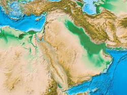
Map of Human Evolution

Homo Diaspora is a map of human evolution. Currently it only shows human fossils on a map, grouped by age and species.

You can either view all the fossils at once, or browse through a preset number of intervals.

Features:
2.5D Map – done:
The map is continuous on the y-axis (horizontally), so that the largest empty part of the map is always left out.

Planned features:
Genetics – in progress:
Genetic information will be included, such as contributions from other human genomes to ours, and the migration routes after Homo sapiens left Africa.
Neanderthal and Denisova admixture has been included.

Climate:
I want to customize the map to illustrate contemporary climates.

Timeline/Slider:
A timeline, possibly with highlights, with a slider for advancing the map.

Animations:
Animations showing populations and gene travel coming and going would be cool, should be able to do something like that with JQuery.

Family Tree:
A visual representation of the human family tree, I’ll see exactly how I work it in

Wiki:
Ideally, eventually it’ll turn into something like wikipedia, where everyone can contribute to the database.

I’m going to use this post as a general to-do list, so if I think of anything else, I’ll add it here.

Suggestions and criticism are more than welcome!

You could use this for a really cool ARG thing. I actually thought that’s what this was the first time I saw it.

Like, make some vague references to there being a mysterious race of humans before the actual first one, something like Homo Novus from Metro 2033. Start out with just a really creepy-looking photoshopped skull, and if you dig deep across a few fake sites you start finding terrifying anecdotes about monsters from people doing research in the area where they were supposed to have lived, and then make some creepy images and eventually it turns into a blair witch project-style found footage indie movie about some anthropology students.

That’s a lot of homos.

ur a homo

That’s actually a cool idea. Some sort of search for a hidden human race which is behind every conspiracy you’ve ever heard of or something.

how many homos does it take to evolve a sapiens?

Lekker.

I would try using a different, cleaner map, though. Right now it’s fairly hard to spot the various markers.

Would also be cool of you could incorporate the supposed migration routes (ie.: https://ngm.nationalgeographic.com/ngm/0603/feature2/images/mp_full.2.jpg)

:smiley:

Yeah, a clean map with no demarcations at all would have been better.
Replacing it would mean recalibrating the markers though, so maybe I’ll do that when I’m up for doing a buttload of work at once :smiley: (29 locations so far)
I would like to include climate data on the map too, like sea level and ice sheet etc., so I’ll have to play around with the map at one point anyway.

I’d like to include as much data as possible, including prehistoric monuments (like megaliths) and genetic data like what you linked to.

Edit: what do you think of the “era” titles? Or the eras themselves. Domination and History sound kind of dumb to me, but I can’t think of anything better at the moment.

Edit again: @bolteh: I just figured out how to draw lines with PHP so it looks like it won’t be too difficult to incorporate DNA information :smiley:

This is some wonderful work you have going on here! Def gonna follow this!

it would be cool to have like a timeline slider thing so you can sort of scroll thru time and see the monkey bones spread out across the world

Thanks Catz! :smiley: I’ll be sure to keep this thread updated then :slight_smile:

I was thinking the same thing, Idi. Maybe with a field for changing the number of years per click.
I’d also like to make it possible to filter by species and stuff like that.

Also, I’m going to use the Denisova hominin as a test case for genetic lineages (drawing lines/arrows on the map) and markers. It’s a perfect start since it stretches into the future to Melanesians and into the past to Neanderthals and then humans.

Maybe there’s some way you could use the map to illustrate how the different species’ physical traits are adapted to their specific habitats.

Would be cool if I could illustrate the climate at the time on the map. I’ll probably have to employ some artistic license for that. I’ll probably get a cleaner map first, as Bolteh pointed out, or clean this one up myself.

If you have any ideas beyond showing the climate and sea levels on the map, I’ll be glad to hear them.

At the moment I’m still filling up the database from this list, after that I’m going to do some updates.

this seems like a good map: https://www.schizosplayground.com/pers/homodiaspora/map.jpg
edit: except australia is cut off :fffuuu: why is it so hard to find a world map with nothing on it at all
edit edit: it’s another one now, it seems perfect

edit edit edit: i implemented the new image, and beyond all my expectations, the markers actually fit pretty well (after some overall recalibrating).
Some are a little off, but it should be pretty easy to get it the way it was again.

Mooi gedaan man!Ik ga dit zeker blijven volgens :smiley:

Hehe, dankje! :smiley:

It looks much better now with the new image, I think :awesome:
the markers may be slightly less accurate now, but oh well, it’s just illustrative anyway

Just finished turning a long messy index page into something decent, really was more work than it should have been. The downside of making things up as you go while not really knowing what you’re doing :stuck_out_tongue:

Updated the OP, hence the double post, visible changes will be coming in slowly now :slight_smile:

The first example of genetic information - the Denisova hominin’s presence in modern genomes - is now live :slight_smile:

Now I’ll be working on improving that and adding more information (first Neanderthal interbreeding and then human genetic migration data). Then I’ll move on to improving the timeline and introducing some sort of slider.

How clean do you need it?

https://www.freeworldmaps.net/printable/

Currently I dont really have any other ideas to add to your map, I have always been a timelinekind of chick, so seeing this take shape is nice.

Do both. Make the map four dimensional, with the Z axis being time.

It would be more or less impossible to read, but the basic idea is sound.

I’m not sure what you mean, are you referring to the climate stuff specifically? Maybe have different versions of the map, or at least parts of the map, at different points on the Z-axis?

Actually, the one I have now is perfect, thanks. I was using one with country names and borders printed on it before, it got a bit messy.

Thanks for the link, that seems like a good reference for what I’m doing here, especially if I want to include civilization and ancient monuments and cities and things like that.

edit: quick example of how I’ll probably display climatic info:

map.jpg

really it is good and have great info about the evolution of human.

Founded in 2004, Leakfree.org became one of the first online communities dedicated to Valve’s Source engine development. It is more famously known for the formation of Black Mesa: Source under the 'Leakfree Modification Team' handle in September 2004.