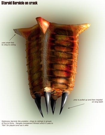
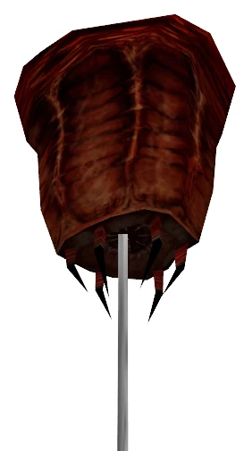
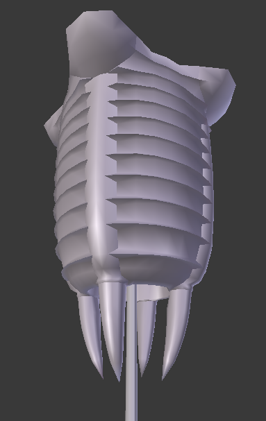
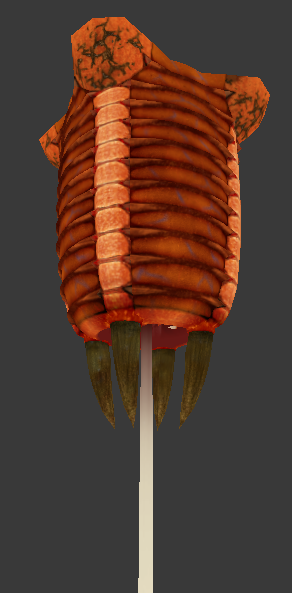
Yeah, the concept art I mentioned would be this, which for all intents and purposes is fairly similar to the actual HL1 model.

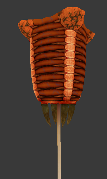
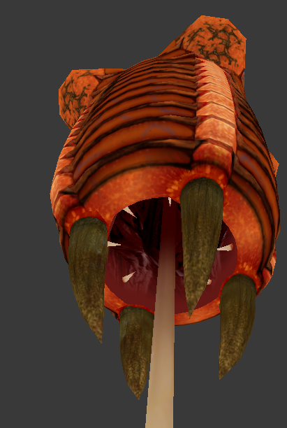
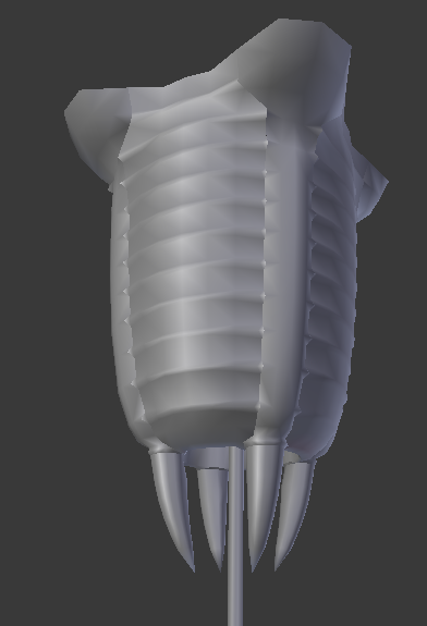
But anyway, updated the model a bit. Extended the ridges, and updated the smoothing to (hopefully) help better define them without the texture. Also played with the texture, including adding higher fidelity detailing to the main body, which also helps bring its brightness down a bit. Not seen in the screenshots, added a second row of upward facing teeth in its maw to help prevent prey from making its way back out (like a pitcher plant).
As for any sort of “grunge,” not sure what would fit best. Would an almost “moldy” sort of look work? Might go along with the cloud of flies Black Mesa adds around them. I feel like just slathering it in blood is a cheap way to detail it, especially when that would only logically apply around its mouth, and only to a certain extent as they pretty well swallow their prey whole.
As well, while not to the extent that the HL2 model has, would some further “rooting” beyond the feet compliment it? Would like the model to still fit with the bit in Opposing Force about being able to detach it from the ceiling without outright killing it, so they would likely fewer and thicker than in HL2. Hopefully properly modeled as well!
Another idea I’m fiddling with is maybe using spiders’ spinnerets as a possible inspiration, as, especially when reeling in something on its tongue, the four outer “claws” look and act quite similarly to them.


