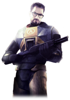
I really like that headcrab.
I like the figure too. It may look off, but a lot of action figures usually have faces that look like somebody beat their facial features into a wall

I really like that headcrab.
I like the figure too. It may look off, but a lot of action figures usually have faces that look like somebody beat their facial features into a wall
Fo shaw. You fuckers try sculpting the detail demanded from a human face at that scale. srs.
challenge accepted
Very accurate action figures can be done.
Look at this shit: https://kotaku.com/5920933/is-this-a-photo-of-heath-ledger-or-a-joker-action-figure
It’s fucking uncanny.
If they can do that, then making Gordon’s face should be a piece of cake!
Too bad Gordon almost never shows his face. Throughout the series it’s changed drastically, and from the pictures they do show, it’s usually just from the front, so I can imagine it would be hard to get a structure of how his head is shaped.
Secondly, it’s not the habit of many action figure designers to put that much work into a toy that is only going for about 16 bucks.
To me it looks quite good regarding the fact that most action figures don’t look as real as their original model. I FUCKING WANT IT!
There’s a 5 inch difference between that figure and the Gordon. It makes all the difference.
The figure looks better at a less ‘straight-on’ angle.
The orange on the forearms is fixed on that one. It might not be the angle, it might just be a better face.
I never said it couldn’t be done. I’ve seen some pretty decent small ones even that actually look almost spot on, but for the most part there aren’t good enough quality ones to not be ass ugly unless they are quite big.
This action figure is great! The only thing keeping me from buying it is the lack of Gordon Freeman.
Seriously, his face is wrong.
EDIT: I guess it does look better at that angle, but I still wont be buying it.
To be fair, the promotional renderings of Gordon for HL1 and the model of Gordon for HL1 and the Promotional renderings of Gordon for HL2 and the model they made for him and never used for HL2 all look completely different.
The model made for him in raising the bar was the reference used for HL2’s promotional art. The HL1 model has the excuse of being shit & HL2 of being non-existent. The promotional art used for HL1 seemed fairly undetailed, oddly proportioned & inconsistent so it’s too hard to work with. For all we know it might be an accurate representation of Gordon’s face, but the lighting & facial expression might make it look wrong.
Exactly; which Gordon do you people want?
This one?
How about this one?
Or this one?
…or??

All slightly different from each other – some completely different.
Honestly, the figure captures a bit from all of them, especially the last image, but with a lighter hair tone. It’s a more than decent interpretation of Gordon Freeman.
Fuck! I’ve never seen such critiques over an action figure of a character that is NEVER seen out of the first person in-game.
Kind of reminds me a little of Bill Engvall + Kelly Bailey.


I don’t know why, but for some reason I always liked the HL1 Mark IV HEV suit as opposed to the HL2 MarK V suit. Either was, they both look pretty sweet.
I liked the fully orange arms on the HL1 suit, plus the glove plates made stuff look a lot cooler. I always disliked how HL2’s Mark V gloves looked like…black gloves.
Also HL1 gordon art’s legs look abnormally long
It’s so hilarious.
That’s definitely trying to be Bailey’s mouth though.
Actually, there’s an awful lot of Bailey in there.
Founded in 2004, Leakfree.org became one of the first online communities dedicated to Valve’s Source engine development. It is more famously known for the formation of Black Mesa: Source under the 'Leakfree Modification Team' handle in September 2004.