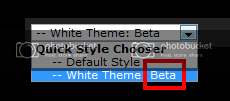
I agree, there’s just too much contrast for it to be useable. And I know you didn’t actually put any effort into it, because no designer in their right mind would use a black foreground and white background.
Change the bG color to darker, and I’m sold. I literally couldn’t give a fuck, I’m just confused and infuriated by seeing the “vBulletin” header when I’m expecing it to say “BLACK MESA SWEET ASS MOD GAEM HEADER GOES HERE”
ttyl ;D
but there’s no way in Christ Almighty I’m using a theme with black borders and white bg, my eyes are bleeding from the ~5 seconds I looked at it alreadhuught6r


