Feedback on Black Mesa retail

(Already posted this on the Steam discussion board, but I like to be redundant. I’m also updating this post as I think of and discover more things.)

Just played the first couple chapters, and I am enjoying it so far. I’d like to give my feedback on some of the changes (later when I have time I can give screenshots and video of the specific things I’m referring to, for clarity):

Things I liked:

  1. The added dialogue in the room where the guard and the scientist bet on Gordon showing up; i.e. the female scientist overhearing the conversation and bursting out laughing. I felt like her laugh and facial animations were a bit overdone, but overall it was a good addition.
  2. Perhaps this was in the mod too, but the scientist going over Dr. Cross pickup lines. (I had only ever heard this when I actually checked out the game’s audio files.)
  3. The change in what happens when you put on the HEV suit. My jaw dropped. Awesome!
  4. The change in how the vortigaunts approach you during the resonance cascade. I didn’t even know this was something the game needed, until I saw it.
  5. The addition to the security guard’s dialogue after you blow up the casserole. “Because that was…‘you-know-who’s’ lunch.” Hehe!
  6. The option for auto crouch-jump. prostrates self before the crouch-jump gods
  7. The little GUI changes that make this feel more like your game.
    Things I didn’t like:
  8. The change in the title screen, which used to be bigger and more ethereal. Now it looks smaller, blockier (more solid), and not nearly as cool. Also, the ghostly sound which plays during the title screen used to play as the title was fading in; now there’s a delay and it’s a bit jarring. (Though maybe that was a bug.)
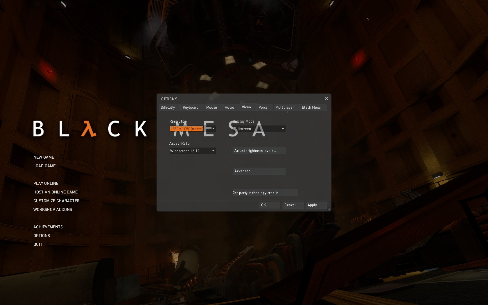
  9. The options menu is translucent, which means the main menu background and text can clutter it and make it hard to read.
  10. One of the scientists who lets you into the test chamber now has an English accent, instead of Sisk’s voice work from the mod. I suddenly felt like I was in The Stanley Parable. It’s not that the voice work was bad; I just don’t think the voice suits him.
  11. Kleiner’s lab coat being like everyone else’s now. In the mod, his is buttoned up. It makes him stand out, it’s in-character, and it provides a good contrast with Eli. It makes sense for it to at least be the same length as the others (in the mod it’s shorter than the rest, and that bothered me), but I think it would be better if it were still buttoned up. Something about his facial design and animation was kind of weird, too. Definitely preferred his appearance in the mod.
  12. It sounds like the HEV suit voice is different, and I don’t think it’s a good change. I remember someone in another thread said it “sounds like funny child”. That’s about the best comparison I can think of.
  13. Is it just me, or do loading screens take EVEN LONGER now? D: I assume there are more resources to load now, but oh my God does it ever break the flow. I don’t imagine there’s much that can be done about it, so I don’t know why I’m griping, but there you go.
  14. The new HEV suit model. It certainly looks cool, but in the mod I liked that it was very noticeably different from the Mark V. To be honest, in my mind, pretty much any detail that highlights how much things change between Black Mesa/Half-Life and Half-Life 2, and reinforces the sense of the passage of time, is an awesome detail. (Examples: G-Man’s model re-skinned with darker colours to match his Half-Life model; Eli and Kleiner being actually redesigned to look younger, not merely re-skinned.) So the mod’s HEV suit model was a source of much appreciation and satisfaction. And now it’s goooone. :<
  15. Some of the changes (like the HEV suit model change, some of the other model, texture, and layout changes) feel like they are trying to make Black Mesa more like Half-Life, at least visually. I’m sure many would love that, but I emphatically wouldn’t. I didn’t fall in love with Black Mesa for the ways it was similar to Half-Life. I fell in love with it for the ways that it was different. I loved it because it was its own, it was unique, and it wasn’t trying to be Half-Life with graphical improvements. It was so much more than that. I’d just…like it to remain more than that. Obviously, the visuals aren’t everything, and are far from the only thing that made Black Mesa such a great experience. But I started gaming in 2010, have played mostly post-2005, first-person games, and am a pretty fussy person. To me, appearance and imagery does count for a lot. So it would make me very sad to see Black Mesa shed its wonderfully unique, distinctive look in favour of visual atavisms.
    Things I’m ambivalent about:
  16. The layout and texture changes are interesting. I have somewhat mixed feelings, but they still look neat!
  17. I have mixed feelings about Gordon gasping in pain when he’s burned. On the one hand, it’s kind of thrilling to hear a tiny bit of voice from an otherwise silent protagonist, like Chell’s pain sounds in Portal. On the other hand, I feel like he should never have more voice than the breathing during the resonance cascade. It just feels taboo somehow. >.> But I wouldn’t want it to disappear… Ideally I would want it to be optional.
  18. The guy who mentions Gordon’s ponytail, having his voice filtered because of the speaker. On the one hand, it makes sense (I always wondered how you could hear him that well through solid glass), but I dunno, it just feels weird. I think a lot of my feelings are just resistance to change. I think this one will grow on me. It was just a bit startling the first time around.
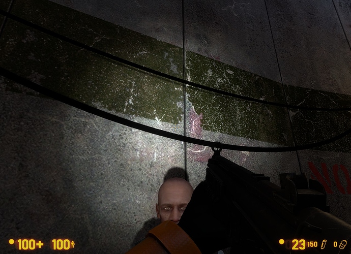
  19. Flashlight! Forgot about the flashlight. It just seems…so dark now. ; _ ; And so small. But it also feels less ridiculous and more realistic, so I’m torn. All I’ll say is, when I first turned it on, I didn’t actually realize it had worked.
  20. The loading screen when you start a new game. On the one hand, it’s cute, and is one of the aforementioned details that make Black Mesa feel like a Crowbar Collective game, rather than a Valve game. But on the other hand, it feels a bit gimmicky and silly. One of the things that roped me into Black Mesa is that it felt much more immersive, as well as much Darker and Edgier, than Half-Life. That loading screen kind of pulled me out of that.
    All in all, still the Black Mesa I know and love! I will post more as I continue to play!

May as well add my own feedback to prevent a billion threads popping up with this sort of stuff.

Love:

  1. Finally captions for Inbound. It was never a huge deal for me because hey, I’m not hearing impaired or anything. I just play with CC on for whatever reason out of habit.
  2. Little bits of added dialog everywhere. Yessssssssss
  3. Small little fixups and improvements everywhere. For instance, the microwave casserole effects no longer look weird, among many other model/texture improvements all over the place.
  4. HOLY HELL THE HEV THINGY IS THE MOST BEAUTIFUL THING EVER it looks like I’m gonna have to scrap my own since it has been thoroughly blown out of the water D:
  5. A lot of scripted sequences are also a lot better in general. So far, the UC vort sequence and the OC sequence with the guard and his zombie buddy no longer look jarring and weird. Good job!
  6. The new direction with the HECU combat lines. Less goofy and more professional, which is a good thing.
  7. WEAPON PICKUP AND IDLE AND SPRINT ANIMATIONS :smiley:
  8. Classic Glock firing modes!
  9. I thought Gordon swung the crowbar like a madman back in the mod version. Now it feels like he swings the crowbar like a lumberjack hooked up to an IV drip of pure caffeine. D:
  10. MP5 feels much more satisfying now. It seems a lot easier to use (like, it’s easier to manage its spread and recoil now), and feels like it packs more of a punch.
  11. Is it just me, or do the HECU grenadiers use their grenades a lot more now? (If so, this is not a bad thing. If not… well you somehow fooled me. :stuck_out_tongue: )
  12. Will add more as I continue to play the game.
    Meh:
  13. The MP5 model is cool, but I personally don’t like side rails on MP5s. That’s just my personal taste though, and it’s not a huge game-killer. The animations and new sound more than make up for this change.
  14. I preferred it when the HECU had radio filters applied to their voices…
  15. Is it just me, or is the flashlight a lot… smaller now? Am I going crazy?
  16. There is no way to set the quicksave and quickload keys in the options menu. I need to bind them manually in the console/config files (I don’t use the normal quicksave and quickload keys that most people do).

Liked:

  1. Most of the new weapon models and animations. Holy hot damn <3
  2. Auto crouch-jump. I never thought I’d use it, but oh my god.
  3. The AI changes. HGrunt battles are intense.
  4. The Vort animation changes. Them being in their “battle stance” all the time looks a lot more appropriate.
  5. New HGrunt voices. They sound great.
  6. Weapon rebalancing. The MP5 was pretty good before, it’s a goddamn beast now. I like it.
  7. The HEV suit intro was absolutely incredible.

The only things that come to mind that I’m really indifferent about are that 1) I preferred the style of the 2012 MP5 model over the current one (not a big deal, the new model is great too), and 2) the 2012 crossbow animations feel really out of place and clunky alongside everything else.

The Crossbow was left as it was in the mod because we are most likely going to give it a revamp for an update, we just hadn’t had time yet.

I wonder if you can pick up a more powerful flashlight from somewhere and mount it on the side rails of your MP5.

The MP5’s current model now reminds me of its old model (the one seen in the “2009” trailer with differences). Anyway, I’m gonna post some feedback when I get the game. :slight_smile:

I haven’t completed the SP, and haven’t gotten a chance to play the MP without total laggage, but I’m enjoying it quite a lot so far.

As far as stuff I like, the list really goes on, but I do have a few highlights.

  • the sprint animations are great. I love the Glock one, it feels so nice.
  • You guys really stepped up your game with the MP5. The return of the classic firing type, and just the way it feels in general is swell, I love using it now.
  • dat HEV boot sequence. Really makes great use of the Anom Mats track, too. Picking up the suit always seemed so anticlimactic, and this is the perfect remedy, and it was done so great. Watching everything light up in unison with the voice was nice, and I just couldn’t stop smiling the entire time.
  • I’m glad you guys have reacted to so much feedback. Even on very small bits, and changes to puzzles and map tweaks. Very nice.
  • Pipe textures! I noticed those right away, and they look really nice.
  • I’m actually not totally certain on this, but is there something different about the specular maps? Does this branch of Source handle them like not-shit, or were they retouched or something? Maybe I just never noticed them before and the new release sent me into overdrive and placebo’d me, but they more pronounced.

Now, stuff I don’t like isn’t as large, but it’s there.

  • The new HECU voice is well performed, but in scripted sequences with multiple soldiers, it’s very apparent that the VA didn’t make much of an attempt to change his voice between characters.
  • As much as I hate to be caught by purism, some of the more memorable lines being changed even further after 2012 edition’s changes made my teeth itch. “he’s been killing marines.” I’m all for expansion and added depth, but changes to some of the lines throw me off. Maybe it’ll get better as I get used to it.
  • New HEV model. I might have said something about this when it was showed off some time ago, but I don’t like the design, and I honestly think it’s one of the lower quality models.
  • M203 modified to be closer to HL1. This is probably in reaction to all the feedback on it, but personally I was in the “it’s great!” boat.

In between stuff, all that really comes to mind is the sci in the pre-AMS airlock. You know the one. I liked the original VA and his delivery more, and it’s more reminiscent of the Half-Life 1 sequence. Immediately after I thought, “Wait, was that the fuckin’ Stanley Parable guy?!” I’m still not sure, but doesn’t quite sit right regardless.
Oh, and the crowbar feels OP. I’m not sure if it actually is, but it certainly feels so. Might be the coffee-fueled animation. Seems like it’s supposed to emulate HL1 more, but I think the feeling got a bit muddled in translation.

So far I’m loving the upgrade. I’ll likely come back with more to say later on when I’ve given it more time. Either way, all of my <3 and look forward to further updates, and possibly to make some Workshop submissions!

This precisely echoes my feelings. XD

I can’t help but wonder if it’s actually Kevan Brighting. Somehow I doubt it, but that’d be kind of amazing. And if it’s not, it’s still amazing because it sounds exactly like him, from the accent right down to the cadence and intonation.

It is the amazing Kevan Brighting. We love him.

As far as stuff I enjoyed about the Steam release (note: I’ll actually play it once the repairs are done on my computer. I’m going by what I’ve seen of it in playthroughs), I can only think of 1 thing that hasn’t been brought up yet on this thread: The fact that ALL the reloads take the chambered round into account (ie, they only cock if you empty the clip before reloading). Stuff I didn’t like:1. The RPG still has no clip counter.

  1. The Revolver’s reload still doesn’t take the number of bullets left in the clip into account.
  2. No options menu setting to pick between “semi-automatic secondary fire” & “double barrel blast secondary fire” in the SPAS-12.
  3. No sights in any of the other guns besides the Colt Python Elite.

I also noticed this and it’s annoying to the eye. Please make the options window non-translucent.

I also noticed this. And I don’t like it smaller neither :frowning: Can you restore the flashlight beam it to its original, bigger size (like in the 2012 mod version)? Please! (Or maybe it’s smaller because of the default extended FoV to 90?.. even so, it looks small I think)
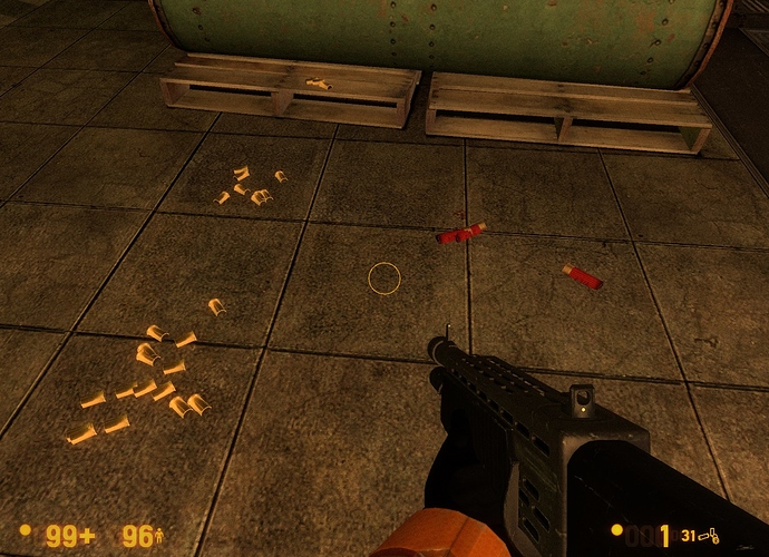
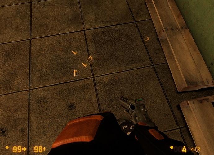
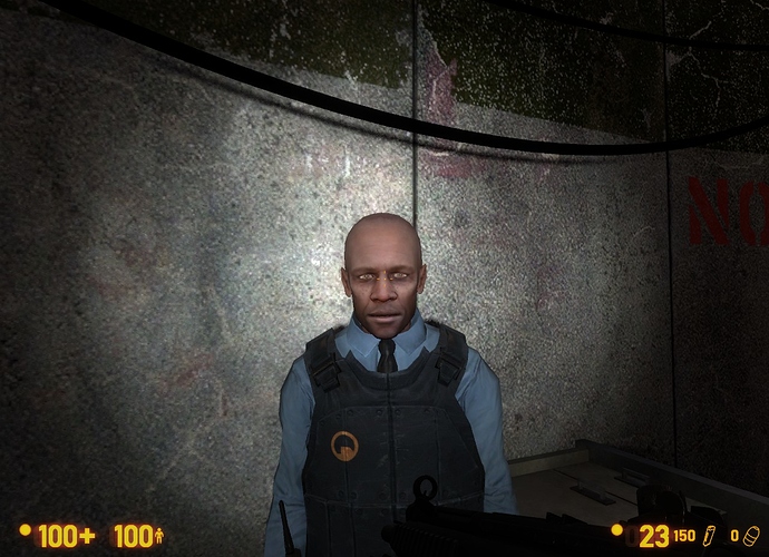
I don’t like that you cannot grab headcrabs and houndeyes… In the 2012 mod version, you can pick them. Please, restore this cool feature :slight_smile: I wanna “play” with the bodies of headcrabs and “paint” the walls :smiley: Please!

I don’t like that you cannot put glasses on your multiplayer characters (on the male and female scientists). Please, add this feature! I wanna customize my female scientist character to have glasses, just like in singleplayere :smiley:

The “Enable Always Run” option is broken. It’s the same result – HL2 move style (= separate walk and sprint keys) – even if you have the option enabled. I guess you decided to keep only the HL2 move style but forgot to remove the “Always Run” option? Elucidate me.

The “Enable Auto-Aim” option is always reseting to ON after I restart the game. Why the hell would someone use auto-aim? We use mouse, not freaking controller o_O I suggest you to remove that option completely (so no Auto-aim in the game at all).

I –
Wha –
Is it actually?! Or are you just messing with us?

Ahh, that makes sense. Looking forward to it! :slight_smile:

On that note, actually, I completely forgot about this… Thank you for rewriting the dialogue between the two marines in the lobby near the beginning of Questionable Ethics. I don’t remember what other people had to say about it at the time, but personally I felt like the original line was in somewhat poor taste. I don’t want to create a huge debacle out of this, so I’ll just leave it at that. Thanks again. :slight_smile:

Are you talking about the “lady doctors” line? Did they change that? Because I loved that exchange. One of many things that made Black Mesa feel Darker and Edgier, and reinforced what monsters some of the Marines are. I’ll be really upset if they changed it. :frowning:

Yes, that’s the one.

Everything looks amazing as usual!
Although, I don’t really like the new MP5 model and its running animations are… awkward. They make it look like Gordon’s brushing the floor or something, and the crowbar’s animations look really silly, reminds me of rowing a boat.
Heh.[/size]

  1. Has anyone else noticed the 9mm shells are way to large and shiny… I mean they’re the size of the shotgun shells almost??? And the magnum shells are smaller and are the default hl2 ones.

  2. I think others have mentioned the flashlight beam is smaller now, but I cant help but notice the beam appears to be projected out of the players eyes preventing the dynamic shadows from being seen. It needs to be lowered. They’re there but its really hard to tell.

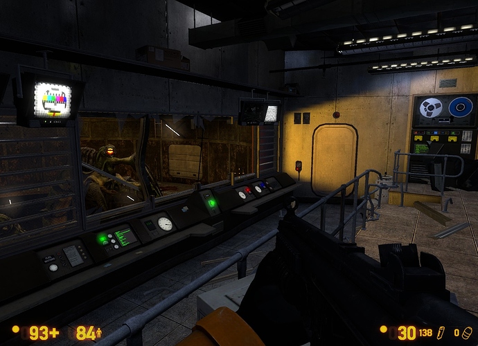
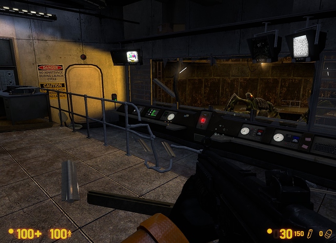
  3. The lighting in the tentacles launch room shows as if the rocket is firing…but it isn’t. Saving and loading appears to trigger and fix it, so ya.


:<

The in-game windows (including options menu; game menu; server browser menu) have a weird bug: The font is broken.

Look here:

the “d” letter is cut at every word (Keyboard, Video, Advanced, Widescreen, so on) in every possible menu / window
the “a” letter is cut at every word in every possible menu / window
the “g” letter is cut at every word in every possible menu / window
the “s” letter is cut at every word in every possible menu / window
all numbers are cut in every possible menu / window

Why is this happening? Can you fix this issue, please? The font gets annoying when it’s cut :frowning:

Founded in 2004, Leakfree.org became one of the first online communities dedicated to Valve’s Source engine development. It is more famously known for the formation of Black Mesa: Source under the 'Leakfree Modification Team' handle in September 2004.