Several people have asked how I am making the documents that I have been using in pre-disaster chapters, so I thought I’d put together a quick tutorial on the subject.
Software Needed
- LibreOffice with the ‘Draw’ component, or any similar word processor with vector drawing functionality. A PhD student where I work uses PowerPoint for this. This tutorial assumes basic familiarity with the functionality of these types of programs.
- GIMP. If you have Photoshop or another relatively heavy-duty image editing tool that will also work but GIMP is free. This tutorial assumes familiarity with common image-manipulation functions in these sort of programs
- VTFEdit. Having some knowledge of Source engine material creation will be helpful.
- The Black Mesa release of the Hammer editor (duh).
Making Paper Documents
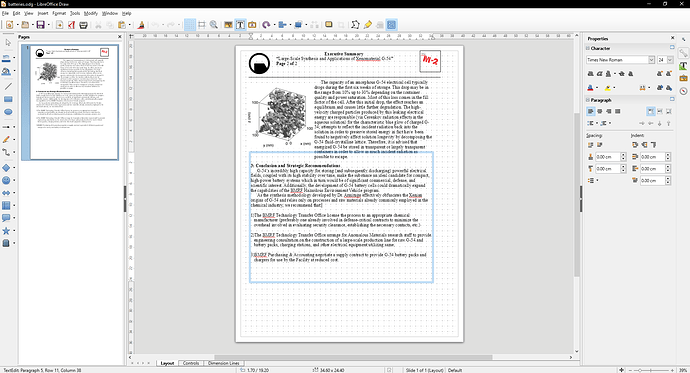
This is typically best done in Draw, with text boxes. If you want you can compose the actual text in the standard word processor and paste it over, but the next step requires copying and pasting the resulting document into GIMP and only the drawing editors can typically do that.
Stuff like the Black Mesa logo and paper formats (technical reports, memos, etc) I tend to copy from other documents to try to keep it consistent. The source documents I use are stored in the VPKs of the pre-disaster mods in case other people want access to them for this purpose.
One thing I find useful is designing the entire document at twice the size it would actually be IRL- for instance instead of an 8.5 x 11 page with 12-point font I use a 17 x 22 page with 24-point font. This makes the resulting image crisper because of how Source handles texture resolutions (see below).
Figures and graphs are typically things I find by typing a few terms vaguely related to the topic of the document into Google Images or Google Scholar. It can have a white or transparent background, either one works. Most of the handwritten annotations on documents are just another text box with a ‘handwritten’ font; anything more complicated than that is a subject we’ll get to later on.
Processing Typed Documents In GIMP
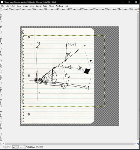
Once you have your document looking the way you want it, you’ll want to have ready a blank paper texture in GIMP. You could just use a flat white rectangle, but actual paper does have some texture to it so I use a file called paper_big.tga that I got off of Google Images and keep in the ‘materialsrc’ folder of the VPKs. There are also a couple of different notebook and graph papers in there, and you can find other paper backgrounds online.
Whatever you use, it’s a good idea to make sure it’s sized at or a little under a power of 2 (1024, 2048, 4096, etc) along its long axis- I’ll explain why in a later section.
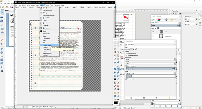
Hit Ctrl-A to select the entire page area in your drawing processor and paste it into GIMP. This will produce a new layer with your text converted to an image- you may need to move and resize it to match the dimensions of the paper, although obviously blowing it up too large will make the image blurry.
Finally, you will want to run the ‘color to alpha’ filter with white selected as the alpha color. This will get rid of any white backgrounds on figures or drawings for you, but it will also allow a little bit of the paper background to show through in areas that were not perfectly black. This goes a long way to making it look as though the text is actually printed onto the background instead of just floating artificially above it.
This is also the step where you can add things like highlighting and redaction using the ‘brush’ tool. The ‘multiply’ setting is good for highlighting because it will affect the white paper but not black print.
Using Preexisting Documents
Some things like equipment manuals, safety posters, and non-BM technical papers I just looked up on the Internet. GIMP has a very useful feature that allows you to import one or more pages from a PDF as an image file. Those typically have white backgrounds, so I just run the color-to-alpha filter on them and put an appropriate background behind them.
Using Hand-Drawn Figures
My preferred method of generating hand-drawn figures or doodles is to take them off of IRL sources. I work at a research university so there are tons of whiteboards and notebooks just lying around with random scientific scribblings for me to photograph; another good place to get materials like this is from YouTube where professors will often post videos of their lectures that you can take screenshots of; sometimes you can also find drawings of things just through Google Images but I’d recommend looking at YouTube first. I suppose you could just draw and annotate diagrams yourself and photograph them, but I’d worry that all of these documents supposedly by different people would come out all in the same style and all with the same handwriting.
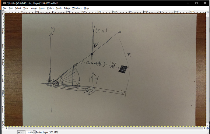
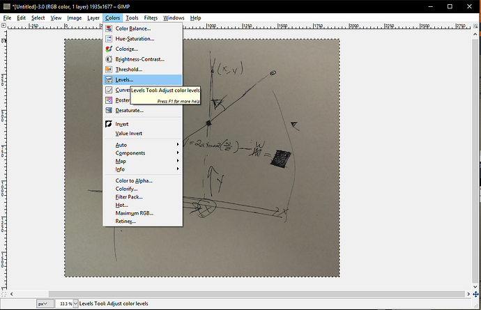
Regardless of source, typically what you get is a photo of a whiteboard, chalkboard, or piece of paper with stuff drawn on it.
You’ll want to begin by cropping out all of the surrounding material so that only the figure and the background are visible.
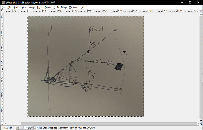
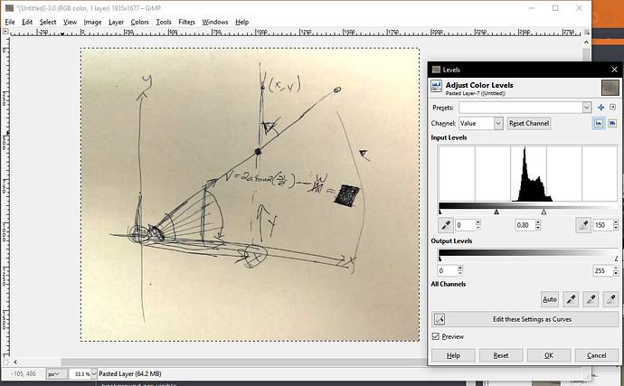
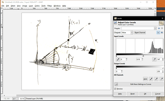
We will want to use “color to alpha” again to extract the figure, but to do that we want the background to be perfectly white and not the mix of light grays it is at the start. This can be achieved by using the ‘Levels’ tool to shift the white threshold of the image but not the black. Sometimes you may need to make multiple passes to get rid of all color in the background without washing out the figure itself:
After that, using color to alpha (and optionally converting to grayscale or colorizing all or part of the image) will produce a nice drawing:
For drawings on chalkboards you may want to invert the colors to produce a dark drawing on a pale background.
Basic things like scribbles, underlines, or circles can generally be found on Google Images.
Making Emails & Other Computer Records
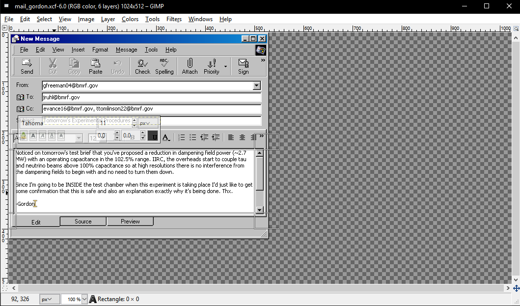
I typically start with a ‘blank’ version of a common program like Outlook or Word. These can be made pretty simply just by finding a screenshot of the program on an older version of Windows and whiting out the text fields. If you wanted to be fancy I suppose you could set up your computer with a retro Windows theme and take screenshots off of that. Either way, I typically just edit the ‘blank’ versions directly in GIMP to add my own text; for things like PowerPoint slides I copy stuff from Draw.
I’ve found that 11-point Tahoma with anti-aliasing disabled very well approximates the system font on old versions of Windows.
There’s blank versions of each of the programs I’ve used in the relevant pre-disaster VPK files.
The ‘Terminal’ Screen Effect
Sometimes for older displays or ones that aren’t a full computer monitor, I’ve added a striated glow effect. This works best on diagrams that are predominantly a black background with light-colored shapes- the ‘invert’ filter in GIMP can be very helpful in this regard.
The actual filter is a four-step process: first, I add the 'Distorts > Video" filter to create the scan lines effect; then, I decompose the image into R, G, and B layers; then, for each layer, I run the ‘artistic > softglow’ filter; and finally recompose the image. This is necessary because if the softglow filter is applied to a full RGB image it just makes the glow white and not the color of what is glowing.
Final Preparation Of Document Textures
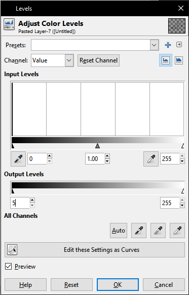
The first thing you will want to do once a document is concocted to your satisfaction is to adjust it so that no part of it is exactly 0-0-0 black. This is because the later Source visual effect will use an RGB value of 0 0 0 to decide not to render portions of the image- this will cause portions of your document which are exactly black to render as ‘holes’ through which the background can be seen. Setting the dark output level in the ‘levels’ tool to 5 is a good way to remove any actual black areas without visibly altering the image:
Next, make sure the image is scaled properly. Source Engine textures must be a power of 2 along each axis (although it needn’t be the same power of 2, i.e. the image can be a rectangle and not a square), but while it’s good practice to fill as much of the available space in the image as possible the actual document need not take up all of it. Since some images (like computer outputs) are supposed to be a specific pixel-for-pixel representation of something and even those that aren’t can lose resolution when resized, you may want to scale the canvas to a power of 2 without affecting the image.
Export the image to some sort of lossless format, import it into VTFEdit, and save it as a VTF file somewhere in your materials directory. Make a corresponding VMT with the following information:
LightmappedGeneric
{
“$basetexture” “path/to/vtf”
$selfillum 1
$selfillumtint “[.75 .75 .75]”
}
The $selfillumtint parameter determines how bright your document will look and is influenced by your tonemap settings. Generally you don’t want them looking dark gray, but at the same time you don’t want them to be at full brightness because then under most tonemap settings there will be heavy bloom that obscures the text.
Displaying The Document In Hammer
The apparatus for displaying a document consists of three parts.
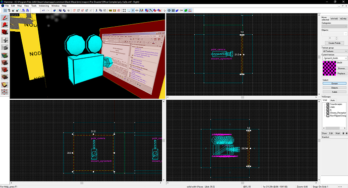
The first is the document itself, which is kept outside the main play area of the map with a point_camera pointed at it. I typically put mine all in a row in a single location, but they can really go anywhere.
The size of the document texture in Hammer doesn’t actually matter because Source maintains the original image resolution regardless of the texture scale- a texture will look just as crisp if it is on a large brush the player is far away from as it will on a small brush the player is close to. This is true for the camera entity as well. A document that takes up a little less than a 32-by-32 brush with the camera ~16 units away will typically be well-positioned to fill the screen. The brush behind the transparent document should be black. The camera doesn’t need any special properties other than a unique name.
The second component is a collection of player behavior and view-management entities. These include a logic_auto with the output
OnMapSpawn <NAME OF YOUR SCRIPT_INTRO> SetBlendMode 5
a game_ui ent with the output
PlayerOff <NAME OF THE FUNC_BUTTON BELOW> PressOut
and the ‘Freeze Player’, ‘Hide Weapon’, ‘+Use Deactivates’, and ‘Jump Deactivates’ flags all set, and a script_intro entity which can be named anything. You only need one of these sets per map.
Finally, each document you want to view needs a func_button entity with the “Use Activates”, “Toggle”, and “Don’t Move” flags set and the outputs
OnIn <NAME OF YOUR SCRIPT_INTRO> SetCameraViewEntity <NAME OF THE CAMERA THAT SHOWS YOUR DOCUMENT>
OnIn <NAME OF YOUR FUNC_UI> Activate
OnIn <NAME OF YOUR SCRIPT_INTRO> Activate 0.01
OnOut <NAME OF YOUR FUNC_UI> Deactivate
OnOut <NAME OF YOUR SCRIPT_INTRO> Deactivate
It is most convenient for all of your buttons to have the same target name.
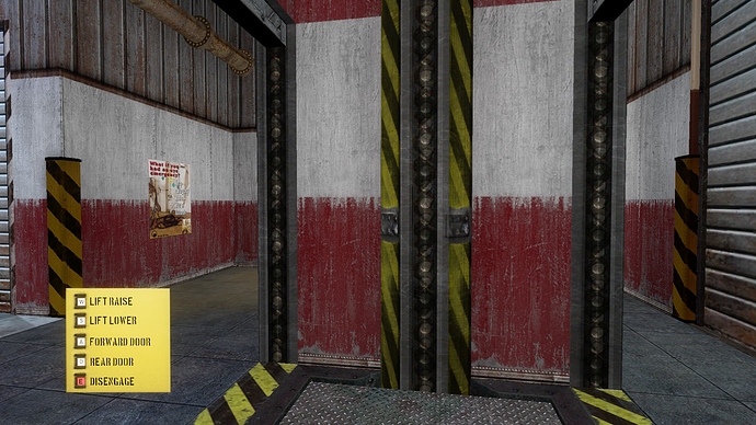
I made a small custom sprite to make the buttons visible, but this has no effect on their logic. The sprite texture is called documents/docflag_sprite.vmt and is available in any Pre-Disaster VPK.

