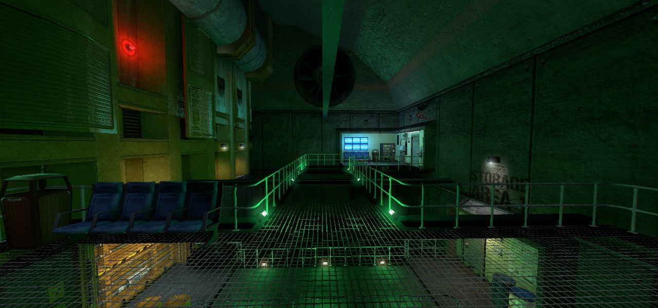
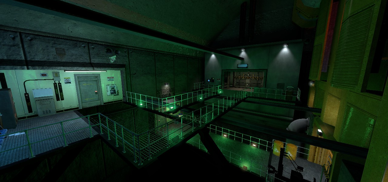
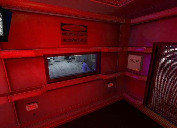
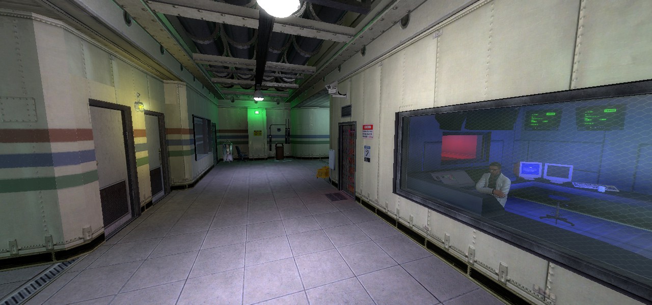
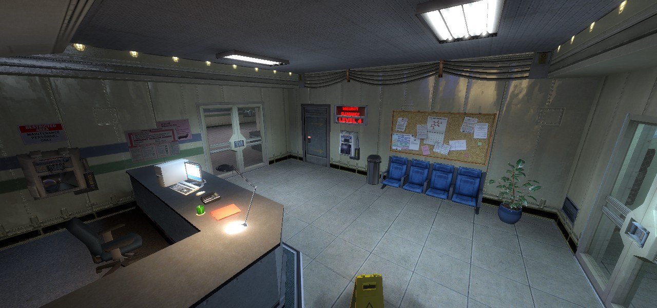
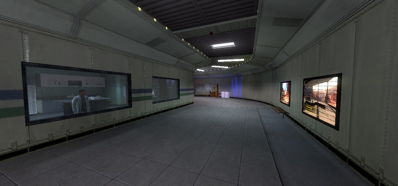
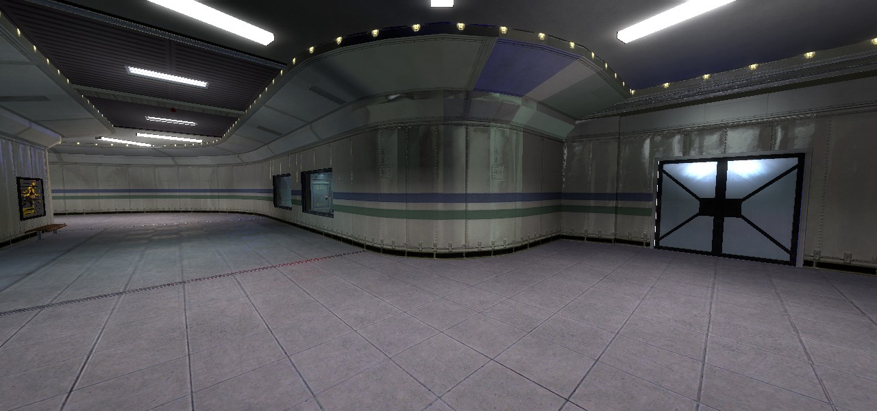
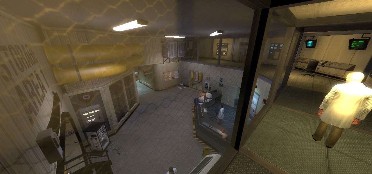
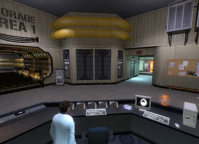
This is a work in progress of the first map in ‘half life decay’ using black mesa source assets. I still currently have a lot of work still to do but just posting a short preview.
In a lot of ways this looks like a good first start and I am curious to see how the project develops. Some of the issues I’m suggesting might just get covered in a ‘polishing’ pass, but I’ll mention them regardless to make sure we are on the same page:
- A lot of the lighting seems to be very consistently desaturated and yellow-white over the whole map. Black Mesa itself usually uses much more saturated colors and switches them up between different rooms. Anomalous Materials-like areas like in the last two screenshots typically are more of a blue, for instance.
- There are very large human-trafficked areas where there are no lights at all- Black Mesa’s default lighting style invariably creates a dismal Hell of a workplace if applied to pre-disaster maps and it is totally OK if you want to hold true to that, but even they make sure there are enough physical lights to illiuminate the whole room even if the light that comes out of them is much dimmer and more saturated than a real workplace would have.
- You’ve got good prop placement over all, but that last corridor seems a little wider than it needs to be and has a large expanse of empty floor for no readily-discernible reason.
- The underlying brushwork beneath those detail props is a little bit sparse in some areas- I am looking in particular at those strange ‘bevels’ on the entrances in the first screenshot and the transitions near the doorways in the second.
- The maps seem very ‘clean’ and there aren’t a lot of decals for dirt, mechanical bits, or structural imperfection in the walls- even ‘clean’ maps like Questionable Ethics and Anomalous Materials have vents, small cracks, dropped papers, and miscellaneous smudges every now and then. This is especially obvious in the first screenshot, where the support beams for the catwalk just sort of fuse into both the concrete wall and the AMS wall without any clear sign of attachment.
- Overall you seem to be going for a theme very similar to bm_c1a0a, which makes sense. However, some of the wall textures are from Questionable Ethics, Lambda Complex, or elsewhere.
- Some textures seem to be misaligned with each other or with corners, borders, and other world features.
When “remastering” the half-life maps, my personal recommendation is to not copy the level design brush for brush, and add better textures, props and doors, but to look at the map itself, and see what were the developers trying to make, and go for something that fits that theme and resembles the original map. Both Questionable Ethics and Surface Tension are great examples of this.
On this map have scanner,that in Half-Life  ecay looks simple. I don’t know how you can do that, because in Black Mesa Source I didn’t see any of this.
The scanner (i’m assuming) your taking about could half-assed with brush work and similar looking entities.
Plus, with what i can tell its already been completed, or at least a placeholder that works.
I never particularly liked that feature of the map and, while tossing around ideas for Decay remakes myself, thought it would actually be better to replace it with something like the double retina scanners at the door to the AMS or just cut it out entirely since Black Mesa does not currently have any way to duplicate the game mechanic it was supposed to demonstrate.
This is why the map is a ‘work in progress’ there are a lot of errors and misaligned textures i know that, but thanks for the feedback.

