Black Mesa: Protocol X

Black Mesa: Protocol X is a Black Mesa add-on that aims to recreate the award winning Gearbox title “Half-Life: Opposing Force”. Using Black Mesa’s assets - as well as self-made assets - Black Mesa: Protocol X will feature new models, dialogue, and new environments.[/size]

Project Leader: X RaY [moddb.com/members/byxray]

Moddb Page: moddb.com/mods/black-mesa-protocol-x

For Join Read The Description: https://www.moddb.com/company/black-mesa-protocol-x-dev-team

Some Pictures About Mod[/size]
[/size]

[/size]
[/size]
[/size]
[/size]
[/size]
[/size]
[/size]
[/size]
[/size]
[/size]
[/size]
[/size]
[/size]
[/size]
[/size]
For more pictures. Please visit our moddb page. :slight_smile: [/size][/size]
[/size][/size]

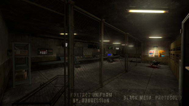
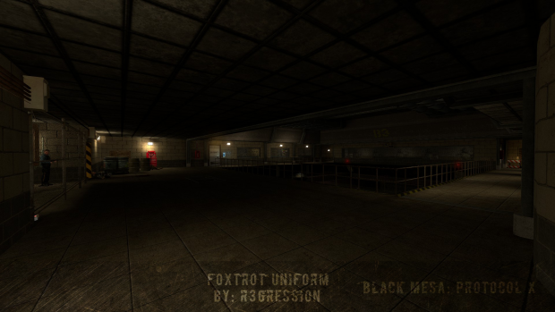
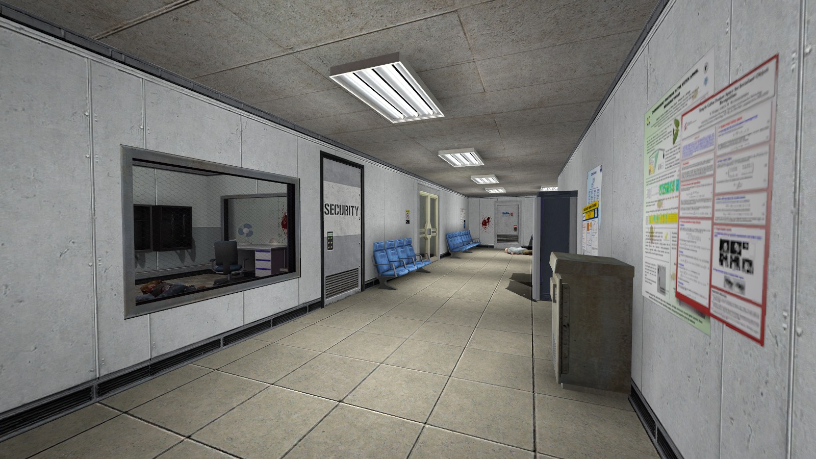
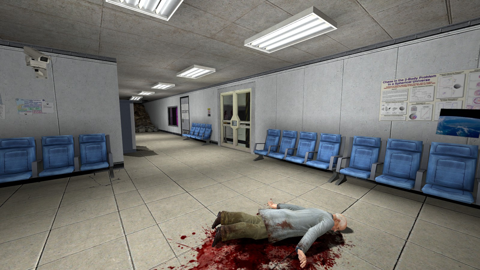
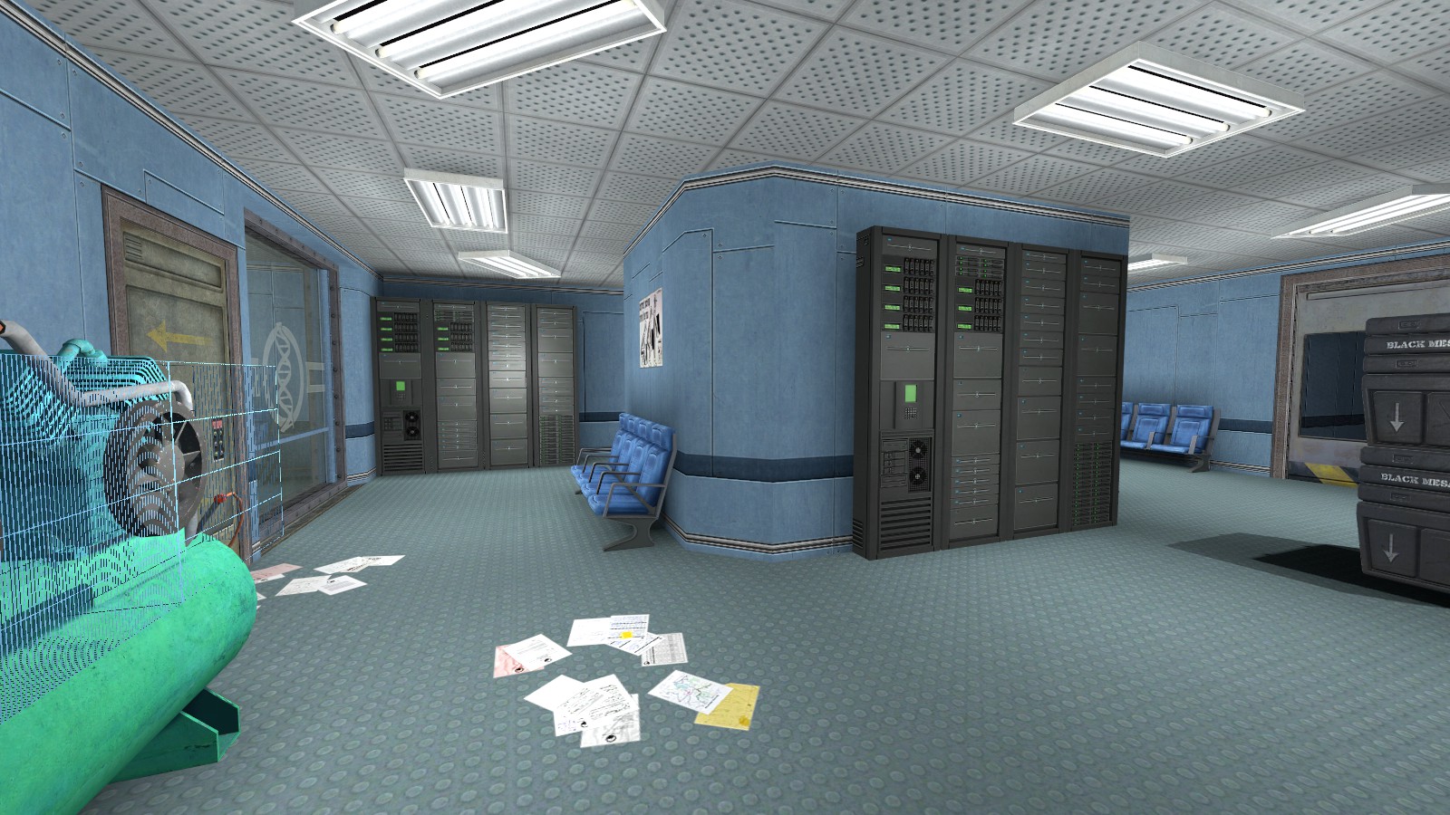
Not wanting to be mean or anything, but why does everyone wants to do their own remake of Opposing Force? Anyway, thoses screens aren’t bad, but they aren’t that good either to be honest… The architecture is really blocky, like in the days of goldsrc, and there is some textures issues (the alignment of the floor and the textures around the elevators doors in the first two screens, and the alignment of the ceiling in the 3rd and 4th screens) also, the lighting seems a bit too bright imo. Despite what I said, I’m looking forward to how you’ll progress on this project.

Ok, a lot of this still looks super rough, but for an early start it’s not bad.

What’s the area in the first two pictures?

I’ll give you the same advice I give many mappers on here when they post work in progress shots - it seems to be a pretty universal theme. There are some basic things which could do with correcting in what you posted - but kudos for putting something together and getting it out there. That’s the toughest part.

Map all basic elements on a grid of at least 32, with texture lock turned off initially. The textures don’t fit properly on your screenshots and it looks messy. Sticking to the grid will make the map look much neater, and will save you a lot of nightmares with texture alignment.

Don’t just make basic rooms and then be done with it, and start layering detail on top of that. They need architectural details and shapes beyond basic blocks. Everything you’ve posted looks very blocky. Yes, it is early work in progress - but the architecture should come BEFORE any detailing, lighting or propping. It should be part of the base, not an afterthought. You can’t just make blocks and then detail them. They have to take proper shape BEFORE that.

Don’t just slap props onto blank, flat walls. Don’t just cut doors/windows/insets into blank, flat walls either. Build things with a purpose. Don’t just put a security room here because it would have been a blank wall otherwise. Don’t just throw powerboxes onto a flat wall because you didn’t know how to make it not boring. If you want a security room there, then design and layout the place in a way that reflects that - that’s where you can derive your detailing, architecture and layout from. Looking at those screenshots, most of the props/doors/windows feel like they were put there just because you didn’t want the walls to be blank - that’s not a good look. Build stuff into the layout, rather.

Just some simple advice to really help push your maps a lot further.

It looks like the hallway before the elevator leading down to the Hydrofauna Studies Laboratories.

On the topic of the maps, I would have to agree with Text. Map with the grid (personally I use a setting of 8), use geometry for detail, and detail in a way that compliments your environment. Along with that, I have a few other suggestions.

Lighting is a big issue here. I know ti’s just WIP, but the lighting here makes the labs feel like this is before the incident. Since this is post disaster, you’re probably best off going for more atmospheric lighting. Firstly, I’d recommend knocking out a few of those lights- I doubt the electrical system would’ve survived the disaster intact, so chances are a few of the fixtures will be broken. Try toning the brightness of the lights down a bit too- if you’re having trouble, you could always just use lights from the stock maps (just make sure you give credit). You could also try adding in some of those red emergency lights that appear throughout the facility- it would make the lighting seem more varied, and less plain. Speaking of which, try adding some variety to your lighting. A lot of Black Mesa’s levels contain rooms lit by multiple fixtures, most of which emit different colored lights. It doesn’t have to be a huge difference, it could just be a light yellow and a light blue. Try studying the lighting within the stock game closely, and chances are you’ll have a better idea of what I’m talking about.

Another thing I noticed is the props you’re using. I mentioned detailing that compliments your environment earlier, and I’m going to take some time to elaborate. I did notice some props feel a bit “random” (i.e. placed as an afterthought, rather than with regards to the environment). Text also brought this up in his post, and I’m going to go into a bit of detail. Whenever you place a detail in the environment, ask yourself “would this prop make sense here?”. If realism is your goal, you’ll need to place props as realistically as you can. Once again, if you’re going for a certain type of environment, you can easily reference the game for inspiration. For example, it seems that you’re basing your level off of “Questionable Ethics”. So, I’d recommend studying how the environments within the chapter are detailed. You don’t have to replicate the details exactly (in fact, I would almost implore you don’t- the biggest reason the Hydrofauna Studies Labs was my favorite area in Opposing Force was the diverse blend of textures), but you can take cues from it. Detailing an environment does take practice, but the payoff is nothing short of rewarding.

I’m no mapping expert, but I have picked up on a few tricks over the years. Certain details can go a long way, and they can even be what separates your maps from the rest.
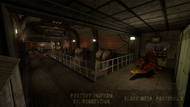
Crush Depth. When we teleport from xen

Founded in 2004, Leakfree.org became one of the first online communities dedicated to Valve’s Source engine development. It is more famously known for the formation of Black Mesa: Source under the 'Leakfree Modification Team' handle in September 2004.