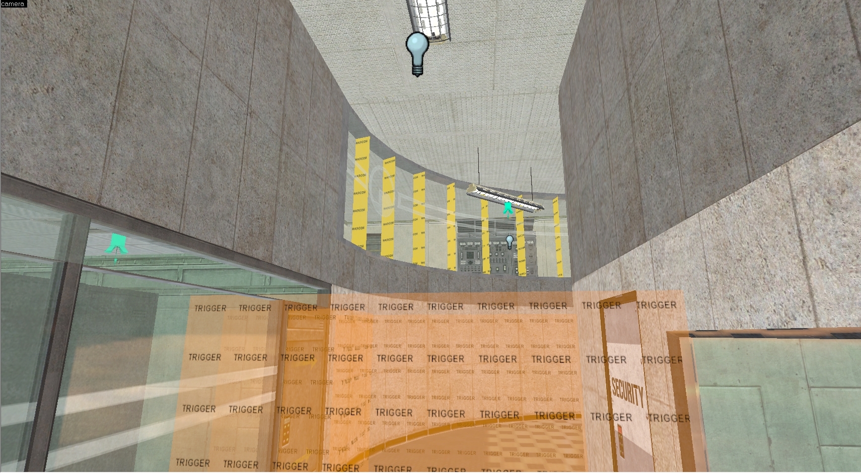
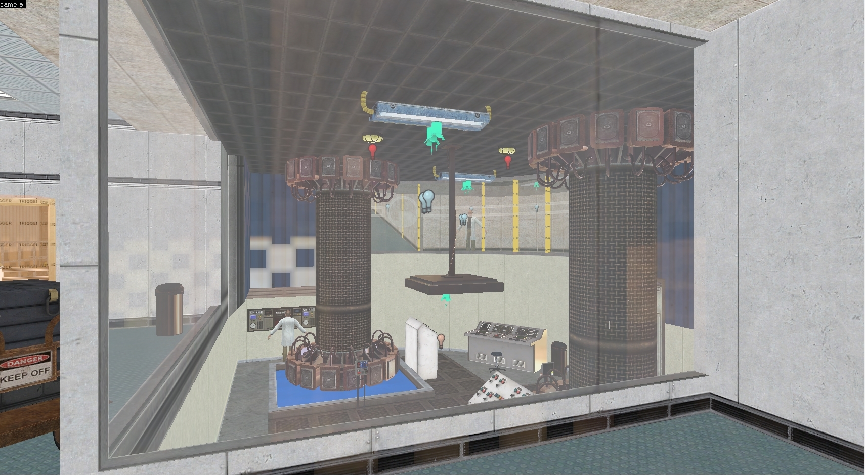
Understandable, one empty room looks much like another.
In the screens that were posted yesterday what changed was only the lightning. I’m working on it : I prefer learning how to make ligthning before creating other rooms.
Maybe he hasn’t been showing them because they’re not ready to be shown? 
Ahp. I see another door blocked by glass in this round of shots.
Well, hey, it’s a recurring problem.
It’s not unreasonable to think it might go in the other direction.
Whichever side of the lab doors the panel is on is the side it closes on.
It’s not unreasonable to think that the door is not blocked, however the incorrect texture was applied.
Buuut, pedantic semantics, I guess.
And that’s why I told him; so he knew about the problem and could fix it.
And please, for the love of Gabe, everyone gets this wrong and it makes me want to cut myself: https://www.grammar-monster.com/lessons/semicolons_before_transitional_phrases.htm[/SIZE]
Semicolons are overrated.
:retard:
Anyway, the doors should be fixed, although it’s probably not a huge deal at this moment.
Jonathan, have you thought about remaking all of Decay? With a team?
Yep, I thought it would be great but it only was an idea, nothing really serious^^
Hi! Sorry for the lack of updates since… well almost two years now xD I’ve been really busy with school exams and other projects and I didn’t managed to find the time to make the map again… I also upgraded my PC to Windows 10 and had to reinstall all my stuff on new HDD. BUT, I found my project again and I recently started to make it again during my free time with the new Black Mesa Steam assets 
I have to say that since I didn’t really practised mapping since… well almost a year, the map might not be really great. I still have to learn how to properly make Scripted Sequences and I MUST add details to my areas… Really Kappa
Finally, I also started the uplink chapter… Just for fun lol
Anyway here are some recent screens :
Have a nice day 
Ooh, not bad, man! Bit rough and early, but you’ve definitely got your ideas down.
A couple observations. Some areas, especially the outdoor ones look far larger and more open/empty than they need to be. It also looks like you aren’t using large grid sizes when building geometry, meaning your geometry will be harder to work with in a bunch of ways, textures won’t align (really, really noticeable on your wall plates and tiles), it’ll be harder to optimize later, and VIS won’t really like it.
Off topic, but am I crazy to have never seen this airlock model before? Looks like I more original-style AM airlock but I don’t recognize it at all.
Incoming heavy duty criticism. I’m doing this because I can see passion and potential, but I can see the fundamentals need cleaning up a lot (and I can see basically all of my early mapping mistakes in those shots!). Good job doing something and putting it out there, though. It’s obvious you’ve done the work on this and that’s always a tough step. Kudos.
I was also going to point out what Crypt says - it’s very clear from a mapper’s perspective that you are not working with regard to the grid. Nothing in those images lines up properly and it looks really noticeable and sloppy. It’s not just clear in the texture misalignment - but in the really thin walls in some of the shots and such. Keep your base layout on powers of 2. There’s no reason not to. It is VERY important for a huge number of reasons.
Lots of the areas are just too square and unbroken - this is not something that needs to be done using detail and props, but it should be built into the main layout and architecture. Especially the outdoor shots where you have huge, unbroken cinderblock walls (by the way, a friendly suggestion - avoid cinderblock like the plague. This is coming from someone who just worked on 2 cinderblock centric maps - cinderblock is seriously restrictive as a material base). Try and get more detail and nuance into the base layouts - you don’t detail a room by making it square and filling it with props - it comes from architecture, function, design.
Really try and think about why areas would be the way they are. Places would have been built on a budget by teams of engineers - I can see quite a few nonsensical design/architectural decisions in your shots that would serve to do nothing but inflate cost. It seems joyless and anti-fun, but really think from an engineering perspective when you map an area, it will make the maps feel much better. For example, in this image, why does the area above the doors curve into the ceiling? Why would they design the area like that? It might not be obvious or even consciously noticeable to someone playing, but things like this result in the maps “feeling” weird.
And watch your texture transitions. In this shot, for example, the transition between the green panelling and the beige one in the hallway is seriously ugly. Mask it with trim, supports, a doorway, anything other than an abrupt transition. Or in this shot too, similar issues. Also - in that shot, don’t ever make tiles slant diagonally like you have on the stairs. That is never really done in real life when it can be avoided. Keep it level. What you can do is cut the brushwork to make the trim at the tops/bottoms line up down the diagonal section, and then use a tiling texture and keep it flat. Here’s an example of what I’m talking about, from Gasworks. Looks outrageously better.
There’s plenty more I can say but this covers the fundamentals. I suggest checking out my Gasworks blog series, it might help cover some of the mistakes I can see here. I hope this doesn’t discourage you too greatly - mapping is an art. Keep working at it, trying to improve your own work, and I can see this going somewhere awesome!
That blastdoor was from the mod originally I included it as an option.
First, thanks for taking the time to analyse what I’ve done and for giving me advises, this will really help me to improve the map!
Yep, I started working on power of 1 layout (if it’s really how one call it Kappa) and I realised that it really was a bad idea. But I’ll make efforts 
Indeed, I forgot to fix this, I made it two years ago and I didn’t fix it since I started working again on the map. After you post,I put a doorway to really separate the different areas on the first screenshot.
I made the same mistake in other places and fixed most of them. I also tried something for the stairs wall textures. Oh, I wanted to thank you for your advice of using a tiling texture on the diagonal section, I will try to use it in several areas to add more details 
Finally, about the area curved above the door, I also fixed that and it should looks more… Logic now 
Again, thanks for your advises !
On the contrary! It motivates me to continue to improve myself at mapping 
Man maps are cool but you need to work on much… check for some Black Mesa Source maps!
Also please learn use displacement tools
Hi ! [/size][/size]
After a really long time, I wanted to share what might be one of the last update of this tiny project.
When I started it it was only to improve myself at mapping but as I worked on it only by small period of time (due to exams, or only because I didn’t wanted to), it became something that could allow me to spend time on hammer making something I enjoyed with music playing in background.
These, were the first maps I managed to do from A to Z, at least for the structure. I learnt how to use Source, how to use some of Hammer’s tools, etc. These two maps weren’t really a simple remake of the maps, with the same corridors etc, as I wanted to create new areas, and something that could differ from the original game. I wanted to do it my way but also keep in mind what Crowbar Collective did with BMS.
Now for the media[/size] [/size]
I quickly recorded Three videos, the first one being the first map (dy_accident1), with the cart path, the second one with the other path (taken by Colette if I’m not wrong), and the third video is the second map.
Please keep in mind I’m still not really good at mapping and that there is still A LOT to do such as making the scenes (I will talk about it later), disabling some shadows, fixing some rooms (and objects like the console falling backwards in map 2), the NPCs etc.
Also, I want to tell you that the first video shows the most recent compiled version of the map. I already did some changes in Hammer such as the room in front of the turning machines but I haven’t compiled it yet.
And a little update on the corridor before the cart room
For the second map, the npc’s aren’t very natural at the moment as I wanted to test them after their placement.
Finally, about the scenes, I worked with “Choreographer” on making scenes with the original dialogues but for some reasons (that I didn’t manage to fix yet) I wasn’t able to rebuild scenes.image…
dy_accident1 (part 1)
dy_accident1 (part 2)
dy_accident2
I might upload another video if I fix all what needs to be (and I will adapt with your feedback) but I don’t know when I will work again on it, if I do it again as I saw someone else is remaking Dual Access WAAAYYY better that me^^
Anyway I hope you will enjoy at least a little bit of what I did 
Thanks a lot![/size]


