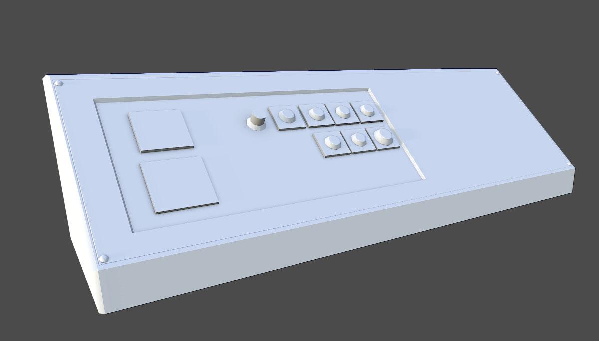
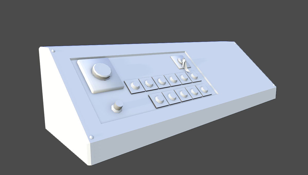
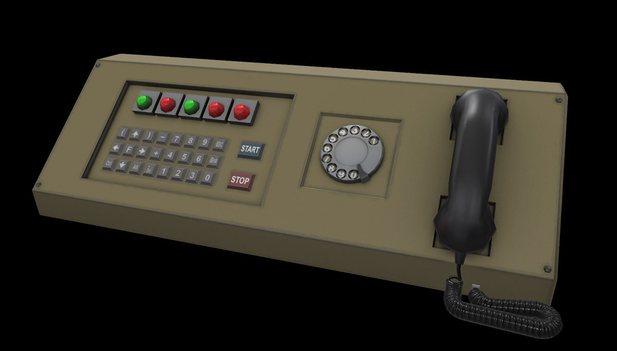
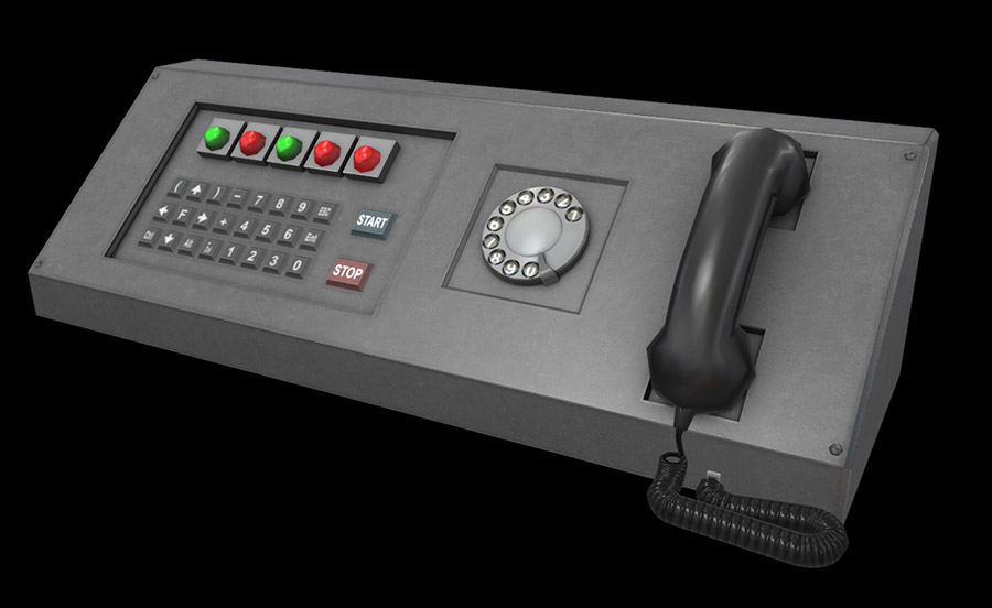
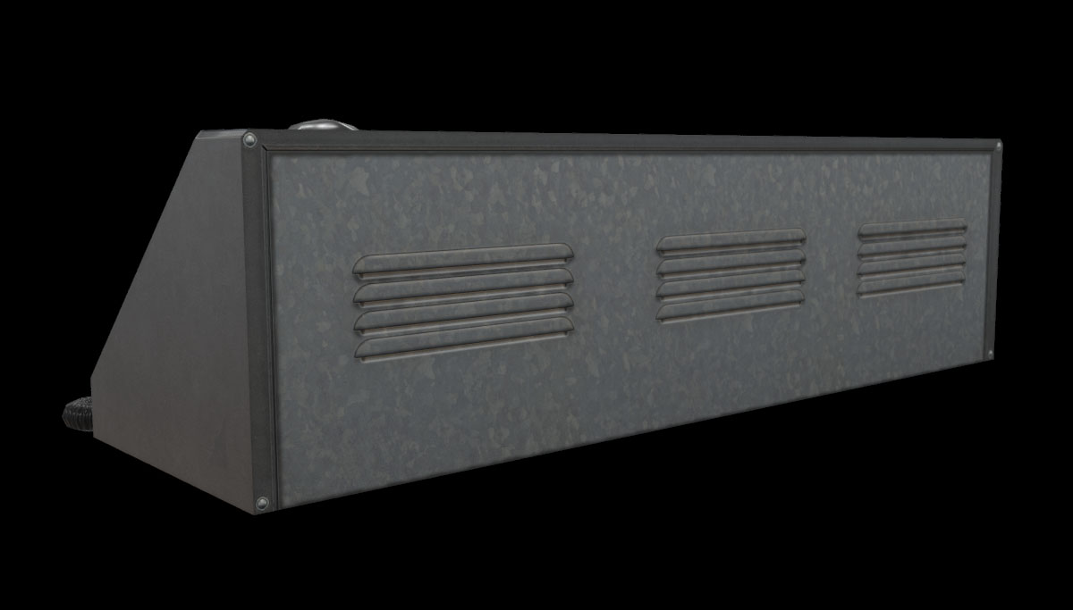
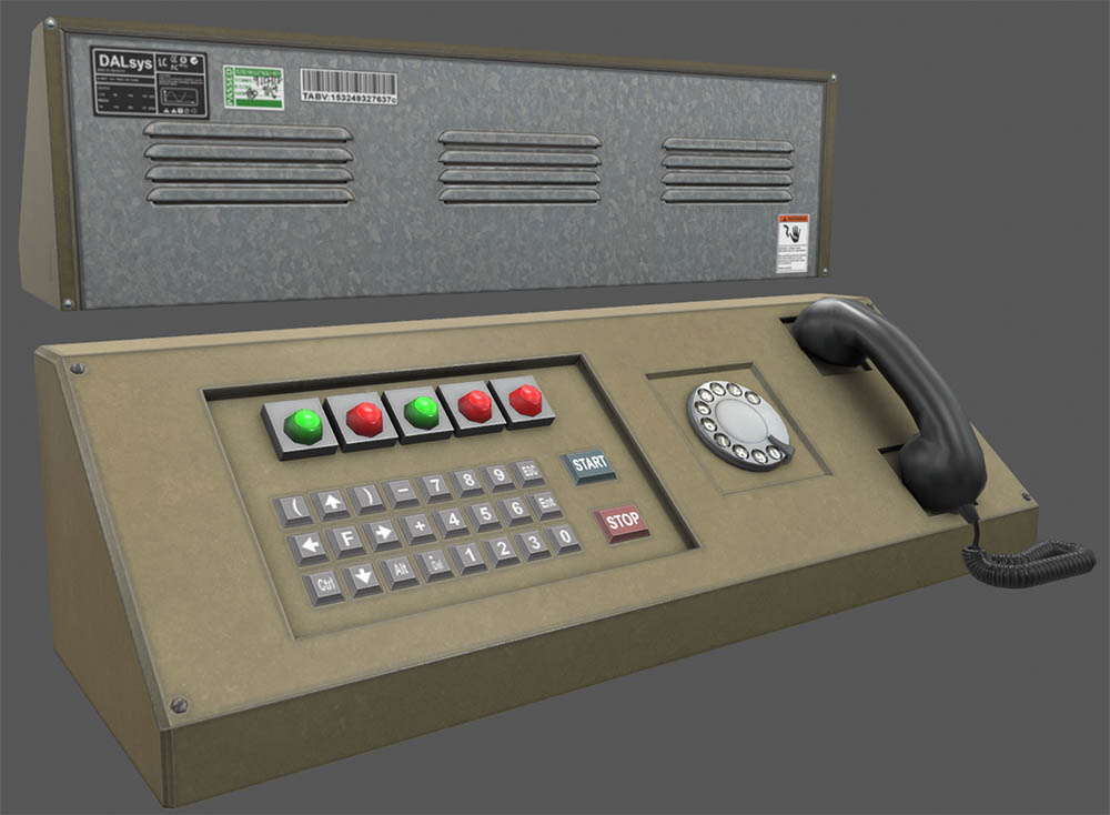
Small update this week. Redoing the desktop consoles and our versions. All are getting detailed, re-UV’d and re-textured (plus making additional skins). Added dial stop on the rotary dial and a phone cord. The 3rd desktop console was changed to have better details keys and button vs the old one used in OAR. Hope you like it.
They look great.
Good!
Awesome job! I’m loving that you have continued the updates despite the crap in the forums.
Every time an update comes out I am more certain that I’ll buy it when it’s done. I’m already 800% certain. 
@ sersoft
Are you prepared for your pending transformation?
Very nice.
From a design/functionality perspective, consider having the “0” button beside the “9” button and shift the “ESC” and “Ent” buttons down.
Ew, suggestions, mods please lock.
Actually I don’t see how that change would help anything. Most keypads have the 0 beneath all keys opposite the 9 anyway.
Model and textures look nice. Are they getting a dust-looking skin for older facility areas?
Each model with the exception of the 3rd one will get 4 textures clean tan/silver and dirty. Dust doesn’t really read well in source because of the crappy rendering of the spec channel. The newer engines really handle spec and gloss well old source not so much. Dusty would read tannish.
As for suggestions this isn’t a suggestions thread. Just saying. I’m not posting for CC or ideas. Just as a kinda blog. I can always stop if the threads reply’s get on my nerves. I have come close several times. Not saying some of the suggestions aren’t good, just that most aren’t.
[COLOR=‘Green’]As Brian’s addressed it, I’m not going to do anything in this instance but please listen to his words, especially those who are on their 100th warning by now.
Understood. That might be worth a quick mention in the OP of future updates for added clarity.
The dirty one is probably identical to what I had in mind. Anyway, keep up the good work, we look forward to the updates because hawtness. 
The reason I did this series is to show that stuff is being worked on. I get all the CC/ suggestions in the private forums. If people want to suggest things then do it in another forum like the general ones (just be aware I won’t be reading it). I thought that was understood that it was just a glimpse into what was going on. Maybe I shouldn’t post current stuff.
Sorry, I just expected anyone showing work willing to hear feedback from those they’re showing it to, but as that’s not the case, no problem at all, no more feedback. Okie dokie, R&U, will henceforth appreciate updates and move on.
I don’t have any problems with people saying are you going to do this or why did you go that direction etc. If you think something looks bad by all means say something…what I really don’t like is the stuff like it would be better if you did X. Like I said I’m not looking for an “at a boy” or the opposite why don’t you to this it would be so much better. I probably shouldn’t say I don’t want cc its just that it gets out of hand and if I don’t change it when people see it later they get pissed. Crypt I don’t mind your feedback at all its the other kind I dont want. If I answer your feedback its all good.
Hey, I do have one bit of feedback, why is there a key pad and a rotary dial? Sort of doesn’t make sense to me, though that is my opinion.
Keypad for whatever functions the console has, dial for phone extensions, perhaps? Seems like cramming the two into one keypad could be potentially dangerous.
Right, right, as said, I get what you’re saying and where you’re coming from.
Also, just want to clarify I’m not personally offended by this, or trying come across as unappreciative of the updates or anything, I just misunderstood. 
Because it is a HL2 prop. It also goes with the analog nature of the facility. It is an old piece of industrial tech.

