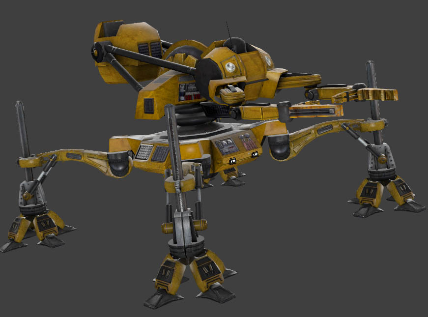
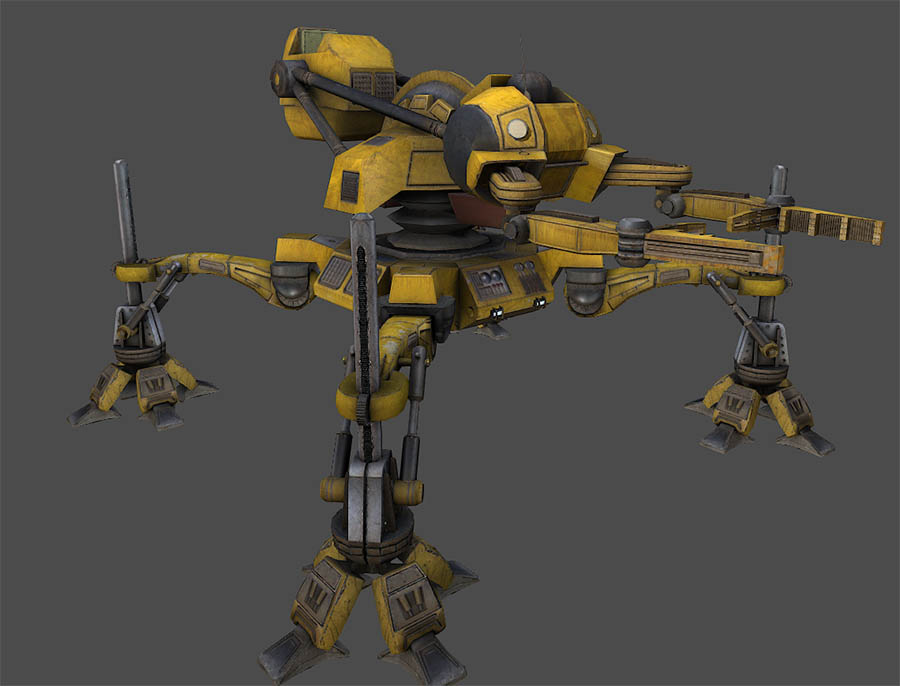
Still learning how to use this program. In the quest to make things more realistic I have been practicing on hard surface things. Wwnt back and corrected a lot of normal map issues and the rebaked the textures. Still not done but you get the basic idea of what is going on. I also went back and added the texture for the lights on the body and I’ve added some sensors too. First shot is model viewer of the old texture…2nd is the one I did tonight.
Very nice!
Looks great so far.
The difference is stunning! I love it.
They’re very nice OP, like bacon.
Wow… and just when I thought the original BM Loader couldn’t look any cooler!
Oh boy…so much epicness!
I want to drive it even more now
Damn, such a shame you only get to see this one in action during the intro. But I am even more impressed because of that. So much work for something you only get a short gimpse of. You guys really wanna make this look really good. Love it!
Since we’re talking about the robo carrier - its walking animation could use some tweaking. If you look closely, the legs that should be still move a bit while it’s walking.
Am I the only one who thinks that the original loader looks better?
Probably.
The original one certainly is more shiny, but those kinds of surfaces really shouldn’t be.
The only reason the other one isn’t shiny is because it’s a render, the newer one will probably shine the same way, unless he uses less phong.
I could be wrong, but they both look like HLMV renders to me, which use more or less the same rendering processes as the engine - phong shading (or lack thereof) included.
Why would they change that? I bet you’re the only one who actually noticed that. You only see this thing once, and it’s such a small issue that fixing it would really just be a waste of precious time.
Actually, I noticed it too. The loader is really cool, so I was watching it like a hawk during that sequence. It certainly has little bearing on most of the game, but in the moment it was a little jarring. I wouldn’t be surprised if they’ve already addressed it.
Much more trivial issues were already resolved on Bug Tracker.
The first pic is hlmv the second is toolbag. They are both using the same texture by Frank the second one is just aged etc in dDo. BTW this is strictly and art blog not discussion of changes you think are needed in animation etc. Please post that in the appropriate suggestion thread.


