NICE JOB 
Nice job, that blends well with that area better.
Those grey ones are in Questionable ethics. Are they staying in that part?
They are just the regular generic consoles that will stay all over.
Your work looks fab!
Feedback to the designer/modeller:
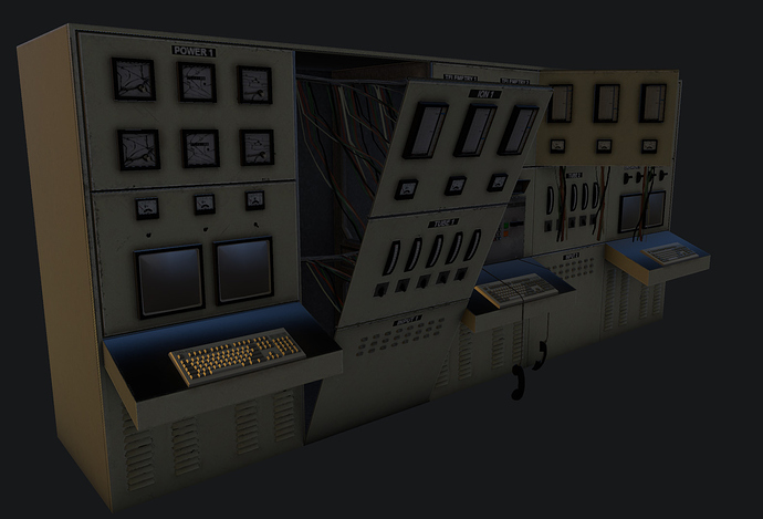
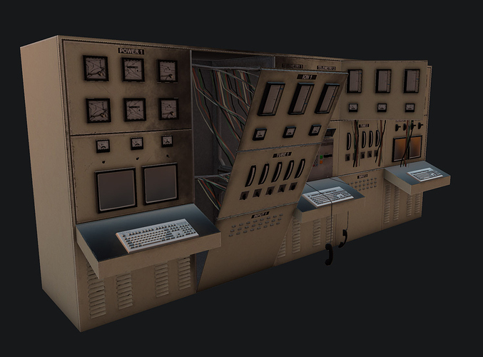
Upper switches/gauges should be lowered by one module/section, so they are in easier reach/view for the scientists.
the scale for that particular model is unknown, so for all we know, the scientists could reach it
Assuming he followed the same proportions as the original, they’re fine.
my thoughts exactly
Looks great, with perhaps one tiny issue: it is all too apparent that the gages etc. are duplicated. It would be better if the values shown by the different gages could differ. If it’s animated, then please disregard this comment.
Looking awesome. 
Do you honestly think you would notice that in-game? Bear in mind this is an incidental prop, not something you will interact with or spend any length of time near.
Of course you notice it while it’s in picture form and supposed to be the center of focus. You can find lots of stuff like that if you look for it. In-game no one’s gonna stop to stare at it and notice that stuff.
except dadster (i think it was? the annoying dude at the the uncut project threads)
i remember textfamguy losing it and going off on him if i’m correct
What is the point of a GENERIC console that can be used anywhere if it has specific labels? Most of the above is from UV sharing, its only split to help the AO or to break up the looks so all the dials or switches aren’t repeated all over. Also do you know how big a texture has to be to have readable dials etc? That one there is 2048 (working copy). That is impractical for in game when it will have 3-6 different skins. Do you know how animated textures work in source? Each frame is the full resolution of the texture plus any alpha channel stuff. So to animate that texture at full rez would be like a 50 meg file for 3 number changes. All my animated textures are small so the size isn’t crazy see the wall screens in AM/UC. Scrolling textures work different. The original texture was only 512. This will be 1024 when finished. Anyway…
Finished up the ion console for UC. The wires were finally finished and added.
Then smoke/burn effects added.
Niiiice.
COOOOL.
Those look great.
You’re correct.
Nice work. Any chance we will be able to play the steam release this year?
Well if you have read any of the other threads you should know that I am only going to answer on topic questions ie model/texture related questions about the particular thread. Go off again and I’ll just lock and not post for awhile. Or just stop all together.
do you guys go through a concept art phase for these model revisions or do you just wing it?
Man these models are getting better and better. I really, really can’t wait to see it all ingame.


