AdmiralSakai and the Quest For Good Interior Lighting

I’ve spent a lot of time looking at and working with interior lighting for BMPD, and I thought I’d share both some of the tips and techniques I’ve discovered, and some of the issues and limitations I’m currently struggling with, in one big post that’s part dev journal, part tutorial, part bug report and part feature request. Hopefully other people working on indoor maps will find this useful, and the BM devs can also get the full context on a few issues I’ve been posting about in a less organized manner for a while now. This post assumes some basic fluency with the fundamentals of Source engine lighting- if terms like “light_spot” versus “point light” and “constant falloff” versus “quadratic falloff” aren’t familiar, I’d suggest the Valve Developer Wiki’s Intermediate Lighting page and the pages linked from it.

The Basic Issue With Interiors In Source[/size]

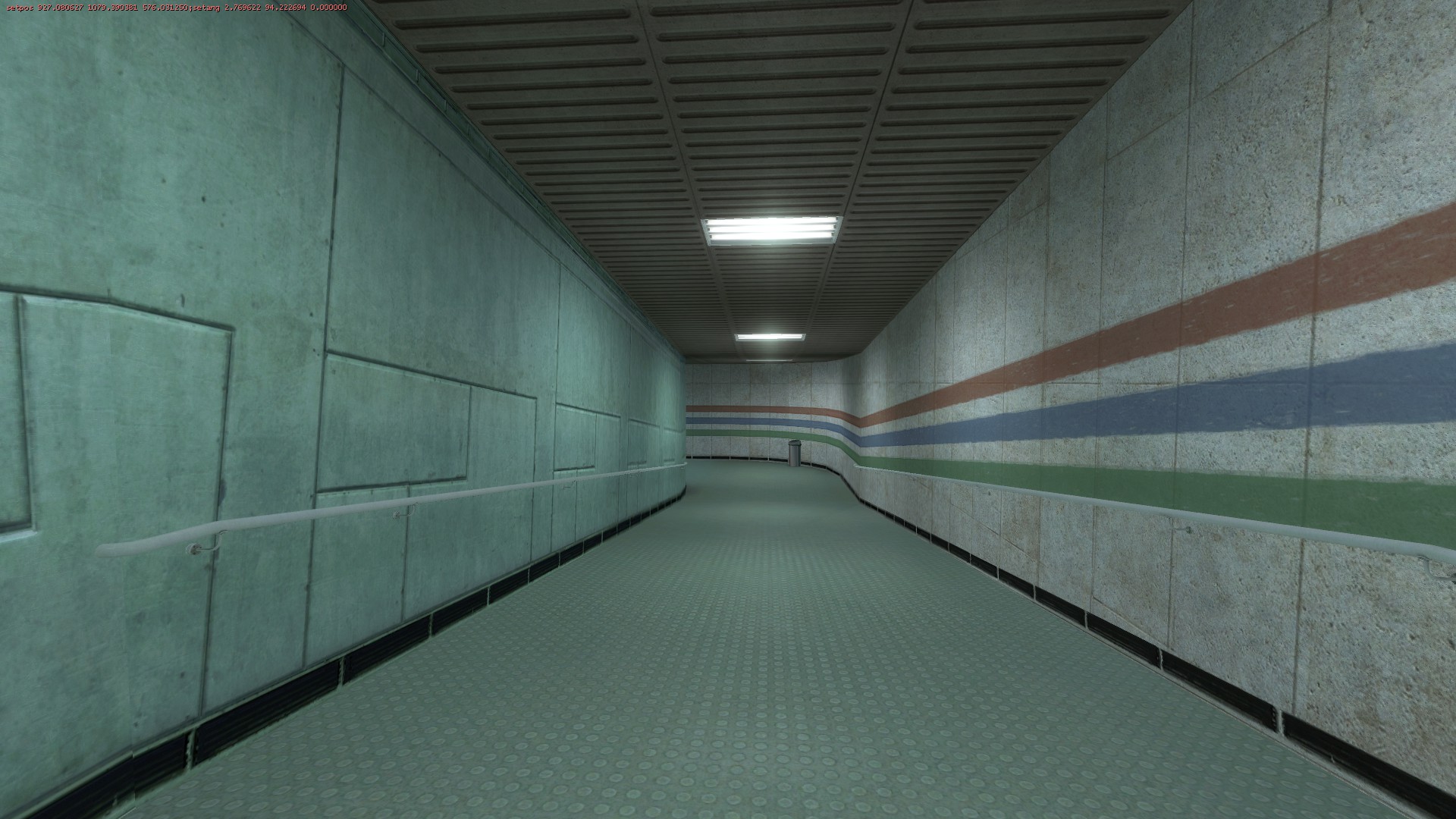
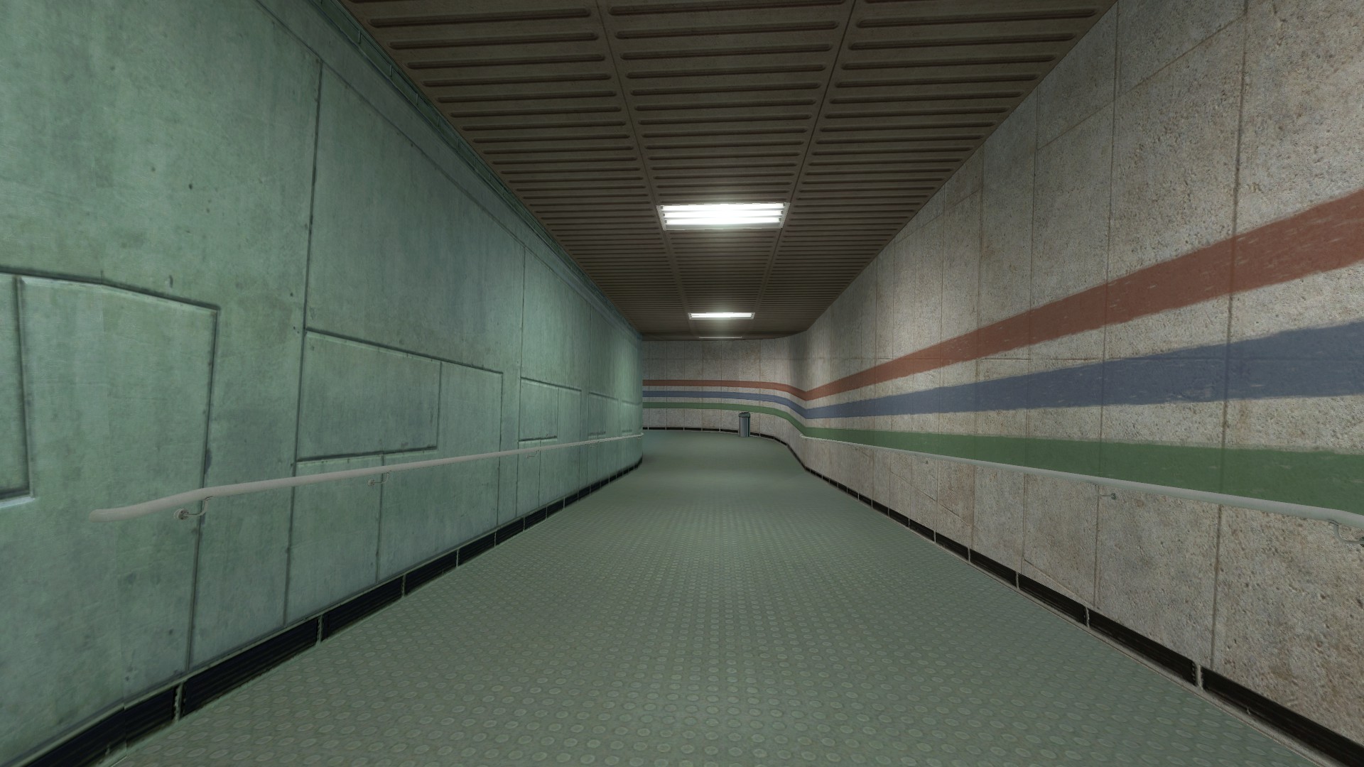
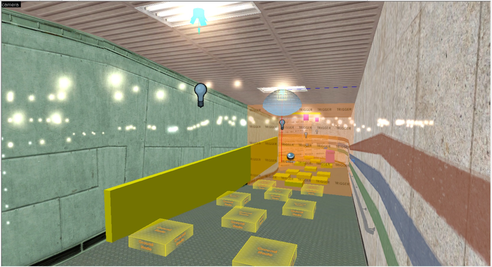
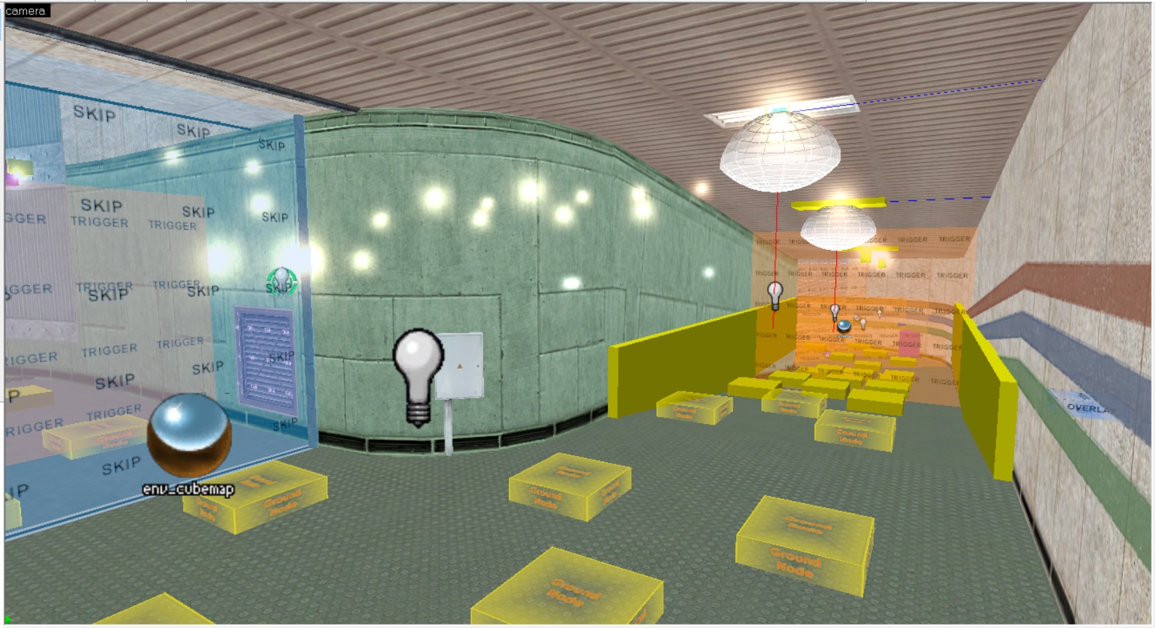
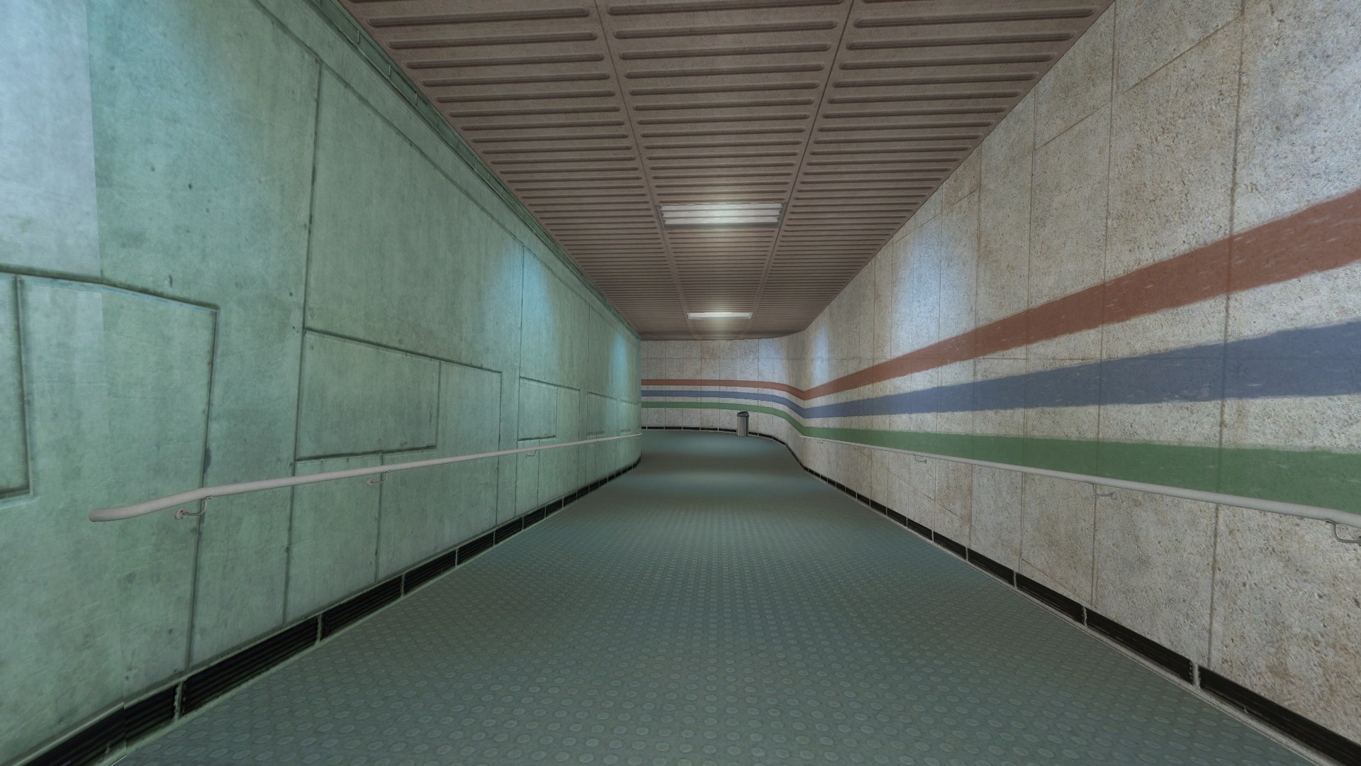
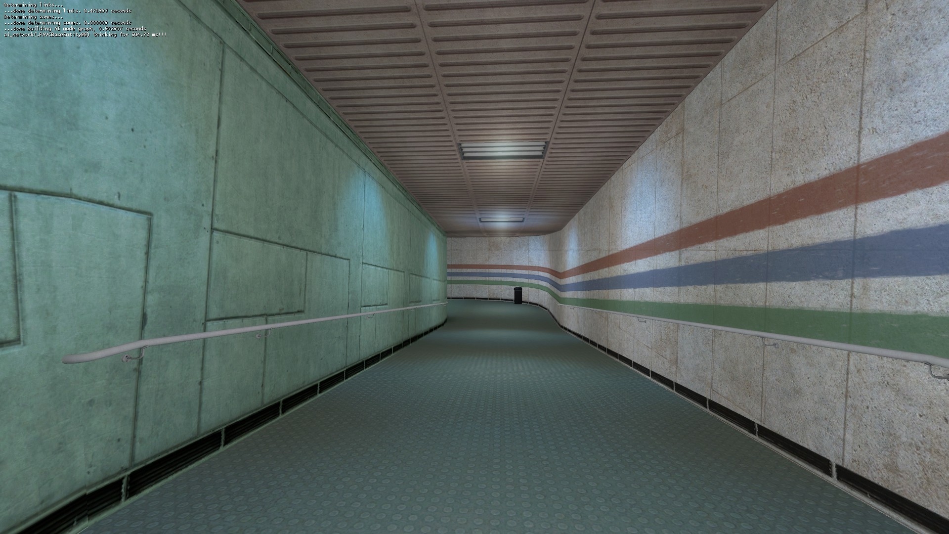
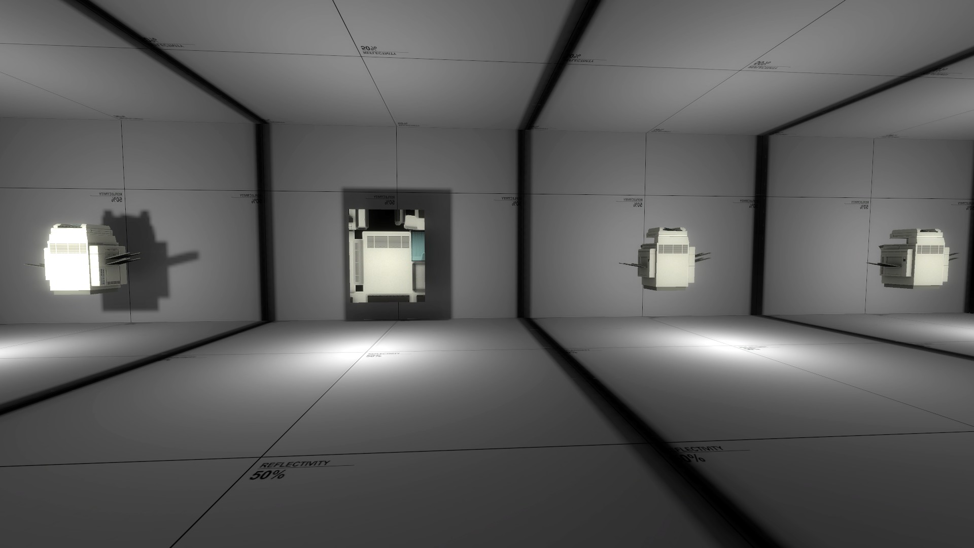
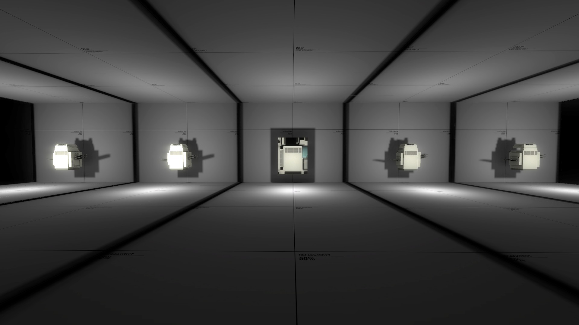
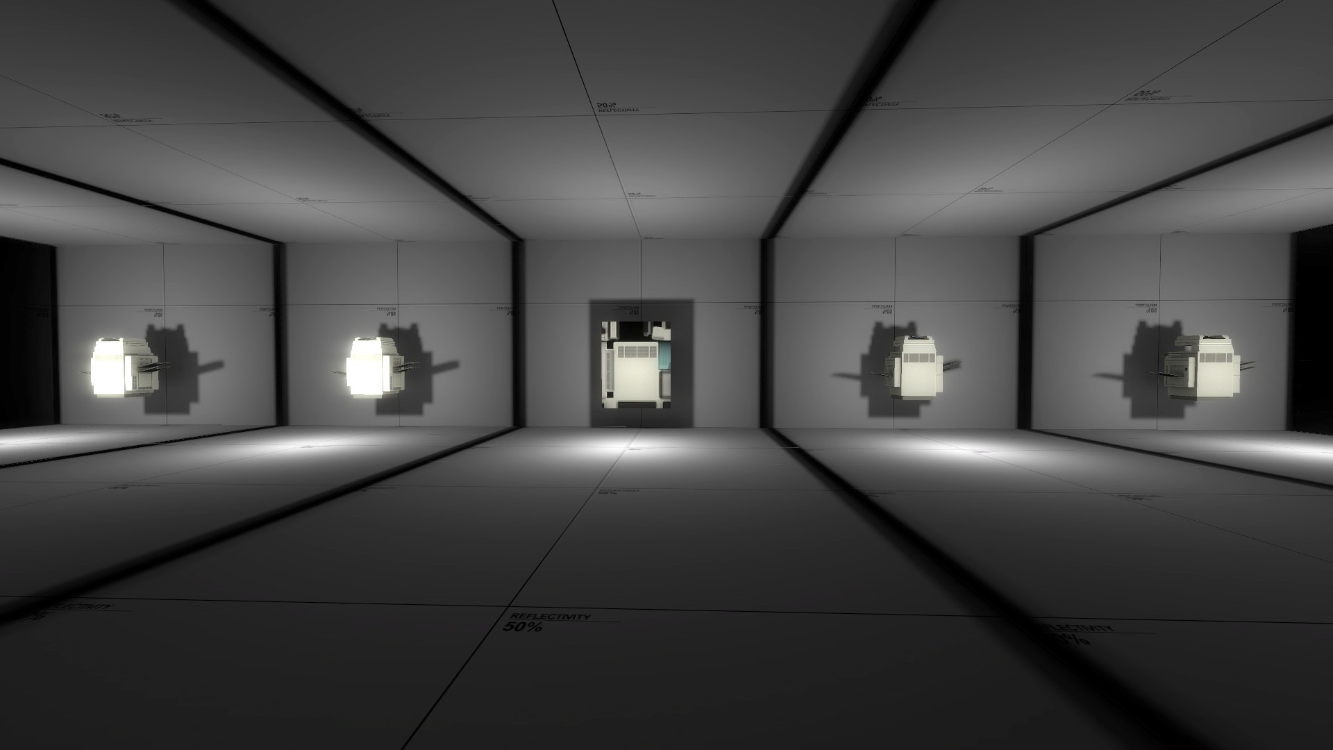
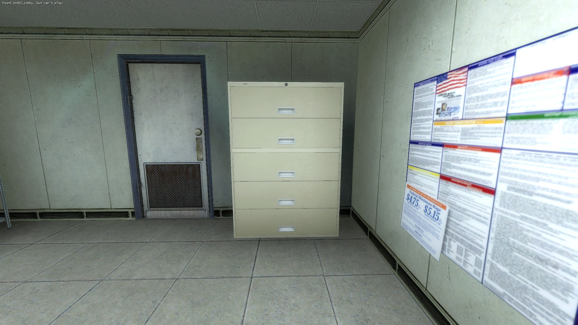
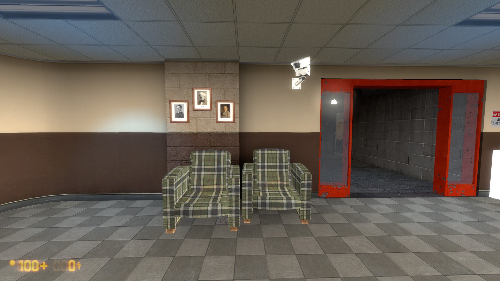
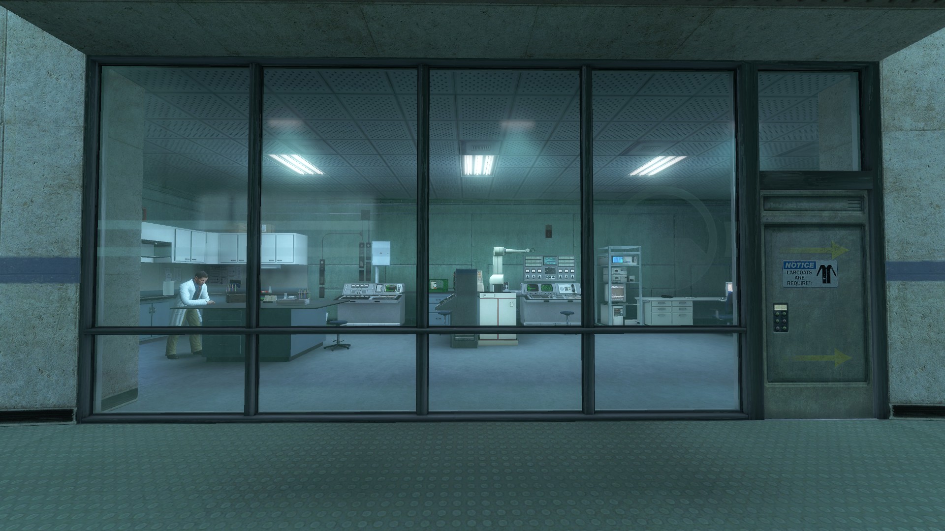
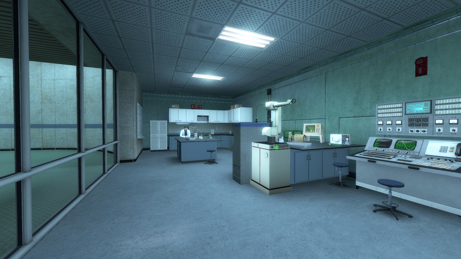
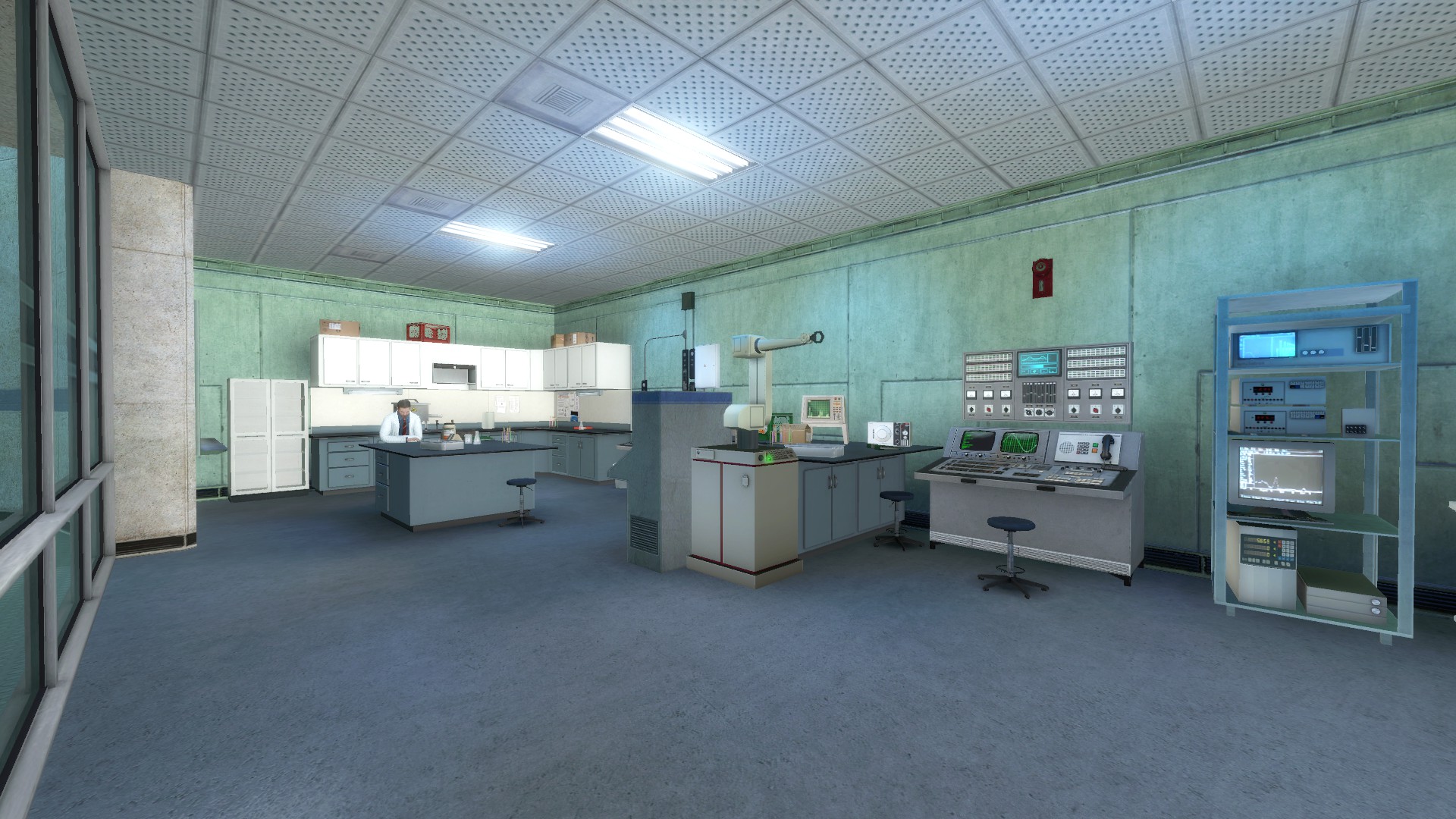
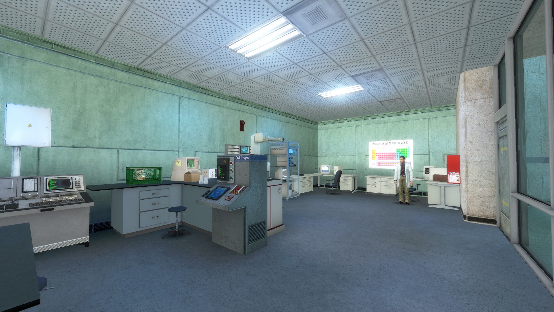
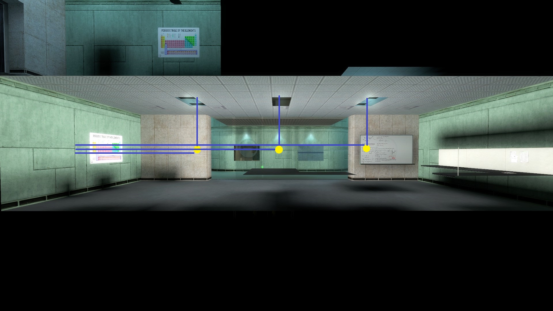
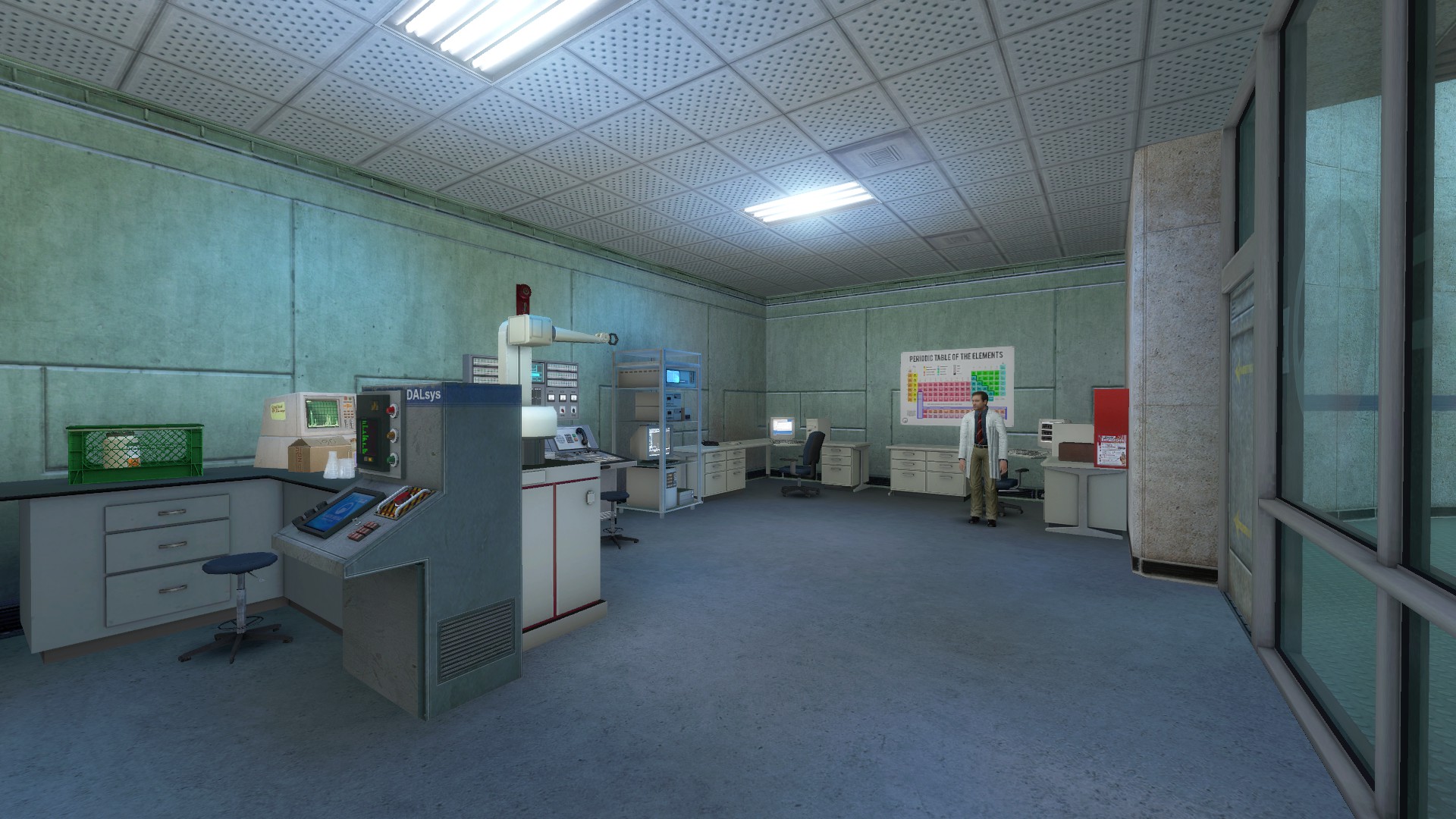
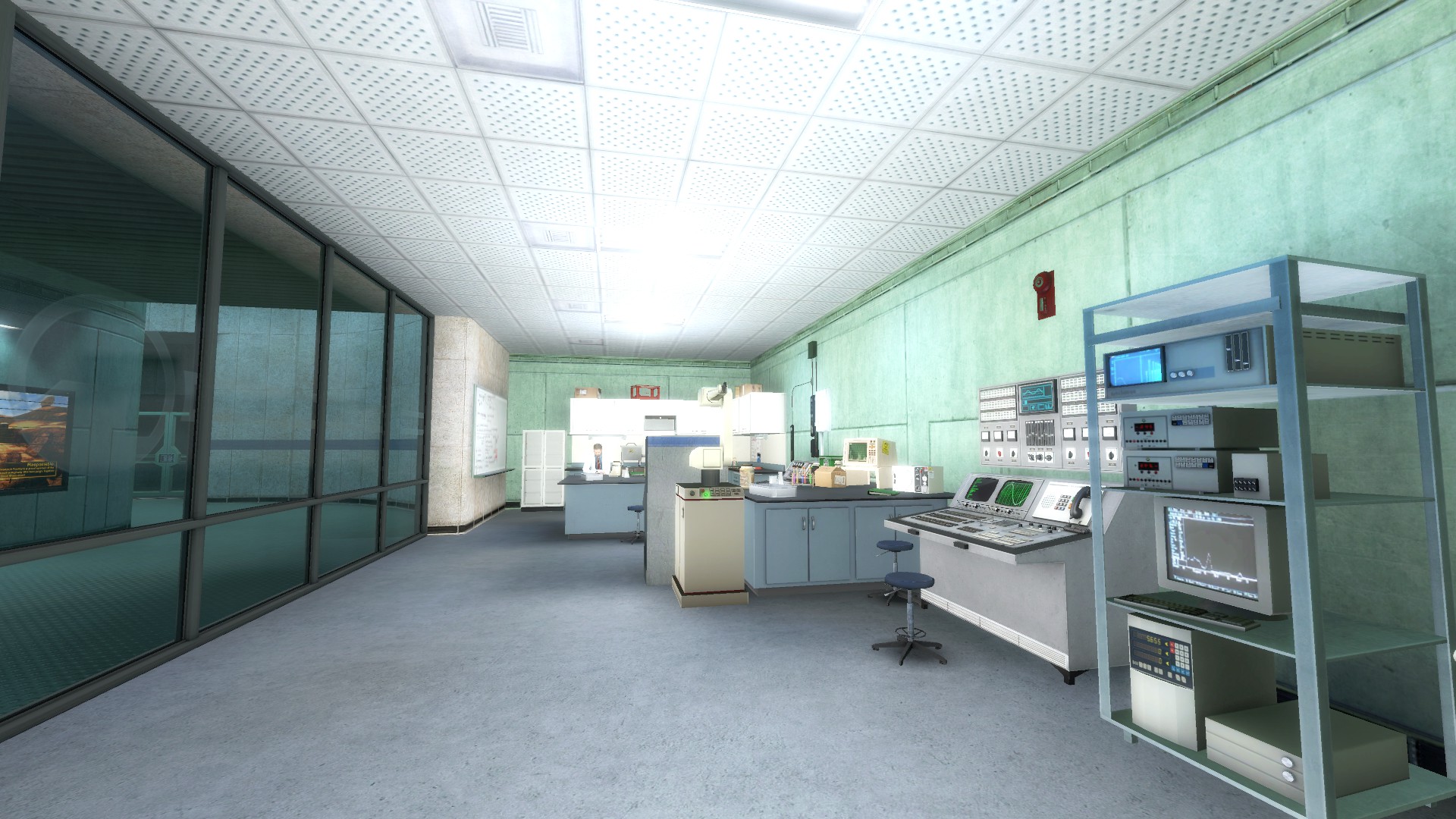
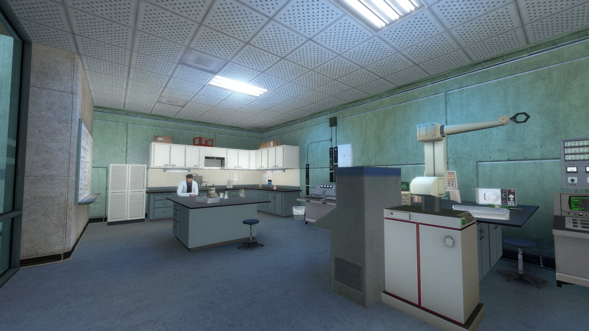
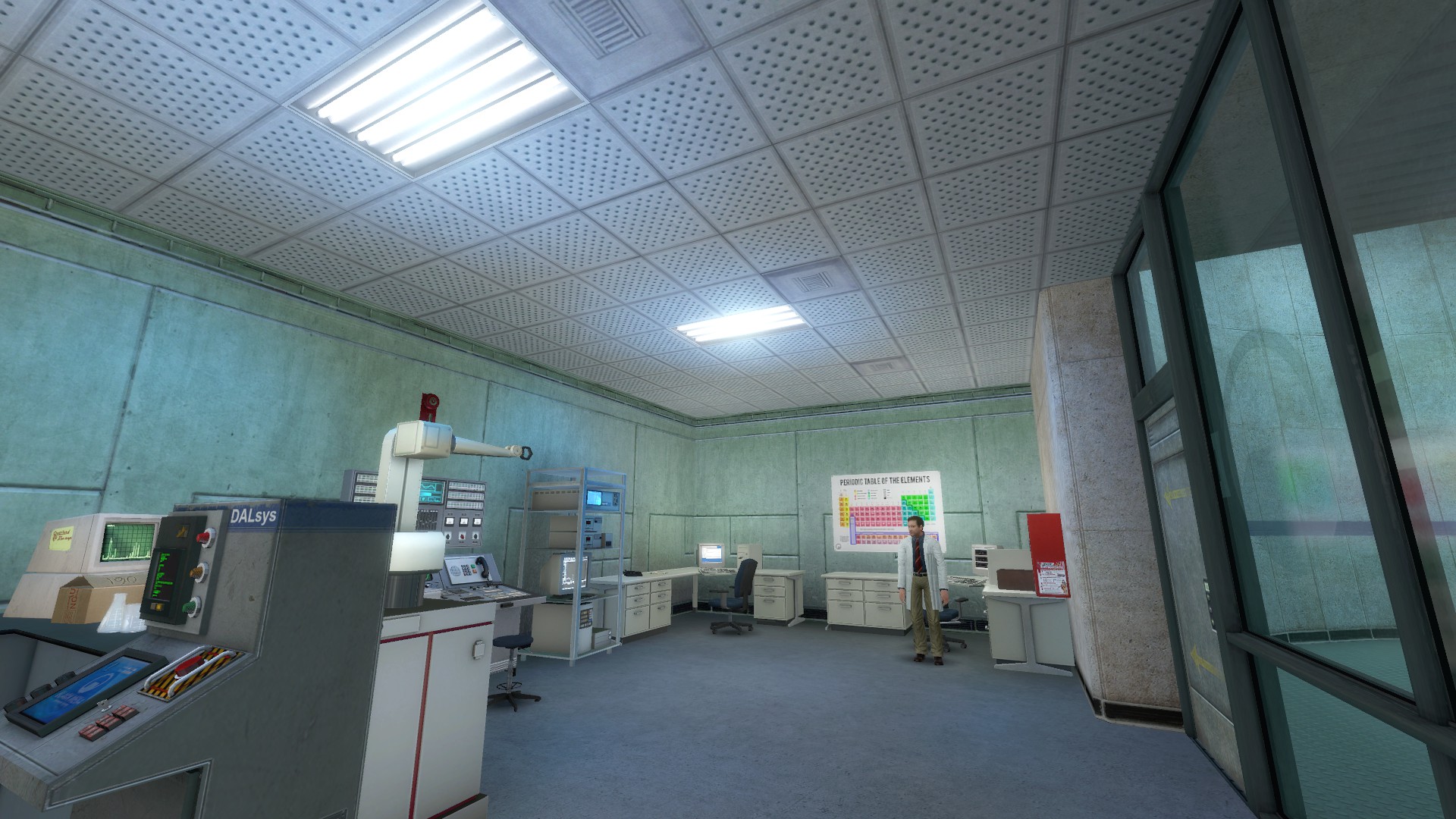
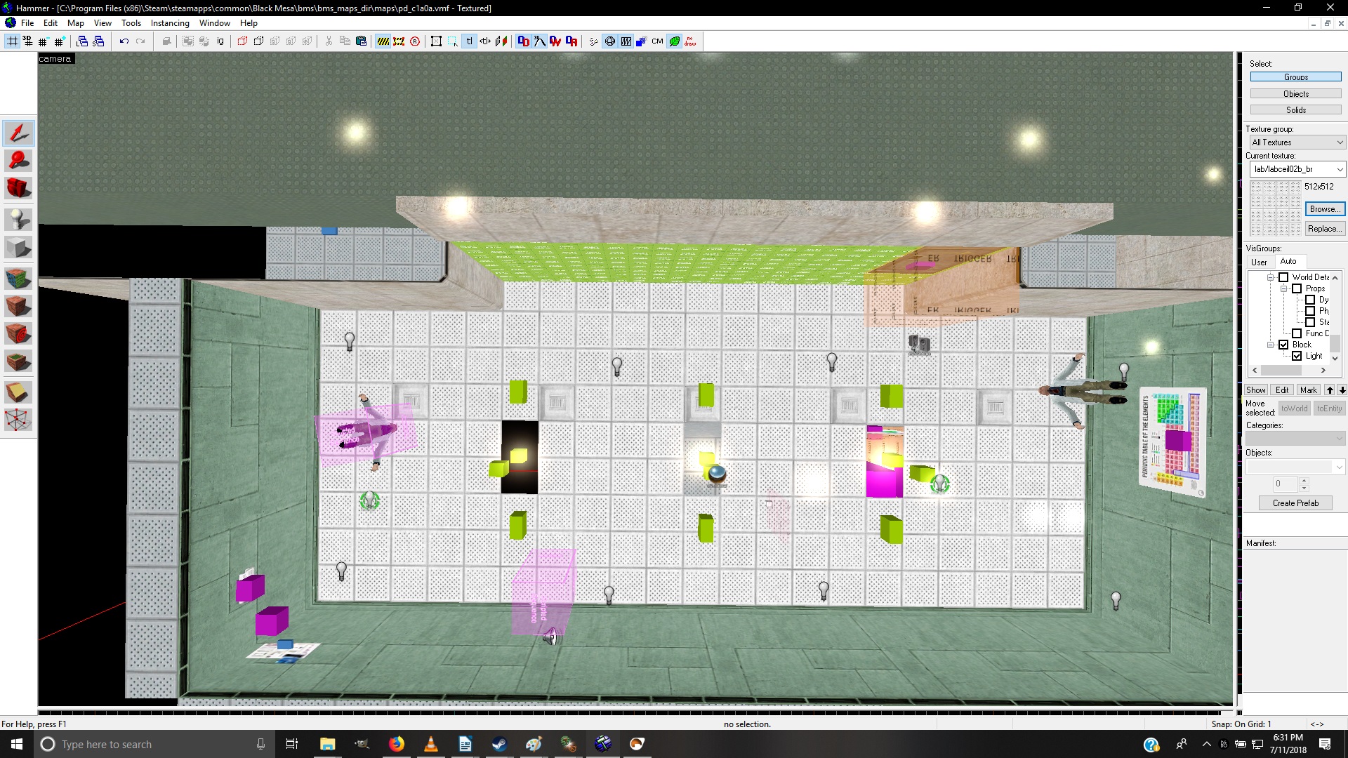
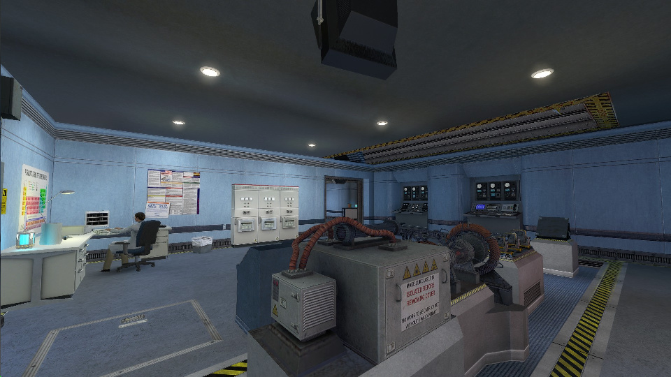
I’ll be using Anomalous Materials’ first map as an example throughout this discussion, specifically this little corridor- explanations of why I chose here and not somewhere else will trickle in as the thread progresses.

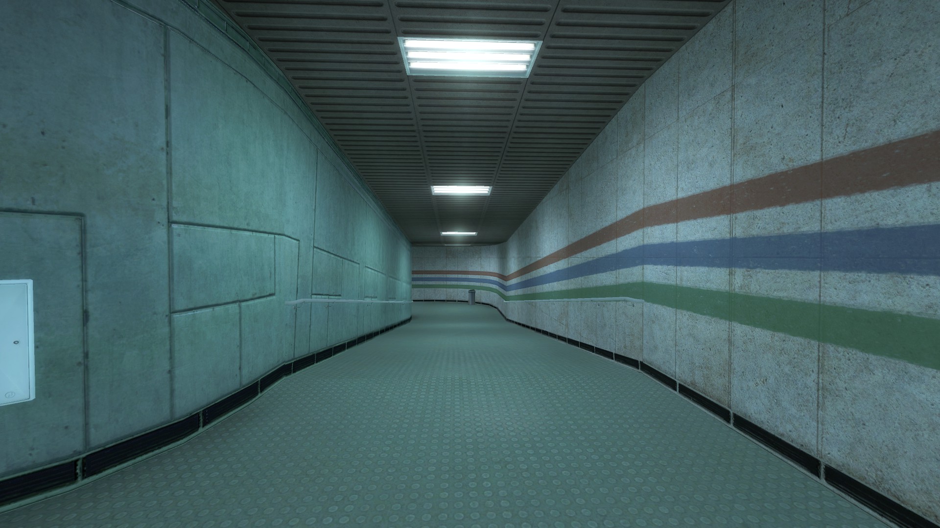
For now, though, it’s pretty much sufficient to say that it’s pretty typical of what I’d expect from a generic modern ‘interior’ area that isn’t some giant hangar or factory bay or something- a regularly-trafficked area about 120-160 Hammer units tall, much wider or longer or both (i.e. it’s a corridor or a room with significant floorspace), and lit by regularly-spaced fluorescent lights in the ceiling. Interiors like this typically have drop/tile ceilings while this has those tan panels, but it doesn’t really matter. Interior areas also tend to have a lot of props and NPCs in them, many of which (desks, tables, control panels, trashcans, benches, cubicle dividers, railings, shelving) reach up to about halfway to the ceiling plus or minus 20 or 30 units- this one does not, and we will see why somewhat later on.

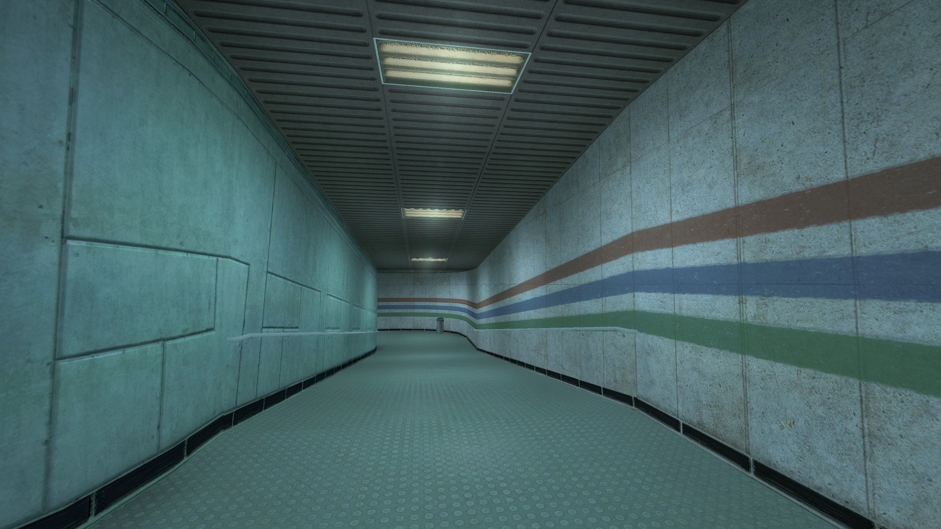
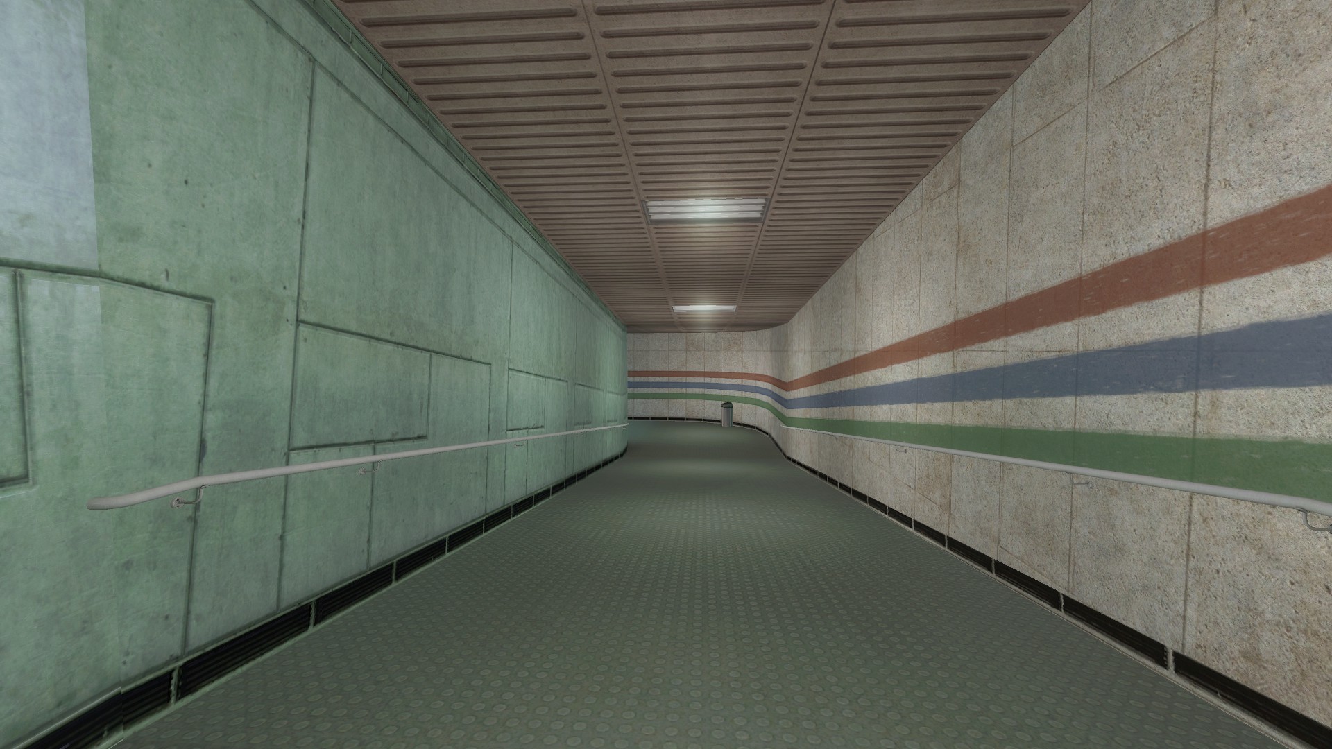
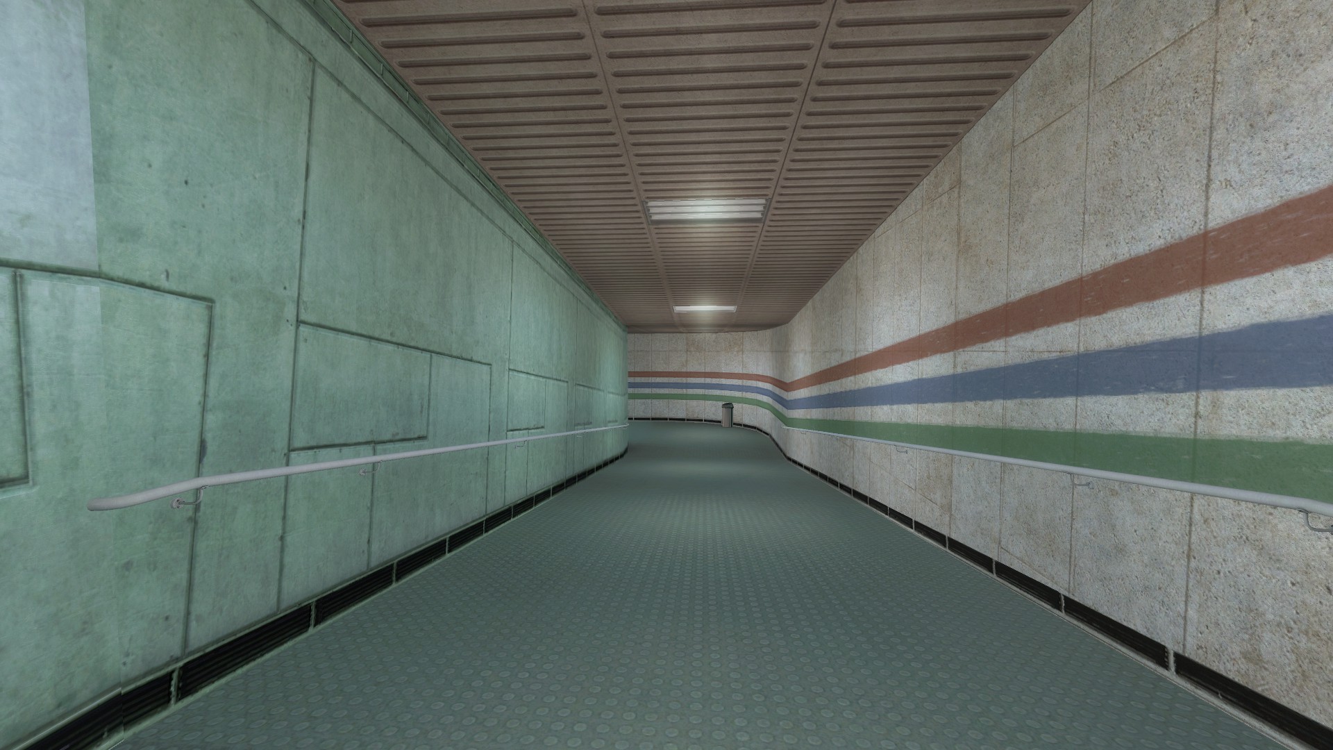
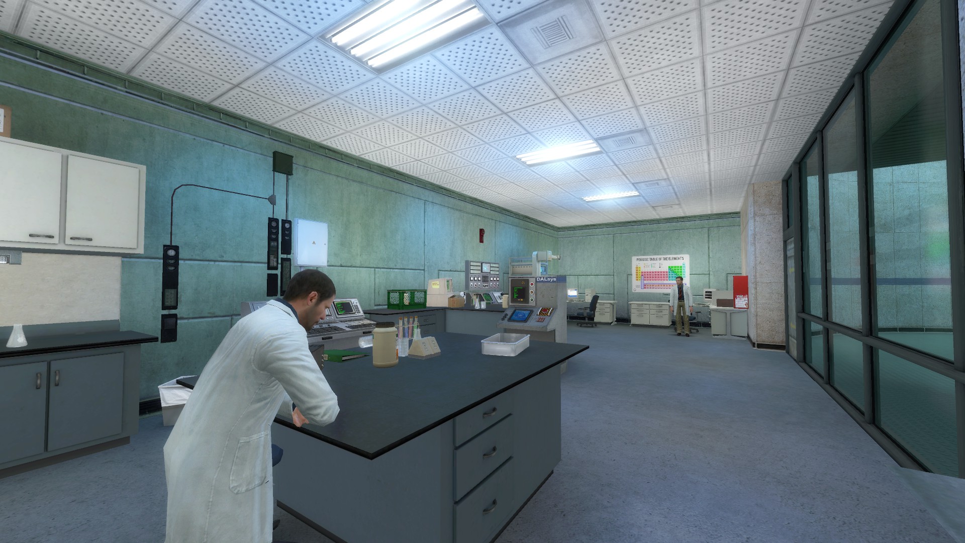
In comparison, I will be looking at a section of hallway outside the lab where I work (in the Glennan Engineering Building at Case University in Cleveland):


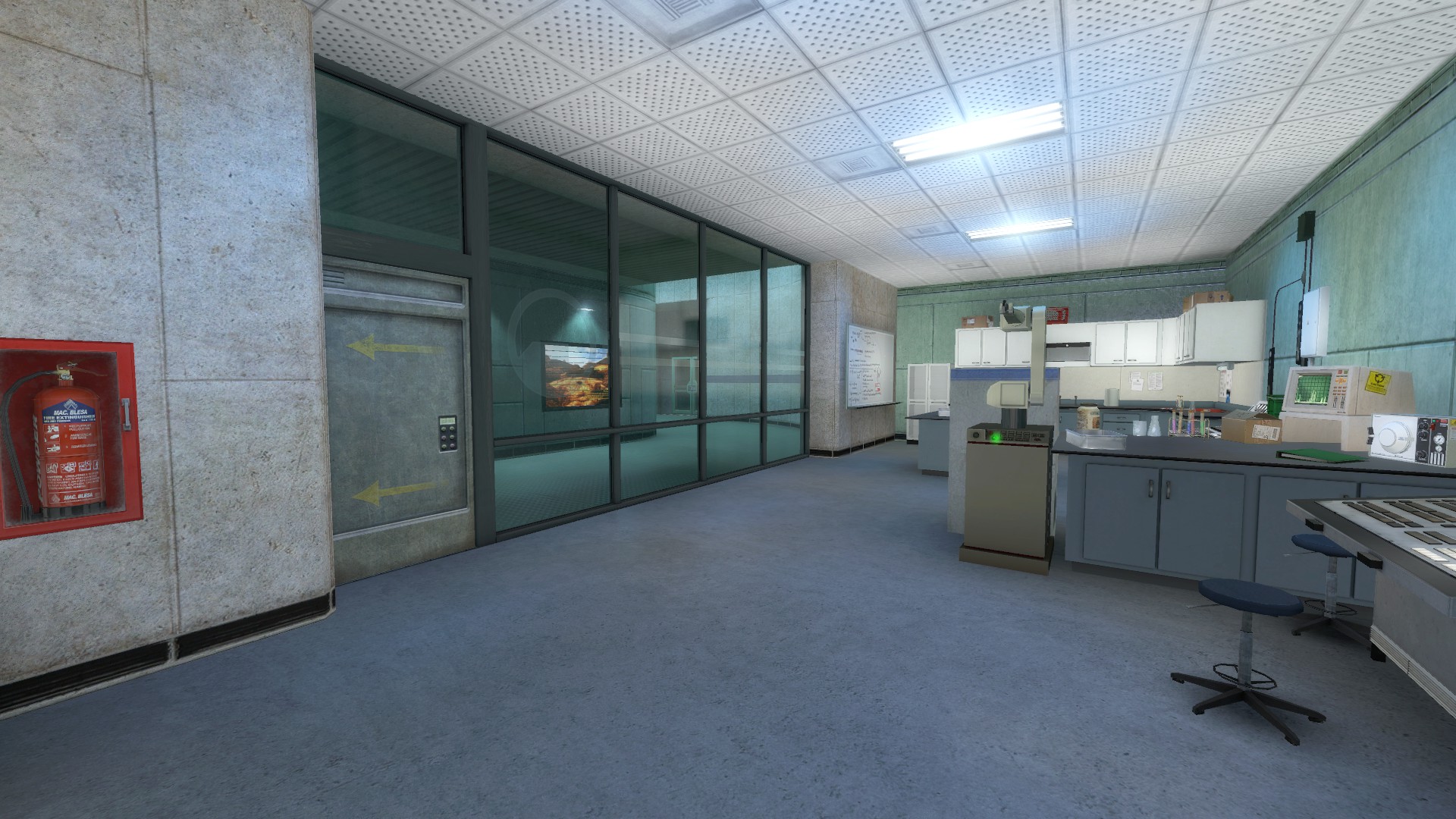
I’ve also included a shot of a random interior classroom in the same building as comparison for if/when I look at a room that’s not a corridor.

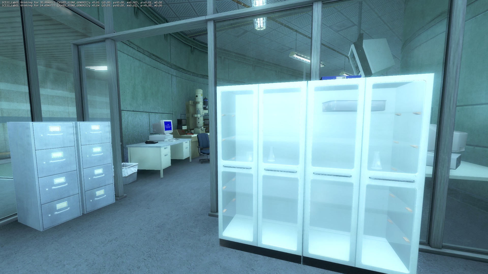
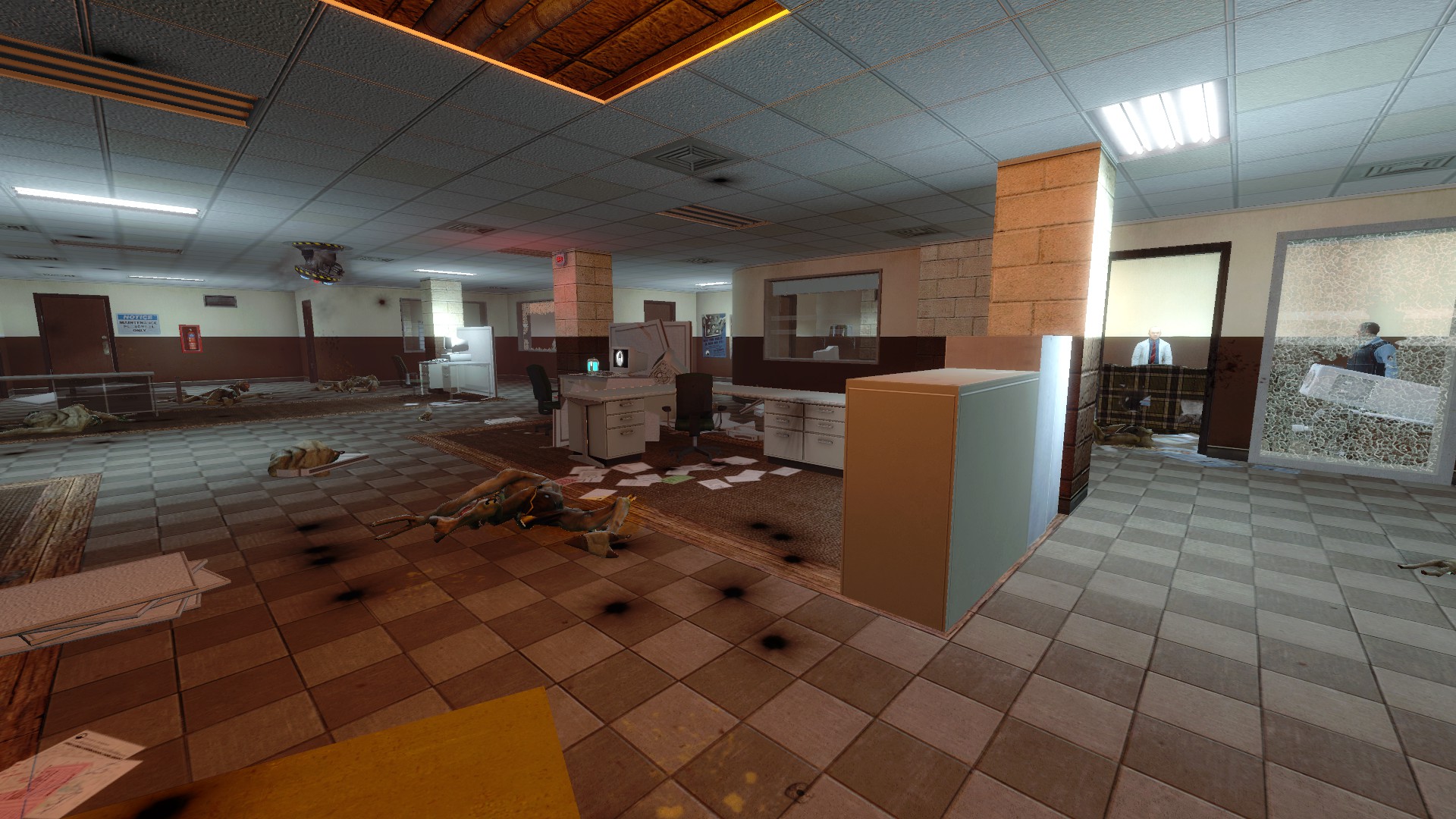
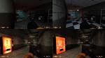
Reality and Black Mesa differ in two main ways. The first is that in Glennan, and in every single other facility like it I have ever seen, the fluorescent lights have covers over them, while in Black Mesa they are bare. There actually are such things in the Black Mesa asset library, but they are never used in game because they don’t quite work:

I’ve messed around with the refraction shaders these bad boys use in previous experiments and could probably make them work properly if for some reason other modders want them, but I’m pretty big on the idea of keeping at least some aesthetic continuity with the original BM maps in fan-created content and so since covers never appear in Black Mesa I don’t intend to use them and as a result don’t intend to put in the time.

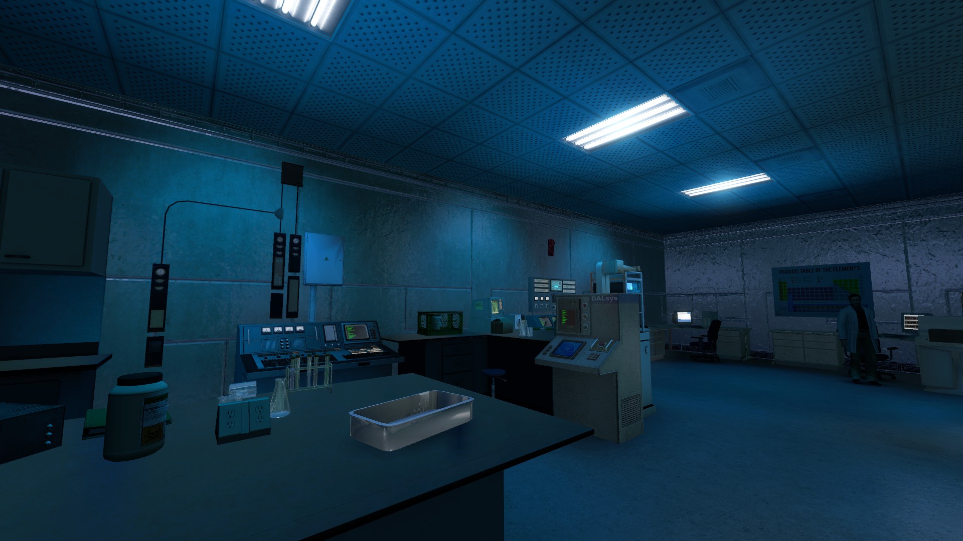
The second issue is the big one- while both of these areas are underground, sterile, and institutional, the real photos look like a reasonably OK place to work while the Black Mesa version just looks too dreary and dismal to spend any amount of time in.

That’s not a big deal in the vast majority of Black Mesa maps which are post-resonance-cascade, where everything is falling apart and operating in low-power mode, but it’s of great interest to me in making my pre-disaster maps and would also be of interest to:

  • Modders looking to re-create areas that are at least partially pre-disaster for other reasons- updates of HL1 content like Blue Shift and Decay that had pre-disaster components, original maps, etc.
  • Modders using Black Mesa as a base for maps not set in the BMRF- i.e. stuff like a new version of the original Counter-Strike.
  • People looking to re-create ‘Black Mesa’ and other indoor areas in Garry’s Mod and other Source games- there does not seem to be a good understanding of how to do this in general through the community, resulting in maps like this (from Hunt Down the Freeman, which has other problems with it, but does this look like an actual hospital?):
    Just in general I feel like that very sterile, institutional, late-80s feel of the Black Mesa facility was a big part of the underlying atmosphere of the original Half-Life, and I’d like to be able to re-create it in modern maps. The problem is, this is actually quite difficult.

Color and Accents [/size]
Getting Rid Of The Murky Look[/size]
Looking at our corridor in Hammer, we see that all of the lights actually have the color 145 185 210- which looks about like this: ██ You can make those lights as bright as you want, but all they are going to do is make the corridor more and more blue-green, doing nothing for the aforementioned ‘underwater’ look. Turning the saturation down to a greyer 162 182 193 does wonders, and going all the way to a completely desaturated 175 175 175 is even better as far as actual livability is concerned.


In fact, if we go all the way to 255 255 255 (pure white as opposed to neutral gray) we see that the lights here are actually kind of overly bright (especially the light_spots coming down from the ceiling) and I wound up taking the spots’ brightness value down from 625 to 100 and increasing the point lights below them from 40 to 80, then moving them down slightly so they were more in the middle of the hall.

Essentially, we have gone from this


to this

This looks very good on the ‘livability’ scale, but in terms of gameplay it’s pretty awful- white doesn’t give you much opportunity for different shades or variations so every single map would look basically the same, and just overall it looks extremely bland and almost unfinished, like I didn’t add any lighting at all and just set everything to fullbright.

Enter Accent Lights[/size]
Really, in an indoor area like this what I am ultimately trying to do is balance two competing trends. The first is the one from reality- in both of the screenshots above, there is some obvious illumination coming directly from the lights, but otherwise the rest of the hallway and the conference room is pretty much evenly bright, with even the corners of the room far away from the lights being plenty bright enough to read in. The second is from the game- very evenly-lit rooms look ‘fullbright’ and unfinished. Fortunately, the human eye is a lot better at recognizing changes in color than in brightness, so I have a whole other channel of information to work with. Thus, I kind of hit on the idea of very evenly lighting an area in white (but making sure no areas are especially bright) and then adding another ‘layer’ of accent lights overtop, which only reach to near the actual light sources.

We start just by making this area almost evenly lit in a low-saturation color (I’m using just white), not really bright but not dim either. This is accomplished in this case by making the point lights have a constant term of 1250, a quadratic term of 0.015 (partially so that they leave that slightly darker area away from the lights, and partly to avoid a problem we will discuss much later from manifesting too obviously and ruining pretty much everything in this area), and a brightness of 95; then removing the light_spots by setting them to 0:


Tune to taste. We’ll discuss the details of this sort of ambient lighting somewhat later on, as well as the problem that caused me to deliberately make the actual fluorescent light props come out so dark (it’s a long story, and we’ll get to it in time).

Then, we add another set of light_spots with a more saturated version of the original color (26 169 255), a constant attenuation of 10000, a quadratic attenuation of 1, and a brightness of 100, but they’re barely visible. Comparing the two screenshots they can in fact be detected, but a player entering this area would just say it was lit in white.


We could make the accent lights brighter and they show up just fine, but not only does this cause NPCs and props more directly under them to glow, but it turned the entire floor (and props below about the halfway height of the corridor) very bright blue while not really affecting the walls. Furthermore, all that blue light reflects, and as a result that underwater look is creeping back into the map.

This is at least partially because, seemingly much more than regular point lights, the brightness of a light_spot on a surface is highly affected by the angle of the surface with respect to the light- the more oblique the surface, the less it will be lit. This makes it difficult for a light_spot pointing generally downward to light up the walls of a room.

(TBC)

To remedy this, I typically set up an arrangement like so:


Three or four narrow spotlights, some of which face straight down and some of which tilt out to illuminate the walls, together combine to trace out a sort of oval shape.

These guys, for instance, have brightness 100.


For the curved sections, I used an arrangement more like this, where there is still only one wide spotlight but it is pointed at the wall in question:


Just in general, these are set up in a manner heavily contingent on the setup of the room you are trying to light. If the light source is more than about 150-200 units away from the walls, it’s probably not worth it to try and accent-light them. There is no need to include sideways-facing lights if there’s no wall there to illuminate.

Advanced Accent And Ambient Lighting[/size]
IRL, fluorescent lights only really shine ‘down’ because they are recessed into the ceiling, but sometimes game designers add a ‘glow’ around them like they were incandescent bulbs or something else that stuck outward:


If you want to replicate this using accent lighting, it’s typically better to have a light_spot facing upward than to use a point light- the accent is more concentrated and there is less ‘splash’ in areas you don’t want.

A common phenomenon when doing this is that it makes the ceiling very bright. A workaround is to split the desaturated ambient lighting into a dimmer series of point lights, and also a series of light_spots with 90-degree angles that will make the walls and floors a little brighter but not light the ceiling.

In terms of color, it’s typically best to give the accent lights a saturation of 240 and a luminosity of ~120- the idea is to make at least one of the R G B components just reach zero and go no further, producing a light that’s “all color and no white”. Then, the intensity can be altered just by changing the brightness. But this isn’t a hard-and-fast rule.

In terms of hue, I typically just try to match the hue of the map’s original lighting. Just in general flourescent lights work best in yellow, cyan, blue, or a sort of purplish pink, but I suppose you could do red or green too if you wanted.

I’ve been talking about the ambient base lights as white, but there’s no real reason they have to be. However, adding a slight tint to them works in kind of a counter-intuitive way. Players’ eyes will quickly adjust to the ambient tint since it affects every surface, and it won’t really be directly perceived, but it will either contrast or mix with the accent lighting (the thing that more directly assigns ‘color’ to the scene). Thus, making the ambient light in the corridor up above cyan will actually make the cyan accent lighting less obvious, while making it magenta will make it more obvious (within certain limits, after about 20 ticks on the RGB scale the ambient color starts to assert itself directly).

So, to summarize:

Technique- Ambient And Accent Lighting: Instead of lighting the entire map in one solid color, include very desaturated ambient lights that cover most of it, and very targeted lights in certain areas that are much more saturated.

  • Good ambient lighting is typically almost fullbright or completely constant, but fades out a little away from the actual light source. Tune to taste.
  • Ambient lighting needn’t be pure white, but making it the same color as the accent lighting will probably deemphasize the accents, while making it a contrasting color will emphasize them.
  • Instead of trying to cover the walls and floor with one big light_spot, use multiple small ones that are angled towards the walls they need to light, although if there’s only one broad wall (typically curved, but not always) it may be better to angle a single wide light_spot towards it.
  • Good accent lights are typically very rich colors, with 240 saturation and ~120 luminosity. This allows their impact on the world to be controlled through brightness, but fine-tune to taste.
  • Similarly, it’s better to use a light_spot facing towards the light source prop as opposed to a point light in order to generate a ‘glow’ around outward-facing lights. If this makes the ceiling too bright, consider splitting the ambient light into point lights (that illuminate the ceiling and everything else) and downward-facing light_spots (that just illuminate everything else).

How do these techniques adapt to outdoor lighting? Granted, these are for interiors, but I’d imagine some similar lighting weirdness can happen in outdoors areas as well.

A lot of this was actually informed by the way outdoor areas are typically lit- a light_env that provides ambient illumination over the whole map/area, with contrasting accent lights around actual light sources. An example of a more direct application of this to an outdoor map might be a road lit by streetlights at night- ambient lights covering the whole area of the road (probably pretty dim ones, and probably relatively narrow light_spots so as not to light up the whole countryside as well), with other, even narrower light_spot accents illuminating/tinting the area directly underneath the streetlights.

Lighting Bugs[/size]
The Static Prop Bug[/size]
Static props light much brighter than brushes or most other elements- this dates back to around the time of the CSM update, I think, but I’m not really sure when it started appearing exactly.

I have here a bunch of identical ‘corridors’ separated by block_lights. Each has a quadratic brightness 50 light in the same place, and from left to right a prop_static printer, a brush with the printer texture, a prop_dynamic, and a prop_physics_override. In-game, note how the static one is much brighter than the others.

This was done with the default lighting settings in VRAD. To cover all of my options, I replaced the prop_dynamic and prop_physics_override printers with four prop_statics, keeping the brush in the center as a reference, and from left to right made them:

Vertex Lighting enabled, Lightmaps disabled – Vertex Lighting enabled, Lightmaps Enabled – (Brush) – Vertex Lighting disabled, Lightmaps disabled – Vertex Lighting disabled, Lightmaps enabled

Then I compiled the map with the following options
(no options, default):

-staticproplighting

-staticproplighting3

While some compile options alter the intensity of the effect, none remove it. It seems the only thing that works is disabling per-vertex lighting in Hammer (which is not ideal, as it results in somewhat flatter-looking static props overall).

I remember a while back that props without normal maps were much brighter than ones with normal maps, but this seems to have gone away.

It’s interesting to note that the effect disappears if r_meshstaticlighting is turned to 0, but persists if r_ambientlightingonly is turned to 1. As I understood it static and ambient lighting are the two components of prop lighting in Source, so it seems like these commands should do the same thing.

I suppose that r_meshstaticlighting 0 command provides a temporary workaround for this issue, but disabling static lighting for props just in general pretty negatively impacts their appearance in-game so I wouldn’t call it a fix.

It’s hard to tell because lighting isn’t as controlled there as it is here, but I’m pretty sure this issue exists in canon maps; the brighter, more even lighting of the style outlined above just makes it more obvious:

The Curious Light_spot Problem[/size]

Observed this in OCPD:


I had some light_spots for ambient lighting in another area with a protruding section between them.

The lighting did not seem to be stopped by the brush section, and furthermore seems to be multiplied similarly to the static props above- only this time, it’s dynamically-lit models like func_doors and prop_physics that are affected (and also some static props for… some reason).

Some additional testing with the ‘printer room’ map revealed the following:

  1. The effect is caused by light_spots but not point lights.
  2. The effect is present with only a single light_spot, but multiple lights “stack”.
  3. The effect is more pronounced with lights where the inner and outer angles are closer together, but always present.
  4. Light_spots don’t really cut through solid brushes to a noticeable degree so much as they do not attenuate properly- the props in the screenshot are lit through the windows in the intervening space, but at a much higher brightness than the surrounding wall.

In summary:

Bug - Static Prop Brightness: Static props render much more brightly unless per-vertex lighting is disabled.

Bug - Light_Spot ‘Leakage’: Light_spots don’t attenuate the way they should, and light non-static props too brightly.

I liked it, I think it would be a great improvement.

So, I’ve been gone messing around with actual maps for a while to refine my understanding of the ambient side of interior lighting, and I think I’ve gotten to the point where I can speak authoritatively on the subject.

A quick reminder that these posts assume some basic fluency with the fundamentals of Source engine lighting and textures- if terms like “light_spot” versus “point light”, “constant falloff” versus “quadratic falloff”, and “shader” or “VMT” aren’t familiar, I’d suggest the Valve Developer Wiki’s Intermediate Lighting page, the material intro page, and the pages linked therefrom.

Ambient Lighting
[/size]
A Note On Textures[/size]
Before we dive too deeply into the actual lighting of ambient lighting, I think it would be worth my time to discuss an issue people are pretty much guaranteed to run into if trying to re-light a pre-existing map, and think surprisingly little about even when making their own maps completely from scratch- the fact that textures are inextricably connected to the sort of lighting you are going to use on them; that using a texture designed for one lighting schema on another will produce odd results; and that what is supposed to be “the same” surface in different lighting contexts will often need different materials.

Consider the textures commonly used in Office Complex, as they appear in Hammer with no lighting effects applied:


These do not accurately reflect what we would think of as the ‘real’ surfaces they are supposed to represent. Ceiling tiles are typically a white or cream color, not mid-greenish-grey, and nobody paints interior walls olive and maroon. But if we create ‘realistic’ textures and apply them in-game, the resulting map looks very odd:

This is because, in reality, there is really no such thing as ‘no lighting’ or ‘perfectly neutral lighting’ where every color has an absolute RGB value between 0 0 0 and 255 255 255. When textures are created and put into the game, the artist makes some sort of assumption about what kind of light is shining on it… hopefully close to how the texture will actually be used in the level. That’s why for Office Complex, which is supposed to be a very cold and dim-looking level hit hard by the Resonance Cascade, the ceiling tiles and paint are so much darker. If things don’t match, we get weird results like in the above example or its converse below, where a bright, sterile, institutional pre-disaster map looks damned odd with the default Office Complex textures applies in a different lighting schema:

The Problem Of Lighting Pileup
[/size]
Let’s go back to Anomalous Materials, but to the other end this time, and take a stab at lighting this little side lab:


We’ll take out the old lights and make a first attempt at some accents (these were taken from the vent room in pd_c1a2b, which has similar geometry to the lab)- typically I do ambient lighting first and then add accents, but it’s in no way a hard-and-fast rule.


Then, add three constant ambient lights with a brightness of 80.


The center of the lab looks… actually pretty good for a first attempt, maybe a little bit too bright and/or a little too even, but what’s up with the front and back walls? The corners with the ceiling and side walls are still too dim, but the front and back walls themselves and the objects directly in front of them are way too bright!

This is due to a phenomenon with constant or nearly-constant lights that I have termed lighting pileup.

Constant lights don’t diminish in brightness with distance. However, just like real lighting, they are affected by the angle between themselves and a section of wall- the further the angle is from 90 degrees, the dimmer the illumination saved to that section of a lightmap will be, and basic trigonometry tells us that the incident angle to a surface gets more oblique if the surface moves farther away from the origin on any axis that is not a radius. Therefore, constant lights do indeed appear to “fall off” and not light an entire area evenly, requiring more than one of them to be placed.


(TBC)

However, when you have multiple constant lights to illuminate, say, patches of the ceiling, there is also going to be some surface where all of the lights hit it in the same place, at the same angle, and since constant lights truly don’t diminish with distance they are all going to be as bright as when they were right nearby:

In this room, since there are three constant lights arranged front-to-back, the front and back walls are going to be roughly three times as bright as the side walls or ceiling. This effect is most pronounced in long, narrow hallways or broad, low-ceiling rooms, since there are going to be many more lights on one or two axes than on the third.

Typically, you can avoid lighting pileup by retaining a very minute quadratic term in the falloff function alongside the constant term. Here are the same three lights with a constant term of 2000 and a quadratic term of 0.1; the center of the lab looks hardly changed, but the pileup is much less noticeable.


Obviously, this term will have to increase if you have more lights in a row- I find that depending on the circumstances, a ratio of anywhere from 2000/0.05 to 2000/10 may be called for. At around the 1 to 5 mark, however, the quadratic effect is generally significant enough to cause undesirable glare close to the light. This can be remedied by splitting the light into two lights of roughly half-brightness and moving them some distance away from each other- a bit paradoxically it is often the case that more, dimmer, quadratic lights can give you a more even lighting environment than a single bright constant one. Another option to avoid lighting pileup is that if there isn’t a lot of complex geometry in the center of a room you can replace the lights there with a pair of light_spots, one shining up and one shining down- this will illuminate the local floor and ceiling without affecting the walls.

However, these are not perfect fixes. For one thing, splitting up lights creates more light entities, and while they don’t take up a lot of memory they do increase the size of your map so it’s theoretically possible (especially if your map is already very large and will need a lot of lights along with a lot of other entities) to push yourself into performance limits or caps because of your lighting. Additionally, these lights tend to shine through openings into darker areas to create these weird blodges some distance away- for this reason, most windows I make actually have a block_light brush overtop of them. Also, some geometries are just not easily tractable through this method- I’ve had a lot of trouble getting the right balance in narrow T-shaped or L-shaped rooms, for instance. This is the big reason why my number-one post-Xen feature request for the Black Mesa devs is some sort of system like a maximum-cast-distance option or falloff blending to change the way lights behave at close versus far distances- being able to give them a very low falloff over a certain interval and then having them quickly ramp down, for instance, in something like a sigmoid function.

Advanced Ambient Lighting - Phantom Lights[/size]
I am still not 100% satisfied with our lab because while the center looks pretty decent and the far corners at least look fairly uniform, those areas are a lot dimmer than I would prefer. We could bump up the brightness of our lights some more to make the very furthest parts of the corners look pretty good, but to do that we have to take the lights all the way up to brightness 400 and for obvious reasons that turns the center of the room into a nuclear hellscape. Once again, the angular falloff of constant lights ruins our day by causing surfaces far from any actual source of illumination, especially weirdly-angled areas like corners, to look dimmer than they have any right to be in an otherwise bright room.

The solution to this issue is to use “phantom” lights- light entities that do not correspond to any object in the game world that would actually be emitting light. Typically, these are very dim put in particularly dark areas so that the player can at least see what they are doing or to subtly highlight some important feature, like this room in Office Complex where a phantom light in front of the filing cabinets allows the player to better see the zombie at the end of the hall:


However, I have gotten into the very common habit of using relatively bright phantom lights as “extenders” to illuminate particularly dim or hard-to-reach places in maps- for instance, here I’ve taken the main lights back down to 80, but added four phantom lights in the corners with brightness 60 (and boosted the quadratic term to 0.2, since more lights means more lighting pileup):

This is where the concept of evening out lights by “splitting” a few very bright ones centrally located into more, dimmer ones spread throughout the level really comes into its own. In fact, especially when there are a lot of accent lights in an area, I usually don’t put any ambient lights directly under the sources but keep them all off to the sides:


Swap out the ceiling texture for a brighter one (perhaps a little too bright, here, but it was what I had on hand) and presto:

Advanced Ambient Lighting - Miscellenea
[/size]
One annoying side effect of covering every window with a block_light is you lose the ability to have light shine dramatically from brighter areas to darker ones. One interesting fact about the Source engine is that materials specified to emit light in map-specific .rad files still do so when made part of a func_brush- so I pick a material that isn’t used elsewhere in the map (brick textures are good for this), texture a func_brush over the window facing outward, add the light I want to the .rad file, and then set up a logic_auto to delete the brush on map start. Black Mesa’s “newLight” and “newLight_spot” entities also ignore block_light brushes.

The bloomscale parameter in tonemaps makes lights somewhat dimmer as it decreases, but also seems to have the effect of decreasing contrast or “smoothing out” difference between very bright and very dark areas.

The AutoExposureMin and AutoExposureMax parameters of tonemaps apply a scalar multiplication to all lights in a map and so aren’t really useful when you can just go into hammer and change the brightness (relative differences in tonemap -synced to certain events or in certain areas, however, are a different story- but they can be used to affect the perceived brightness of $self-illum objects like lamps and computer monitors.

The $reflectivity parameter in textures affects the amount of light bounced from the material without actually changing the brightness of its lightmap- the overall result of this is that a higher $reflectivity parameter (above 1) will help “smooth” and “even out” lighting, while a lower one will make lights sharper and more localized.

Recently been experimenting with block_light brushes in the middle of rooms to create a variety of more shadowy areas or to confine very even lighting to specific sections. If you shape such a brush so that it doesn’t actually touch the walls but is only in the center of the space, you get a more gradual transition from light to darkness:

I wonder if I can also use this to separate areas with roughly the same lighting from each other to reduce pileup…

I thinkThe final blue laser need to change into red color like original half-life to me its look beter then blue. I like how look new light 2018.Sadly 2012 free mod version light look horible and is no longer updated i wish could be posible update light 2012 free mod. steam version 2018 all maps after disaster looks too me to dark . The new crowbar atack animation to fast i think need to chage more slow atack and make beter animation like 2013 reanimation look beter then new. And why. Black mesa doesnt have horror sounds like half life then. Horror sounds need to put in black mesa in some ares like you found zombie eating meat or alien fish catch science no mater whoat Half- life have much more sounds then black mesa need more add sounds to black mesa. Black mesa xen beter then half life xen but before realease xen i think need alot work with black mesa sounds and need change some textures the old texture of original half life.

Like this images the old look beter. Admiral sakai you have alot experiece can you make this textures to black mesa.

This screenshot from https://www.google.de/search?q=black+mesa+texture&client=ms-opera-mobile&channel=new&espv=1&prmd=ivsn&source=lnms&tbm=isch&sa=X&ved=2ahUKEwjcuoaAu8jfAhWDo4sKHWBMBU4Q_AUoAXoECAsQAQ&biw=320&bih=404&dpr=1.5#imgrc=uPafPnPR76C6uM%3A

I’d like to help you out but I’m a little unclear on what you want other than changing the color of the final laser that destroys the wall to red. Are you asking to make textures similar to what is shown in the screenshot for Office Complex?

The final laser destroy the wall change into red and make textures similar like in shown screenshot to office complex and thats all.

I’ll see what I can do. The Office Complex textures will probably be simpler actually since there may be compatibility issues with other mods affecting the map with the laser in it.

1 Like

Textures are done: https://steamcommunity.com/sharedfiles/filedetails/?id=1622832373

Thank you for your work the textures looks nice

Thanks Admiral, the office textures look great. I’ll be sure and add them on my next playthrough!

1 Like

Does anyone know why when I use Black mesa’s new light entities, my brushes do not seem to block the lights.

Founded in 2004, Leakfree.org became one of the first online communities dedicated to Valve’s Source engine development. It is more famously known for the formation of Black Mesa: Source under the 'Leakfree Modification Team' handle in September 2004.